
A design system's documentation is what turns a simple component library into a genuine single source of truth—the kind of resource that actually helps you scale and keep things consistent. It’s the essential manual that spells out the how and why behind your design choices, bridging that all-too-common gap between the designer's vision and the final coded product.
Why Your Design System Needs Great Documentation
Let's be real. Without clear guidance, a design system is just a glorified folder of assets. Good documentation is the connective tissue for your product teams, making sure everyone is speaking the same language. It goes way beyond a basic style guide by explaining not just what a component is, but its purpose, its behavior, and the principles that brought it to life.
Getting this right pays off in some huge ways:
- Accelerates Development: When developers have clear instructions and ready-to-use code snippets, they can build features much faster. It cuts out the guesswork and endless back-and-forth.
- Ensures Consistency: Everyone pulling from the same playbook for color, typography, and components means the user experience feels cohesive across your entire platform. No more rogue buttons.
- Streamlines Onboarding: New designers and engineers can get up to speed in record time by diving into one central, trusted resource.
Treating Documentation as a Product
Truly effective documentation is the bedrock of consistency and scale. It lays out all the written guidance on how your system's components, styles, and patterns are meant to be used, acting as that single source of truth for every team. As a company matures, this documentation needs to evolve, incorporating live code examples and even contribution guidelines. It stops being a static PDF and becomes a living, breathing resource.
This shift in mindset—viewing documentation as a core product, not a tedious afterthought—is absolutely critical for long-term adoption and success. Think about it: a strong brand is so much more than a logo, right? Well, a strong design system is more than just its parts. If you're curious about the building blocks of a visual identity, our guide on branding vs. logo design offers some great background.
Ultimately, the goal of documentation is to make the relationship between design decisions and user impact crystal clear. It has to spell out how every choice connects back to the overall experience. For a deeper dive into these core ideas, it’s worth exploring the key distinctions between User Experience (UX) and User Interface (UI) principles.
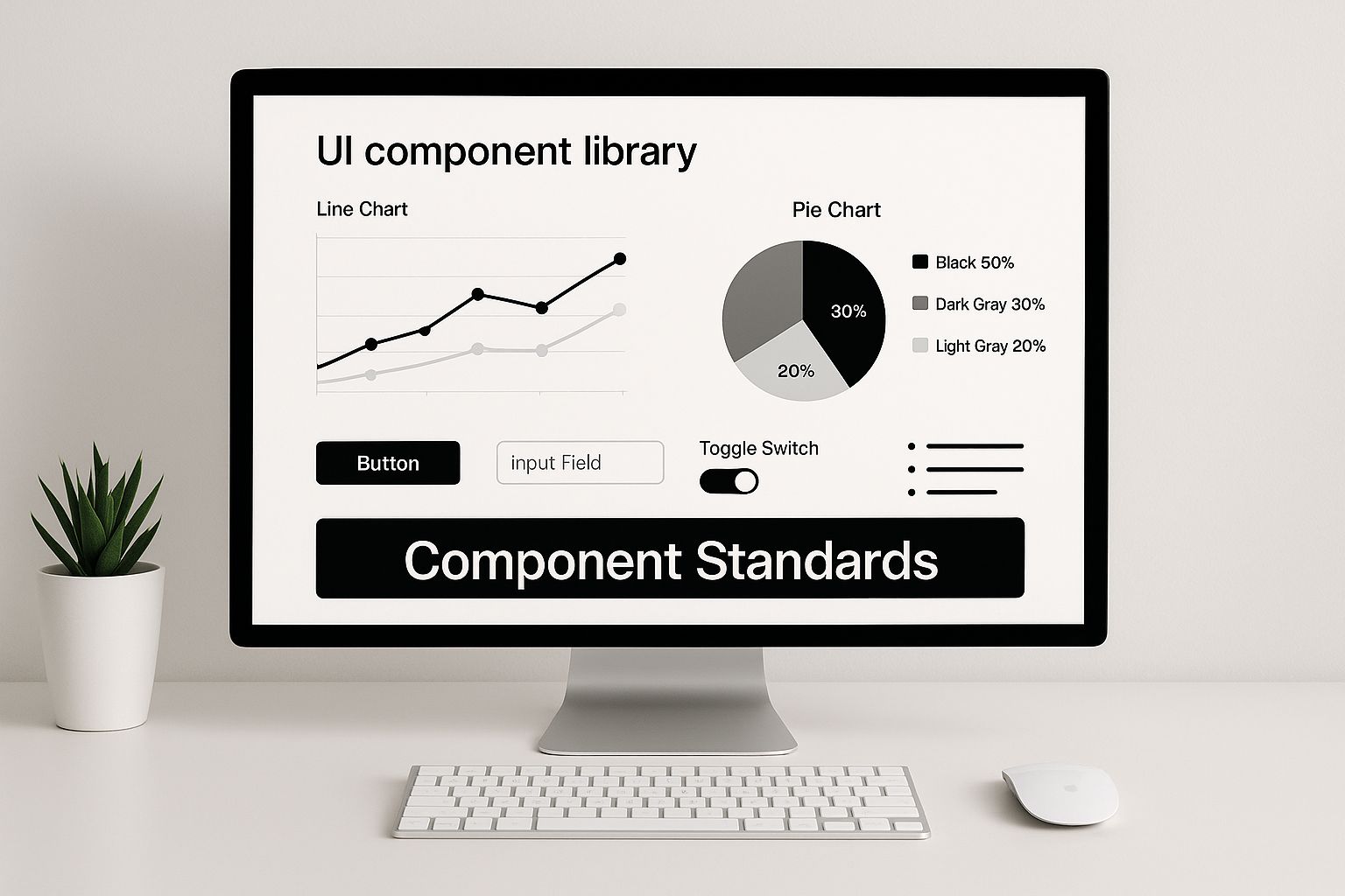
Anatomy of World-Class Documentation

Let's be honest, a design system without great documentation is just a folder of files. World-class documentation, like what you see from Google's Material Design above, isn't just a style guide—it's the operational blueprint for your entire product team. It’s what turns a collection of assets into a living, breathing resource that people actually trust and use.
The image really says it all. You see clear navigation, visual examples, and a structure that just makes sense. It guides you from the big-picture principles right down to the nitty-gritty of a single component. To get to this level, you have to be intentional. You need to organize everything into distinct, logical categories that speak to designers, developers, and product managers in their own language.
Foundational Building Blocks
Before you even think about documenting a button, you have to lay the groundwork. This is your visual DNA, the core language that makes your product look and feel like your product. These are the "whys" behind your aesthetic choices.
These foundational rules are deeply connected to your product's core purpose. You can actually dive deeper into this way of thinking in our article that breaks down the fundamental principles of design with examples.
At a minimum, your foundation has to include:
- Color Palette: Your primary, secondary, and accent colors need to be locked in. Don't forget the supporting cast—specific shades for states like errors, warnings, and successes. Always include the hex codes and clear rules on where and when to use them.
- Typography System: Define everything. Font families, weights, sizes, line heights, the works. A clear typographic scale is non-negotiable for creating hierarchy and readability.
- Spacing and Layout: This is where you establish rhythm. Document your grid system, define your spacing units (an 8px scale is a common, solid choice), and lay out the core principles for keeping everything aligned.
Components and Patterns
Okay, foundation's set. Now for the fun part: the tangible, reusable pieces of your UI. This section is usually the biggest and gets the most traffic in any design system documentation. It’s where the magic really happens for your team.
People simply want to do the best possible work they can. We’ve seen teams level up their work dramatically by referencing our documentation. The office hours we have now versus before the playbook are just night and day.
Here, you're cataloging two key things: individual components and the larger patterns they form.
- Components are your basic building blocks. Think
Buttons,Forms,Modals, andCards. Every single one needs its own dedicated page with detailed usage guidelines, all possible states (hover, disabled, active), and copy-paste-ready code snippets. - Patterns are the bigger picture. They are tried-and-true solutions for common design problems, like a
Login Flow, aData Table, or anOnboarding Sequence. These pages are less about a single element and more about explaining how to combine multiple components to create an experience that feels natural to the user.
To help you get started, here's a quick look at the essential categories every set of documentation should have.
Essential Documentation Categories
| Category | Purpose | Examples of Content |
|---|---|---|
| Foundations | To define the core visual and interactive language. | Color palette, typography scale, spacing units, grid systems, iconography. |
| Components | To provide a catalog of reusable UI elements. | Buttons, forms, modals, cards, navigation bars, tooltips, alerts. |
| Patterns | To document solutions for common user tasks. | Onboarding flows, search and filtering, data tables, checkout processes. |
| Content | To establish a consistent brand voice and style. | Tone of voice, grammar rules, terminology, editorial guidelines. |
| Accessibility | To ensure the product is usable by everyone. | WCAG compliance, keyboard navigation, screen reader support, color contrast. |
Having these categories clearly defined and populated turns your documentation from a simple reference into an indispensable tool.
Standards and Guidelines
Finally, your documentation needs to connect all the dots. This section is all about the "how" and "why" behind your system, giving your team the context they need to make smart, consistent decisions on their own.
This includes content standards, which define your brand's voice, tone, and the specific words you use (or don't use). It’s also where you'll house your accessibility guidelines, making sure your product is truly for everyone. This is where you get to explain your rationale, bridging the gap between a design decision and a line of code. It's what keeps everyone aligned and moving in the same direction.
This is it. This is where the magic happens.
Clear component documentation is where your abstract design principles become real, tangible tools your team can actually use. If there’s one part of your design system that will get visited over and over again, it’s this one. Nailing it is absolutely critical for getting people on board.
The whole point is to wipe out any confusion. You want a designer's mockup and a developer's final build to be a perfect match. A well-documented component answers every single question before anyone even thinks to ask it. This is how you prevent those little slip-ups—like a missing button state or weird error handling—that add up to a clunky user experience.
Think of each component page as its own mini-instruction manual. A developer or designer should be able to land on the "Button" page, get everything they need to use it correctly, and walk away without ever having to ping someone for help.
A Template for Component Documentation
To keep things consistent across your whole library, you need a standard template. The specifics can shift around a bit, but every solid component page has a few core pieces. Let's use a classic "Button" component to walk through it.
- 1. Clear Description: Start with a simple, one-sentence summary. What is this thing and what does it do? For example: "Buttons trigger an action or event, like submitting a form or opening a dialog."
- 2. Visual Examples: You have to show, not just tell. Display every single visual variation and state. For our button, that means primary, secondary, and tertiary styles. It also means showing what it looks like in its hover, focused, disabled, and loading states.
- 3. Live Interactive Preview: This is a total game-changer for developers. Pop in a live, interactive version of the component. Let people toggle the props and see the changes happen in real time. Tools like Storybook are fantastic for this, making it a breeze to test out different setups.
- 4. Usage Guidelines (The Do's and Don'ts): This is where you get direct. Give clear, straightforward advice using simple bullet points and visuals to show exactly when and how to use the component.
Just look at how the Atlassian Design System does it. They provide a super clean, easy-to-navigate library that helps their teams find what they need in a snap.
This kind of layout is so effective because it splits components into logical groups. It makes finding the docs for a button or a badge feel intuitive, turning the documentation into a practical tool instead of some dense, academic textbook.
Detailing Usage and Accessibility
That "Do's and Don'ts" section? It's your first line of defense against misuse. It gives direct, actionable guidance that leaves no room for guessing.
Do: Use a primary button for the main call to action on a page.
Don't: Use multiple primary buttons in the same view. It confuses the user's sense of priority.
This simple format—a rule plus a quick reason why—is incredibly powerful. It helps your team understand the thinking behind the design, which empowers them to make smarter choices when they're working on something new.
And finally, every single component needs its own accessibility (A11y) notes. Good design system documentation doesn't treat accessibility as an afterthought; it bakes it in from the very beginning.
- Keyboard Navigation: Explain how it should work with a keyboard. For a button, it’s pretty straightforward: "The button must be focusable and activatable using both the
EnterandSpacekeys." - Screen Reader Behavior: Be specific about how screen readers should announce the component. If you have an icon-only button, you absolutely must include a text label that's hidden visually but read aloud.
- Color Contrast: Reference your system's color contrast standards. Make sure all text and icons on the button meet WCAG AA or AAA requirements.
When you meticulously document every component with these elements, you’re not just writing instructions. You're building a source of truth that closes the gap between design and development, driving consistency and making everyone’s work faster.
Choosing Your Documentation Platform
Picking the right home for your design system documentation is a huge decision. Honestly, it's one that can make or break how successful the system becomes. This isn't just about selecting a tool; it's about creating an environment that actually fits how your team works and what they know.
The landscape for these tools has come a long way from the days of static PDFs living in a forgotten shared drive. Today, you've got everything from super user-friendly, all-in-one platforms to deeply customizable, code-based solutions. Your choice here will touch everything from designer-developer collaboration to whether your system is still alive and kicking a year from now.
Categories of Documentation Tools
Generally, documentation platforms shake out into three main buckets. Each one is built for different kinds of teams and priorities. Getting your head around these categories is the first step to narrowing down the massive list of options and finding what’s right for your crew.
- All-in-One Platforms: Think tools like Zeroheight. They're built for ease of use, giving designers and writers a no-code or low-code way to build beautiful documentation sites. Their real magic is the direct integration with design tools like Figma, which automatically syncs components and styles so everything stays up-to-date.
- Developer-Centric Tools: This is where you find platforms like Storybook. They live right next to your codebase and are fantastic for building an interactive component library. Developers can see live previews, play with different component states, and grab usage info right inside their own world.
- Documentation-as-Code: For teams craving total control, there are tools like Docusaurus or Nextra. This approach treats your docs just like a software project. You write content in Markdown, manage it all in Git, and get powerful version control and integration options. It's a powerhouse, but you need the technical chops to run it.
This is all about creating a central hub for your standards so everyone on the team is singing from the same song sheet.
As you can see, a solid platform is the key to keeping those component standards consistent, which is really the whole point.
Making an Informed Decision
Let your team's DNA guide this choice. A design-led team will probably feel right at home with the visual-first vibe of Zeroheight. On the other hand, an engineering-heavy organization will likely gravitate toward the code-centric workflow of something like Storybook.
When it comes to weighing your options, a comparison can really help clarify which path is best for your team's specific needs.
Documentation Tool Comparison
Here's a breakdown of the most common tool categories to help you figure out where to start your search.
| Tool Category | Best For | Key Strengths | Considerations |
|---|---|---|---|
| All-in-One Platforms | Design-led teams, rapid setup, and ease of maintenance. | Visual editing, direct design tool integrations (Figma, Sketch), no-code/low-code interface. | Less customizable, can feel restrictive for complex technical documentation. |
| Developer-Centric Tools | Engineering-led teams and component-driven development. | Live, interactive component examples, tightly coupled with the codebase. | Steeper learning curve for non-developers, less focus on written/design guidelines. |
| Documentation-as-Code | Teams needing full control and deep integration with developer workflows. | Highly customizable, version controlled with Git, scales well for complex systems. | Requires significant technical expertise to set up and maintain. |
Ultimately, there's no single "best" tool—only the best tool for your team and your workflow.
A classic mistake is picking a tool just for its shiny features, without thinking about who has to maintain it. The best platform is always the one your team will actually use day in and day out.
The good news is that design systems are no longer a niche experiment. Adoption is mainstream, and many companies now have dedicated teams to manage them. This shift proves their value as a core part of product development. If you want to dig deeper into this trend, you can explore the latest report on design system adoption.
When you make your final call, weigh each option against your team's size, technical comfort, and budget. But most importantly, see how well it plays with your existing tools—especially Figma and your code repository—to make sure you're setting up a smooth, sustainable workflow for your design system documentation.
Establishing Sustainable Governance and Maintenance
Your design system documentation isn't a one-and-done project. It's a living, breathing product that has to evolve right alongside your design system. If you don't have a rock-solid plan for keeping it fresh, even the most beautifully crafted docs will gather dust. Before you know it, they're outdated, your teams lose faith, and adoption grinds to a halt.
Putting clear governance in place is the only way to keep your documentation accurate, relevant, and trusted for the long haul.
So, where do you start? First, you have to decide who owns the documentation and how changes get made. Many teams go with a centralized model, where a core design system crew handles all the updates. Others prefer a federated approach, empowering folks from different product teams to chip in. This can build a much stronger sense of shared ownership across the company.
A classic mistake is picking a tool just for its shiny features, without thinking about who has to maintain it. The best platform is always the one your team will actually use day in and day out.
Whichever model you land on, having a crystal-clear process is non-negotiable. Without one, you'll get well-intentioned but unvetted changes causing chaos—a fast track to scope creep. It's smart to learn how to manage scope creep from the get-go with structured processes and open communication.
Creating Clear Contribution Workflows
To keep updates flowing without sacrificing quality, you need a transparent contribution workflow. Think of it as the official playbook any team member follows to propose, review, and merge a change. A solid workflow is your best defense against bottlenecks, and it ensures every single update meets your quality standards.
A battle-tested workflow usually has a few key stages:
- Proposal: The contributor kicks things off by submitting a change request through a set template. This needs to spell out exactly what's changing and why it matters.
- Review: The core design system team (or whoever you've designated) looks over the proposal. They're checking for clarity, accuracy, and whether it aligns with the system's core principles.
- Implementation: Once it gets the green light, the change is built out in a separate branch, away from the live documentation.
- Final Approval: The finished work gets one last look-over before it's officially merged into the main documentation for everyone to see.
This structured approach is what allows your documentation to grow in a way that’s controlled and predictable, not chaotic.
Managing Versions and Communicating Changes
As your documentation expands, you've got to manage all the updates with a clear versioning strategy. Using semantic versioning (like v1.2.1) is the industry standard for a reason—it instantly tells people the nature of an update. A major version bump (like to 2.0.0) warns of breaking changes, while minor (1.3.0) and patch (1.2.1) versions signal new features and bug fixes, respectively.
But versioning is only half the battle. You also need a proactive plan to tell people what's new. You can't just expect them to stumble upon the changes.
- Maintain a Changelog: Keep a detailed, running list of every single change, bug fix, and new feature. This is your foundation for transparency.
- Use Communication Channels: Don't be shy! Announce important updates in your dedicated Slack or Teams channels, send out a newsletter, or talk about it in team meetings.
- Provide Migration Guides: If you're introducing breaking changes, you owe your users clear instructions on how to adapt their work to the new version.
Measuring Documentation Health and Adoption
How do you prove all this effort is paying off? You measure it. Metrics are your best friend for tracking the health and adoption of your documentation, helping you make a case for the resources you need. Start with key metrics like documentation usage to see how often people are actually visiting your pages.
For a deeper dive, check out the 9 design system metrics that matter on Supernova.io. It offers some great insights into tracking things like page visits, session duration, and even interaction heatmaps, all of which can help you figure out what's working and what needs improvement.
Driving Adoption Through Workflow Integration

Here’s the hard truth: even the best, most detailed design system documentation is useless if no one uses it. If it’s a hassle to get to, it’ll gather digital dust. The real key to getting your team on board is to weave your documentation directly into their daily tools, transforming it from a bookmarked website into a helpful assistant that’s always there.
The goal is simple: make it faster and easier with the documentation than without it.
You have to kill the context-switching. A designer shouldn't have to bounce out of their canvas to double-check spacing rules. A developer shouldn’t need to open yet another browser tab just to copy a code snippet. When the answers are right there, the path of least resistance naturally becomes the path of consistency.
Embedding Documentation in Design Tools
For designers, their world revolves around tools like Figma. This is your ground zero. Getting your documentation integrated here is a game-changer, making it a natural part of the creative flow. This is where plugins and native features become your best friends.
Think about these kinds of integrations:
- Direct Component Linking: Use plugins that connect your documentation right to the components in your Figma library. Imagine a designer selects a button, and a small pop-up or sidebar panel instantly shows its usage guidelines and variants.
- In-Canvas Information: Some tools can surface critical info right in the design space. Hovering over a color style could instantly reveal its token name and accessibility contrast ratio. That immediate feedback is incredibly powerful.
- Plugin-Powered Search: A custom plugin that lets designers search the entire documentation library without ever leaving Figma is a huge win. They can pull up what they need, right when they need it.
“One of the most challenging things when it comes to keeping consistency is determining your source of truth. The key is choosing tools that support your current needs while leaving room for growth.”
Suddenly, your design tool isn't just a canvas anymore; it’s an interactive guide that reinforces best practices in real time.
Bringing Documentation to the Code Editor
Over on the development side, the Integrated Development Environment (IDE) like VS Code is their command center. Forcing them to leave that focused space to hunt for documentation is a massive productivity killer. So, making your docs accessible right in the IDE is non-negotiable for adoption.
Here are a few ways to make that happen:
- IDE Extensions: Build or find extensions that pull component documentation directly into the IDE. As a developer types
<Button, a tooltip could pop up showing the available props and their descriptions, pulled straight from your docs. - Code Snippet Libraries: This is a big one. Integrate your component code snippets into the IDE’s native library. A developer could type a shortcut like
ds-cardand instantly get the correct boilerplate code. - Linting and Autocompletion: Set up linters to flag when a component is used incorrectly or a prop is deprecated. The error message can even include a direct link to the documentation explaining how to fix it.
By putting the guidance right where the work is happening, your documentation stops being a static manual and becomes a dynamic partner. This level of deep integration is what separates good project execution from great. Speaking of which, for more on keeping complex creative work on track, check out our guide on creative project management software.
Answering Your Top Documentation Questions
Look, every team that's ever built design system documentation runs into the same handful of questions. It's just part of the process. If we can get ahead of these common sticking points, we can stop roadblocks before they happen and build a resource that people actually want to use.
Let's dive into some of the most frequent challenges we see and get you some straight answers.
One of the biggest hurdles? Just getting people to open the darn thing. If your documentation feels like a chore or an extra step, it's going to get ignored. The real secret is making it the path of least resistance.
"People simply want to do the best possible work they can. We’ve seen teams level up their work dramatically by referencing our documentation." – Ryan Tinsley, Staff Product Designer at eBay
Ryan's point is spot-on. When the documentation is genuinely useful and easy to get to, people will use it to make their own work better. It’s not about forcing people; it’s about providing real value that makes their jobs easier.
How Do We Get Teams to Actually Use This Stuff?
To get real adoption, you have to bake the documentation right into the team's daily grind. Think plugins for tools like Figma or extensions for code editors like VS Code that push information to your team without them having to switch gears and go searching for it.
When your documentation becomes the fastest, most reliable source of truth, its usage will just naturally grow.
Make it official, too. This documentation needs to be the guide for any and all UI decisions. A great way to cement this is to make it a core part of your reviews. For more on that, check out our guide on building a rock-solid design review process. This step really reinforces its role as the single source of truth.
Okay, So What Should We Document First?
When you're just starting out, don't try to boil the ocean. Go for the quick wins that will give your teams the most immediate value. Prioritize these areas to get some momentum going:
- Foundational Elements: Start with your core design tokens. We're talking color, typography, and spacing. These are the absolute building blocks of your visual language and touch every single component.
- Critical Components: Next up, tackle the components your team uses most often. This is usually stuff like buttons, form inputs, and cards. Clear guidance here will give you the biggest bang for your buck on consistency and development speed right out of the gate.
How Much Detail Is Too Much?
Your goal should be clarity and scannability, not a novel. Good documentation is thorough but incredibly easy to skim.
For each component page, include a short description, super clear "do's and don'ts" with visual examples, the essential accessibility notes, and code snippets ready for developers. If you find yourself writing a huge paragraph to explain a guideline, that's usually a red flag that the component itself is too complicated and might need a rethink.
The sweet spot is providing just enough information to kill any ambiguity, and not a word more.
At Creativize, we know that clear guidelines and strong creative foundations are everything. If you're looking to build your brand with incredible talent, our platform is here to connect you with local creative professionals who can make it happen. Find your next creative partner at https://creativize.net.