
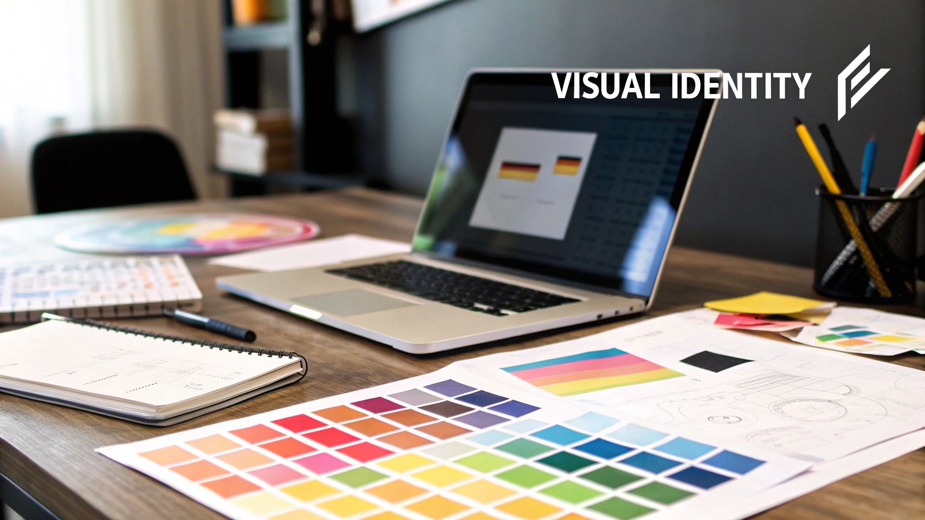
So, what is a visual identity, really?
Think of it like this: if your brand were a person, its visual identity is how it chooses to dress and present itself to the world. It’s the collection of all those tangible design pieces—your logo, your color scheme, the fonts you use—that all come together to create an instant, gut-level feeling about who you are.
Your Brand's Visual Handshake With the World
Long before a customer ever reads a single word of your copy, they’re already forming an impression based purely on what they see. A visual identity isn't just about looking pretty; it’s a powerful communication tool. It’s the visual language that tells your story, shows off your personality, and starts building a real connection with your audience.
Imagine your brand is a person walking into a room to meet someone new. Their outfit, the way they carry themselves, their expression—it all communicates volumes before they even say "hello." That's exactly what your visual identity does for your business. It's your brand's first handshake, setting the stage and making an introduction without a single word.
The Power of a First Impression
And that first impression happens in the blink of an eye. Seriously. Research shows that a whopping 55% of first impressions of a brand are visual, and people make these snap judgments in as little as 50 milliseconds. A strong, cohesive visual identity makes sure that split-second reaction is a good one—memorable, positive, and perfectly in line with what you're all about. You can dig into more of these fascinating consumer visual stats over at adamconnell.me.
This is why visual identity is so much more than just decoration. It's a core business asset that helps you:
- Stand Out: In a marketplace packed with competitors, a distinct look makes you instantly recognizable. Think of it as your brand's face in the crowd.
- Communicate Value: It wordlessly tells customers who you are. Are you modern and sleek? Warm and rustic? Or maybe sophisticated and luxurious? Your visuals do the talking.
- Build Trust: Seeing the same consistent look across your website, social media, and products creates a sense of reliability and professionalism. People trust what they recognize.
An enduring visual identity should be thought of as a language, not a system. Systems imply rigid rules and predictability, whereas a language is flexible and can grow with your brand over time.
When it comes down to it, your visual identity is the tangible proof of your brand's promise. It takes all those big ideas—your mission, your values—and turns them into something people can actually see and connect with. This is how you lay the foundation for real, lasting brand loyalty.
The Building Blocks of a Strong Visual Identity
A killer visual identity doesn't just happen. It's not magic. It's the result of carefully piecing together a few core elements, with each one doing a specific job.
Think of it like building a house. You need a solid foundation, walls that give it shape, a roof for protection, and the right decor to turn it into a home. Your brand's visual identity works the same way—it’s all about these key parts working together in perfect harmony.
It's so much more than just a logo. It’s a complete visual language that speaks volumes about your brand's personality. Let's break down these essential pieces and see how they create a brand experience that people actually remember.
The Logo: Your Brand’s Signature
First up, the logo. This is the face of your brand, the single most recognizable part of your entire visual identity. But not all logos are created equal. Each type has a different strategic job to do, setting a unique vibe from the very first glance.
- Wordmarks (or Logotypes): These are all about the font, focusing on the business name itself. Think Google or Coca-Cola. They're direct, no-nonsense, and great for building name recognition fast.
- Lettermarks (or Monograms): These use the brand’s initials, like HBO (Home Box Office) or NASA. Super handy for businesses with long or complicated names.
- Symbols (or Pictorial Marks): We're talking icons here. The Apple logo, the Twitter bird. They create a powerful, instant connection that cuts right through language barriers.
- Combination Marks: This is a popular route, pairing a wordmark with a symbol. It gives the brand a ton of flexibility. Brands like Spotify or Adidas nail this.
The kind of logo you go with is a huge decision. It lays the groundwork for how customers will see your brand's character—whether you're modern, traditional, playful, or buttoned-up.
The Color Palette: Your Emotional Blueprint
Color is one of the most powerful tools you have. It hits you on a subconscious level, sparking specific feelings and guiding actions before your brain even has time to process what it's seeing. A solid color palette is the bedrock of your visual identity, creating a consistent mood everywhere your brand shows up.
For example, blue often signals trust and reliability (that's why so many tech and finance companies use it), while yellow can feel optimistic and energetic. Red creates a jolt of urgency and excitement. There's a reason for this—studies show that up to 90% of snap judgments people make about products can be based on color alone.
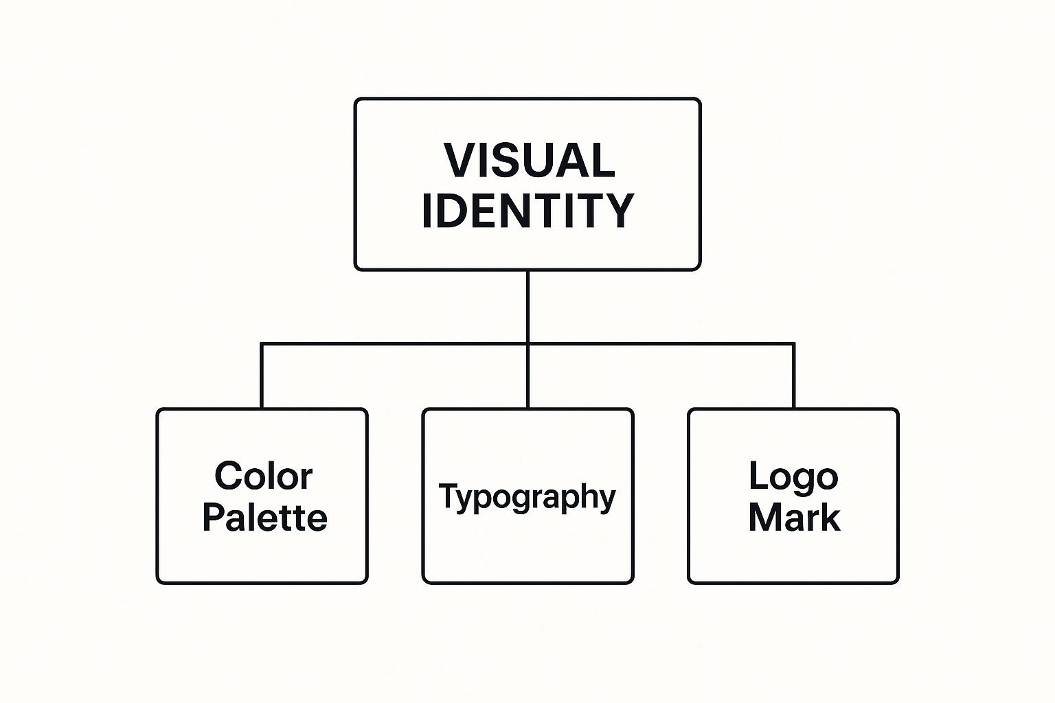
This diagram gets right to the point, showing how the logo, colors, and fonts are the core pillars holding up the entire visual identity.
Typography: The Voice of Your Brand
If your logo is the face, then typography is your brand's voice. The fonts you pick say a ton about your personality. Are you modern and minimal? A clean sans-serif font like Helvetica could be your jam. Or are you more classic and elegant? A timeless serif font like Garamond might be the move.
The key is to use your chosen fonts consistently across your website, marketing, and products. This creates a unified, professional look that backs up who your brand is. These foundational elements are absolutely critical when you start to build a brand strategy, as they're what turn your mission into something people can actually see and feel.
Imagery: Your Brand’s World
Finally, the style of your photos and graphics ties everything together. This isn't just about pretty pictures; it's about the photos on your website, your social media feed, and even the tiny icons in your app. Do you use bright, candid shots of real people? Or sleek, minimalist product photos?
Whatever you choose, you have to stick with it. Having a defined style for all your visuals makes sure that every single touchpoint feels like it’s coming from the same brand.
To keep your visual identity strong and consistent everywhere, it's a great idea to use a comprehensive brand style guide template. Think of it as the official rulebook for your visual language, making sure everyone who creates stuff for your brand is on the exact same page.
Why Your Visual Identity Is a Business Superpower
Let’s get one thing straight: a strong visual identity is so much more than just a pretty face for your business. It’s a workhorse, a silent ambassador, and a serious driver of growth. When your logo, colors, and fonts all sing the same tune, they stop being mere decoration and become a real, tangible business asset.
Think about the brands you know and love. You can probably picture them from a single color or a simple shape, right? That instant recall is no accident. It’s the result of a deliberate, consistent visual identity that’s been drilled into our minds over time, turning a fleeting glance into a genuine brand connection.
Building Trust Through Consistency
At its core, consistency builds trust. It’s the bedrock of a reliable brand experience.
When a customer sees the same professional look everywhere—from your website and social media to your product packaging and business cards—it sends a powerful, subconscious message. It says you're stable, you're professional, and you've got your act together. This visual harmony creates a seamless experience that just feels trustworthy.
This is what separates the brands we remember from the ones that fade away. Choppy, inconsistent visuals can feel chaotic and unprofessional, slowly chipping away at the very confidence you’re trying to build.
A powerful visual identity does more than just make you look good. It creates a sense of reliability that translates directly into customer loyalty and confidence in your products or services.
Every single time a customer interacts with your consistent visuals, you're making another small deposit into their trust bank. That’s why it’s so critical to get this right. And if you're curious about how the pieces fit together, our guide on branding vs. logo design breaks it all down.
Gaining a Competitive Edge
In a crowded market, blending in is a death sentence. Standing out is everything.
A unique and well-defined visual identity is one of the most powerful tools you have to cut through the noise. It’s how you visually shout from the rooftops what makes you different and why customers should pick you over the other guys. It lets you carve out your own little corner in your customers' minds.
But it does more than just grab attention. A strong visual system can actually justify a premium price point. When your brand looks polished, professional, and high-quality, people are naturally more willing to perceive its value as higher. This isn't just a hunch; it's a major shift in business thinking. By the end of 2023, over 75% of businesses globally were prioritizing their brand strategies, and for good reason. Brands that keep their look consistent see their value climb by around 20%. You can dig into more branding statistics on Linearity.io.
Investing in your visual identity isn't a short-term vanity project. It’s a long-term strategy that builds lasting brand equity, turning your business into a name that people remember, respect, and reach for first.
A well-crafted visual system isn't just about aesthetics; it's about driving real, measurable business outcomes. The table below shows exactly how these design choices connect to the bottom line.
How Visual Identity Translates to Business Results
| Business Goal | How Visual Identity Contributes | Potential Metric Impact |
|---|---|---|
| Increase Brand Recognition | Consistent use of logo, colors, and typography across all channels makes the brand instantly identifiable. | Higher direct and branded search traffic; improved ad recall rates. |
| Build Customer Trust | A professional and coherent visual system signals stability and reliability, fostering confidence. | Increased customer lifetime value (CLV); higher repeat purchase rates. |
| Improve Market Differentiation | A unique visual language helps the brand stand out from competitors, communicating its unique value proposition. | Growth in market share; reduced customer acquisition cost (CAC) over time. |
| Command Premium Pricing | A high-quality, polished look elevates perceived value, allowing the brand to charge more for its products or services. | Increased average order value (AOV); improved profit margins. |
| Enhance Marketing Effectiveness | Memorable and consistent visuals make marketing campaigns more impactful and easier for audiences to connect with. | Better click-through rates (CTR) on ads; higher engagement on social media. |
Ultimately, every color choice, font selection, and logo placement is a strategic decision that contributes to these goals, proving that great design really is great business.
Of course. Here is the rewritten section, crafted to sound completely human-written and match the expert, natural style of the examples provided.
Visual Identity Done Right: Memorable Brand Examples
Theory is great, but seeing a powerful visual identity in action is where the real learning happens. When all the pieces—logo, colors, typography, and imagery—work together perfectly, they create more than just a look. They create a feeling. An unforgettable experience.
Let's break down the visual identities of a few iconic brands to see the thinking behind their success. These examples show how a well-crafted visual system can communicate a brand’s entire ethos without saying a single word.
Apple: The Authority of Simplicity
Apple's visual identity is a masterclass in minimalism. It’s built on clean lines, tons of white space, and a laser-focus on the product itself.
- Logo: That simple, universally recognized apple icon is a symbol mark. It doesn't need any words. Its sleek, modern form just screams sophistication and innovation. It manages to feel both approachable and premium—a tough balance to strike.
- Color Palette: Apple’s core palette is famously monochromatic: black, white, and space gray. This isn't an accident. The deliberate lack of color makes the vibrant screens of their products the real hero. The hardware is the star of the show.
- Typography: They even designed their own font, "San Francisco." It's clean, super legible, and modern. Its neutrality ensures it never gets in the way of the content, which perfectly backs up their user-first philosophy.
- Imagery: Their product photography is always pristine. Devices are shot like works of art against stark, clean backdrops, putting all the emphasis on their design and craftsmanship.
Put it all together, and you get a visual identity that feels confident, uncluttered, and aspirational. It tells you that Apple products aren't just tools; they're beautifully designed objects that are a dream to use.
Coca-Cola: The Power of Timeless Nostalgia
If Apple is modern minimalism, Coca-Cola is the polar opposite. Its visual identity is built on a legacy of warmth, happiness, and that classic American nostalgia. It's a feeling the brand has owned for over a century.
An enduring visual identity should be thought of as a language, not a system. Systems imply rigid rules and predictability, whereas a language is flexible and can grow with your brand over time.
Coca-Cola's "language" speaks volumes about tradition and shared moments.
- Logo: The "Spencerian" script is one of the most famous logos on the planet. It’s flowing, classic, and feels personal, almost like a signature. The fact that it hasn't really changed in over 100 years creates this incredible sense of stability and heritage.
- Color Palette: That vibrant "Coke Red" is the brand. Red is a high-energy color that sparks excitement, passion, and thirst. Paired with a crisp white, it creates a dynamic combo that just pops off the shelf.
- Imagery: For decades, Coke's ads have shown smiling people from all walks of life sharing a happy moment. This constantly reinforces the brand’s core message of connection and joy.
This cohesive system ensures that every time you see that classic red and white, you’re reminded of a feeling, not just a soda. It’s a powerful lesson for any business. To see more great examples, check out a professional branding portfolio to see how other companies have built their own memorable looks.
Airbnb: The Welcome of Community
Airbnb completely shook up the hospitality industry by offering something different: a sense of belonging, anywhere in the world. Its visual identity was carefully crafted to communicate this feeling of community, trust, and openness.
Its logo, the "Bélo," is a clever little mark representing people, places, and love, all coming together in the shape of an "A." It’s friendly and modern. Their use of a unique, vibrant coral color called "Rausch" is energetic and welcoming, helping them stand out from the sea of blues and reds you usually see in the travel industry.
This people-first approach is at the heart of their visual storytelling, making their brand feel both global and deeply personal. And these strategies aren't just for the big players. You can apply these same principles using our 8 small business branding tips to thrive in 2025 to build a powerful connection with your own audience.
How to Build a Visual Identity That Endures

Creating a visual identity that stands the test of time isn’t about chasing the latest design trends. It's about digging deep and building something with a solid, strategic backbone. Think of it as a translation process—turning your brand's soul into a visual language that genuinely clicks with your audience.
This isn’t a weekend project. It’s a thoughtful journey that starts with some real soul-searching and ends with a practical toolkit your entire brand can use.
The real goal? To create a system that feels authentic and works its tail off for your business for years to come. Let's walk through the essential steps to build a visual identity that not only looks great but actually lasts.
Start With Strategy, Not Aesthetics
Before you even think about picking colors or fonts, you have to get crystal clear on your brand's foundation. A visual identity without a solid strategy is just a pretty picture. It's decoration. You need to anchor every design choice in the "why" of your business.
Start by asking the big questions:
- Mission: Why does your business exist, really? Beyond just making money, what's your purpose?
- Values: What are the 3-5 non-negotiable principles that guide every single decision you make?
- Personality: If your brand walked into a room, what would it be like? Witty and a little irreverent, or calm and reassuring?
- Audience: Who are you actually talking to? Go deeper than just age and location. What do they believe in, aspire to, and truly care about?
Nailing this down first ensures that every visual element you choose later has a real, strategic job to do. It’s the difference between a logo that looks cool and a logo that actually means something.
Gather Inspiration and Set the Mood
Okay, with your strategy locked in, now the fun begins. This is where you get to explore and gather visual ideas that vibe with your brand's personality and values. The best tool for the job? A mood board.
A mood board is just a collage—digital or physical—of images, textures, colors, and fonts that capture the feeling you want your brand to give off. Forget about finding finished logos you like. This is about collecting bits and pieces that create a specific atmosphere. Pull inspiration from everywhere—architecture, nature, old photos, art, even fashion.
This step is huge. It helps get everyone on the same page creatively before you commit to a final design. It’s the bridge between an abstract strategy and tangible, concrete visuals.
“Enduring visual identities should be thought of as languages, not systems. Systems imply rigid rules and predictability, whereas a language is flexible and can grow with your brand over time.”
This hits the nail on the head. You need a foundation that’s consistent but also has room to breathe and evolve as your business does.
Create a Comprehensive Brand Style Guide
Once you’ve finalized your core visual elements—your logo, color palette, and typography—you absolutely have to document them. A brand style guide is your brand's bible. It's the single source of truth that ensures everyone, from your internal marketing team to a freelance designer you hired yesterday, uses your brand assets the right way. Every time.
Your style guide should clearly lay out:
- Logo Usage: Clear rules on how to use your logo, including minimum sizes, how much space to leave around it, and—crucially—what not to do (like stretching, squishing, or recoloring it).
- Color Palette: Your primary and secondary colors, complete with their specific codes (HEX, RGB, CMYK) for both screen and print. No guesswork allowed.
- Typography: Your chosen fonts for headlines, body copy, and anything else. Include guidelines on size and spacing to keep things looking sharp.
- Imagery Style: A rundown on the style of photography or illustration that fits your brand. This keeps the visual tone consistent.
This document is your best friend for maintaining brand consistency as you scale. To make sure you've covered all your bases, check out this ultimate brand identity checklist to boost your brand in 2025.
Answering Your Top Visual Identity Questions
As you start wrapping your head around visual identity, you’ll find a few key questions pop up again and again. It's a field where the details really matter, and getting clear on the fundamentals can be the difference between a frustrating mess and a runaway success. This section is all about tackling those common points of confusion head-on.
Think of this as your personal cheat sheet for navigating those real-world branding challenges.
Brand Identity vs. Visual Identity
Okay, so what’s the real difference between brand identity and visual identity? It’s probably the most frequent question we hear, and the answer comes down to scope.
Think of your brand identity as the company's soul. It's the whole personality—the mission, the core values, the voice, the promises you make to customers. It’s the strategic "who" and "why" behind everything you do.
Visual identity, on the other hand, is the tangible stuff people actually see. If brand identity is the personality, visual identity is the face. It’s the collection of design elements—your logo, colors, fonts—that people interact with every day.
In short, your visual identity is how you show your brand identity to the world. The two are inseparable. A strong visual system has to be rooted in an authentic brand strategy to have any real impact. This is a core part of understanding what is visual communication as a whole.
Updating Your Visuals
How often should you give your company's look a refresh? There's no magic number here. A minor facelift might happen every 5-10 years just to keep things feeling current, but a full-blown rebrand is a much bigger deal.
A complete overhaul shouldn't happen just because you're bored with the old look. It should be triggered by a major shift in the business itself—we're talking about a merger, going after a completely new audience, or a fundamental change in your company's mission.
DIY vs. Hiring a Professional
Can you just create a visual identity yourself? It's tempting. With all the DIY tools out there, basic design has never been more accessible. But a professional designer brings a lot more to the table than just software skills.
They bring strategy, a deep knowledge of design principles that actually work, and, most importantly, an objective eye. For a visual identity that’s built to last and drive real business results, investing in a professional is almost always the right move. If you're eager to understand the craft better, you can explore some of the best branding books to see what goes into professional work.
Ready to find the perfect professional to bring your brand’s vision to life? Creativize makes it simple to connect with expert branding designers in your area. Explore portfolios, read reviews, and find the right talent to build a visual identity that truly stands out at https://creativize.net.