
Let's be honest, we're all visual creatures.
When you boil it down, what is visual communication? It’s simply the art of showing instead of just telling. It’s a language we all instinctively understand, one that uses images, signs, and design to get a message across—often cutting straight through the clutter of written words. Our brains are just built differently for visuals; we process them in a flash.
Understanding the Language of Sight
At its core, visual communication is about turning a message into something you can actually see. Think about a stop sign. That iconic red octagon hits you with a clear "stop" command way faster than you could ever read the word itself.
This immediate understanding is the superpower of visual language. It’s not about just making things look good for the sake of it. It's about making information land more effectively, stick around longer, and have a real impact.
This isn’t some niche skill, either. It’s everywhere. From the emojis you pepper into your texts to the detailed charts in a business presentation, you’re using it daily. The right visuals can steer your audience's focus, make sense of tricky subjects, and stir up real emotions. In fact, research shows that visuals can boost learning and retention by an incredible 400 percent because they help cement ideas in our memory.
Why Visuals Are More Critical Than Ever
We're drowning in information. Every day, countless messages are fighting for our attention, and cutting through that noise is a huge challenge. That’s where visual communication comes in.
A sharp infographic can take a mountain of dry statistics and make them instantly digestible. A single, powerful photograph can spin a tale with more depth and feeling than a whole page of text.
To help you get a better handle on this, here's a quick look at the core components that make visual communication tick.
Core Concepts of Visual Communication at a Glance
| Component | Brief Explanation | Example |
|---|---|---|
| Imagery | Photos, illustrations, and icons that convey ideas and evoke emotion. | A charity using a photo of a smiling child to connect with donors. |
| Typography | The style and appearance of text, used to set a tone and improve readability. | A luxury brand using an elegant, serif font for its logo. |
| Color | Used to create mood, draw attention, and organize information. | Traffic lights using red, yellow, and green for universal signals. |
| Layout | The arrangement of visual elements to guide the viewer's eye. | A magazine spread with a clear headline, columns, and images. |
| Data Visualization | The practice of turning data into visual formats like charts and graphs. | A business report using a bar chart to show quarterly growth. |
Each of these pieces plays a role in crafting a message that doesn't just get seen, but gets understood.
This guide is your deep dive into this powerful field. We’ll dig into its history, break down the essential elements, and show you exactly how it’s being used in the real world to get results. Let’s face it: mastering this skill isn't just a "nice-to-have" anymore. It's a must for anyone who wants to communicate with genuine clarity and impact.
How Visuals Have Shaped Human History
Long before anyone ever wrote a single word, people were already communicating visually. This isn't some newfangled idea born out of the internet age; sharing ideas through images is a core part of our collective story, woven right into the fabric of human development. Honestly, looking back at this history tells you everything you need to know about why visuals are still so incredibly powerful today.
Think about it. The journey starts in the pitch-black darkness of ancient caves. We're talking over 40,000 years ago, when early humans in Asia and Europe picked up charcoal and ochre to paint vivid scenes on stone walls. These weren't just pretty pictures. They were some of the very first attempts to tell stories, document hunts, or maybe even conduct rituals—passing down critical information from one generation to the next without a single letter.
From those primal beginnings, visual language started getting more sophisticated. You had civilizations like the Egyptians developing hieroglyphs, a full-blown system where intricate symbols stood for sounds, objects, and complex ideas. This was a huge leap, allowing for much more detailed records and richer stories, setting the stage for what was to come.
The Dawn of Mass Communication
The real game-changer was the printing press in the 15th century. Suddenly, you could copy and share images and text on a massive scale. This blew the doors wide open on information, making knowledge accessible to everyone, not just the wealthy elite.
Fast forward a few centuries, and the invention of photography in the 1800s added a whole new layer of realism to visual storytelling. For the first time, people could see real moments frozen in time. This had a profound effect on everything from how news was reported to how products were sold, proving just how much power an authentic image has to stir up emotion and convey truth.
Key Takeaway: Every major leap in technology—from the printing press to the camera—has amplified our ability to communicate visually. It’s made our messages more immediate, more persuasive, and more accessible to more people.
These historical milestones aren't just fun facts; they're the foundation that all modern design is built on. To create visuals that really connect with people today, you have to get a feel for the core ideas that have been tested and refined over thousands of years. If you’re trying to build up your own skills, understanding the basic design principles is the perfect place to start.
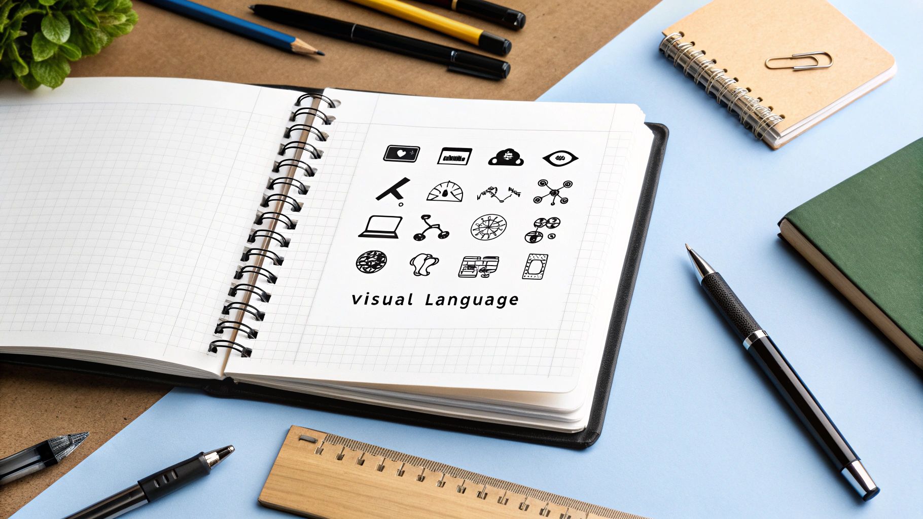
From Analog to Digital and Beyond
This infographic gives a great snapshot of the key elements that designers juggle in today's visual world.
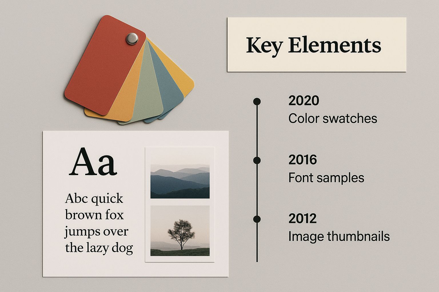
You can see how everything from the color swatches and font choices to the image thumbnails has to work together to tell a single, coherent story.
The 20th century put this evolution on hyperdrive, first with television bringing moving pictures into living rooms across the globe. But the most dramatic shift came with personal computers and the internet. Back in the 1980s, desktop publishing software put design tools into the hands of everyday people for the first time.
Now, we live in a world completely saturated with stunning digital visuals—from interactive data charts and slick app interfaces to the silly GIFs we pass around in group chats.
Every single step on this long road, from a cave wall to a smartphone screen, has hammered home the same timeless truth: visuals are an essential, powerful, and deeply human way to make a connection and share what matters.
The Building Blocks of Powerful Visuals

To really get what visual communication is all about, you have to look under the hood at its core parts. It’s a lot like a chef pulling together individual ingredients to make an incredible meal. A visual communicator does the same thing, just with specific elements to craft a message that hits home.
These are the pieces that turn a simple image into a story with real impact.
When these elements click together, they form a visual language that our brains just get—often way faster than words on a page. Nailing these is the secret to creating visuals that don't just get a passing glance but are actually understood and remembered.
Color and Emotion
Color is easily one of the most powerful tools you have. It's so much more than just decoration; it’s a direct line to our feelings and gut reactions. The colors a brand picks for its logo or a director uses in a movie scene? Totally intentional, and designed to make you feel a certain way.
Think about it. Why do so many banks and tech companies lean on blue? Because it often creates a sense of trust and stability. Red, on the other hand, can scream urgency, passion, or even danger, which is why you see it on sale signs and stop signs. This is where understanding the psychology of color in branding becomes a game-changer, as colors tap into deep-seated associations that shape how we see things.
It's wild, but a study found that people form a subconscious opinion about a product within 90 seconds, and a whopping 62% to 90% of that first impression is based on color alone.
Typography and Tone
Typography is the art of making text look good and easy to read. But the fonts you pick do more than just display words; they give the whole message a personality and set the tone.
A bold, clean, sans-serif font can feel modern and straight to the point—perfect for a tech startup's website. Flip that, and an elegant, looping script font might suggest luxury and tradition, making it a great fit for a fancy wedding invitation. How big the text is, how heavy it looks, and how much space is around it all play a part in what the viewer pays attention to first.
Composition and Guidance
Composition is simply how all the visual pieces are arranged on the canvas. It's the invisible grid that leads your eye through the design, making sure you see the most important stuff first. Good composition feels balanced and deliberate. Bad composition just feels like a mess.
A few key principles of composition are always in play:
- Hierarchy: Making the most critical elements bigger or bolder to grab immediate attention.
- Balance: Spreading out the visual weight, either symmetrically for a classic, formal vibe or asymmetrically for something more energetic.
- White Space: Using empty areas to cut down on clutter, make things easier to read, and create a sense of focus.
These three—color, typography, and composition—are just the starting line. They're part of a bigger playbook of rules that drive great design. For a much deeper look, our guide on mastering the 8 principles of visual design in 2025 gives you the complete roadmap. Once you understand these building blocks, you start seeing the world differently, able to decode the messages behind the images all around you.
Exploring Different Types of Visual Communication
While the big idea of visual communication is the same everywhere, it shows up in a ton of different ways in our daily lives. Think of it like music: you have countless songs, but they all fall into genres like rock, pop, or jazz. In the same way, we can group visual communication into distinct categories, each with its own vibe and purpose.
Once you start seeing these categories, you’ll notice the specific strategies being used to send a message. It's in the branding that makes you trust a company and the app interface that just works. Each type has a unique job to do.
Let's break down some of the most common and powerful forms you'll run into.
Graphic Design and Branding
Graphic design is probably the most visible type of visual communication out there. It’s the art of mixing images, colors, and typography to create stuff that represents a brand or an idea. We’re talking about everything from a company’s logo and business cards to its social media feed and event posters.
The main goal here is to build a look that people recognize instantly and to communicate a brand's personality without saying a word. A well-designed logo, for instance, can immediately tell you if a company is fun and modern or traditional and buttoned-up. It's the visual bedrock a company builds its whole story on. If you want to get good at this, digging into effective visual storytelling techniques is a fantastic place to start.
Data Visualization and Infographics
Not all visuals are about brand vibes. Sometimes, the goal is just crystal-clear understanding. That's where data visualization shines. It’s the magic of turning dense spreadsheets, messy stats, and raw data into charts, graphs, and maps that actually make sense.
An effective infographic can cut through the noise and make you understand complex information almost instantly. It turns raw numbers into a narrative, revealing trends, comparisons, and relationships that would get totally lost in a wall of text. A simple bar chart showing sales figures is just way more intuitive than a long list of monthly revenue numbers, right?
User Interface (UI) and User Experience (UX) Design
Every single time you use an app on your phone or click around a website, you’re interacting with UI and UX design.
User Interface (UI) design is the part you see—the look and feel of the buttons, icons, and layouts. It’s all about making a digital product look good and feel intuitive.
User Experience (UX) design, on the other hand, is a bit broader. It’s about the entire feeling a person gets while using the product. Is it easy and seamless, or confusing and frustrating? Both UI and UX rely heavily on visual cues to guide people through a digital space without them even having to think about it.
Of course, there are other important types of visual communication, too.
- Video and Animation: These use moving pictures to tell stories, explain how things work, or just entertain. Think of a quick product demo or an animated explainer video.
- Signage and Wayfinding: This is all about the physical signs that guide us through the world, like traffic lights, airport directions, and the maps you see in a mall.
- Digital Art and Illustration: This is a constantly evolving space, with new forms popping up all the time. One of the most interesting developments is the use of AI text-to-image models, which are creating entirely new kinds of visuals from simple text prompts.
How Visuals Drive Real-World Success
Theories are great, but the true magic of visual communication happens when you see it in action. Across every field imaginable, from marketing to education, great visuals aren’t just a nice-to-have. They’re a core part of what makes things work, driving tangible results and boosting everything from understanding to customer loyalty.
Think about it. Strong visual communication is the engine behind so many successful brands. That memorable logo, the cohesive color palette, those ad images you can't forget—they all work together to build a brand's identity. This kind of consistency creates a feeling of trust and recognition, making it way easier for customers to connect with a business and remember it when it's time to buy.
Turning Data Into Decisions
In business, we're swimming in data. But raw numbers are often a headache to sort through, and frankly, pretty overwhelming. This is where data visualization steps in and saves the day. By turning complex spreadsheets into clear charts, graphs, and dashboards, businesses can spot trends, uncover opportunities, and make smarter, fact-based decisions—fast.
This isn't some new-fangled idea. It has a long history of making abstract information concrete and understandable. The first recognized statistical graph was actually created way back in 1644 by Michael Florent Van Langren to visually compare different estimates of longitude. That simple line chart was far more intuitive than a jumble of numbers, proving just how well visuals can reveal patterns at a glance.
Today, that principle is more important than ever. Studies even confirm our brains process visuals 60,000 times faster than text. For a fantastic look at how we got here, you can explore the evolution of the infographic.
Real-World ROI: Research shows that businesses using strong visual content can save up to $1,200 in productivity per employee each year. Why? Because visuals make information quicker to grasp and easier to remember, cutting down on time wasted trying to figure out what dense documents are even saying.
Boosting Learning and Engagement
The power of visuals goes way beyond the boardroom. In education, they are absolutely essential for making complex subjects click and helping information stick. For example, a diagram of the solar system makes the relationships between planets instantly clear in a way that a block of text never could.
This idea of clear organization is fundamental. When you arrange elements logically, you guide the viewer’s eye straight to what matters most. For anyone looking to level up their own designs, a perfect next step is to learn the fundamentals of visual hierarchy and see how it directs attention.
Ultimately, whether it’s through a powerful brand identity, a revealing data report, or an engaging educational diagram, visual communication proves its worth again and again by turning abstract ideas into clear, impactful, and successful outcomes.
Alright, we've walked through the history, the core building blocks, and the real-world power of visual communication. Now it's time to put it all into practice.
At the end of the day, using visuals effectively is a core skill for anyone who wants their message to actually stick. This isn't just for designers. It's for anyone who wants to be a better, clearer communicator.
You can start thinking more visually today, even with tiny steps. The real secret is just being intentional about it. Before you create anything—a presentation, a social media post, an email—just stop and ask yourself a few questions. What’s the single most important idea I need to get across? Who am I really talking to? And what kind of visual will make my point land with them?
Your Action Plan for Better Visuals
To keep things simple, here’s a quick mental checklist to run through:
- Define Your Core Message: Before you even think about picking an image or a font, get laser-focused on what you need to say. A sharp message is way easier to translate into a powerful visual.
- Know Your Audience: Think about who's on the other end. A funny GIF might be perfect for an internal team update, but you'll probably want a clean, formal chart for a big client report. The visual has to match the viewer.
- Choose the Right Visual Type: Use the right tool for the job. Got a bunch of data to untangle? Use a chart. Want to tell a story with numbers? An infographic is your best bet. Need to explain a complex process? A simple diagram will do the trick.
The real goal here is to stop just presenting information and start creating a memorable experience. Every single visual you choose should have a clear purpose—to make what you're saying more efficient and a hell of a lot more impactful.
If you want to see how top-tier pros put these ideas into motion, check out the incredible work on the lpcreative studio homepage. And when you're ready to build a consistent look and feel for your own brand, our guide on creating a brand style guide template is the perfect place to start.
Seriously, start today. Just look at the visuals all around you—in ads, on websites, in your own inbox. Ask yourself why some work and others just fall flat. The more you apply these principles, the clearer, more engaging, and far more memorable your own communication will become.
Alright, even after a deep dive into visual communication, you probably still have a few questions rattling around. It's totally normal. Let's tackle some of the most common ones head-on so you can feel confident putting this stuff into practice.
So, What's the Real Goal of Visual Communication?
In a nutshell, it’s about getting a message across clearly and quickly. This isn't just about making things look nice—it's about using visuals like charts, images, and even simple color choices to help people understand something, feel an emotion, or take a specific action.
The ultimate goal? To make complex information way easier to digest and remember than a wall of text ever could.
Is This Stuff Just for Designers?
Not a chance. While professional designers are the masters of the craft, pretty much everyone uses visual communication every single day, whether they realize it or not.
Ever sent a GIF to a friend to capture a vibe? Put together a simple slide deck for a meeting? Even just using emojis in an email counts.
The real skill isn't about mastering complicated software. It's about learning to think visually and picking the right tool for the job to make your point stick. That’s a game-changer for anyone who needs to communicate well.
I Have Zero Experience. How Do I Even Start?
Getting started is way easier than it sounds. You don’t need to be an artist. Seriously. Just start small by finding ways to enhance the work you’re already doing.
Here are a few dead-simple ways to begin:
- Use Marked-Up Screenshots: Instead of typing out long, confusing instructions, just snap a screenshot. Use arrows or circles to show exactly what you're talking about. It's faster for you and clearer for them.
- Sprinkle in Simple Icons: Got a dense paragraph? Break it up with a few relevant icons. They draw the eye, highlight key points, and make the whole thing more readable.
- Turn Data into Basic Charts: Don't just list numbers in an email. Pop them into a simple bar or pie chart. It instantly makes comparisons and progress so much easier to grasp at a glance.
What Actually Makes a Visual Work?
An effective visual is one that gets its point across with total clarity. It’s not about how much detail you can cram in; in fact, the most powerful visuals are often the simplest.
It really boils down to three things:
- Clarity: Is the message instantly obvious? Or does it need a long explanation to make sense?
- Relevance: Does the visual actually support the main idea? And is it right for the person you're trying to reach?
- Impact: Does it grab your attention? Does it make the information stick in your brain long after you’ve looked away?
Ready to bring your ideas to life with some serious creative firepower? Creativize is where you can connect with top-tier local experts in branding, animation, and design. Find the perfect creative partner today!