Visual hierarchy is really just a fancy term for arranging things on a page to show what’s most important. Think of it as a tour guide for your eyes. Before you even read a single word, a good design has already told your brain what matters and where to look first, turning a jumble of information into a path that just makes sense.
The Unseen Language of Design
At its core, visual hierarchy is about telling a story with your design. It guides a visitor's eyes, pointing them exactly where to look first, then second, and so on. It’s like a conductor leading an orchestra—every instrument plays its part, but the conductor makes sure the main melody sings out loud and clear. That’s what visual hierarchy does for a webpage.
Every little choice—from a big, bold headline to the specific color of a button—works together to create a clear, easy-to-follow path. This isn't just about making things look good; it's a fundamental part of clear communication. It’s how you answer the user’s subconscious questions: "What is this page about?" and "What am I supposed to do here?" A strong hierarchy makes the answers obvious.
Building Trust Through Structure
A clean, organized design doesn't just make a site easier to use; it instantly builds trust. We've all landed on a chaotic, confusing website that just feels untrustworthy, right? That gut reaction is powerful, and it's shaped almost entirely by design.
In fact, the numbers back this up. An incredible 94% of users form their first impression of a website based on its design alone. And nearly 50% of people say a site’s design is the number one factor they use to judge a brand’s credibility. This is exactly why getting a grip on what is visual hierarchy is so critical for any business. If you want to dive deeper into the data, Content Snare's graphic design statistics are a great resource.
A great design isn't just what it looks like; it's how it works. Visual hierarchy is the bridge between aesthetics and function, ensuring that your message is not only seen but also understood in the intended order.
Why It Matters for Every User
Ultimately, the whole point of visual hierarchy is to create a smooth, effortless experience. It cuts down on the mental heavy lifting a user has to do to figure out a page and find what they need. By creating a clear focal point and guiding people through the rest of the information, you help them get things done faster.
Whether you want someone to sign up, buy something, or just read an important article, a solid hierarchy is your best friend. It turns passive scrolling into active engagement, making it a cornerstone of good user experience (UX) and a key driver of getting people to actually do things. Without it, even your most valuable content can just get lost in the noise.
Why Visual Hierarchy Drives Success

A strong visual hierarchy does a lot more than just make things look organized; it's a quiet engine for business growth. At its core, it makes your design intuitive. It cuts down on the mental effort—the cognitive load—a user needs to make sense of what they're seeing. When people can find what they need without thinking, they stick around.
This has a real, measurable impact on the numbers that matter. A clear path for the eye helps lower bounce rates and bumps up the average time people spend on your page. These aren't just vanity metrics. They’re signals that your audience finds your content valuable and easy to get through.
From Clarity to Conversion
Here's where the magic really happens: a good visual hierarchy is your silent salesperson, guiding users toward a specific action.
Picture a well-designed sales page. Your eyes land on the big product image, then snap to the bold headline explaining its main benefit. Finally, you spot the bright, high-contrast "Buy Now" button. That’s not an accident. It's a carefully crafted path designed to make purchasing feel like the most natural next step.
This same idea works for any goal you have:
- Lead Generation: Guiding a visitor’s gaze from a juicy offer to a simple, clean "Sign Up" form.
- Content Consumption: Using typography and smart spacing to pull readers through an entire article, not just let them skim the headlines.
- User Onboarding: Breaking a complicated setup process into simple, numbered steps that feel completely manageable.
When you create a structured and intuitive journey, you eliminate friction. You make it easy for customers to do what you want them to do—the very foundation of a design that converts.
A thoughtful hierarchy isn't just a design choice; it's a strategic business tool. It transforms a passive webpage into an active guide that builds momentum toward a desired outcome, turning visitors into customers.
Building Trust and Professionalism
Beyond the immediate wins, a well-structured visual experience builds a ton of brand trust. When someone lands on a site that’s clean, organized, and easy to understand, it instantly communicates professionalism. It sends a subconscious signal that you care about their experience.
That feeling of trust is critical. An organized layout suggests an organized company—one that's reliable and sweats the details. This professional image is vital for keeping customers around and building a solid brand reputation. The demand for this level of clarity is why the global graphic design market, where visual hierarchy is a bread-and-butter skill, grew to an estimated $52.6 billion in 2024. (You can dig into those numbers on IBISWorld.)
The Foundation of Strategic Design
Ultimately, every single element of visual hierarchy should serve a business goal. It’s the framework that makes your message land and your calls-to-action impossible to miss. Without it, even the most brilliant copy or amazing offer can get totally lost in a sea of visual noise.
Getting these design elements right is a huge part of any successful project. In fact, a deep understanding of visual hierarchy is central to effective creative project management. It ensures the final product doesn't just look good, but actually does its job perfectly. When you master these principles, you stop just making designs and start engineering successful experiences that deliver real, tangible results.
The Core Principles of Visual Hierarchy
To really get what visual hierarchy is all about, we need to look at the ingredients that make it work. These principles are the tools designers lean on to direct a user's attention and create a clear path for their eyes to follow. Think of them as the grammar of visual language—each one helps build a sentence that’s easy to read and makes perfect sense.
When you start mixing them together, they create a strong, intuitive structure. Mastering them is the difference between just placing stuff on a page and actually designing an experience that guides the user.
Let's dive into the key principles that form the bedrock of any effective visual hierarchy. The image below shows how three of the biggest players—Size, Color Contrast, and White Space—work in concert to establish a clear order of importance.
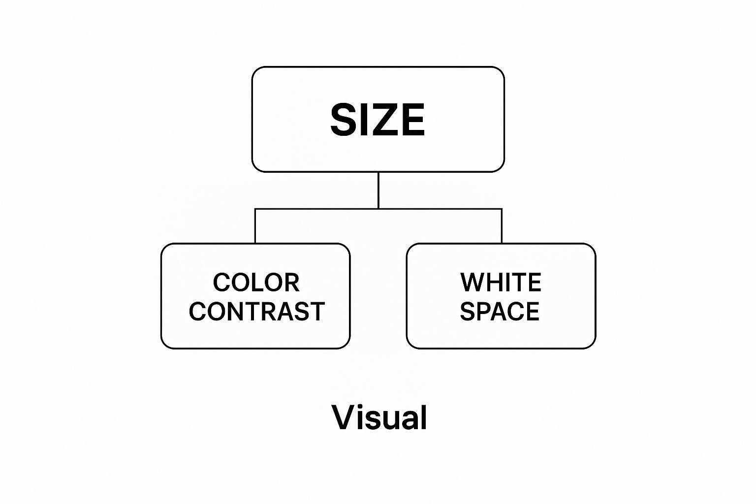
You can see how size grabs the spotlight, color adds emphasis, and whitespace gives everything room to breathe. It’s a simple but powerful combination.
Size and Scale Create Immediate Focus
Want to signal importance? The easiest way is through size. It’s just human nature. Larger elements feel more significant and automatically pull our focus. This is why headlines are always bigger than body text, and why a "Buy Now" button often dwarfs a "Learn More" link. It’s a direct visual cue telling you, “Hey, look at me first!”
This isn't just a hunch; research shows that our eyes are hardwired to notice bigger things first. By playing with scale, you can instantly change an element's position in the visual pecking order. A big, beautiful image will almost always be the first thing someone sees, making it the perfect focal point for a webpage.
Color and Contrast Guide the Eye
Color is a heavy hitter. It can create emphasis, stir up emotions, and guide a user's gaze without them even realizing it. Bright, bold colors pop against muted or neutral backgrounds, which is why they’re perfect for critical elements like call-to-action buttons or urgent alerts.
But color is nothing without contrast. High contrast—like a bright yellow button on a dark gray background—makes an element jump off the page. Low contrast helps it fade into the background. Get this right, and users will never have to hunt for the most important actions on your site.
Typography Establishes Textual Order
Not all text is created equal, and typography hierarchy is how you prove it. It’s all about using different font sizes, weights (like bold or regular), and styles to bring order to your words. A clear typographic scale makes your content scannable and way easier to digest.
A typical text hierarchy looks something like this:
- Primary Headline (H1): The biggest and boldest text, announcing the main topic.
- Subheadings (H2, H3): Smaller than the H1, used to break content into logical chunks.
- Body Text: The main course, set in a comfortable, readable size.
- Captions or Fine Print: The smallest text, reserved for secondary info.
This structure lets readers skim a page and zero in on what matters to them without having to read every single word. To see how typography fits into the bigger picture, check out our guide on the core principles of visual design.
Whitespace Creates Breathing Room
Whitespace—or negative space—is the empty area around elements in your design. Don't mistake it for "blank" space. It’s an active and powerful tool for creating focus and killing clutter. By giving elements some breathing room, you make them stand out and easier to process.
Think of it like a spotlight. The more empty space you put around an object, the more attention it gets. Good use of whitespace improves readability, adds a touch of elegance, and helps guide the eye from one element to the next without any distractions.
Repetition and Pattern Build Consistency
Repetition creates a sense of unity and rhythm in a design. When you use the same colors, fonts, or layout styles for similar elements, you’re teaching the user how your interface works. For example, if all your clickable links are blue and underlined, people will instantly recognize them across your entire site.
This consistency makes navigation feel intuitive. It lowers the user's cognitive load because they don't have to relearn the rules on every new page. They just get it.
Proximity Signals Relationships
The principle of proximity is dead simple: things that are close together are seen as related. When you group a title, an image, and a descriptive paragraph together, you’re sending a clear signal that they all belong to one cohesive unit.
This is a fundamental technique for organizing information. It allows you to create logical groupings that make even complex layouts easy to scan and understand at a glance. Of course, mastering visual hierarchy is just one piece of the puzzle. For a deeper look at how design drives sales, exploring these ecommerce user experience best practices is a fantastic next step.
Comparing Hierarchical Design Patterns
The principles we've covered are the building blocks, but how do they come together in a real layout? Designers often rely on established scanning patterns that predict how a user's eyes will naturally move across a screen. These patterns are a direct result of effective visual hierarchy.
The table below breaks down some of the most common ones.
| Pattern | Best Use Case | Primary User Behavior |
|---|---|---|
| Z-Pattern | Simple, landing page-style layouts with few elements. | Eyes scan from top-left to top-right, then diagonally down to bottom-left, and finally across to the bottom-right. |
| F-Pattern | Content-heavy pages like blog posts or search results. | Users scan horizontally across the top, then move down and scan another shorter horizontal line, and finally scan vertically down the left side. |
| Gutenberg Diagram | Text-heavy, uniform layouts with no strong visual hierarchy. | The eye sweeps from the top-left (Primary Optical Area) to the bottom-right (Terminal Area), largely ignoring the corners in between. |
Choosing the right pattern depends entirely on your content and your goals. By understanding these natural tendencies, you can arrange your elements to meet your users where they’re already looking, making your design feel effortless and intuitive.
Seeing Visual Hierarchy in the Real World
Theory is one thing, but seeing how the principles of visual hierarchy actually play out is where it all starts to click. Let's move from the abstract to the concrete and look at how some of the world's top brands master this art. By breaking down the designs of websites you see every day, we can see exactly how they guide your attention with pinpoint precision.
These companies aren't just throwing elements on a page and hoping for the best. Every choice—from the size of a product photo to the color of a "buy" button—is a deliberate move designed to create a smooth, intuitive experience.
Let's pull back the curtain on a few examples to see how it's done.
The Apple Masterclass in Simplicity
When it comes to using visual hierarchy to create focus and desire, Apple is in a league of its own. Their product pages are clean, almost sparse, and completely dialed in on one thing: making the product the undeniable star. They pull this off with a few simple but powerful techniques.
Just look at Apple's homepage. Your eye immediately lands on the newest product. There's no confusion.

That huge product image, the simple background, and the tiny amount of text create a powerful focal point. It's a masterclass in using size, contrast, and whitespace.
What you're seeing is a perfect execution of a few core principles:
- Size and Scale: The hero product image is massive. It’s the most important thing on the page, and you can't help but look at it first.
- Whitespace: There's a ton of negative space surrounding the product and text. This gets rid of any distractions and gives the main message a premium, important feel.
- Color and Contrast: The dark background makes the product colors and crisp white text pop right off the screen. The high-contrast "Buy" and "Learn more" links are obvious next steps, but they don't compete with the main image.
By cutting away everything that isn't absolutely essential, Apple builds a strong hierarchy that screams value and guides you exactly where they want you to go. It's surgical.
How Airbnb Builds Trust and Clarity
Airbnb has a totally different challenge. They have to throw a ton of information at you—location, price, ratings, photos—but make it feel simple and trustworthy. Their search results page is a brilliant case study in organized hierarchy.
Think about it. The stuff that matters most when you're making a choice gets the most visual weight. The price per night is usually bold and prominent, the photos are large and inviting, and the star rating with its little icon is instantly recognizable. Smaller details, like the host's name or a long list of amenities, are de-emphasized.
Airbnb’s design works because it gets inside the user’s head. It answers your biggest questions first: Where is it? What does it look like? How much? Is it any good? Only then does it offer up the finer details. This makes you feel in control and cuts down on the mental effort.
This approach creates a clear path for your eyes. You can scan dozens of listings in seconds, pulling out the key info you need to compare options without feeling overwhelmed. This kind of systematic organization is crucial for a platform built on trust and quick decisions. In fact, breaking down successes like this is a key part of any good design review process, helping teams learn from what's already working in the wild.
The New York Times and Readability
For a content-heavy site like The New York Times, typographic hierarchy is everything. Their main job is to make a mountain of text feel approachable and easy to scan. They nail this with a consistent and rigid typographic scale.
The main headline for a story is huge, bold, and grabs your attention, setting it at the top of the food chain. Subheadings break the article into manageable chunks, while pull quotes use a different style entirely to highlight juicy takeaways. The body text itself is set in a comfortable, readable font.
This structure lets you choose your own adventure. You can dive in and read every word, or just skim the headlines and pull quotes to get the gist. It’s a perfect example of how visual hierarchy isn't just for selling stuff—it's essential for clearly communicating any kind of information.
Alright, let's move from theory to practice.
Knowing the principles is one thing, but actually putting them to work is what separates a truly great design from a merely good one. Implementing visual hierarchy isn’t about following some rigid, step-by-step formula. It’s about making a series of deliberate choices that guide your user’s eye exactly where you want it to go.
And that whole process starts not in Figma or Sketch, but with a simple question.
Before you touch a single color hex code or font family, you have to define your primary communication goal. What's the number one thing you want someone to do? What's the single most important message you need them to walk away with? That goal becomes your North Star for every design decision that follows.
Establish a Single Focal Point
Every single layout needs a hero. It needs one dominant element that grabs attention the second the page loads. Without that clear focal point, a design just feels chaotic and confusing. You’re essentially making the user do all the hard work of figuring out where to look first, which is a perfect recipe for a high bounce rate.
So, how do you create that focal point? Ask yourself what single element on the page directly serves your main goal.
- Is it a product shot on an e-commerce page? Then make that image big and place it front and center.
- Is it a killer headline on a blog post? Give it some serious size and weight.
- Is it a “Sign Up” button on a landing page? Use a color that pops right off the screen.
By setting one clear anchor, you’re creating the very top level of your hierarchy. You’re giving the entire design a sense of purpose and order. This is the first real step in turning the idea of visual hierarchy into a layout that actually works.
Create Clarity with Color and Typography
With your focal point set, your next job is to build out the supporting cast. This is where your color palette and typographic scale become your best friends for creating order and guiding the user through the secondary and tertiary info.
A classic mistake is throwing too many colors at the design, which just creates visual noise. Instead, stick to a limited, intentional palette. Use your most vibrant or high-contrast color sparingly—but strategically—for the most important interactive elements, like buttons and links. This literally trains the user to recognize what’s clickable.
The same goes for your type. Establish a clear typographic scale with distinct sizes for your H1s, H2s, body text, and captions to make the content instantly scannable.
A well-structured hierarchy makes sure that even the smallest details have their place. As you get the hang of how to implement visual hierarchy, remember it applies to every single element on your site—including things like designing high-converting contact pages that guide users seamlessly to their goal.
Use Grids for Structure and Consistency
Think of a grid system as the invisible skeleton holding your entire design together. It’s the framework that helps you align elements, create consistent spacing, and make sure your layout feels balanced and professional—not just on one page, but across different devices, too.
Using a grid forces you to be intentional about where you place things. It naturally helps you apply the principle of proximity by organizing related items into clean, logical blocks. This underlying structure makes your design feel less random and more intuitive, which goes a long way in building user trust.
When you're ready to dive deeper into these foundational concepts, our guide covering the basic design principles has a ton of great info.
Common Questions About Visual Hierarchy
Even after you get the hang of the core principles, visual hierarchy can still feel a bit tricky. It’s a real blend of art and science, mixing creative intuition with rules that just plain work.
To help clear things up, let's walk through some of the questions that pop up most often for designers and business owners trying to put these ideas into action. Think of it as your go-to reference when you hit a bump in the road.
How Does Visual Hierarchy Differ from Visual Weight?
This is a fantastic question because these two concepts are completely intertwined, but they play different roles. The simplest way to put it is this: visual hierarchy is your overall game plan, and visual weight is the key move you make to win.
Visual hierarchy is the entire system you build. It’s the deliberate arrangement of everything on a page to lead someone’s eye from the most important thing right down to the least. It's the master plan for attention.
Visual weight, on the other hand, is the pull a single element has. It's what makes one thing feel heavier or more important than another. You create this weight using things like size, color, and contrast. A big, bright red button has a ton of visual weight, so it naturally grabs your eye first.
In short, you give different amounts of visual weight to various elements to build an effective visual hierarchy. The element with the most weight sits at the top of the pyramid, and the one with the least sits at the bottom.
Can You Have Too Much Visual Hierarchy in a Design?
One hundred percent, yes. In fact, it’s one of the most common mistakes designers make. When too many elements are screaming for attention at once, you get total visual chaos. Nothing stands out, which defeats the whole purpose of having a hierarchy in the first place.
The goal is clarity, not a shouting match. Imagine a room where everyone is yelling—you wouldn’t be able to understand a single word. Your webpage is no different. If every button is neon, every headline is massive, and every image is animated, the user just gets overwhelmed and confused.
Great design uses emphasis sparingly. A good rule of thumb is to create three clear levels of importance:
- Primary: The one thing that absolutely must be seen (your hero).
- Secondary: Supporting info and the next most important actions.
- Tertiary: The small stuff, like fine print or less-critical links.
A cluttered hierarchy is no hierarchy at all. Simplicity is your secret weapon here.
What Is the First Step to Creating a Good Visual Hierarchy?
The most important step happens way before you even think about opening a design tool. You have to define the goal of your page. This is a strategy decision, not a design one.
Ask yourself one simple, powerful question: "What is the number one thing a user should do or understand here?"
Is the goal to get them to buy a product? Sign up for a newsletter? Read a specific piece of info? That answer becomes the peak of your hierarchy. Every design choice you make after that—from the colors you pick to the fonts you use—should serve that single purpose.
Without a clear goal, your design will feel random and weak. But when you start with a defined objective, you give your design real power and focus. This transforms it from a jumble of elements into a persuasive tool that works. This focus is also crucial for more advanced creative work. To see how hierarchy can build a bigger narrative, you can check out these powerful visual storytelling techniques that guide people through a compelling journey.