
Ever felt like you and your client are speaking two different languages? You say "clean and modern," but they picture something straight out of a sci-fi movie. This is exactly where a mood board comes in.
Think of it as the visual blueprint for your project. It’s a carefully chosen collection of images, colors, textures, and even bits of text that come together to nail down the feeling of a project before a single pixel is pushed or a swatch is ordered. It's all about getting everyone on the same page from the get-go to avoid those costly "this isn't what I had in mind" moments down the line.

What a Mood Board Actually Does
So, what is a mood board in practice? I like to think of it as a creative compass. It doesn't give you a turn-by-turn map to the final design, but it points everyone in the same direction, ensuring every choice you make feels right.
Words are slippery. They can be interpreted in a million different ways. A mood board cuts through the ambiguity with a shared visual language. It’s the difference between describing a website as "bold and energetic" versus showing a collage of vibrant gradients, punchy typography, and dynamic layouts. Suddenly, everyone's on the same wavelength.
This visual alignment is a game-changer. It becomes the north star for the creative team, a communication tool for clients, and a constant source of inspiration.
A solid mood board helps you:
- Establish a clear aesthetic with a curated mix of images, type, and textures.
- Define a specific color palette that actually evokes the right feeling.
- Get buy-in from everyone involved by creating a shared vision from day one.
To put it simply, here’s a quick breakdown of what makes up a mood board and why it matters.
Mood Board at a Glance
| Component | Description |
|---|---|
| Imagery & Photos | Sets the overall tone and style. Think lifestyle shots, product photos, or abstract art. |
| Color Palette | A specific selection of 3-5 core colors that define the project's emotional vibe. |
| Typography | Examples of fonts that communicate the brand's personality—is it classic, modern, or playful? |
| Textures & Patterns | Adds depth and tactile feeling, whether it’s for a digital interface or a physical space. |
| Keywords | A few descriptive words (e.g., "warm," "minimal," "rustic") to anchor the visual direction. |
Ultimately, it all boils down to building a solid foundation.
A mood board’s real job is to make the abstract tangible. It takes fuzzy words like "sophisticated" or "playful" and turns them into a concrete visual strategy that everyone can see and agree on.
When you start with this framework, every decision that follows—from picking a button color to choosing a fabric—becomes easier and more intentional. It's the essential first step for any project where looks really matter.
The Evolution of Creative Vision Boards
To really get what a mood board is, you have to look at where it came from. Long before we had digital tools, these creative blueprints were tangible, physical things. Think of the bustling fashion houses and ad agencies of the mid-20th century, where creative directors needed a way to translate a gut feeling into a shared visual language.
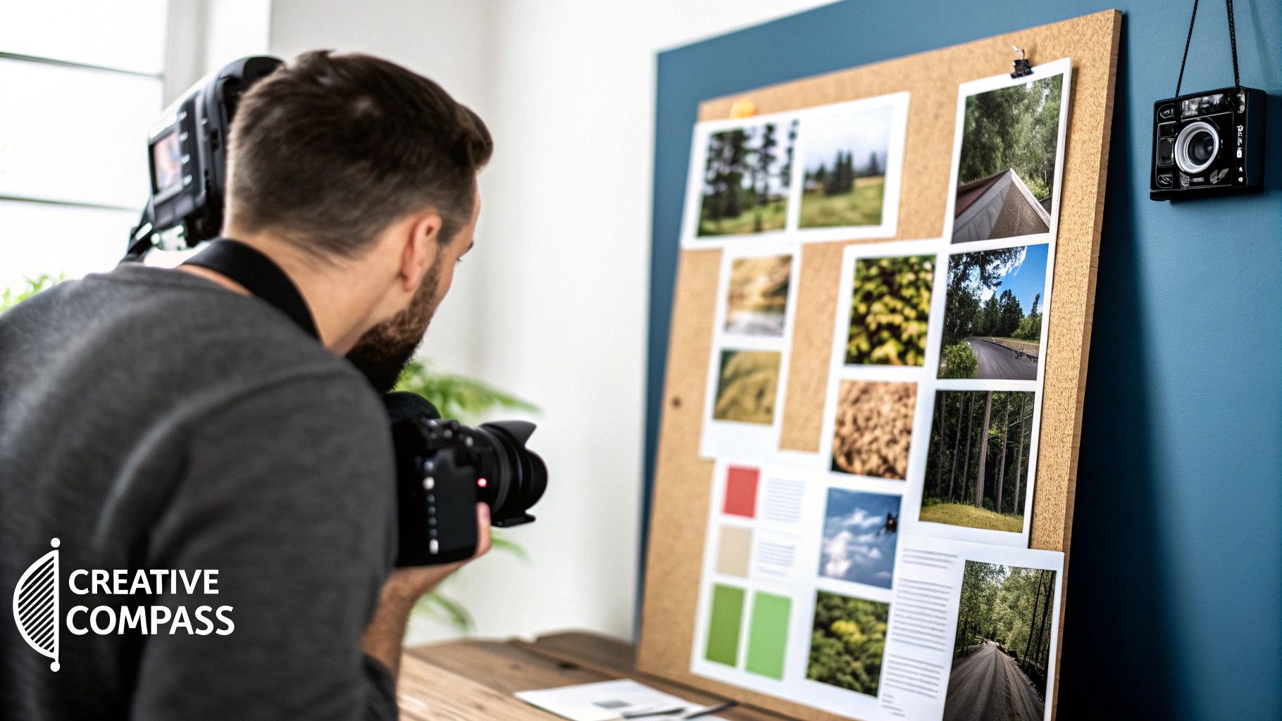
Picture it: huge corkboards plastered with fabric swatches, clippings from magazines, typeface samples, and candid photos. These weren't just random collages. They were meticulously curated tools meant to define the entire aesthetic of a campaign before a single dollar was spent on production.
This hands-on method became absolutely essential. By the early 1990s, an estimated 85% of design professionals were using some form of a physical mood board to guide their projects. It was the only way to make sure the whole team—from the copywriter to the photographer—was on the same page about the desired feel, texture, and tone.
From Physical Walls to Digital Screens
While the tool itself has changed dramatically, its core purpose hasn't budged. The journey from pins on a corkboard to pixels on a screen is really a story about the evolution of creative work itself. Digital platforms now give us dynamic, collaborative spaces where we can build and tweak a vision with a team scattered across the globe, all in real-time.
The tool has evolved from a static, physical object into a living, shareable document. Yet, its fundamental mission—to align vision and emotion—is as crucial as ever.
This shift to digital makes everything more flexible. It’s easier to collaborate, quicker to iterate, and way more efficient. Understanding this history helps clarify why a mood board is still a foundational element in any strong visual branding strategy. Today’s digital versions carry the same spirit as those original creative walls, proving that a solid visual plan never goes out of style.
Why Mood Boards Are a Creative Essential
A mood board is way more than just a collage of pretty pictures. Think of it as the aesthetic blueprint for a project—a bridge that takes you from a fuzzy, abstract idea to a concrete design direction. It doesn't show you the final product, but it absolutely defines the style, materials, and overall feeling that will guide every decision from that point forward.
This is where vague concepts like "warm and inviting" become tangible. Suddenly, that feeling is represented by specific textures, color palettes, and photographic styles that everyone can see and agree on. Building this visual guide upfront saves a ton of time and prevents those painful, costly revisions down the road. It’s the first, most crucial step in getting a team or a client aligned around a single creative vision.
The Three Core Jobs of a Mood Board
At its heart, a mood board really does three critical things to make sure a project starts strong and stays on track. Each one addresses a different part of the creative process, from the initial "what if" stage to the final sign-off.
These three pillars work together to build a rock-solid foundation:
- Exploration: This is the playground. A mood board gives you the freedom to mess around with different visual directions, test out weird color combos, and hone your ideas without any real commitment. It’s a low-risk way to land on the perfect aesthetic.
- Communication: Words can be tricky and subjective, but visuals? They’re pretty universal. A mood board becomes the central source of truth that ensures everyone—designers, clients, stakeholders—is speaking the same language. If you want to dive deeper into why this works, you can learn more about the fundamentals of what is visual communication.
- Validation: Before you sink a bunch of time and money into a project, the mood board validates the chosen path. It helps get that crucial buy-in and confirms the visual tone is hitting the right notes, giving you the green light to move forward with confidence.
A mood board’s main job is to turn subjective feelings into an objective plan. It’s the proof-of-concept that confirms everyone agrees on the destination before the journey even begins.
Honestly, a big reason mood boards are so essential is that they make complex design decisions feel a lot simpler. For instance, figuring out how to choose art for your home is way less intimidating when you have a clear visual plan to follow. This whole approach just creates a solid foundation for creative work, ensuring a smoother process and, ultimately, a much stronger final result.
How Professionals Use Mood Boards
Okay, let's move past the theory. A mood board isn't just a pretty collage; it's a powerhouse tool professionals use to turn abstract feelings into something real and tangible. Think of it as the visual workhorse that gets everyone on the same page about a project's aesthetic before a single dollar is spent.
For an interior designer, it's the critical first step that helps a client actually see the final look of a room. They’ll pull together fabric swatches, paint chips, furniture styles, and lighting examples to build a shared vision. This simple act prevents so many costly "this isn't what I imagined!" moments down the line.
Branding agencies do the same thing to define a company's entire visual identity. They translate core values—like "bold" or "trustworthy"—into a concrete palette of colors, fonts, and imagery. This is often a foundational piece of a solid design brief.
A Tool for Every Creative Field
The applications for mood boards are wildly diverse, which just goes to show how versatile they really are. In the fast-paced world of fashion, they’re absolutely essential for dreaming up new collections and designing store layouts, forming a core part of any good fashion merchandising strategy.
But it doesn't stop there. Here are a few other ways pros put them to work:
- UX/UI Designers: They use them to pin down a digital product's entire vibe—from button styles to color schemes—making sure the user experience feels consistent and intuitive.
- Event Planners: They're setting the theme for a wedding or a big corporate event, making sure everything from the invitations to the floral arrangements feels connected.
- Web Developers: Before a single line of code is written, a mood board helps them get a client's enthusiastic "yes!" on the look and feel of a new website.
A mood board is like a universal translator. It takes the fuzzy, subjective language of creativity and turns it into a clear, objective plan that anyone on the team can understand and execute.
The proof is in the numbers. In graphic design, a whopping 89% of agencies rely on mood boards for concept development, while in interior design, the adoption rate hits 95%. This isn't just about making things look good; it's a smart business move. This one practice has been shown to slash design revisions by 30-40%, saving everyone time and money.
With 84% of UX/UI teams using them and millions of individuals creating personal boards for their own projects, the value is undeniable. For a deeper dive, you can see just how widespread its use is across different fields on Wikipedia.
How to Build an Effective Mood Board
Building a mood board that actually works isn’t about just pinning a bunch of pretty pictures. It's a thoughtful process of curation—you’re creating a visual compass for your entire project.
The first step is always to nail down your core message or goal. What feeling are you trying to bottle up and share? Jot down a few keywords that will act as your guide. Words like "calm," "energetic," or "sophisticated" are perfect starting points.
From Collection to Curation
With your keywords in hand, it’s time to start gathering inspiration. And I mean everything, not just images. Pull in textures, typography samples, and color swatches. This is your chance to really dig into color theory for designers and find a palette that speaks the right language.
Once you have a pile of potential assets, the real work begins: curating. You have to be ruthless here. If something doesn't scream your core keywords, it gets cut. No exceptions.
The final step is the arrangement. A great mood board has balance and what designers call "breathing room." Don't cram everything together. Group related items, leave some empty space, and let your key ideas shine. This is what turns a simple collection into a powerful visual strategy.
Choosing Your Format: Physical vs. Digital
One of the first practical calls you’ll need to make is whether to go old-school with a physical board or keep it all on-screen. Each has its perks, and the best choice really boils down to your project and how you like to work.
Physical boards give you that tactile, hands-on feel, while digital boards offer endless flexibility and make collaboration a breeze.

As you can see, whether it's for interior design, branding, or a new website, the fundamental purpose is the same: get everyone on the same page, visually, from day one.
To help you decide which route is right for you, here’s a quick breakdown.
Physical vs Digital Mood Boards
Trying to pick the best format for your project? This quick comparison should help you make the call.
| Feature | Physical Mood Board | Digital Mood Board |
|---|---|---|
| Tactility | High. You get to feel real textures and see actual materials. Perfect for projects with physical products. | Low. There's no physical interaction, which can be a letdown for some projects. |
| Flexibility | Low. Making changes can be a pain. Ripping and re-gluing isn't exactly efficient. | High. A dream to edit. You can resize, swap, and rearrange elements with just a few clicks. |
| Collaboration | Challenging. Great for in-person meetings, but a nightmare for remote teams. | Excellent. Just share a link. Everyone can jump in with real-time feedback and ideas. |
| Resources | Limited. You're stuck with what you can find in magazines, fabric shops, and printouts. | Unlimited. The entire internet is your oyster. Access endless images, fonts, and inspiration. |
Ultimately, there's no wrong answer. The best tool is the one that helps you communicate your vision most effectively and keeps your project moving forward.
Still Have Questions About Mood Boards?
Even after you get the hang of what a mood board is, a few questions always seem to pop up. Let's clear the air on those, because understanding its role inside and out is what keeps a project from going off the rails.
The biggest mix-up? People often lump mood boards in with other visual planning tools. They might look similar on the surface, but what they're built to do is completely different. Getting this distinction right is everything for effective creative communication.
Mood Board vs. Storyboard
So, what's the difference between a mood board and a storyboard? It all boils down to vibe versus sequence.
A mood board’s whole job is to capture the aesthetic and emotional soul of a project. Think of it as a curated collage of inspiration that answers the question, "What should this feel like?" It’s the visual style guide that everything else is built on.
A storyboard, on the other hand, is all about narrative. It lays out a story or a process step-by-step, focusing on the action and flow—almost like a comic strip for a film or an animation. Its job is to answer, "What happens next?"
In a nutshell: a mood board sets the style, while a storyboard outlines a sequence. One defines the world; the other tells a story that happens within it.
Finding the Right Balance
Another thing people often ask is whether a mood board can be too abstract or too specific. The answer is a hard yes to both. The real magic is in finding that sweet spot right between broad inspiration and clear, actionable direction.
If a board is too abstract, it might look cool but offer zero real guidance, leaving your team scratching their heads. Go too specific, though, and it can look like a finished design, which totally shuts down creative exploration and might even make stakeholders think the work is already done.
An effective mood board should set the creative guardrails while still leaving plenty of room for new ideas to bubble up.
It acts as a visual compass, much like how a solid creative brief template provides written direction without trying to dictate the final pixel. Both tools are there to guide, not to command.
Ready to bring your own creative vision to life? Find the perfect local professional for your next project on Creativize. Explore portfolios and connect with top talent in branding, animation, and more at https://creativize.net.