
Unlocking Design Brilliance: Mastering the Fundamentals
Want to create visually stunning and effective designs? This listicle provides practical examples of the 8 core principles of design: Balance, Contrast, Emphasis, Rhythm and Movement, Unity/Harmony, Hierarchy, Proportion and Scale, and White Space. Understanding these principles of design examples is crucial for strong visual communication, improved user experience, and impactful branding. Whether you're a startup, small business, or freelancer, mastering these fundamentals will elevate your designs from amateur to professional. Let's dive in!
1. Balance
Balance is a fundamental principle of design that significantly impacts how viewers perceive and interact with visual content. It refers to the distribution of visual weight within a composition, creating a sense of stability and structure. By arranging elements so they complement each other, designers can guide the viewer's eye through the information and evoke specific emotional responses. This principle is crucial for creating designs that are both aesthetically pleasing and effective in communicating their intended message, making it a cornerstone for any design project.

Balance manifests in several forms: symmetrical (formal), asymmetrical (informal), radial, and crystallographic. Symmetrical balance, often seen in logos like the Coca-Cola logo, achieves stability through mirrored elements, creating a sense of formality and order. Asymmetrical balance, as used in Apple's product pages, employs different elements with equal visual weight, resulting in a more dynamic and modern feel. Radial balance arranges elements around a central point, like the petals of a flower, creating a sense of movement and focus. Finally, crystallographic balance involves repeating elements in a pattern, offering a sense of rhythm and uniformity often used in textile designs.
The skillful use of balance offers several advantages. It creates order and prevents visual chaos, making content easier to digest. It guides viewers through the content in a structured way, enhancing readability and comprehension. Furthermore, balance evokes specific emotional responses, ranging from stability and tranquility in symmetrical designs to tension and dynamism in asymmetrical ones. However, overusing symmetrical balance can lead to static or boring compositions. Achieving effective asymmetrical balance requires more skill and careful consideration of visual weight (size, color, texture). Balance can also be subjective and culturally influenced, so testing designs across different audiences is crucial. Finally, rigid adherence to balance can sometimes limit creative expression.
Examples of Balance in Design:
- Apple Product Pages: Apple masterfully uses asymmetrical balance to showcase their products. Carefully placed text and images create a dynamic yet balanced layout that highlights product features while maintaining a clean aesthetic.
- Coca-Cola Logo: The iconic Coca-Cola logo is a prime example of symmetrical balance. The mirrored design is instantly recognizable and conveys a sense of timeless classicism.
- The Last Supper (Leonardo da Vinci): This masterpiece of Renaissance art demonstrates balanced composition, with figures arranged symmetrically around Christ, creating a focal point and a sense of harmony.
- BBC Website Layout: The BBC website effectively utilizes balanced content blocks, creating a structured and user-friendly experience. This allows readers to easily navigate and find the information they need.
Tips for Implementing Balance:
- Grid System: Employing a grid system is a valuable tool for establishing balanced layouts. Grids provide a framework for aligning elements and ensuring consistent spacing.
- Visual Weight: Consider the visual weight of elements, including size, color, and texture, not just their physical space within the design. Darker colors and larger elements typically carry more visual weight.
- Cross-Cultural Testing: Test your designs with different audiences to ensure your approach to balance translates effectively across various cultures.
- Creating Focal Points: Ironically, you can use balance to create focal points by intentionally breaking it. A strategically placed element that disrupts the established balance can draw the viewer's eye.
Balance, as popularized by movements like the Swiss Design Movement and Bauhaus, and design luminaries such as Dieter Rams and Paul Rand, is a core principle of design. Its effective application significantly contributes to creating visually appealing and user-friendly designs that effectively communicate their intended message. It's a crucial skill for anyone working in visual communication, from small businesses and startups to marketing agencies and community organizations. By understanding and applying the principles of balance, designers can create compelling and effective visuals that resonate with their target audience.
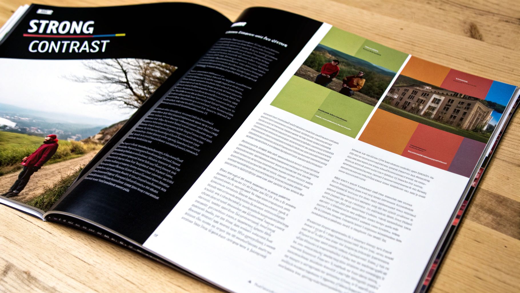
2. Contrast
Contrast, a fundamental principle of design, leverages the juxtaposition of opposing elements like size, color, shape, texture, or typography to create visual interest, emphasis, and hierarchy. It helps differentiate components within a design and directs attention to key areas, making the overall composition more engaging and effective. By strategically implementing contrast, designers can guide the viewer's eye, highlighting crucial information and establishing a clear visual flow. This principle is essential for effective communication and user experience, impacting everything from readability to brand recognition.
Contrast deserves its place in the list of design principles because it is foundational for creating effective and accessible designs. Its features, including the ability to create visual hierarchy and focal points, improve accessibility and readability, and generate visual tension and energy, are crucial for conveying information clearly and capturing audience attention. It can be applied to multiple elements, from color and size to shape, type, direction, and even texture, providing designers with a versatile tool to enhance their work. For example, a website might use contrasting colors for call-to-action buttons, making them stand out against the background and encouraging clicks. Similarly, a poster might use contrasting font sizes to distinguish the headline from the body text, guiding the viewer's eye through the information hierarchically.
Pros of Using Contrast:
- Makes important information stand out: Contrast draws the viewer's eye to key elements, ensuring important messages are not missed.
- Enhances legibility and accessibility: Sufficient contrast between text and background is crucial for readability, especially for users with visual impairments.
- Creates visual interest and prevents monotony: Contrast adds dynamism and prevents designs from appearing flat or boring.
- Helps organize information hierarchically: Using different levels of contrast can establish a clear visual hierarchy, making complex information easier to understand.
Cons of Using Contrast:
- Excessive contrast can be visually jarring or overwhelming: Too much contrast can create a chaotic or unpleasant viewing experience.
- Insufficient contrast may compromise readability: Low contrast, especially in text, can make content difficult or impossible to read.
- Requires careful balance to maintain harmony: Effective contrast requires a thoughtful approach to ensure a balanced and harmonious design.
- Can create confusion if used inconsistently: Inconsistent application of contrast can disrupt visual flow and confuse the viewer.
Examples of Effective Contrast:
- Google's Material Design: Utilizes elevation and shadow to create contrast and depth, giving elements a tangible feel.
- Nike's bold black swoosh against white backgrounds: A classic example of high contrast creating a powerful and instantly recognizable brand identity.
- The New York Times website: Contrasts headline and body text sizes to establish a clear hierarchy and guide readers through the content.
- Spotify's interface: Uses color contrast between interactive and static elements to improve usability and guide user interaction. Learn more about Contrast offers additional insights.
Tips for Implementing Contrast:
- Accessibility: Ensure text has a minimum contrast ratio of 4.5:1 for accessibility, adhering to WCAG guidelines.
- Guidance: Use contrast to guide users to important actions or information, like call-to-action buttons or key data points.
- Testing: Test designs in different lighting conditions to verify contrast effectiveness, ensuring readability across various environments.
- Responsiveness: Consider how contrast works across different device screens and sizes to maintain a consistent experience.
Contrast, popularized by figures like Johannes Itten and Josef Müller-Brockmann, as well as movements like the International Typographic Style and Google's Material Design principles, is a powerful tool for any designer. By understanding and applying the principles of contrast effectively, businesses and organizations can create visually engaging, accessible, and impactful designs that resonate with their target audience.
3. Emphasis (Focal Point)
Emphasis, also known as the focal point, is a crucial principle of design examples that directs the viewer's attention to the most important element within a composition. It creates a visual hierarchy, essentially guiding the eye through the content in order of importance. By establishing a clear entry point and controlling the flow of information, emphasis ensures the intended message is communicated effectively. This is why it deserves its place in any list of essential design principles.
Emphasis works by highlighting key elements and differentiating them from the rest of the design. This can be achieved through various techniques, including:
- Size: Larger elements naturally draw the eye.
- Color: Contrasting or vibrant colors stand out.
- Position: Placement according to the rule of thirds or in isolated areas creates focus.
- Isolation: White space around an element emphasizes its importance.
- Contrast: Differences in color, shape, texture, or size can all create emphasis.
Effective emphasis allows viewers to quickly grasp the main message and navigate the design with ease. For instance, a call-to-action button designed with a contrasting color immediately attracts attention and encourages clicks. This focused approach not only strengthens the communication of key messages but also results in memorable designs that highlight distinctive elements. Think about Apple product pages: they masterfully use size and positioning to emphasize the newest features.
Examples of Successful Implementation:
- Apple product pages: New features are emphasized through strategic size and positioning, making them instantly noticeable.
- Amazon's call-to-action buttons: Bright, contrasting colors draw the eye to "Add to Cart" or "Buy Now" buttons.
- Magazine covers: Large, bold headlines and striking imagery immediately grab attention on newsstands.
- Airbnb's booking button: Prominent placement and a distinctive color make booking a stay effortless.
Pros of Using Emphasis:
- Guides users to the most important information first, improving user experience.
- Creates clear navigation paths, simplifying the user journey.
- Enhances communication of key messages, ensuring effective information delivery.
- Creates memorable designs by highlighting distinctive elements, improving brand recall.
Cons of Using Emphasis:
- Multiple points of emphasis can create confusion and dilute the intended message.
- Too strong emphasis can overshadow other important elements, hindering overall comprehension.
- Cultural differences may affect how emphasis is perceived, requiring careful consideration for diverse audiences.
- Overuse can lead to cluttered designs, negating the positive effects of emphasis.
Actionable Tips for Implementing Emphasis:
- Limit primary points of emphasis: Aim for one primary focal point per composition or section to avoid confusion.
- Rule of thirds: Utilize this classic composition technique to position focal elements effectively.
- Isolation: Create emphasis by surrounding important elements with white space.
- Eye-tracking: Test your designs with eye-tracking software to verify if the emphasis works as intended and adjust accordingly.
When and Why to Use Emphasis:
Emphasis is essential for any design project aiming to communicate a clear message and guide the viewer's attention. It's particularly valuable for:
- Websites: Directing users to key actions like signing up or making a purchase.
- Marketing materials: Highlighting special offers or product benefits.
- Presentations: Focusing attention on key data points or takeaways.
- Logo design: Making the brand recognizable and memorable.
Pioneers like Paul Rand (renowned for his logo design principles), Massimo Vignelli, Jan Tschichold (a key figure in the New Typography movement), and Edward Tufte (a specialist in information design) have popularized and refined the use of emphasis in design. Learn more about Emphasis (Focal Point)
By understanding and applying the principle of emphasis, small and medium businesses, startups, entrepreneurs, creative freelancers, marketing agencies, and local community organizations can all create more effective and engaging designs that achieve their communication goals. This principle of design examples is truly foundational to success.
4. Rhythm and Movement
Rhythm and movement are essential principles of design examples, adding dynamism and direction to visual compositions. This principle guides the viewer's eye through the design in a purposeful way, creating a sense of flow and progression. It leverages patterns, sequences, and directional cues to establish a sense of dynamism, impacting how users engage with and navigate content. Understanding and implementing this principle is crucial for anyone involved in visual communication, from small businesses creating marketing materials to large corporations designing websites.
Rhythm and movement can manifest in various forms, either through regular rhythm (consistent and predictable patterns) or progressive rhythm (gradual changes in elements). This principle essentially creates connections between different elements within a design, establishing a sense of movement, direction, and continuity. Think of it as the visual equivalent of a musical beat – it can be steady and predictable or shift and evolve to create different feelings and guide the listener (or in this case, the viewer).
Successful Implementations of Rhythm and Movement:
- Apple.com's product pages: Apple masterfully utilizes scrolling rhythm. As users scroll, new product features are revealed in a timed sequence, creating a dynamic and engaging experience. This progressive rhythm keeps users interested and guides them through a large amount of information.
- The Guardian newspaper: Their grid system creates a clear reading rhythm, making it easy for readers to navigate articles and sections. This regular rhythm provides predictability and enhances readability.
- Instagram's feed interface: The consistent image rhythm in the feed creates a familiar and seamless browsing experience. This predictability makes the platform intuitive and encourages continuous scrolling.
- FedEx's logo: The subtle arrow formed between the "E" and "x" creates a sense of implied movement and speed, visually communicating the company's core service. This subtle yet effective use of rhythm creates a memorable and meaningful logo.
Tips for Implementing Rhythm and Movement:
- Directional cues: Utilize arrows, lines, or the gazing direction of subjects to guide the viewer's eye.
- Progressive rhythm: Gradually change the size, color, or spacing of elements to create visual interest and a sense of progression.
- Responsiveness: Ensure your chosen rhythm works effectively across different device sizes and orientations.
- Animation and transitions: In digital designs, use animation and transitions to enhance movement and create a more dynamic user experience.
Pros of Using Rhythm and Movement:
- Improved navigation and usability: Intuitive flow created by rhythm simplifies navigation.
- Cohesion: Creates visual connections between different sections or pages.
- Engagement: Visual momentum holds viewer interest.
- Brand recognition: Consistent rhythmic elements can contribute to a stronger brand identity.
Cons of Using Rhythm and Movement:
- Complexity: Overly complex rhythms can be disorienting.
- Unwanted directional pull: Rhythm might inadvertently draw attention away from crucial content.
- Responsive challenges: Maintaining consistent rhythm across various screen sizes requires careful planning.
- Monotony: Unvaried rhythm can become tedious.
This principle deserves its place in the list of principles of design examples because it significantly impacts how users perceive and interact with visual content. By understanding how rhythm and movement work, designers can create more engaging, intuitive, and effective designs. Learn more about Rhythm and Movement to delve deeper into the strategic implementation of this powerful principle. Pioneers like Saul Bass (film title sequences), László Moholy-Nagy (Bauhaus movement), Paula Scher (typography and layout), and Neville Brody (The Face magazine) have showcased the power of rhythm and movement in their respective fields, demonstrating its enduring importance in visual communication.
5. Unity/Harmony
Unity, or harmony, is a crucial principle of design that ensures all elements within a design work together cohesively. It's the glue that binds various components, regardless of their individual characteristics, into a unified whole, supporting the overall message and purpose. Think of it as an orchestra: individual instruments play different notes, but together, they create a harmonious melody. Achieving unity in design creates a sense of completeness and coherence, making designs feel intentional and professional rather than random or disjointed. This is why it deserves its place amongst the core principles of design examples.
Unity is essential for effective communication and a positive user experience. By creating visual relationships between elements, it improves comprehension and reduces cognitive load. It helps present information as a unified system, making even complex information feel ordered and connected. For small and medium businesses, startups, creative freelancers, marketing agencies, and even local community organizations, understanding and applying the principle of unity is key to creating impactful and memorable designs.
Features and Benefits of Unity:
- Creates Coherence: Unity establishes connections between diverse design elements like typography, imagery, color, and whitespace. This coherence guides the viewer's eye through the design and emphasizes the intended message.
- Balance of Variety and Cohesion: Unity doesn't mean everything needs to be identical. It's about striking a balance between variety to maintain interest and cohesion to provide structure and clarity.
- Enhanced Brand Recognition: Consistent visual language across different platforms and materials strengthens brand identity. This consistency, born from unity, helps customers easily recognize and connect with a brand.
- Professional Polish: Unity elevates a design, giving it a polished and professional look. It demonstrates attention to detail and a considered approach, enhancing credibility.
Pros:
- Improved Comprehension: Clear visual relationships between elements facilitate understanding and information processing.
- Stronger Brand Recognition: Consistent visual language across all platforms reinforces brand identity.
- Professional Appearance: Unity gives designs a polished, sophisticated look.
- Reduced Cognitive Load: Information presented as a unified system is easier to digest and understand.
Cons:
- Potential for Monotony: Overusing unity can lead to visually boring and undifferentiated designs.
- Limited Creative Expression: Strict adherence to unity can sometimes restrict creative exploration.
- Challenging for Large Teams: Maintaining consistent unity can be difficult across large teams or complex design systems.
- Balancing Act with Variety: It requires careful balancing with variety to avoid monotony and maintain visual interest.
Examples of Successful Implementation:
- Apple: Apple’s ecosystem showcases remarkable unity across its products, packaging, and user interfaces. This cohesive design language strengthens brand recognition and creates a seamless user experience.
- Airbnb: Airbnb maintains a consistent visual language across its website, app, and marketing materials, providing a unified experience for its users regardless of the platform.
- The New York Times: The New York Times utilizes a unified typography system across its print and digital publications, ensuring a consistent and recognizable brand presence.
- IKEA: IKEA’s catalog demonstrates unified style across thousands of products, making it easy for customers to navigate and visualize how different pieces might work together in their homes.
Actionable Tips for Applying Unity:
- Develop a Consistent Color Palette: Limit the number of colors used and ensure they work harmoniously together.
- Establish a Typography System: Choose a limited set of fonts and define clear rules for their usage (headings, body text, etc.).
- Use Style Guides and Design Systems: These tools help maintain consistency across teams and projects, ensuring unity in larger organizations.
- Repeat Key Visual Elements: Repeating shapes, lines, or patterns throughout a composition can create visual connections and reinforce unity.
- Utilize Grid Structures: Consistent grid structures can unify different sections of a design, creating a sense of order and structure.
Influential Figures in Unified Design:
- Wes Anderson (Filmmaker): Known for his highly stylized and visually unified films.
- Massimo Vignelli (Designer): A proponent of unified design systems, famous for his work on the New York City subway map.
- Dieter Rams (Industrial Designer): Championed coherent product design at Braun, emphasizing simplicity and functionality.
- Stefan Sagmeister (Graphic Designer): Creates visually unified campaign designs with a strong emphasis on typography and imagery.
By understanding and applying the principle of unity, businesses and creatives can create designs that are not only visually appealing but also highly effective in communicating their message and achieving their goals. It’s a fundamental principle that elevates design from a collection of elements to a cohesive and impactful whole.
6. Hierarchy
Hierarchy is a fundamental principle of design that organizes elements based on their importance, effectively guiding users through content in a logical and predictable manner. It establishes clear relationships between different components, creating pathways for efficient information processing. By leveraging visual cues such as size, color, contrast, spacing, and positioning, hierarchy communicates which elements deserve attention first, second, and so on, making even complex information more accessible and navigable. This structured approach allows designers to emphasize key information while ensuring a smooth and intuitive user experience.
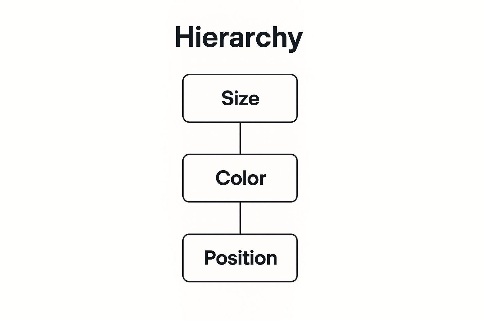
The infographic above visually represents the hierarchical structure of a webpage layout. At the top, we have the most prominent element, the main headline, followed by subheadings that categorize content. Further down the hierarchy, we find body text, images, and finally, less prominent elements like footers and legal information. This hierarchical arrangement guides the user's eye through the page, ensuring they absorb the information in the intended order.
When designing a website or any other digital product, understanding how users interact with it is crucial for a seamless and intuitive user experience. For insightful examples and inspiration on how to structure user interactions, explore these information architecture examples from OneNine, which highlight best practices in information architecture.
Hierarchy deserves its place among the principles of design examples due to its crucial role in effective communication. It streamlines the user's cognitive process, making it easier to understand and retain information.
Features of Effective Hierarchy:
- Organizes content: Structures information by importance and relationship.
- Uses visual cues: Leverages size, color, contrast, spacing, and positioning to indicate significance.
- Creates clear pathways: Guides users through information in a logical sequence.
- Establishes multiple levels of emphasis: Distinguishes between primary, secondary, and tertiary information.
Pros:
- Improves information comprehension and retention
- Reduces cognitive load by organizing complex information
- Enhances usability by making navigation intuitive
- Helps users find specific information quickly
Cons:
- Can be complex to implement effectively across responsive designs
- Poor hierarchy can lead to missed information or confusion
- Requires understanding of user priorities, which may vary by audience
- May require regular testing and refinement
Examples of Successful Hierarchy:
- The New York Times (digital and print): Masterful use of typography and layout to establish clear hierarchy.
- Google's search results page: Clear distinction between search results, ads, and other elements.
- Apple's product pages: Distinct typographic hierarchy highlighting key product features and calls to action.
- Mailchimp's dashboard: Organizes information by importance, making it easy for users to navigate and manage campaigns.
Tips for Implementing Effective Hierarchy:
- Limit hierarchical levels: Stick to 3-5 levels to avoid overwhelming users.
- Squint test: Squint your eyes to see if the hierarchy is clear at a glance.
- F and Z patterns: Consider these common reading patterns when arranging elements.
- User testing: Test hierarchy with different user groups to ensure it caters to varied needs.
Popularized By:
- Josef Müller-Brockmann (grid systems)
- Ladislav Sutnar (information design pioneer)
- Edward Tufte (data visualization hierarchy)
- Material Design system by Google
By understanding and applying the principle of hierarchy, designers can create user-centered experiences that are both visually appealing and easy to navigate, ultimately enhancing communication and user satisfaction. This principle is especially valuable for small businesses, startups, freelancers, agencies, and community organizations seeking to effectively communicate their message and engage their target audience through clear and compelling design. Using hierarchy effectively ensures that your message is understood and your calls to action are noticed.
7. Proportion and Scale: Sizing Up Success in Design
Proportion and scale are fundamental principles of design examples that significantly influence how users perceive and interact with a design. They dictate the relative size relationships between elements within a design and between the design and its surrounding context. Understanding and applying these principles effectively is crucial for creating visually appealing, functional, and user-friendly designs, whether for a logo, a website, a building, or a piece of furniture.
Proportion refers to the size of elements in relation to each other. For instance, the relative size of a heading compared to body text, or the size of a button compared to the surrounding whitespace. Scale, on the other hand, relates the size of elements to a standard unit of measurement, like human dimensions (think ergonomics of a chair) or screen size (responsive web design). Together, these principles create visual hierarchy, establish importance, and ensure designs function effectively in their intended environments.
How Proportion and Scale Work:
These principles leverage the human eye's natural tendency to compare and contrast sizes. By carefully manipulating the size of elements, designers can:
- Create visual hierarchy: Larger elements naturally draw the eye first, establishing a clear focal point and guiding the user through the design.
- Convey importance: Scaling up key elements emphasizes their significance, while smaller elements recede into the background.
- Improve usability: Properly scaled interactive elements, like buttons and menus, are easy to locate and use.
- Enhance visual interest: Varying the scale and proportions of elements creates dynamic compositions and prevents monotony.
- Adapt designs to different contexts: Scaling ensures designs function correctly across various devices, screen sizes, and viewing distances.
Illustrative Examples of Proportion and Scale:
- The Golden Ratio in the Twitter Logo: The Twitter bird logo subtly incorporates the golden ratio (1:1.618), a mathematically derived proportion found throughout nature and art, creating a harmonious and visually appealing design.
- IKEA's Scaled Furniture Displays: IKEA showrooms expertly use scale to showcase furniture in realistic room settings, allowing customers to visualize how pieces would fit in their own homes.
- Apple's Consistent Proportional Relationships: Apple maintains consistent proportional relationships across its device interfaces, creating a familiar and intuitive user experience.
- Architectural Proportions: From the Parthenon to modern Apple stores, architectural design relies heavily on proportion and scale to create aesthetically pleasing and functional spaces.
Actionable Tips for Utilizing Proportion and Scale:
- Embrace Mathematical Relationships: Employing principles like the golden ratio can create inherently balanced and pleasing proportions.
- Consider Context and Device: Design with responsiveness in mind. How will your design scale on different devices and viewing distances?
- User Testing is Key: Test your designs with real users to ensure interactive elements are appropriately scaled and functional.
- Strategic Scaling for Impact: Use scale to draw attention to key elements and create dramatic visual effects.
Pros and Cons of Focusing on Proportion and Scale:
Pros:
- Establishes hierarchy and emphasis naturally
- Creates visual interest and variety
- Improves usability and accessibility
- Adapts designs across different contexts and sizes
Cons:
- Inappropriate scaling can lead to usability issues (e.g., tiny buttons, unreadable text)
- Requires careful consideration across multiple devices and contexts
- Can present accessibility challenges if not implemented thoughtfully
- Maintaining consistent proportions across responsive designs can be complex
Why Proportion and Scale Deserve a Place in the List:
Proportion and scale are essential principles of design examples because they directly impact the user experience. They are not merely aesthetic considerations but fundamental building blocks for creating functional and effective designs. Learn more about Proportion and Scale These principles were popularized by influential figures like Le Corbusier (Modulor proportional system), Leonardo da Vinci (Vitruvian Man proportions), the Bauhaus school, and the Swiss Design Movement, demonstrating their enduring relevance in the design world. By mastering proportion and scale, designers can create visually compelling and user-friendly experiences for their target audience, whether it's a small business crafting a logo, a startup developing a website, or a marketing agency designing a campaign.
8. White Space (Negative Space)
White space, also known as negative space, is a crucial principle of design exemplified by the area between and around design elements. It's not simply empty or unused space; rather, it's an active design element that breathes life into a composition. White space enhances readability, creates visual balance, and directs the viewer's eye to key information. Mastering its use is often the hallmark of professional, sophisticated design, setting it apart from amateur work. Its strategic application contributes significantly to effective communication and overall aesthetic appeal, making it a powerful tool for anyone working with visual content. This is why it deserves a prominent place in any list of design principles.

White space works by providing visual breathing room, reducing cognitive load, and isolating elements to create focus. It establishes relationships between elements based on their proximity, even without explicit lines or connections. Furthermore, the amount of white space used contributes to brand perception. For example, luxury brands often utilize generous negative space to project an image of elegance and sophistication. Think of Apple's minimalist website design or the spacious layout of a high-end fashion magazine. These examples showcase the power of white space in creating a specific brand identity and enhancing the user experience.
Features and Benefits:
- Creates visual breathing room and reduces cognitive load: Less clutter means less strain on the viewer's eyes and mind, making the information easier to process.
- Improves focus on key elements by isolating them: Strategic white space directs attention to the most important parts of the design.
- Establishes relationships between elements through proximity: Elements grouped closer together appear related, even without visible lines connecting them.
- Contributes to brand perception: Ample white space can communicate sophistication and luxury.
Pros and Cons of Utilizing White Space:
Pros:
- Enhances readability and comprehension: Content becomes easier to scan and digest.
- Creates clean, professional, and sophisticated appearance: White space elevates the overall aesthetic quality.
- Improves user experience by reducing visual clutter: A less cluttered design is more user-friendly and inviting.
- Makes content more scannable and digestible: Readers can quickly grasp the key information.
Cons:
- Can reduce information density, requiring more scrolling/pages: Using more white space can lead to longer web pages or documents.
- May be viewed as wasted space by clients or stakeholders: Educating clients about the value of white space can be crucial.
- Requires careful balance to maintain content hierarchy: Overuse can diminish the importance of key elements.
- Can be challenging to maintain across responsive designs: Ensuring consistent white space across different screen sizes requires careful planning.
Examples of Effective White Space Implementation:
- Apple's website and marketing materials: Known for its minimalist design, Apple uses generous white space to highlight its products and create a sense of elegance.
- Google's minimal search interface: The clean, uncluttered search bar allows users to focus on their search query.
- Luxury brand advertisements (Chanel, Rolex): Abundant negative space projects an image of exclusivity and sophistication.
- The FedEx logo: The hidden arrow created by the negative space between the "E" and "x" is a classic example of clever use of this principle.
Tips for Using White Space Effectively:
- Don't think of white space as empty space but as an active design element: It's a tool to guide the viewer's eye and create visual hierarchy.
- Use micro white space (between letters, lines) and macro white space (between major elements): Both are essential for a balanced and readable design.
- Increase white space around important elements to create emphasis: Isolation draws attention.
- Use consistent white space patterns to create rhythm and unity: Consistency improves the overall visual flow and coherence.
White space is a cornerstone of effective visual communication. By understanding its power and implementing it strategically, you can create designs that are not only aesthetically pleasing but also highly effective in communicating your message. You can learn more about White Space (Negative Space) and its application in design. This principle is particularly valuable for small and medium businesses, startups, entrepreneurs, creative freelancers, marketing agencies, and local community organizations looking to create professional, impactful visuals. This design principle is a powerful tool for enhancing readability, focusing attention, and projecting a polished brand image.
Principles of Design: 8 Key Examples Comparison
| Principle | Implementation Complexity 🔄 | Resource Requirements ⚡ | Expected Outcomes 📊 | Ideal Use Cases 💡 | Key Advantages ⭐ |
|---|---|---|---|---|---|
| Balance | Medium – requires skill for asymmetry | Moderate – needs testing and grids | Visual stability and harmony | Structured layouts, guiding viewer flow | Enhances readability and emotional impact |
| Contrast | Medium – careful tuning needed | Low – mainly design choices | Visual interest and hierarchy | Emphasis on key info, accessibility | Improves legibility and attention guidance |
| Emphasis (Focal Point) | Low to Medium – focused use | Low – targeted element styling | Clear visual hierarchy and focus | Highlighting calls to action, key messages | Guides user attention and improves UX |
| Rhythm and Movement | High – must manage flow and patterns | Moderate – planning and animation | Dynamic flow and engagement | Sequential content, storytelling, interfaces | Holds interest and improves navigation |
| Unity/Harmony | Medium – consistency maintenance | Moderate to High – style systems | Cohesive and polished designs | Branding, multi-platform consistency | Creates coherence and reduces cognitive load |
| Hierarchy | Medium to High – multiple levels | Moderate – testing and refinement | Organized information flow | Complex content layouts, dashboards | Enhances comprehension and usability |
| Proportion and Scale | Medium – proportional adjustments | Moderate – testing on devices | Visual impact and usability | Responsive design, physical & digital interfaces | Natural emphasis and improved usability |
| White Space (Negative Space) | Low to Medium – balancing act | Low – design discipline | Clean, readable, and sophisticated | Minimalist layouts, luxury branding | Reduces clutter and enhances focus |
Level Up Your Creative Game: Putting Principles into Practice
From achieving visual balance to harnessing the power of white space, understanding the principles of design examples showcased in this article is paramount for impactful design. We've explored eight key principles – balance, contrast, emphasis, rhythm and movement, unity/harmony, hierarchy, proportion and scale, and white space – each playing a crucial role in elevating your visuals. By mastering these concepts, you can create designs that not only capture attention but also effectively communicate your message, enhancing brand recognition and driving engagement. Whether you're crafting marketing materials, developing a website, or designing a logo, applying these principles of design examples will transform your creative output from ordinary to extraordinary. These foundational elements contribute to a more professional, polished aesthetic that resonates with your target audience, ultimately boosting your brand's image and achieving your business goals.
Strong design isn't just about aesthetics; it's about effective communication. By thoughtfully implementing these principles, you create a visual language that speaks directly to your audience, reinforcing your brand identity and ultimately contributing to your success. Remember, good design is an investment, not an expense.
Ready to take your designs to the next level? Creativize connects you with talented designers who are experts in applying these principles of design examples. Visit Creativize today and unlock the full potential of your creative projects, bringing your vision to life with the help of experienced professionals.