
Ace Your Showcase: Presenting Your Portfolio Like a Pro
Your creative portfolio is more than just a collection of work; it's your story, your brand, and your ticket to exciting opportunities. But how do you present it effectively? This listicle provides crucial portfolio presentation tips to help you shine and make a lasting impression. We'll explore how to structure your content, tell compelling project stories, highlight your process, curate wisely, ensure accessibility, demonstrate impact, optimize performance, and guide users with clear calls-to-action. These insights will help you present your portfolio professionally and effectively.
1. Create a Strong Visual Hierarchy and Flow
One of the most crucial portfolio presentation tips for captivating your audience and effectively showcasing your skills is to establish a strong visual hierarchy and intuitive flow. At its core, visual hierarchy is the art and science of arranging portfolio elements to clearly indicate their order of importance. It's about intentionally guiding the viewer's eye through your content, ensuring they absorb the most critical information first and then progress logically through supporting details. This isn't just about making your portfolio look good; it's about making it work effectively. By strategically using layout, typography, color, and spacing, you create a seamless and intuitive experience that helps your audience understand your design thinking, problem-solving abilities, and overall professional capabilities without confusion or frustration.
How does this work in practice? Imagine your portfolio is a guided tour. Visual hierarchy ensures your viewers don't get lost or sidetracked. Key elements, such as project titles, your most impactful work, or calls to action, should visually dominate lesser elements like captions or supplementary text. This is achieved through several design features working in concert:
- Strategic Use of Typography Sizes and Weights: Larger, bolder fonts naturally draw the eye first. Headings should be more prominent than subheadings, which in turn should stand out more than body text. Varying font weights (e.g., bold, regular, light) within a consistent type family can also create subtle yet effective distinctions.
- Consistent Spacing and Alignment Systems: The use of grids, margins, and padding creates order and predictability. Consistent spacing around elements and blocks of content helps define relationships between them and provides "breathing room," preventing a cluttered look. Alignment (left, right, center) ensures that elements feel intentionally placed and connected.
- Color Coding and Visual Grouping: Color can be a powerful tool for differentiation and association. You might use a specific accent color to highlight key project outcomes or consistently use a particular background color for case study introductions. Grouping related items visually—perhaps by placing them within a shared container or using similar visual treatments—helps viewers process information in chunks.
- Clear Navigation Paths: Whether your portfolio is a website, a PDF, or a physical book, viewers need to know how to move through it. Clear, consistent navigation (e.g., menus, next/previous buttons, a table of contents) is essential for a good flow.
- Logical Content Progression: Your projects and overall portfolio should tell a story. Start with a strong introduction, present your work in a logical sequence (perhaps by skill, by impact, or chronologically), and conclude effectively. Each project should also follow a logical flow, typically from problem statement to process to solution and results.
To better understand how these core elements contribute to a strong visual hierarchy, the following diagram illustrates their relationship:
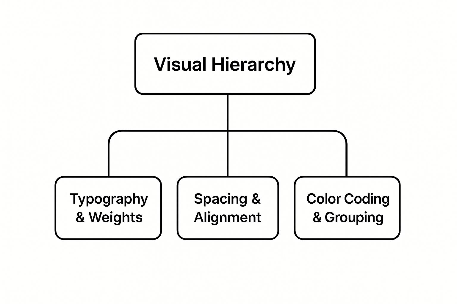
This infographic clearly shows that effective 'Visual Hierarchy' is built upon the strategic implementation of 'Typography & Weights', 'Spacing & Alignment', and 'Color Coding & Grouping', each playing a distinct yet interconnected role in guiding the viewer's eye and structuring information.
The benefits of investing time in a strong visual hierarchy are significant. Firstly, it reduces cognitive load for viewers. When information is well-organized, it’s easier to process and understand, allowing your audience to focus on the quality of your work rather than struggling to decipher your layout. Secondly, it powerfully demonstrates your design thinking skills. A well-structured portfolio is, in itself, a design project that showcases your ability to organize complex information and guide user experience – a valuable skill in any creative or professional field. This leads to improved portfolio memorability; a clear, aesthetically pleasing, and easy-to-navigate portfolio is more likely to leave a lasting positive impression. Finally, it creates an undeniable sense of professional polish, signaling to potential clients, employers, or collaborators that you are detail-oriented and serious about your craft.
However, there are considerations. Crafting a robust visual hierarchy requires careful planning and solid design skills. It’s not something that can be haphazardly thrown together. It can also be time-consuming to perfect, often involving iteration and refinement. Furthermore, to maintain its effectiveness and relevance, your portfolio's hierarchy and flow may need regular updates to reflect your latest work, evolving skills, or current design trends.
We see excellent examples of strong visual hierarchy in action across the digital landscape. Top designers on Dribbble often use strict grid systems and clear typographic hierarchies to make their shots immediately digestible. Behance featured portfolios frequently showcase a consistent visual treatment across diverse projects, creating a cohesive brand identity for the designer. Even large design agency websites, like that of Pentagram, employ sophisticated layout systems that guide users effortlessly through vast amounts of information, always prioritizing clarity and impact. These examples underscore how fundamental these principles are. Learn more about Create a Strong Visual Hierarchy and Flow and other core design principles to further enhance your understanding.
To implement this in your own portfolio, consider these actionable portfolio presentation tips:
- Use the 60-30-10 color rule: For visual balance, allocate 60% to a dominant color, 30% to a secondary color, and 10% to an accent color. This helps create harmony and guide attention without overwhelming the viewer.
- Implement consistent margins and padding throughout: Consistency is key. Define a spacing system (e.g., based on 8px or 10px increments) and stick to it for all elements like text blocks, images, and sections.
- Test your portfolio flow with unfamiliar viewers: Ask friends, colleagues, or mentors who haven't seen your portfolio to navigate it. Observe where they hesitate, get confused, or what they notice first. Their feedback is invaluable for identifying weaknesses in your hierarchy and flow.
- Use white space strategically: Don't be afraid of empty space! White space (or negative space) is crucial for reducing clutter, improving readability, and creating a sense of elegance and focus. It helps to separate and define different sections and elements.
Ultimately, creating a strong visual hierarchy and flow is paramount because it directly impacts how your work is perceived and understood. It’s the bedrock upon which all other portfolio presentation tips build, ensuring your talent and achievements are communicated with clarity, professionalism, and impact. Whether you're a freelancer seeking clients, a startup pitching to investors, or a marketing agency showcasing case studies, a well-structured portfolio is your most powerful ambassador.
2. Tell Compelling Stories Behind Each Project
Moving beyond a simple showcase of final deliverables, one of the most impactful portfolio presentation tips is to transform your portfolio pieces into engaging narratives. Project storytelling is the art of revealing the 'why' and 'how' behind your work, not just the 'what.' It allows potential clients, employers, and collaborators to understand your problem-solving prowess, creative thinking, and professional methodology, making your contributions far more tangible and impressive.
This approach involves framing each project within a compelling story. Instead of a static display, you create a dynamic account that walks the viewer through your journey. Key features of this narrative style include a clear problem statement that sets the stage, detailed context about the project's initial situation, and a step-by-step documentation of your process. You'll highlight the challenges encountered, explain the creative and strategic solutions you developed, and, crucially, measure and present the results and impact of your work. Sprinkling in personal insights and key learnings from each project adds an authentic touch, showing growth and reflective practice.
So, why does this method deserve a prime spot in our list of portfolio presentation tips? Firstly, it powerfully demonstrates your critical thinking and analytical abilities. By articulating the problem and your solution, you're showing you can think deeply and strategically. Secondly, it showcases your communication skills – the ability to convey complex processes and ideas clearly and persuasively is invaluable. Perhaps most importantly, storytelling makes your work significantly more memorable and relatable. People connect with stories, not just images or statistics. A well-told project story can lodge in a viewer's mind far longer than a mere gallery of outputs. This narrative depth effectively differentiates you from competitors who might only offer a superficial look at their finished pieces, giving you a distinct advantage. It builds trust by offering transparency into your working methods.
We see this powerful technique used by industry leaders. For instance, design consultancy IDEO’s case studies are renowned for detailing their human-centered design process, taking you from initial research to final concept. Julie Zhuo, in her influential design leadership blog, often breaks down product thinking through narratives that explain the rationale behind design decisions. Similarly, Airbnb Design’s Medium articles frequently showcase the evolution of their design systems or specific features, telling the story of iteration and improvement. These examples aren't just project showcases; they are masterclasses in explaining the value and thought process behind impactful work. They effectively use storytelling to build authority and share knowledge, a core principle you can adapt for your own portfolio.
Ready to implement this in your own portfolio? Here are some actionable portfolio presentation tips focused on storytelling:
- Embrace the STAR Framework: Structure your project narratives using Situation (the context and problem), Task (your role and objectives), Action (the steps you took, your process), and Result (the outcomes, impact, and learnings). This framework provides a clear and logical flow.
- Show, Don't Just Tell Your Process: Visuals are key. Include sketches, wireframes, mind maps, user flow diagrams, photos of brainstorming sessions, and even iterations that didn't make the final cut. These artifacts offer tangible proof of your thinking process and creative journey.
- Validate with Data and Metrics: Whenever possible, use quantitative or qualitative data to back up your design decisions and demonstrate the impact of your work. Did your redesign increase conversion rates? Did user engagement improve? Did you meet specific client goals? Numbers and testimonials speak volumes.
- Maintain Client Confidentiality: This is crucial. While sharing insights is valuable, always be mindful of proprietary client information. Anonymize sensitive data, focus on your process and learnings rather than confidential specifics, or seek client permission for what you can share. Often, you can tell a compelling story about your problem-solving approach without revealing sensitive details.
- Craft a Clear Narrative Arc: Think of each project story as having a beginning (the problem/challenge), a middle (your process and actions), and an end (the solution and impact). Ensure a logical progression that keeps the reader engaged.
This storytelling approach is beneficial for almost everyone presenting a portfolio, from creative freelancers and marketing agencies to startups and even local community organizations showcasing their projects. It’s particularly vital when you're aiming for roles or projects that demand strong problem-solving, strategic thinking, user-centricity, and collaborative skills. Small and medium businesses (SMBs) can use it to build trust and demonstrate value beyond just a price tag, while entrepreneurs can articulate their vision and process to potential investors or partners.
The 'why' is simple: it elevates your portfolio from a mere collection of work to a powerful testament to your capabilities, thought process, and the tangible impact you deliver. It answers the crucial 'how' and 'why' questions that potential clients or employers have, moving beyond the superficial 'what.' Understanding the power of narrative can transform how your work is perceived; indeed, you can Learn more about Tell Compelling Stories Behind Each Project and its broader applications in convincing an audience.
While incredibly effective, this comprehensive approach does have some considerations. Crafting compelling narratives for each project undoubtedly requires a more significant time investment upfront compared to simply uploading final images. You'll need to gather process artifacts, articulate your thoughts, and structure the story. There's also the potential to inadvertently reveal proprietary client information if you're not careful, so diligence in protecting confidentiality is key. Finally, detailed case studies can make portfolios longer and potentially more complex to navigate. To mitigate this, consider creating in-depth stories for your 3-5 best and most relevant projects, with shorter summaries for others, ensuring your portfolio presentation tips cater to various levels of viewer engagement.
The emphasis on detailing process and rationale in portfolios has been significantly influenced by the rise of design thinking methodology, notably championed by institutions like Stanford d.school. Furthermore, the case study formats adopted by top design consultancies such as IDEO and Frog have set a benchmark for how to articulate design solutions and their impact through compelling narratives, popularizing this in-depth approach across creative and professional fields.
3. Showcase Process and Research Methods
In the competitive landscape of creative and professional services, a portfolio that merely displays polished end-results is no longer enough. One of the most impactful portfolio presentation tips is to Showcase Process and Research Methods. This approach involves peeling back the curtain on your work, revealing the intellectual rigor, strategic thinking, and iterative journey that led to the final deliverables. By demonstrating your methodology and research approach, you prove an ability to think systematically and make informed design decisions, offering a transparency into your working style that helps clients and employers understand your value far beyond the surface aesthetics.
What Does It Mean to Showcase Process and Research?
Showcasing your process and research means you're not just presenting what you created, but how and why you created it. It's about narrating the story behind your work, highlighting the problem-solving stages, the challenges encountered, and the rationale for your decisions. This involves sharing tangible evidence of your working methods, from initial discovery and research through to ideation, prototyping, testing, and iteration. Think of it as a compelling case study for each relevant project, where the journey is as important as the destination. This transparency is key; it transforms your portfolio from a gallery of outcomes into a testament to your problem-solving prowess and strategic thinking.
Why This Tip is Essential for Your Portfolio Presentation
This element deserves its prominent place in any list of portfolio presentation tips because it directly addresses what potential clients or employers are often most curious about: your thinking. While a beautiful design or a successful campaign is impressive, understanding the systematic approach behind it builds a deeper level of trust and confidence. It shows you're not just relying on intuition but on structured methodologies, data, and user understanding. For small and medium businesses, startups, and even marketing agencies, this insight into your reliability and strategic capabilities can be a deciding factor. They want to see evidence that you can tackle complex problems, adapt to feedback, and ultimately deliver solutions that are not just visually appealing but also effective and user-centered.
Key Features of a Process-Oriented Showcase:
To effectively demonstrate your methodology, consider including these elements:
- User Research Documentation: Share snippets of user personas, journey maps, interview summaries, or survey results that informed your project. This proves you design with the end-user in mind.
- Ideation and Brainstorming Evidence: Include photos of whiteboarding sessions, early sketches, mind maps, or digital mood boards. This gives a glimpse into your creative exploration and collaborative efforts.
- Wireframes and Early Concepts: Display low-fidelity and mid-fidelity wireframes or early-stage mockups. Explain the evolution of these concepts and the thinking behind different layouts or functionalities.
- Testing and Validation Processes: Detail how you tested your ideas. This could be usability testing notes, A/B test results, or summaries of feedback sessions and how that feedback was analyzed and incorporated.
- Iteration Cycles and Refinements: Crucially, show how your designs evolved. "Before and after" visuals, annotated to explain the changes based on research, testing, or stakeholder feedback, are incredibly powerful.
The Upside: Benefits of Transparency (Pros)
- Builds Trust Through Transparency: Openly sharing your process fosters a sense of honesty and reliability.
- Shows Systematic Thinking Approach: It demonstrates that you have a structured, logical, and repeatable way of tackling projects.
- Demonstrates Collaboration and Feedback Integration: Highlighting how you worked with teams or incorporated stakeholder/user feedback showcases your adaptability and team skills.
- Proves Ability to Validate Decisions with Data: Showing research and testing results underscores that your decisions are informed and not arbitrary.
Potential Pitfalls to Avoid (Cons)
- Can Clutter Portfolio with Too Much Detail: The key is to be selective. Present summaries and highlights, perhaps with options to "learn more" or dive deeper for those interested.
- May Slow Down Viewing Experience: Ensure process sections are well-organized, visually engaging, and skimmable. Use clear headings and concise text.
- Some Clients May Not Appreciate Process Complexity: Tailor the depth of your process showcase to your audience. For some, a brief overview is sufficient; for others, a detailed account is expected.
Learning from the Best: Examples of Process Showcase
Several leading organizations excel at this:
- Google Design's Material Design Documentation: While a design system, its documentation clearly shows the systematic thinking, principles, and research behind its guidelines.
- Spotify Design: Their blog and case studies often detail their user research methodologies and iterative design processes.
- IBM Design Thinking: IBM publicly shares its Design Thinking framework and case studies, showcasing a detailed and collaborative process.
Actionable Tips for Implementing This in Your Portfolio:
- Tell a Story: For each project, frame your process as a narrative: the initial challenge, the research undertaken, the ideas explored, the solutions developed, and the impact.
- Visualize Your Process: Use flowcharts, diagrams, or timelines to make your methodology clear and easy to understand at a glance.
- Show, Don't Just Tell: Instead of saying "I conducted user research," show a persona or a key insight from an interview.
- Highlight "Before and After": Present initial concepts alongside revised versions, clearly explaining why changes were made based on testing, feedback, or research findings. This is compelling evidence of growth and responsiveness.
- Document Collaborative Efforts: If you worked in a team, show evidence of collaborative workshops, brainstorming sessions (even a photo can work), and how stakeholder feedback was integrated.
- Keep it Concise but Comprehensive: Provide enough detail to demonstrate rigor, but be mindful of your audience's time. Use clear headings, bullet points, and concise text. Link to more detailed documentation if appropriate (e.g., a full PDF case study).
To gain further insights into visually structuring your design story, the following video offers valuable perspectives on visual storytelling, which is key when presenting your process:
When and Why to Emphasize Process
Emphasizing your process is particularly crucial when applying for roles that demand strong UX thinking, research skills, strategic input, or complex problem-solving (e.g., UX Designer, Product Designer, Service Designer, Design Strategist). It's also invaluable for freelancers and agencies pitching to clients who need assurance of a methodical and reliable approach. If you're looking to differentiate yourself beyond pure aesthetics and demonstrate your intellectual contribution to a project, showcasing your process and research is non-negotiable. It validates your design decisions, justifies your strategic choices, and ultimately proves that you are a thoughtful, capable professional who can deliver not just beautiful work, but effective solutions.
By thoughtfully integrating your process and research into your portfolio, you elevate your presentation from a simple showcase to a compelling demonstration of your expertise and value – a truly essential portfolio presentation tip for anyone serious about making an impact.
4. Quality Over Quantity – Curate Selectively
In today's competitive landscape, a vital portfolio presentation tip is embracing the 'Quality Over Quantity' philosophy. This isn't just about displaying your work; it’s about strategic storytelling. To curate selectively means to meticulously choose a concise collection of your highest-quality projects that best articulate your core skills, your unique value proposition, and—most importantly—the needs of your target audience. Instead of overwhelming viewers with an exhaustive catalog of everything you've ever done, this focused approach aims to create a potent, memorable impact with a few stellar examples. It’s a testament not only to your confidence in your best work but also to your respect for the viewer's valuable time.
Why This Approach Matters: The Power of Focus
The impact of a well-curated portfolio cannot be overstated. By prioritizing quality, you immediately craft stronger, more positive first impressions. Viewers, whether potential employers, clients, or collaborators, are often time-constrained. A concise, high-impact selection respects their time and reduces decision fatigue, allowing them to engage more deeply with each piece you present. This deeper dive enables you to thoroughly showcase your process, the challenges you overcame, and the tangible results you achieved for each selected project.
Furthermore, this selectivity isn't perceived as a limitation. Instead, it's seen as a hallmark of strong editorial judgment, strategic thinking, and high professional standards—qualities highly prized in any field. It signals your ability to discern what’s truly excellent and, critically, what is most relevant to the opportunity at hand.
How It Works: Key Features of Strategic Curation
Implementing a 'Quality Over Quantity' strategy in your portfolio involves several key features:
- Rigorous Project Selection Criteria: This is the cornerstone. Before anything else, establish clear criteria for what makes a project "portfolio-worthy." Does it powerfully showcase a critical skill you want to highlight? Did it achieve impressive, measurable results? Is it work you're genuinely proud of and can speak passionately and knowledgably about?
- Diverse Skill Demonstration Across Fewer Pieces: The goal isn't to show one skill perfectly replicated across multiple projects, but to demonstrate a range of your most valuable competencies through your chosen examples. Each piece should narrate a slightly different story about your capabilities, problem-solving approaches, or creative flair.
- High Production Value in Presentation: Each selected project must be presented impeccably. This means high-resolution images, clear and concise well-written case studies or descriptions, and a clean, professional overall layout. This 'quality over quantity' mantra extends beyond just the work you show; it also applies to how you present it. For physical portfolios or leave-behinds, investing in professional presentation materials ensures that your curated selection is showcased with the polish and impact it deserves, reinforcing the high standard of your work.
- Relevance to Target Opportunities: Your "best" work might shift slightly depending on who you're presenting to. Always aim to tailor your curated selection to align with the specific needs, industry, or aesthetic preferences of your intended audience.
- Regular Portfolio Auditing and Updating: Your portfolio is a living document, not a static archive. Periodically review your curated selection, ruthlessly removing outdated work and strategically adding new, stronger pieces to ensure it always represents your current best and future aspirations.
Learning from the Masters: Examples of Successful Implementation
This principle of "less is more" isn't new; it's been proven effective by some of the most successful brands and influential thinkers. Consider Apple's product portfolio strategy, particularly under Steve Jobs. They consistently focus on a limited number of products, each engineered and marketed to be exceptional, rather than flooding the market with countless variations. This approach builds an undeniable reputation for excellence and innovation.
Similarly, the renowned designer Dieter Rams championed the philosophy of 'Weniger, aber besser' – 'Less, but better.' His minimalist and highly functional designs for Braun are iconic examples of focusing on essential quality and user benefit over sheer volume or superfluous features. In the agency world, top design and marketing firms often showcase only 6-8 in-depth case studies on their websites, rather than a sprawling list of 20+ minor projects. This allows them to comprehensively detail their strategic thinking and significant achievements more effectively, offering powerful portfolio presentation tips by example.
Actionable Tips for Curating Your Portfolio
So, how can you effectively apply this 'Quality Over Quantity' principle to your own portfolio?
- Aim for 5-8 Strong Projects: While there's no magic number, this range (typically 5-8, sometimes up to 10-12 for broader roles) is often a good target for a primary portfolio. It’s generally enough to showcase breadth and depth without being overwhelming.
- Choose Projects That Tell Different Stories: Select pieces that highlight diverse skills, problem-solving approaches, or successful outcomes. For instance, one project might showcase your technical prowess, another your strategic thinking, a third your creative innovation, and a fourth your collaborative abilities.
- Prioritize Impact and Relevance: For each potential project, ask critical questions: Does this piece strongly demonstrate a key skill I want to highlight for this opportunity? Is it directly relevant to the kind of work or clients I'm seeking? Did it achieve measurable results or significant impact?
- Remove Outdated or Weaker Work Regularly: Be honest and objective. If a project no longer represents your best work, current skill level, or if it simply looks dated, it's time to retire it from your primary, curated portfolio. This is a critical step in maintaining a high-quality, impressive presentation.
- Get External Feedback on Project Selection: It can be incredibly difficult to be objective about your own work. Ask trusted peers, mentors, or even individuals who represent your target audience for their honest opinion on which projects resonate most strongly and why. Their insights can be invaluable.
- Craft Compelling Narratives: For each chosen project, develop a concise yet compelling story. Briefly explain the client/brief, your specific role and process, the key challenges you faced, and, most importantly, the solutions and results. Let the quality of your thinking and execution shine through.
Acknowledging the Considerations (Cons)
While highly effective, this curated approach does come with certain considerations:
- May Not Show Full Range of Capabilities: By selecting only a few projects, you might not showcase every single skill or type of work you've ever done. To mitigate this, you can have a secondary, more comprehensive online portfolio (perhaps linked as "archived work" or "more projects") or simply mention that further examples tailored to specific needs are available upon request.
- Requires Difficult Decisions About What to Exclude: Deciding what to cut can be challenging, especially if you're proud of many projects or have a vast body of work. However, making these tough choices is a sign of professional maturity, confidence, and strategic thinking.
- Can Feel Limiting for Prolific Creators: If you produce a large volume of work, selecting only a few pieces might initially feel restrictive. Reframe this: you're not limiting your work; you're focusing its impact and demonstrating your crucial ability to identify and present your most potent contributions.
When and Why to Use This Approach
The 'Quality Over Quantity' strategy is almost universally applicable and beneficial when presenting your professional portfolio. It's especially crucial in high-stakes situations: when applying for specific, competitive roles where your submission will be one of many; when pitching to high-value clients who expect nothing but excellence; or during networking events where you have a very limited time to make a significant impression.
Why? Because in a world saturated with information and stimuli, clarity, focus, and demonstrable impact are what cut through the noise. A carefully curated portfolio demonstrates that you understand strategy, value quality, and respect your audience's intelligence and time. It’s not just about showing everything you can do; it’s about powerfully showcasing what you can do best and what is most relevant to their needs. Adopting and mastering this approach is one of the most fundamental and impactful portfolio presentation tips for anyone looking to make a lasting, positive professional mark.
5. Make It Mobile-Responsive and Accessible
In today's digitally driven world, your online portfolio is often the first impression you make on potential clients, employers, or collaborators. To ensure this impression is a strong and positive one, it's paramount that your portfolio is both mobile-responsive and accessible. This approach isn't just a "nice-to-have"; it's a fundamental aspect of modern web design and a critical component of effective portfolio presentation tips. It signals professionalism, technical acumen, and an inclusive mindset.
So, what exactly do "mobile-responsive" and "accessible" mean in the context of your portfolio? Mobile-responsive design ensures that your portfolio's layout, images, and text automatically adjust to fit the screen size of any device a viewer might be using – from a large desktop monitor to a tablet or a smartphone. This is typically achieved through techniques like fluid grid systems, where page elements are sized in relative units like percentages rather than fixed units like pixels, and flexible layouts that can reflow content gracefully. The goal is to provide an optimal viewing and interaction experience, preventing users from needing to pinch, zoom, or scroll horizontally to see your work.
Accessibility (often abbreviated as A11y), on the other hand, focuses on designing and developing your portfolio so that it can be used by everyone, including people with disabilities. This encompasses a wide range of considerations, such as ensuring your site is navigable using only a keyboard (for users who cannot use a mouse), providing text alternatives (alt text) for images (for visually impaired users relying on screen readers), ensuring sufficient color contrast between text and background (for users with low vision or color blindness), and supporting assistive technologies.
These two concepts are deeply intertwined and crucial for a successful portfolio. Why is this so important? Imagine a busy hiring manager quickly reviewing your portfolio on their phone during their commute, or a potential client with a visual impairment trying to understand the scope and quality of your work. If your site is frustrating to navigate on a mobile device or unreadable by a screen reader, you've immediately created a barrier and potentially lost a valuable opportunity. This is why making your portfolio mobile-responsive and accessible is one of the most impactful portfolio presentation tips you can implement; it demonstrates foresight, empathy, and technical skill.
Key Features to Implement:
Successfully implementing mobile responsiveness and accessibility involves several specific features:
- Fluid grid systems and flexible layouts: These are the backbone of responsive design. Instead of fixed-width elements, your layout uses percentages or other relative units, allowing content blocks, images, and text to resize and reflow seamlessly across different screen dimensions.
- Touch-friendly navigation and interaction: For mobile and tablet users, interactive elements like buttons, links, and menu items must be large enough to be tapped accurately with a finger. Hover-dependent interactions common on desktops (e.g., dropdown menus appearing on hover) need touch-friendly alternatives, like appearing on tap.
- Fast loading times across devices: Mobile users often have less stable or slower internet connections. Optimizing images (compressing them without losing too much quality), minifying CSS and JavaScript files, and leveraging browser caching are essential for ensuring your portfolio loads quickly, keeping users engaged.
- Screen reader compatibility: This is achieved through semantic HTML (using heading tags like
<h1>,<p>,<ul>correctly), ARIA (Accessible Rich Internet Applications) attributes where necessary, and, crucially, providing descriptive alt text for all informative images. This allows screen reader software to interpret and convey the page content and structure logically. - Keyboard navigation support: All interactive elements must be reachable and operable using only the keyboard (primarily the Tab, Shift+Tab, Enter, and Spacebar keys). A visible focus indicator (an outline around the currently selected element) is also essential to show keyboard users where they are on the page.
The Undeniable Pros:
Adopting a mobile-responsive and accessible approach offers significant advantages for your portfolio:
- Reaches a broader audience across devices: With a vast number of internet users browsing primarily on mobile devices, a responsive design ensures your portfolio is viewable and usable by everyone, regardless of how they access it.
- Shows technical and inclusive design skills: This is a direct demonstration of your understanding of modern web standards and user-centered design. For creative freelancers, agencies, or anyone in the tech or design field, this is a powerful showcase of relevant expertise.
- Improves SEO and discoverability: Google and other search engines prioritize mobile-friendly websites in their search rankings. Accessibility features like alt text and proper heading structures also contribute positively to SEO, making your portfolio easier to find.
- Future-proofs portfolio investment: Designing with flexibility and accessibility standards in mind means your portfolio is more likely to remain compatible with new devices, browsers, and assistive technologies as they emerge, reducing the need for frequent overhauls.
Potential Cons to Consider:
While the benefits are substantial, it's important to acknowledge some potential challenges:
- Requires additional development time and skills: Implementing robust responsiveness and thorough accessibility can be more time-consuming than creating a simple, static site. It may necessitate learning advanced CSS, JavaScript, or specific accessibility testing techniques.
- May limit certain creative layout options: Highly complex or unconventional visual designs can sometimes be more challenging to translate into fully responsive and accessible experiences without some compromises. Careful planning is needed to balance creative vision with usability.
- Needs ongoing testing and maintenance: Web standards, browser capabilities, and accessibility guidelines evolve. Regular testing across different devices and with assistive technologies, along with periodic updates, is necessary to maintain a high-quality experience.
Examples of Excellence:
For inspiration on how to effectively implement these principles, look towards government design systems like the UK's GOV.UK, which are renowned for prioritizing accessibility and clarity. Major tech companies’ career sites almost universally offer flawless mobile experiences, understanding that prospective candidates will often browse on the go. Furthermore, award-winning portfolios featured on platforms like Awwwards frequently showcase exceptional responsive design, proving that creativity and technical excellence can go hand-in-hand. If you're looking for more ideas on how to build creative yet functional sites, you can Learn more about Make It Mobile-Responsive and Accessible and see various examples.
Actionable Tips for Your Portfolio:
Ready to implement these crucial portfolio presentation tips? Here’s how to get started or improve your current site:
- Test on actual devices, not just browser simulation: While browser developer tools offer convenient simulators, they don't always replicate real-world device behavior perfectly. Test on a variety of actual smartphones and tablets (both iOS and Android) to catch touch-specific usability issues or performance bottlenecks.
- Use descriptive alt text for all informative images: Every image that conveys meaning or content needs alt text that accurately describes it for users who cannot see it. For purely decorative images that add no informational value, use an empty alt attribute (
alt=""). - Ensure color contrast meets WCAG guidelines: The Web Content Accessibility Guidelines (WCAG) specify minimum contrast ratios for text against its background to ensure legibility for users with low vision or color deficiencies. Use online contrast checker tools to verify your color choices (aim for at least WCAG AA compliance).
- Implement progressive enhancement principles: Design your portfolio with a core, accessible experience that works for everyone. Then, layer on more advanced visual features or interactions for browsers and devices that can support them. This ensures a functional baseline for all users.
- Prioritize clear and intuitive navigation: Your site's menu and navigation links should be easy to find, understand, and operate on all screen sizes. For mobile views, patterns like the "hamburger" menu are common, but ensure it's clearly labeled and its functionality is obvious.
By dedicating the effort to make your portfolio mobile-responsive and accessible, you are significantly enhancing its effectiveness. You broaden its reach, demonstrate a commitment to professionalism and inclusivity, and ultimately create a more compelling showcase for your work – all essential elements for a successful portfolio presentation.
6. Include Measurable Results and Impact
In today's competitive landscape, a visually stunning portfolio is often just the starting point. One of the most potent portfolio presentation tips to truly elevate your work and capture the attention of discerning employers and clients is to showcase measurable results and the tangible impact of your creative endeavors. This approach transforms your projects from mere aesthetic displays into compelling case studies of strategic business solutions. By quantifying the outcomes, you demonstrate not only your creative prowess but also your understanding of business objectives and your ability to contribute to an organization's bottom line.
What is Quantifying Impact and How Does It Work?
Quantifying impact means going beyond showcasing the "what" (the design, the campaign, the content) and focusing on the "so what?" – the effect your work had. It’s about translating your creative skills into a language that resonates with decision-makers: the language of data, growth, and return on investment (ROI). This involves identifying key performance indicators (KPIs) relevant to each project and then tracking and presenting how your contributions influenced these metrics.
This powerful technique works by providing concrete evidence of your value. Instead of simply stating a design was "successful," you can prove it with numbers. For instance:
- Before and After Metrics Comparison: Showcasing data points before your intervention and after demonstrates a clear cause-and-effect relationship. This could be website traffic, sales figures, or lead generation numbers.
- User Engagement and Satisfaction Data: Metrics like increased time on page, reduced bounce rates, higher click-through rates, improved Net Promoter Scores (NPS), or positive user reviews directly reflect the effectiveness of user-centered design or compelling content.
- Business KPI Improvements: Directly link your work to overarching business goals. Did your marketing campaign reduce customer acquisition cost? Did your UI redesign lead to more completed profiles?
- A/B Testing Results: Presenting A/B test results highlights a data-driven approach to design and optimization, showing that your decisions are based on evidence, not just intuition.
- Conversion Rate Optimizations: Illustrate how your work led to more desired actions, such as sign-ups, purchases, downloads, or form submissions.
Why This Approach Deserves a Prime Spot in Your Portfolio Strategy
Including measurable results is a game-changer for several reasons, making it one of the most critical portfolio presentation tips for anyone serious about their career:
- Demonstrates Business Acumen: It shows you understand that creative work serves a larger business purpose and that you think strategically about how your skills can achieve client or employer objectives. This is invaluable for small and medium businesses (SMBs) and startups looking for contributors who can wear multiple hats.
- Provides a Concrete Value Proposition: Numbers speak louder than adjectives. "Increased conversion rates by 15%" is far more compelling than "created an engaging user experience." It provides a clear, undeniable statement of the value you bring.
- Appeals to Stakeholders Focused on ROI: Clients, employers, and investors are often most interested in the return on their investment. Quantifiable results directly address this concern, making it easier for them to justify hiring or partnering with you.
- Differentiates You from Purely Aesthetic Portfolios: Many creatives can produce beautiful work. Far fewer can clearly articulate and prove the impact of that work. This differentiation is crucial, especially for creative freelancers and marketing agencies aiming to win competitive bids.
Examples of Successful Implementation:
- Imagine a Shopify UX team presenting a portfolio piece. Instead of just showing new screen designs, they might highlight: "Redesigned the checkout process, resulting in a 12% decrease in cart abandonment and a 7% increase in completed purchases within three months."
- Netflix's design blog often shares insights into their A/B testing. A designer could emulate this by saying, "Conducted A/B tests on call-to-action button placement, with Variant B (top-right placement) leading to a 20% uplift in clicks compared to Variant A."
- Mailchimp’s public discussion of its design system emphasizes efficiency. A designer who contributed to or utilized a design system could state, "Contributed to the development of a new design system that reduced design and development time for new features by 25%, leading to faster go-to-market strategies."
Actionable Tips for Showcasing Your Impact:
Effectively presenting measurable results is key. Here are some actionable portfolio presentation tips for incorporating this into your own work:
- Start Tracking Early: Even for personal projects, define what success looks like and try to measure it. For client work, discuss KPIs at the project's outset.
- Use Percentage Improvements (with context): Instead of saying "increased sales by $500" (which might be sensitive or misrepresent scale), say "increased sales by 15%." If possible, provide context, like "for a new product line" or "during a Q3 campaign."
- Pair Quantitative with Qualitative: Numbers are powerful, but stories connect. Include user feedback quotes, testimonials, or short anecdotes alongside your metrics to add a human element. "User X said, 'The new interface is so much easier to navigate!'" adds weight to a 30% improvement in task completion time.
- Show Long-Term Impact When Possible: If you can demonstrate that your work had a sustained positive effect over several months or years, it’s even more impressive.
- Connect Design Decisions Directly to Business Outcomes: Clearly articulate how your specific design choices, content strategy, or campaign execution led to the reported results. For example: "By simplifying the navigation and improving visual hierarchy (design decisions), we saw a 25% reduction in bounce rate (business outcome)."
- For Early Career Professionals or Projects Without Clear Metrics: If you lack hard numbers, focus on:
- Process improvements: "Streamlined the content creation workflow, reducing revision rounds by an average of two per project."
- User research insights: "Conducted user interviews that identified three critical pain points, leading to a revised product roadmap."
- Clearly defined problem-solving: Detail the problem, your approach, and the solution, even if the final impact wasn't tracked quantitatively by the client.
- Hypothetical impact (use with caution): Based on industry benchmarks, you could suggest potential impact, clearly stating it's an estimate.
Addressing Potential Challenges (Cons):
- Not all creative work has easily measurable direct outcomes: For branding projects or purely artistic endeavors, focus on qualitative feedback, awards, client satisfaction, or the problem your work solved.
- May require client permission to share sensitive data: Always seek permission before sharing specific numbers. If declined, use anonymized data, percentage changes, or focus on the process and qualitative results.
- Can be challenging for early career professionals: It takes time to build a portfolio with significant measurable results. Focus on smaller wins, personal projects, and articulate your understanding of how design can drive results, even if you don't have large-scale examples yet.
By diligently working to include measurable results and impact in your portfolio, you're not just showcasing your skills; you're proving your strategic value. This is a powerful differentiator that resonates strongly with SMBs, startups, entrepreneurs, marketing agencies, and even local community organizations looking for creative partners who deliver tangible outcomes. For those looking to dive deeper into tracking the right numbers for their projects, you can Learn more about Include Measurable Results and Impact to effectively measure your campaign performance and showcase your contributions.
7. Optimize for Fast Loading and Performance
In the digital realm, first impressions are fleeting, often decided in mere seconds. When it comes to your online portfolio, one of the most critical yet often underestimated portfolio presentation tips is to ensure your site loads like lightning. Optimizing for fast loading and performance isn't just a technical checkbox; it's a fundamental aspect of user experience that directly impacts how potential clients, employers, or collaborators perceive your professionalism and your work. Slow-loading portfolios frustrate visitors, leading to high bounce rates – meaning they leave before even seeing your carefully curated projects. Conversely, a snappy, responsive portfolio respects their time, creates an immediate positive impression, and subtly demonstrates your understanding of modern web standards.
What is Portfolio Performance Optimization and How Does It Work?
Portfolio performance optimization is the practice of fine-tuning every element of your online portfolio to ensure it loads and responds as quickly as possible for all users, regardless of their device or internet connection speed. It involves a multifaceted approach targeting various aspects of your website's construction and delivery. The core idea is to reduce the amount of data that needs to be transferred and to ensure the browser can render the visible content swiftly.
This works through several key features:
- Optimized Image Compression and Formats: Images are often the heaviest assets on a portfolio. Optimization involves compressing images to reduce file size without significant loss of visual quality. This also includes using modern, efficient image formats like WebP, which offers superior compression and quality characteristics compared to older formats like JPEG and PNG, where browser support allows.
- Efficient Code Structure and Minification: Clean, well-structured HTML, CSS, and JavaScript code is easier for browsers to parse and render. Minification takes this a step further by removing unnecessary characters (like spaces, comments, and line breaks) from code files, making them smaller and faster to download.
- Content Delivery Network (CDN) Implementation: A CDN distributes copies of your website's static assets (images, CSS, JavaScript) across multiple servers geographically closer to your users. When a visitor accesses your portfolio, content is served from the nearest server, significantly reducing latency and speeding up load times.
- Progressive Image Loading & Lazy Loading: Instead of waiting for an entire high-resolution image to load, progressive loading displays a lower-quality version quickly, which then sharpens as more data arrives. Lazy loading is a technique where images and other non-critical content "below the fold" (not visible until the user scrolls) are only loaded when they are about to enter the viewport. This prioritizes the initial, visible content for a faster perceived load time.
- Minimal External Dependencies: While third-party scripts for analytics, fonts, or social media widgets can add functionality, each one adds an external request that can slow down your site. Performance optimization involves carefully evaluating these dependencies and minimizing them or loading them asynchronously so they don't block the rendering of primary content.
Why This Deserves Its Place: The Undeniable Benefits
Prioritizing speed is a non-negotiable aspect of effective portfolio presentation tips for several compelling reasons:
- Reduces Bounce Rates Significantly: Studies consistently show that users abandon slow-loading websites. Kissmetrics found that 40% of people abandon a website that takes more than 3 seconds to load. A fast portfolio keeps users engaged.
- Improves Search Engine Rankings: Search engines like Google use page speed as a ranking factor, particularly with Core Web Vitals. A faster portfolio can lead to better visibility in search results, bringing more organic traffic to your work.
- Shows Technical Competency: For web designers, developers, and even UX/UI professionals, a fast-loading portfolio is a direct demonstration of your skills and attention to detail. For other creatives, it signals professionalism and a respect for the viewer's experience.
- Creates a Better User Experience (UX): Ultimately, performance is about UX. A site that loads quickly and responds smoothly feels more polished, reliable, and enjoyable to use, fostering a positive perception of you and your work.
Examples of Successful Implementation:
- Google's Web Performance Best Practices: Google itself champions web performance, offering tools like PageSpeed Insights and extensive documentation on best practices. Their emphasis on Core Web Vitals has pushed the entire web towards better performance.
- Award-Winning Portfolios Maintaining Sub-3-Second Load Times: Many Awwwards or FWA-recognized portfolios, despite often featuring rich visuals and interactions, manage to achieve impressive load times. This demonstrates that aesthetic quality and performance can coexist.
- Design Agencies Like Huge Inc.: Prominent design agencies often showcase their commitment to performance on their own websites, understanding that it reflects their capabilities and client-centric approach. They prioritize performance alongside cutting-edge aesthetics.
Potential Considerations (Cons):
While the upsides are massive, there are some considerations:
- May Require Sacrificing Some Visual Richness: Extremely large, unoptimized high-resolution images or complex video backgrounds might need to be rethought or heavily optimized, potentially leading to slight compromises in visual impact if not handled carefully.
- Needs Ongoing Monitoring and Optimization: Performance isn't a "set it and forget it" task. New content, plugin updates, or changes in web standards can affect speed, requiring periodic checks and adjustments.
- Can Limit Creative Interactive Features: Very heavy JavaScript-based interactions or numerous third-party integrations can impact performance. A balance must be struck between creative expression and loading speed.
Actionable Tips for Readers:
- Embrace Modern Image Formats: Use WebP for images where supported, providing fallbacks to JPEG or PNG for older browsers. Tools like Squoosh can help you compress and convert images effectively.
- Implement Lazy Loading: For content below the fold, especially images and videos, use native HTML
loading="lazy"attribute or JavaScript libraries to defer loading until needed. - Test Relentlessly: Use tools like Google PageSpeed Insights, GTmetrix, or WebPageTest to analyze your portfolio's speed. Crucially, test loading times on simulated slow connections (many browser developer tools offer this feature) to understand the experience for users with less-than-ideal internet.
- Prioritize Critical Above-Fold Content: Ensure that the content visible without scrolling loads first and as quickly as possible. This might involve inlining critical CSS and deferring non-essential JavaScript.
- Choose Your Hosting Wisely: A good web host with server locations near your target audience can significantly impact speed. Consider managed WordPress hosting or VPS if your needs are greater.
- Minify Your Code: Use tools or plugins to automatically minify HTML, CSS, and JavaScript files.
- Leverage Browser Caching: Configure browser caching so repeat visitors can load your site faster by storing static assets locally.
Optimizing for fast loading and performance is a cornerstone of successful portfolio presentation tips. It signals respect for your audience, enhances their experience, and can even boost your visibility. While it requires diligence, the payoff in terms of engagement and positive perception is well worth the effort. If you're undertaking a website overhaul or building anew, performance considerations should be integral from the start. Learn more about Optimize for Fast Loading and Performance and other key elements to consider during a website redesign for a comprehensive approach to your online presence.
8. Create Clear Call-to-Actions and Contact Information
Your portfolio is a visual testament to your skills and accomplishments, but without clear pathways for engagement, it's like a stunning storefront with no door. One of the most crucial portfolio presentation tips is to strategically implement clear call-to-actions (CTAs) and make your contact information highly accessible. This transforms your portfolio from a passive gallery into an active lead-generation tool, ensuring it serves its ultimate purpose: creating opportunities and fostering valuable connections. This business-focused approach is what separates a good portfolio from a great one that consistently delivers results for small and medium businesses, startups, entrepreneurs, creative freelancers, and marketing agencies alike.
What Are Clear CTAs and Contact Information in a Portfolio Context?
In the realm of portfolio presentation, a Call-to-Action (CTA) is a prompt designed to encourage your viewer to take a specific, desired step. Instead of leaving them to wonder "What next?" after being impressed by your work, a CTA guides them. Examples include "Let's Work Together," "Request a Quote," "View My Services," "Download My Resume," or "Schedule a Consultation." These aren't just buttons; they are invitations.
Equally important is clear and comprehensive contact information. This means more than just an email address tucked away on a forgotten page. It involves making it incredibly easy for potential clients, employers, or collaborators to reach out to you through their preferred channels.
These two elements work in tandem. Your amazing work piques interest, your well-crafted case studies build credibility, and then the CTA, supported by easily found contact details, provides the direct line to convert that interest into a tangible opportunity. This structured approach is a cornerstone of effective portfolio presentation tips aimed at achieving real-world outcomes.
Why This Tip is Essential for Your Portfolio's Success
This item deserves its prominent place in any list of portfolio presentation tips because it directly impacts your ability to convert viewers into prospects. A portfolio without clear CTAs or contact info is a missed opportunity.
- Converts Portfolio Views into Actual Opportunities: The primary goal of most portfolios is to secure work, collaborations, or employment. CTAs are the mechanisms that facilitate this conversion.
- Reduces Friction for Potential Collaborators/Employers: When someone is interested, they want to act quickly. Making it easy for them to connect, without having to hunt for information, significantly improves the chances of them reaching out.
- Shows Business and Marketing Awareness: Incorporating clear CTAs demonstrates that you understand your portfolio is not just an art project but a marketing tool. This professionalism is highly valued by potential employers and clients, especially for marketing agencies and entrepreneurs.
- Provides Multiple Engagement Pathways: Different people prefer different methods of communication. Offering various options caters to a wider audience and increases engagement potential.
Key Features of Effective CTAs and Contact Sections
To maximize impact, your CTAs and contact information should incorporate several key features:
- Prominent Contact Information Placement: Don't make people search. Your primary contact details (or a link to your contact page) should be visible in consistent locations like the website header and footer. A dedicated "Contact" page is also essential for more detailed information.
- Multiple Communication Channel Options: Offer variety. This could include:
- A professional email address.
- A contact form (helps reduce spam and can guide the inquiry).
- A phone number (if appropriate for your profession and preference).
- Links to professional social media profiles.
- Clear Next Steps for Interested Parties: Your CTAs should set expectations. For instance, "Book a Discovery Call" implies a meeting, while "Get a Free Quote" suggests a pricing discussion. If they fill out a form, let them know when they can expect a response.
- Professional Social Media Links: Include links to platforms relevant to your field, such as LinkedIn (for almost everyone), Behance or Dribbble (for designers), GitHub (for developers), or even Instagram (if it’s a curated professional presence).
- Downloadable Resume or Capabilities Document: For those who prefer an offline review or need to share your credentials internally, offering a PDF version of your resume, CV, or a more detailed capabilities deck is a valuable feature.
Actionable Tips for Implementation
Ready to supercharge your portfolio? Here are actionable portfolio presentation tips for CTAs and contact info:
- Strategic Placement: As mentioned, place contact info or links in your header, footer, and have a dedicated contact page. Consider placing relevant CTAs at the end of case studies or project descriptions (e.g., "Like what you see? Let's discuss your project.").
- Use Action-Oriented Language: Verbs inspire action. Instead of "Contact," try "Let's Connect," "Start Your Project," "Hire Me," or "Learn How I Can Help."
- Make CTAs Visually Distinct: Use buttons with contrasting colors that stand out from the rest of your page design. Ensure they are large enough to be easily clickable on all devices.
- Set Expectations: If you have a contact form, mention an expected response timeframe (e.g., "I'll get back to you within 24-48 business hours"). This manages expectations and shows professionalism.
- Offer Multiple Contact Methods: Cater to different preferences. Some prefer email, others a direct message on LinkedIn, or filling out a structured form.
- Keep Forms Simple: If using a contact form, only ask for essential information. Long, complicated forms are a major deterrent.
- Test Everything: Regularly click your CTA buttons, test your contact forms, and ensure all links to social media or downloadable documents are working correctly.
- Tailor CTAs to Your Goals: If you're a freelancer seeking project-based work, CTAs like "Get a Project Quote" or "View Service Packages" are ideal. If you're job hunting, "View My Resume" or "Connect on LinkedIn" might be more prominent.
Examples of Successful Implementation
- Freelance Platforms (e.g., Upwork): These platforms excel at CTAs. Profiles often feature prominent "Hire [Freelancer]" or "Send a Message" buttons, alongside clear paths to view proposals or invite them to jobs.
- Design Agencies: Most successful agency websites have clear "Start a Project," "Contact Us," or "Request a Proposal" forms, often featured prominently on their homepage and services pages. They streamline the inquiry process, making it easy for potential clients.
- Personal Branding Experts (e.g., Gary Vaynerchuk): While a large-scale example, Vaynerchuk’s content consistently drives engagement through clear CTAs across all his platforms, whether it's to buy a book, subscribe to a newsletter, or text him. The principle of optimizing for engagement is key.
- A Creative Freelancer's Portfolio: Imagine a photographer's website. After a stunning gallery, a CTA like "Book Your Session" or "Inquire About Prints" directly guides interested visitors. Their contact page might offer an email, a form for specific types of shoots, and a link to their professional Instagram.
Potential Downsides and How to Mitigate Them
While highly beneficial, there are a few potential cons:
- May Attract Unwanted Solicitations (Cons): Making your contact details public can lead to spam.
- Mitigation: Use contact forms with CAPTCHA, avoid listing your email directly as plain text (use an image or JavaScript protection if you must), and consider a dedicated email address for portfolio inquiries.
- Requires Active Maintenance of Contact Methods (Cons): Dead links or unmonitored inboxes are unprofessional.
- Mitigation: Schedule regular checks (e.g., monthly) to ensure all contact methods are functional and that you're promptly responding to legitimate inquiries.
- Can Feel Overly Commercial if Not Done Tastefully (Cons): Aggressive or poorly placed CTAs can be off-putting.
- Mitigation: Ensure CTAs fit naturally within your portfolio's design and brand voice. Focus on being helpful and inviting rather than demanding. The language should align with your professional persona.
When and Why to Use This Approach
When to use it? Always, if your portfolio is intended to generate leads, clients, job offers, or collaborations. It's particularly critical when you are actively seeking new opportunities or launching a new service. For startups and entrepreneurs, this is fundamental for converting interest into business.
Why use it? Because a portfolio's ultimate value lies in its ability to connect you with opportunities. Clear CTAs and accessible contact information bridge the gap between showcasing your talent and achieving your professional goals. They demonstrate proactivity, make it effortless for interested parties to engage, and are a hallmark of effective portfolio presentation tips. By guiding your audience, you take control of the narrative and significantly increase the likelihood of desired outcomes.
In essence, failing to implement clear call-to-actions and easily accessible contact information is like leaving money on the table. By embracing this fundamental aspect of portfolio design, you empower your work to work for you, turning admiration into action and viewers into valuable professional relationships.
8 Tips Portfolio Presentation Comparison
| Tip Title | Implementation Complexity 🔄 | Resource Requirements ⚡ | Expected Outcomes 📊 | Ideal Use Cases 💡 | Key Advantages ⭐ |
|---|---|---|---|---|---|
| Create a Strong Visual Hierarchy and Flow | Medium – requires design skills & planning | Moderate – typography, color, layout tools | Improved portfolio readability and professional polish | Designers wanting clear communication of work | Reduces cognitive load; showcases design thinking |
| Tell Compelling Stories Behind Each Project | High – time-intensive per project | Moderate – storytelling & content creation | Engaging narratives that reveal process and thinking | Portfolios aiming to differentiate through story | Demonstrates critical thinking; enhances memorability |
| Showcase Process and Research Methods | High – detailed documentation and visuals | High – research artifacts and documentation | Builds trust and shows systematic working style | Professionals showcasing methodology & validation | Proves transparency; supports data-driven design choices |
| Quality Over Quantity – Curate Selectively | Low to Medium – selective editing | Low – fewer projects, but high quality | Stronger first impressions and focused portfolios | Creators with broad portfolios needing focus | Shows editorial judgment; reduces viewer fatigue |
| Make It Mobile-Responsive and Accessible | High – requires technical and testing skills | High – development and ongoing maintenance | Broader audience reach; accessible user experience | All portfolios aiming for inclusivity and reach | Demonstrates tech skills; future-proofs portfolio |
| Include Measurable Results and Impact | Medium – data gathering and presentation | Moderate – analytics and client cooperation | Shows concrete business value and ROI | Portfolios targeting business-focused stakeholders | Differentiates through quantifiable success |
| Optimize for Fast Loading and Performance | Medium – development and optimization tasks | Moderate – tech tools for compression, CDN | Reduced bounce rates; improved SEO and UX | Web portfolios needing speed and performance | Enhances user experience; shows technical competence |
| Create Clear Call-to-Actions and Contact Information | Low – straightforward placement and copy | Low – content creation and maintenance | Increased opportunities and user engagement | Portfolios focused on lead generation | Converts views into leads; provides multiple contact options |
Now Go Forth and Dazzle!
You're now equipped with a powerful arsenal of portfolio presentation tips, ready to transform your showcase from a simple gallery into a compelling client-attraction engine. Throughout this guide, we've emphasized that a successful portfolio hinges on more than just great work; it's about how you present it. Key insights like establishing a strong visual hierarchy and flow, weaving compelling stories behind each project, and transparently showcasing your process and research methods are fundamental. Remember the power of selective curation—quality over quantity—and ensure your presentation is technically sound with mobile-responsiveness, accessibility, and fast loading speeds. Crucially, backing up your beautiful work with measurable results and providing clear calls-to-action and contact information will convert interest into tangible opportunities.
The core takeaway from these portfolio presentation tips is that your portfolio is a critical strategic communication tool. It’s often the first, and most impactful, impression you make on potential clients, partners, or employers. Mastering these approaches allows you to not only display your skills but also to clearly articulate your professionalism, your problem-solving capabilities, and the unique value you deliver. A strong presentation can truly make all the difference.
So, what are your next steps? Start by reviewing your current portfolio against the strategies discussed. Identify one or two key areas for immediate improvement and begin implementing these changes. The effort you invest in refining your presentation will yield significant returns, leading to more impactful client engagements, successful project bids, and ultimately, the growth and success of your creative endeavors or organization.
Remember, your portfolio is a living document, a dynamic reflection of your evolving talent and expertise. By continuously applying these portfolio presentation tips, you're not just showcasing past achievements; you're building a compelling narrative that resonates with your ideal audience and inspires action.
Now that your portfolio is polished and primed to impress, ensure it reaches the businesses and organizations actively seeking your unique skills. Creativize is a dedicated platform where you can feature your enhanced showcase, connecting directly with clients looking for top-tier creative talent and services. Make your expertly presented portfolio work even harder for you by joining a community designed for creative success.