Before you even think about firing up Figma or picking a color palette, we need to talk. Great page design isn’t about jumping straight into the visuals. It's about building a solid foundation first.
Honestly, the most successful designs I've ever worked on started with a deep understanding of two things: the audience's needs and the page's primary goal. Everything else is just decoration.
Ground Your Design in People and Purpose
It's so tempting to start moving pixels around right away. I get it. That's the fun part. But skipping the strategy phase is a recipe for a page that looks nice but doesn't actually do anything. Think of it like building a house. You wouldn't let a contractor start putting up walls without a blueprint, right? This is your blueprint phase—less glamorous, but absolutely critical.
Your first job is to get inside your audience's head. What are they struggling with? What are they hoping to find on this page? Simple user research, even just a few informal chats or a quick survey, can give you incredible clarity. This is how you stop guessing and start making decisions based on what real people actually want.
Figure Out What Winning Looks Like
Once you have a handle on your user, you need to get crystal clear on the page's job. Every single page needs one primary purpose. Is it to get sign-ups for your newsletter? Sell a specific product? Encourage someone to read another article?
You have to define a clear, measurable goal. "Get more sign-ups" isn't a goal; it's a wish. "Increase newsletter sign-ups by 15% in the next quarter" — that's a goal. This kind of focus will guide every single decision you make, from where you stick the call-to-action button to the exact words you use in your headline. This is a core concept of effective design, and if you want to go deeper, you can explore our detailed guide on what user experience design is.
A page without a clear goal is like a ship without a rudder. It might look impressive, but it’s not going anywhere meaningful. Every element on your page should support its primary objective.
See What the Competition Is Up To
Next, it’s time for a little recon. Take a look at what your competitors are doing. How are their pages structured? What’s their messaging like? What path do they send users on?
Your goal here isn't to copy them. It's to find the gaps. See what they’re doing well, but more importantly, identify where their experience feels clunky or confusing. Those are your opportunities to create something much better and more intuitive for your own audience.
This groundwork is so important because people make snap judgments online. It takes just 0.05 seconds for someone to form an opinion about your site, and a staggering 94% of first impressions are based purely on design. For those looking to really nail this foundational stage, checking out insights from professional web design services can offer some valuable perspective.
Structuring Your Content for Clarity and Flow
Alright, you've figured out your audience and your goals. Now for the fun part: building the architectural blueprint for your page. We're not talking about colors or fonts just yet. This is about the bones of the page—the skeleton that holds everything together. It's where you map out the content hierarchy and plan the user's journey without getting bogged down in the visual details.
The first move here is to create a low-fidelity wireframe. Think of it like a simple, black-and-white sketch of your page. Its only job is to arrange elements, define the layout, and figure out how a user will get from point A to point B. By stripping away all the visual fluff, you can focus purely on function and flow.
This initial sketch forces you to answer the tough questions early. What’s the most critical piece of information? Where does that main call-to-action need to live? How does someone navigate from one section to the next without getting lost?
Building a Strong Layout Foundation
A powerful layout doesn't just happen by accident. It's built on proven principles that guide a user's eye and make your content incredibly easy to digest. One of the biggest concepts to get right is visual hierarchy. This is simply the art of arranging elements to signal their importance. We actually have a whole guide on what is visual hierarchy if you want to go deeper.
Beyond that, a few other components are absolutely essential for a solid structure:
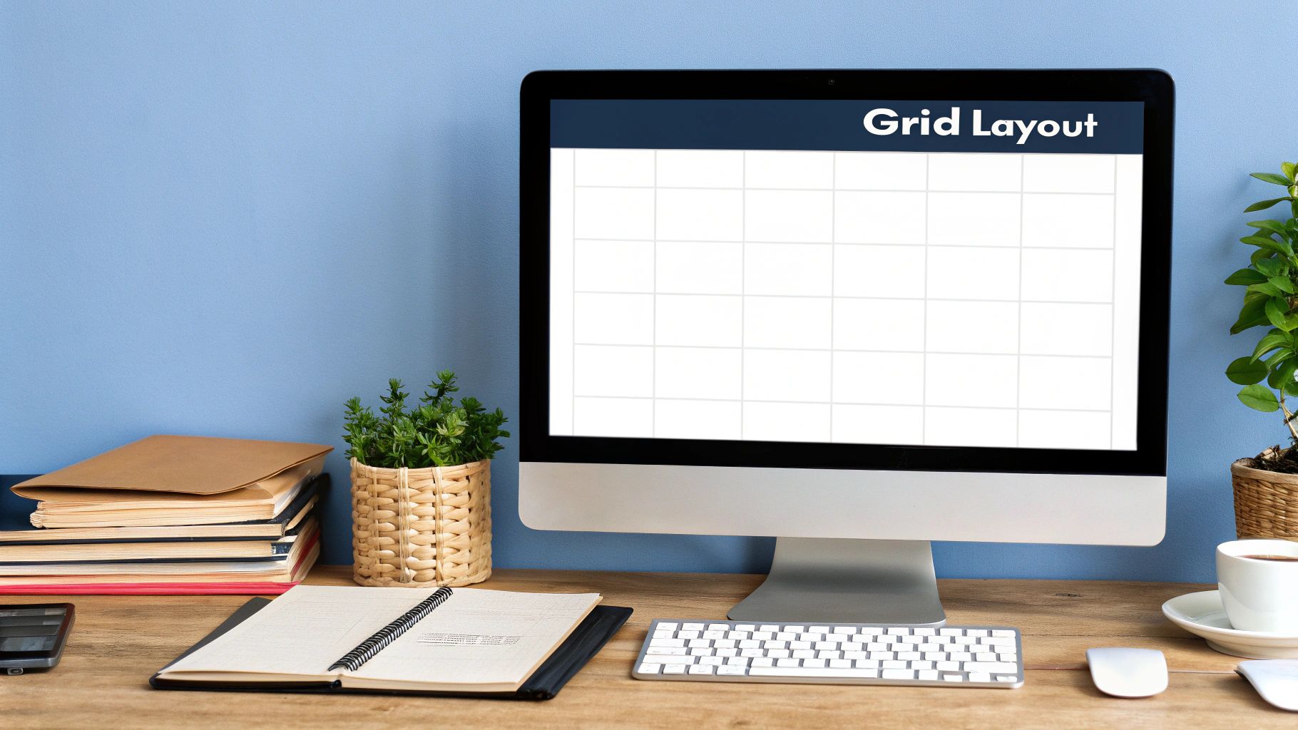
- Grid Systems: Picture an invisible set of lines and columns that your content snaps to. This creates a sense of order and balance, making the page feel professional and intentional, not just a jumble of elements.
- White Space: The empty spots around your content? They’re just as important as the content itself. Good use of white space (or negative space) cuts down on clutter, makes text easier to read, and helps people focus on what matters.
- Common Scanning Patterns: Let’s be real—people rarely read websites word-for-word. They scan. And they tend to scan in predictable patterns, which you can use to your advantage.
For instance, many of us scan in an "F-pattern." We look across the top of the page, then down the left side a bit, and then shoot across again on a lower point. Others follow a "Z-pattern," zigzagging from the top-left to the top-right, then diagonally down to the bottom-left before scanning across to the bottom-right. If you place your logo, key headlines, and CTAs along these natural paths, their visibility goes way up.
From Blueprint to Wireframe
Once you've got these principles in your head, you can start building your wireframe. Tools like Figma or Balsamiq are brilliant for this. They come with pre-made components that make the whole process fast and surprisingly intuitive. Your goal is just to create a clear, simple representation of the page's structure.
Here’s a great example of what a simple wireframe kit looks like inside a design tool.
See how it’s all purely structural? Simple boxes and placeholder text are used to mark where the real content, images, and buttons will eventually go. It’s all about placement, not polish.
A well-structured wireframe is the single most important step in designing an effective page. It makes sure your page is logical and user-friendly before you pour time and energy into the visual design, saving you from painful revisions down the road. This blueprint gives you a solid foundation for the next phase: bringing it all to life with visuals.
Applying Visuals That Truly Engage Your Users
Okay, you've got your wireframe—the skeleton of your page. Now for the fun part: breathing some life into that structure. This is where you move from a functional blueprint to a visual experience that genuinely grabs people and keeps them around. It's so much more than just making things look pretty; it's about making strategic choices that guide your user, build trust, and tell your story.
Don't underestimate how much this matters. Poor design is a massive turn-off, driving away roughly 38% of visitors before they even give your content a chance. On the flip side, getting the visual and user experience right can boost e-commerce conversion rates by a staggering 400%.
It all begins with being deliberate about the core elements of your design.
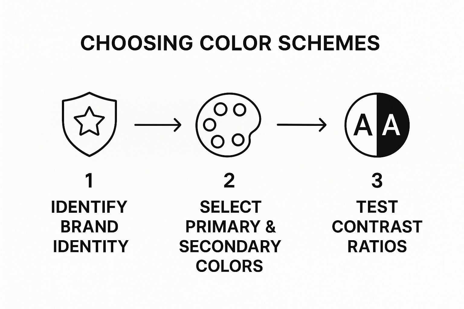
Developing a Purposeful Color Palette
Color is probably the most potent tool in your design kit. It’s not just about picking colors you personally like—it's about using color to spark specific emotions and hammer home your brand's personality. Think about it: a bank uses blues to feel trustworthy and stable, while a wellness blog might lean into greens to signal health and nature.
Start with your primary brand colors and build out from there. Here’s a simple way to think about it:
- Primary Color: This is your hero. Use it for the most important stuff, like your main headlines or that big "Buy Now" button.
- Secondary Color(s): These are your supporting actors. They should complement the primary color and are great for highlighting secondary info or just adding a bit of visual flair.
- Neutral Colors: Your workhorses. We're talking grays, whites, and off-blacks. They form the foundation for backgrounds and body text, making sure everything is easy to read and doesn't feel overwhelming.
And please, always check for accessibility. Your text needs to have enough contrast against the background to be readable for everyone, including people with visual impairments.
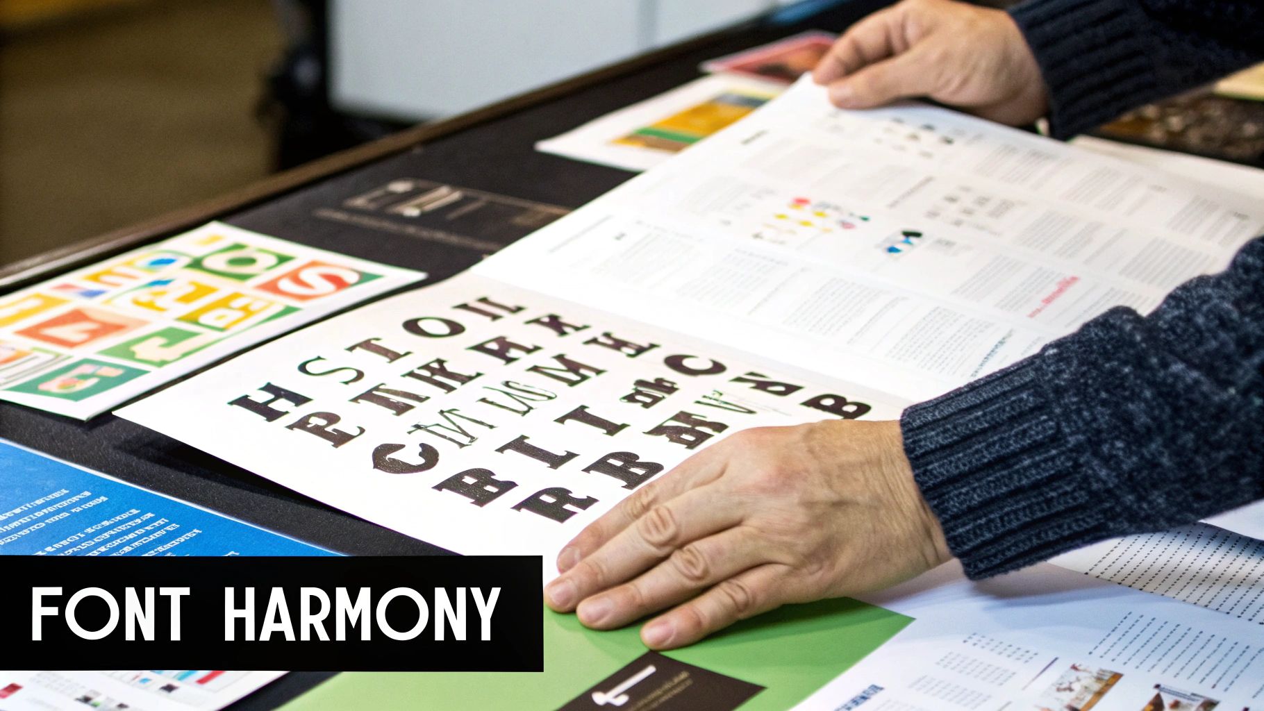
Mastering Typography and Readability
Typography is the silent narrator of your brand. The fonts you choose have a direct line to how people feel about your content. A classic serif font like Garamond can feel traditional and authoritative. A clean, modern sans-serif like Inter feels approachable and fresh.
Beyond just picking a font, establishing a clear type hierarchy is absolutely essential. This just means using different sizes, weights (like bold or regular), and styles to create a clear difference between headings, subheadings, and body text. A solid hierarchy makes your page instantly scannable, letting people find what they need in seconds. If you want to go deeper on this, we've got a great guide on mastering the 8 principles of visual design in 2025.
Pro Tip: Keep it simple. Stick to two, maybe three, fonts for your entire site. Any more than that, and you risk creating visual chaos that looks amateurish and disorganized.
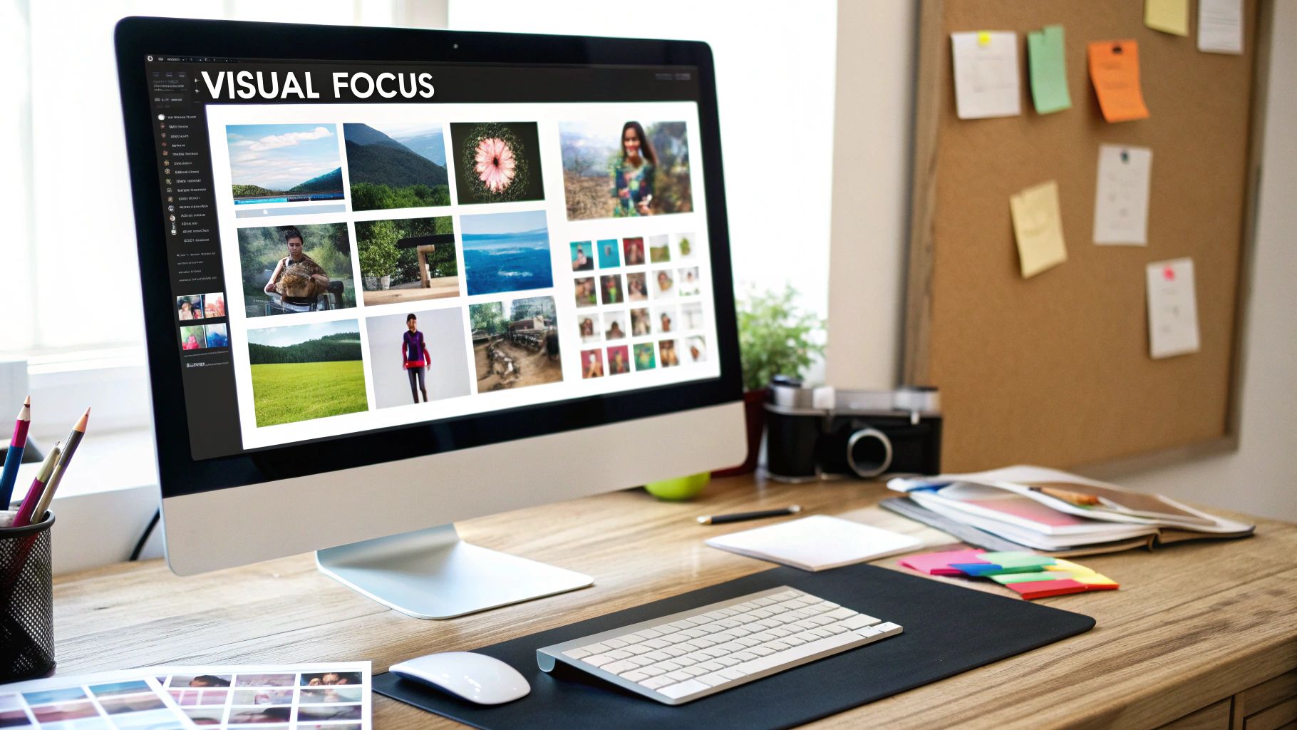
Using Imagery and Icons Strategically
Images, illustrations, and icons do way more than just break up walls of text. They help clarify complex ideas, pull the user's eye toward important sections, and inject a much-needed human touch. Just make sure you're using high-quality, relevant images that actually support your message—not just soulless stock photos that everyone has seen a million times.
Icons are brilliant for creating quick visual shortcuts, especially in navigation or feature lists. A shopping cart icon is universally understood, no explanation needed. The key here is consistency. Whether you go with an outline, filled, or two-tone style, stick with it across your site for a cohesive look. And when you're selecting these visuals, it helps to know how they fit into the bigger picture of your theme. For some great insights, check out this guide on WordPress theme best practices.
To tie all this together, here’s a quick rundown of how these elements work to create a great user experience.
Core Visual Design Elements and Their Impact
| Element | Primary Goal | Best Practice Example |
|---|---|---|
| Color | Evoke emotion & reinforce brand | Using calming blues and greens for a meditation app. |
| Typography | Ensure readability & create hierarchy | Using a bold, large font for H1 tags and a smaller, regular font for body text. |
| Imagery | Add context & human connection | Showing real photos of your team instead of generic stock imagery. |
| Icons | Provide quick visual cues | A simple "phone" icon next to a contact number. |
| White Space | Reduce clutter & improve focus | Leaving ample margin around text blocks and between sections. |
Ultimately, great design is intentional. Every color, font, and image should have a purpose that serves both your brand and your user. When all these pieces work together, you create a seamless and enjoyable experience that people will remember.
Ensuring a Flawless Mobile and Responsive Experience
Let's be blunt: designing for a single screen size anymore is a surefire way to fail.
Over 60% of all web traffic now comes from mobile phones. That means your page must look and feel perfect on every device, from a tiny smartphone screen to a massive desktop monitor. This is where responsive design comes in, and it's not just a technical term—it's the core of modern web work. If you're new to the concept, this guide on What is Responsive Web Design is a great primer.
This isn't just a "nice-to-have" feature; it's absolutely fundamental. The data doesn't lie: a clunky or broken mobile layout will cause 73.1% of visitors to bounce. Think about that. You're losing almost three-quarters of your audience just because the experience felt off on their device.
Embrace the Mobile-First Approach
Here’s a mindset shift that will change the game for you: adopt a mobile-first design philosophy. Instead of designing for a big desktop screen and then trying to painfully cram everything onto a smaller one, you start with the most constrained environment—the mobile phone.
Why? It forces you to prioritize. With such limited real estate, you have no choice but to focus on the most essential content, the most important actions. You cut the fluff.
The result is a cleaner, more focused design that, frankly, benefits users on all devices. It helps you build a rock-solid foundation before you even think about scaling up the layout for tablets and desktops.
By designing for the smallest screen first, you naturally strip away the clutter and focus on what truly matters to the user. This creates a stronger core experience that you can then progressively enhance for tablets and desktops.
The Building Blocks of Responsive Design
So, how do you actually make a layout responsive? It all comes down to a few core technical pieces that you'll use to make your design fluid and adaptable.
- Flexible Grids: Ditch the old-school fixed-width layouts (like a rigid 960 pixels). Instead, use relative units like percentages. This allows your layout to stretch or shrink gracefully based on the screen size.
- Fluid Images: In the same vein, your images need to scale within their containers. A simple bit of CSS like
max-width: 100%ensures an image never breaks the layout or causes that dreaded horizontal scrollbar. - CSS Media Queries: This is where the magic really happens. Media queries are like simple "if/then" statements in your CSS. They let you apply specific styles only when certain conditions are met, like when a screen is wider or narrower than a certain pixel value.
You could, for example, use a media query to transform a three-column layout on a desktop into a clean, readable single-column view on mobile. It's this kind of adaptation that keeps your visual identity consistent and professional, no matter the device.
As you can see from this flow, your foundational choices—like your color scheme—are directly tied to your larger brand strategy. When you make these decisions thoughtfully from the start, your branding remains strong and cohesive, even as the layouts themselves shift and adapt.
Leveraging Modern Tools for a Smarter Workflow
Knowing the principles of good page design is one thing. But bringing those ideas to life quickly and efficiently? That's a whole different ball game, and it comes down to having the right tools. Your tech stack can seriously speed up the whole process, turning a great concept into a working product faster than you might think.
Take artificial intelligence, for instance. It's quickly becoming a designer's co-pilot, not a replacement. AI tools can handle the grunt work—generating unique background images, spitballing headline ideas, or even suggesting smart layouts based on your content.
This frees you up to focus on the big-picture strategy and creative problem-solving, which is where the real magic happens. If you want to dive deeper into that strategic mindset, our guide on the design thinking process is a great place to start.
Choosing the Right Platform
The platform you decide to build on is every bit as crucial as the design itself. A Content Management System (CMS) is usually the backbone of any website, so getting familiar with the major players is a must.
WordPress is still the undisputed king of the hill, powering a massive 40% to 43% of all websites on the internet. With its endless sea of plugins and themes, it's the go-to for a reason. But there are other kids on the block.
Modern setups like Jamstack (JavaScript, APIs, and Markup) are picking up steam because they create blazing-fast, secure sites by pre-rendering pages. Your choice here directly impacts how you design for performance and future growth.
Then you have Progressive Web Apps (PWAs), which are blurring the line between websites and mobile apps. They're known for being incredibly fast and working offline, and the payoff is huge—they see engagement rates that are 68% higher than typical mobile sites.
At the end of the day, the best tool is simply the one that serves your project's goals. Don't just chase the latest trend. Step back and figure out if a PWA, a Jamstack site, or a classic CMS will actually give your audience the best possible experience.
Emerging Design Frontiers
Beyond what's popular right now, it pays to keep an eye on the horizon. Things like Augmented Reality (AR) are starting to unlock some wild new possibilities for page design. We're talking truly immersive experiences that blend the digital and real worlds.
Imagine a furniture store's website that lets you use your phone's camera to see how a sofa actually looks in your living room. That's not science fiction anymore; it's the next frontier.
Your toolkit should be a mix of battle-tested platforms and these forward-thinking technologies. It's all about working smarter, not harder, to create designs that truly connect with people.
Got Questions About Page Design? We've Got Answers
Even after years in the trenches, certain questions about page design just keep popping up. It's totally normal. Knowing how to design a great page often just means having solid, go-to answers for these common hurdles.
Let's break down a few of the big ones.
What’s the Single Most Important Part of Page Design?
If you have to pick just one thing, it’s visual hierarchy. Hands down.
It’s the subtle art of arranging everything on the page to guide a person's eye. It tells them what to look at first, second, and third, making sure your most important message and call-to-action are impossible to ignore.
Without a strong hierarchy, even the most beautiful design can feel like a confusing mess. And a user who doesn’t know where to look next is a user who’s about to click away. Think of it as the invisible force that makes a design just feel right.
How Do I Pick the Right Colors?
Start with what you already have: your brand colors. That’s your foundation.
From there, think about the vibe you want to create. Are you going for trust and dependability? Blues are a classic choice. Need a jolt of energy and optimism? Yellows can work wonders. You can use online tools to find great complementary or analogous palettes that just work.
But here’s the most important part: make sure your design is accessible. Your text has to stand out clearly from the background. You should always aim for at least a WCAG AA rating for color contrast. This ensures everyone, including people with visual impairments, can actually read what you’ve written.
What's the Real Difference Between UX and UI Design?
Ah, the classic question. It comes up all the time, and it's simpler than it sounds.
Think of it like this:
- UX (User Experience) Design is the master blueprint. It’s all about the overall feel and usability of the page—the big picture. This is where you get into user research, mapping out the journey someone takes, and making sure the whole experience is smooth and logical.
- UI (User Interface) Design is about bringing that blueprint to life visually. It’s the tangible stuff you see and interact with: the colors, the fonts, the style of the buttons, and all the little icons.
If we're building a house, UX is the architectural plan that makes it functional and easy to live in. UI is the paint, furniture, and light fixtures that give it personality and style. You really can’t have one without the other.
As our tools get smarter, so does our process. A recent study shows that over 58% of web designers are now using AI tools to help generate images and other assets, folding some really cool assistance right into their UI workflow. You can get the full scoop on how AI is shaking things up in these new web design statistics.
Ready to turn those design ideas into reality? Creativize is where you can connect with incredible local designers who build stunning, user-friendly pages every day. Find the perfect creative partner for your next project at https://creativize.net.