
Ever wondered what people mean when they talk about "user experience" or "UX"? It's one of those terms that gets thrown around a lot, but it's actually pretty simple at its core.
User experience (UX) design is all about making technology feel intuitive, logical, and even enjoyable to use. It’s the art and science of understanding what people need and then creating a product—like a website or app—that solves their problems in a way that feels natural and effortless.
What Is User Experience Design in Simple Terms

Think of a UX designer as an architect for a digital product. An architect doesn't just sketch out a building's final look; they obsess over how people will actually live in that space. They map out where to put doors for a smooth flow between rooms, place light switches where your hand naturally reaches, and design the layout to feel comfortable and make sense.
That's exactly what a UX designer does, but for the digital world. They map out the entire journey a person takes with a product, from the very first impression to the final click. The goal is to make every step feel purposeful and completely free of frustration. It’s a human-first approach to building things.
Don Norman, the cognitive scientist who literally coined the term, put it perfectly:
“User experience encompasses all aspects of the end-user’s interaction with the company, its services, and its products.”
- Don Norman, Cognitive Scientist & Co-founder of Nielsen Norman Group
This gets to the heart of it: UX isn't just about one screen or a single button. It’s the total sum of every touchpoint a person has with a company and its offerings.
More Than Just a Pretty Face
A lot of people think UX design is just about making things look good. While a beautiful design is definitely part of the package (that's more in the UI, or user interface, realm), the real core of UX is about the feeling of using a product. It asks questions that go much deeper than just what you see on the surface.
For example, a UX designer is constantly digging into things like:
- Usefulness: Does this product actually solve a real problem for the person using it?
- Usability: How easy is it for someone to get things done? Can they find what they need without getting lost?
- Desirability: Does the experience leave people with a positive emotional connection?
- Accessibility: Can people with different abilities and needs use the product just as effectively?
Ultimately, the aim is to create experiences that are both seamless and meaningful. A great UX designer is part empathy, part psychologist, and part problem-solver, all rolled into one. They get into the user's head to understand their motivations and frustrations, then build something that helps them reach their goals without creating new headaches.
It’s a discipline built on a simple but powerful idea: technology should serve people, not the other way around.
To break it down even further, the user experience is made up of several key ingredients that all work together.
Core Components of User Experience
This table shows the essential elements that combine to create a complete user experience, clarifying what each component contributes.
| Component | What It Means for the User |
|---|---|
| Usability | The product is simple, easy to learn, and efficient to use. No confusion. |
| Utility | The product has features that meet the user’s specific needs and solve their problems. |
| Desirability | The user finds the product attractive and feels a positive emotional connection to it. |
| Findability | The user can easily navigate and locate the information or features they're looking for. |
| Accessibility | People with a wide range of abilities can access and use the product without barriers. |
| Credibility | The user trusts the product and the company behind it. It feels reliable and secure. |
| Value | The product delivers real-world value to the user, making their life better in some way. |
When all these components click into place, you're not just left with a functional product—you have an experience that people genuinely love using. That's the magic of great UX.
The Hidden History of User Experience Design
You might think the term "user experience design" is a modern buzzword, something cooked up during the dot-com boom. But the truth is, the core ideas behind it are surprisingly old. The practice of making tools and environments work better for people has roots stretching back long before the first computer flickered to life.
At its heart, UX is about a simple, timeless goal: making things less frustrating and more intuitive.
This journey really kicked off with disciplines like ergonomics and industrial design. Picture the early 20th century, a time of massive industrial growth. A few forward-thinking pioneers started asking some really important questions: How can we make factory work safer and more efficient? How do we design a product so it just feels right in someone's hand?
From Factory Floors to Living Rooms
One of the first glimmers of UX thinking came from a field called scientific management. Way back in 1911, Frederick Taylor started using time and motion studies to improve how factories operated. A few years later, Frank and Lillian Gilbreth took it even further, breaking down complex tasks—like assembling weapons—into tiny, simple motions to boost speed and reduce worker fatigue.
This is the direct ancestor of modern usability testing. It’s all about observing how people actually do things to make the process better. You can see more on this evolution in this deep dive into usability history.
This human-first focus didn't stay on the factory floor for long. Industrial designers like Henry Dreyfuss brought it right into our homes. When he was tasked with designing the iconic Model 302 telephone for Bell Labs, he wasn't just thinking about how it looked. He was obsessed with how people held the receiver, how they dialed, and every little interaction.
Dreyfuss had a simple but powerful guiding principle: "We design for people." His belief was that the machine should fit the person, not the other way around. That single idea is the absolute bedrock of what user experience design is today.
Wartime Innovations and a Touch of Magic
The real trial by fire for these principles came during World War II. A new field, human factors engineering, suddenly became critically important. Military leaders began to realize that a shocking number of pilot errors weren't from a lack of skill, but from horribly designed cockpit controls.
Engineers went to work redesigning flight instruments to be more logical and intuitive. The result? A dramatic drop in catastrophic failures, saving countless lives. It was undeniable proof that designing for human psychology wasn’t a nice-to-have; it was a necessity.
Believe it or not, even the world of entertainment has a huge place in UX history. Walt Disney was, in his own way, one of the first true masters of experience design. He didn't just build a theme park; he orchestrated every single moment of a visitor's journey.
- Guided Navigation: He used strong visual cues, like the castle at the end of Main Street, to naturally pull people through the park. No confusing maps needed.
- Managing Flow: The layout of paths and attractions was meticulously planned to handle huge crowds and prevent those frustrating bottlenecks.
- Emotional Connection: Every detail, from the background music to the character interactions, was carefully crafted to build a consistent, magical feeling.
Disney's work is a masterclass in anticipating people's needs and guiding them toward a positive outcome, whether they're in a theme park or using a mobile app. It’s about applying empathy at a massive scale—a skill we still explore in depth during any good design thinking workshop.
When you look back at this rich history, you see that UX design isn't some passing trend. It's the modern chapter in a long story of making our world more functional, intuitive, and enjoyable for the people in it.
Guiding Principles of Great UX Design

What’s the difference between a product that feels like a chore and one that’s an absolute joy to use? It’s not magic. The secret is a deliberate commitment to a handful of core principles that guide every decision.
These rules are the invisible blueprint behind every fantastic user experience. They’re what turn a confusing mess into a clear, confident interaction. Think of them as the timeless truths that have guided designers for decades.
Embrace a User-Centric Mindset
If there’s one rule to rule them all in UX, it’s this: be user-centric. This simply means every single decision—from the color of a button to the architecture of the entire app—is made with the real user’s needs, goals, and limitations in mind. You're designing for them, not for your team or for yourself.
To do this, you need real empathy. You have to be able to step into your user's shoes and see the world through their eyes. It’s about constantly asking, "What would a user expect to happen here?" instead of, "What do we think would be cool?" This mindset is completely non-negotiable if you want to build products people actually love and use.
"When we are designing for people, the objective is to make them feel safe, comfortable, efficient, and happy." – Henry Dreyfuss, Industrial Designer
This wisdom gets to the heart of it—good design is about addressing basic human needs. The concepts we talk about in UX today were shaped by pioneers like industrial designer Henry Dreyfuss and even Walt Disney. Their work in physical products and entertainment was all about knowing the audience and guiding their attention, principles that are just as critical in the digital world.
Create Clarity with Visual Hierarchy
Let's be honest, not everything on a screen is equally important. Visual hierarchy is how you arrange elements to show what matters most, acting as a subtle tour guide for the user's eye. A strong hierarchy tells people what to look at first, then second, then third, preventing them from feeling overwhelmed.
Designers use tools like size, color, contrast, and placement to build this structure. A big, bold headline naturally grabs your attention before the smaller text below it. A brightly colored "Buy Now" button pops out from less important links. Without a clear hierarchy, a page is just a chaotic jumble of competing information, leaving users confused and unsure of what to do next. To really get this right, you need to master visual hierarchy.
Maintain Unwavering Consistency
Consistency is what makes users feel like they've mastered your product. When things look and act the same way across the board, people don't have to constantly relearn how your site works. It builds trust and, just as importantly, reduces their mental workload.
This isn't just about one thing; it applies to everything from the look and feel to how things function.
- Visual Consistency: Using the same color palette, fonts, and icon styles creates a cohesive, professional experience.
- Functional Consistency: A trash can icon should always mean delete. A "submit" button should always perform the same kind of action. No surprises.
- External Consistency: Following conventions people already know (like a logo in the top-left corner) helps them feel at home on your site right away.
Make Accessibility a Cornerstone
Great UX has to be for everyone. Accessibility is the practice of designing products that can be used by people with a wide range of abilities—including those with visual, auditory, motor, or cognitive impairments. This isn't just a "nice-to-have" feature; it's a fundamental part of creating an ethical and truly effective user experience.
And here’s the best part: designing for accessibility almost always makes the product better for everyone. High-contrast text designed for someone with a visual impairment also makes your screen easier to read in bright sunlight. Simple, clear language helps people with cognitive disabilities, but it also makes your interface easier for everyone else to understand.
When you make accessibility a priority from day one, you build a product that works for all users, not just some of them.
Walking Through the UX Design Process
A fantastic user experience doesn't just happen. It’s not an accident. It's born from a deliberate, human-focused process that takes a rough idea and shapes it into something polished and genuinely useful. This isn't some rigid, step-by-step formula you have to follow perfectly. Think of it more as a flexible game plan for discovery, building, and refining.
It’s a lot like building a custom home. You don't just show up and start laying bricks. First, you'd spend a ton of time talking with the family who will live there (Research). Then, you'd sketch out different floor plans to see what works best (Ideation). You might even build a small-scale model to help them visualize the space (Prototyping). Finally, you walk the family through that model to get their honest feedback before you ever break ground (Testing).
This loop—research, ideate, prototype, test—is the engine that drives great UX design. It’s what helps teams move from guessing what people want to knowing for sure, ensuring the final product actually solves a real problem for real people.
Let’s walk through what this looks like using a classic example: creating a new food delivery app.
Phase 1: Research and Discovery
Before a single pixel is designed, you have to get inside the heads of the people you're designing for. This entire phase is about one thing: empathy.
For our food delivery app, we’d start by interviewing potential users. We'd ask about their current ordering habits, what drives them crazy about the apps they already use, and what their dream experience would feel like.
Getting this raw, honest feedback is non-negotiable. You can gather it through methods like surveys and one-on-one interviews. For some great ideas on how to do this well, check out these powerful Voice of Customer (VoC) examples. From all this research, designers then create user personas—basically, fictional characters that represent different types of users—to keep the whole team focused on actual human needs.
Phase 2: Ideation and Design
With a solid grasp of who the user is and what they need, the team can finally start brainstorming solutions. This is the ideation phase, where creativity gets a bit of structure. It usually starts messy and gets progressively cleaner.
For our food app, this stage would involve a few key activities:
- User Flows: Literally charting out the step-by-step journey a user takes, like from the moment they open the app to when they get that "Your order is confirmed!" message.
- Sketching: Drawing super rough, low-cost versions of different screens. This is all about exploring as many layout ideas as possible, fast.
- Wireframing: Creating a more structured, digital blueprint of the app. A wireframe is like an architectural drawing—it shows the layout and where everything goes, but without any of the fancy colors or graphics yet.
This natural progression from a quick napkin sketch to a detailed wireframe is how ideas start to become real.
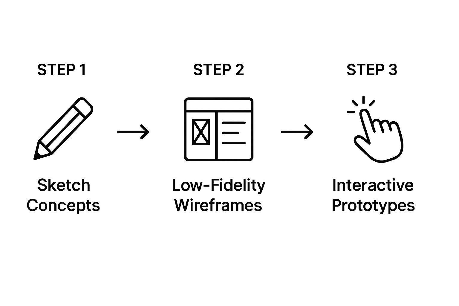
The image above perfectly shows this visual journey. You can see how designers build on simple concepts, layering in more detail and fidelity at each stage to create something that can actually be tested.
Phase 3: Prototyping
A wireframe is a flat picture, but a prototype is an interactive model that makes the app feel real. It's a game-changer. In this phase, designers use tools like Figma or Adobe XD to link those wireframe screens together, creating a clickable, tappable version of the app.
The prototype for our food delivery app would let someone tap on a restaurant, add food to their cart, and click through the checkout flow. It might not look pretty yet, but it perfectly simulates the core experience. This step is absolutely critical because it lets you test your ideas before a single line of code gets written, which saves a massive amount of time and money down the road.
Phase 4: Testing and Iteration
This is where the rubber meets the road. During the testing phase, you put your prototype in front of real people and ask them to complete a few tasks. Then you watch. Silently. You take notes on where they get stuck, what confuses them, and what feels totally natural.
The goal of testing is to find problems. Watching someone struggle with your prototype isn't a failure; it’s a priceless opportunity to fix a problem before it affects thousands of users.
The feedback from these sessions is pure gold. You take those insights and go back to the drawing board. Maybe users couldn't find the search bar. Or maybe the checkout button wasn't obvious enough. The team then iterates on the design, updates the prototype, and tests it again.
This cycle repeats until the experience is as smooth and intuitive as possible. The thoroughness of these stages is exactly why a well-defined design process is vital for any project's success. This constant loop of refining and re-testing is what separates good UX from truly great UX. It’s how you make sure the product you launch is not just used, but loved.
The Modern UX Designer's Toolkit
So, how do UX designers actually turn abstract ideas and user frustrations into something you can click, tap, and interact with? They have a powerful suite of digital tools that act as their workshop, lab, and presentation room—all rolled into one.
This isn't about chasing the flashiest new software. It’s about knowing which tool to pull out at just the right moment. A designer’s toolkit is carefully curated to shepherd a project from a rough concept all the way to a polished, final product.
Research and Analysis Tools
Before a single pixel is placed, designers have to get inside the user's head. Research tools are how they gather and make sense of all that messy, human feedback, uncovering behaviors and pain points.
- UserTesting is like having a one-way mirror. Designers can watch real people try to use their prototypes, giving them raw, unfiltered feedback on what’s working and what’s a complete disaster.
- Hotjar brings websites to life with heatmaps and session recordings. It visually shows you exactly where people are clicking, where their mouse hovers, and, most importantly, where they get stuck.
These tools trade guesswork for hard evidence. They provide the "why" behind every design decision and help answer the fundamental question of what is user experience design: What do people actually need?
Ideation and Prototyping Tools
This is where ideas finally start to look like something real. These apps are the digital sketchpads and model-building kits of the modern designer, allowing them to create everything from basic wireframes to stunningly realistic, interactive mockups.
Figma has pretty much taken over the industry. It's a living, breathing design space where entire teams can create, prototype, and drop comments in real-time. A designer in Berlin can tweak a button, and a developer in Boston sees the change instantly. It’s a game-changer.
The screenshot you see above? That’s Figma’s collaborative magic in action. Multiple people can jump into the same file and work side-by-side, a massive leap from the old days of emailing static files back and forth.
A couple of other heavy hitters in this space include:
- Adobe XD is a powerhouse, especially for those already in the Adobe ecosystem. It handles everything from design to prototyping and integrates seamlessly with apps like Photoshop and Illustrator.
- Sketch was the go-to for years and still has a loyal following. It's known for its incredibly precise vector tools and a massive library of plugins that let you customize your workflow.
Collaboration and Handoff Tools
Great design is a team sport. Period. Collaboration tools are the central command center where designers, product managers, developers, and other stakeholders get on the same page.
Miro is basically an infinite digital whiteboard. It’s perfect for those chaotic (but brilliant) brainstorming sessions, mapping out user flows, and getting everyone aligned, even if the team is spread across the globe.
A design is only as good as its implementation. The handoff process—where a designer passes their final work to the engineering team—must be flawless to ensure the vision becomes reality.
This is where a tool like Zeplin becomes a designer's best friend. It bridges the gap between design and development by taking designs from apps like Figma and automatically generating style guides, code snippets, and exact measurements. It removes the ambiguity so developers can build the product exactly as it was imagined.
Of course, running a successful creative project involves more than just design chops; it requires some serious business sense. We dig into that in our guide to starting a freelance business.
And sometimes, the best "tool" isn't software at all—it's having the right people on your team. You can find incredible people by sourcing talented remote designers to build a crew that can bring any idea to life.
Why Good UX Is a Business Superpower
Let's cut to the chase: investing in user experience isn't some feel-good line item in a design budget. It's a direct driver of business success. Good UX translates straight into the metrics every single executive and business owner obsesses over—more revenue, rock-solid customer loyalty, and a brand that people trust.
Think about it in the simplest terms. A smooth, one-click checkout process makes it incredibly easy for customers to give you their money. On the flip side, a clunky, confusing form with vague error messages practically begs them to abandon their cart and find a competitor who makes buying simple. That lost sale? That’s the real, tangible cost of bad UX.
Boosting Your Bottom Line
When a product is genuinely intuitive and a pleasure to use, it creates a powerful ripple effect across the entire business. This is where UX stops being just a "design thing" and becomes a core business strategy.
- Higher Conversion Rates: When people can effortlessly find what they need and get things done, they’re far more likely to convert. That could be making a purchase, signing up for a newsletter, or requesting a demo.
- Increased Customer Loyalty: A great experience builds trust. It creates an emotional connection. Happy users don’t just come back for more; they become your best salespeople, telling friends and family about you.
- Reduced Support Costs: An intuitive product means fewer confused customers. When people can figure things out on their own, you spend way less time and money answering support calls and emails.
This isn't a new concept. The demand for UX professionals skyrocketed from about 1,000 practitioners in 1983 to roughly 1 million by 2017—a 1,000-fold increase. This explosion was fueled by the PC and web revolutions, which proved, time and again, that companies prioritizing usability gained a massive competitive advantage.
Impact of UX on Business Metrics
This table breaks down how investing in User Experience Design directly translates into measurable business benefits that matter to your bottom line.
| Business Goal | How Good UX Contributes |
|---|---|
| Increase Revenue | Streamlines the path to purchase, reducing cart abandonment and making it easier for users to buy. |
| Improve Customer Loyalty | Creates positive, memorable interactions that build trust and encourage repeat business. |
| Lower Operational Costs | Reduces the need for customer support by designing intuitive interfaces that users can navigate without help. |
| Strengthen Brand | Ensures every touchpoint with your company is positive, building a reputation for quality and customer-centricity. |
| Gain Market Share | Differentiates your product from competitors by offering a superior, more enjoyable experience that users prefer. |
Ultimately, thoughtful UX design is a clear path to building a better, more resilient business.
It's a Strategic Investment, Not an Expense
At the end of the day, great UX design is about building a better relationship with your customers. A strong brand is so much more than a slick logo; it's the sum of every single interaction someone has with your company. To see what we mean, check out our comparison of branding vs. logo design. A positive user experience ensures those interactions are consistently excellent.
Investing in UX isn't a cost—it's an investment in your customers' happiness and your company's future. When users succeed, your business succeeds with them.
Plus, you can actually measure this stuff. By using frameworks like Objectives and Key Results (OKRs), you can tie your design efforts to concrete business goals. This is how you demonstrate the real return on investment and solidify UX’s role as a true business superpower.
Your Top UX Design Questions, Answered
As you dive deeper into User Experience, you'll find a few questions tend to pop up again and again. It's totally normal. Let's tackle some of the most common ones to help build a rock-solid understanding of this field.
What's the Real Difference Between UX and UI Design?
This is, without a doubt, the question we hear most. It’s a classic point of confusion, but a simple analogy makes it crystal clear.
Imagine you're building a house. UX (User Experience) design is the architect's blueprint. It’s the very foundation, the structural integrity, the flow between rooms, and how the entire layout works for the people who will actually live there. Is the kitchen next to the dining room? Is it easy to get from the bedrooms to the bathroom? That's UX.
UI (User Interface) design, on the other hand, is the interior decorator. They choose the paint colors, the furniture, the light fixtures, and the finishes. They’re responsible for the look and feel that brings the blueprint to life and makes the house feel like a home.
In a nutshell:
- UX is the underlying journey and how it works. It's the logic, the research, and the structure.
- UI is the visual layer you see and interact with. It’s the buttons, the colors, and the overall presentation.
You absolutely need both. A stunning app that's a nightmare to use has great UI but awful UX. A super-functional, logical app that looks like it was made in 1999 has great UX but poor UI. The magic happens when they work together seamlessly.
What Skills Actually Matter for a Career in UX?
It's easy to think a UX career is all about mastering fancy software, but that's not the whole story. While technical skills are part of the job, the most critical abilities are deeply human. You can always learn a new tool, but these core skills are what truly separate the great designers from the good ones.
The real game-changers are:
- Empathy: This is non-negotiable. The ability to genuinely step into your user's world—to feel their frustrations and understand their goals—is the foundation of everything in UX.
- Problem-Solving: At its core, UX is all about solving problems for people. It requires a curious, analytical mind that can unpack a complex challenge and find a simple, elegant solution.
- Communication: A brilliant design is useless if you can't explain why it's brilliant. UX designers have to clearly articulate their decisions to developers, executives, and everyone in between.
A great UX designer is part researcher, part psychologist, and part artist. They connect business goals to user needs through a process of constant testing, refinement, and deep listening.
How Do You Even Know If a Design Is "Good"?
Unlike a piece of art hanging in a gallery, UX design isn't subjective. Its success isn't a matter of opinion—it can and should be measured with cold, hard data. This is how you prove that design decisions are working, moving beyond "I think this looks better" to "I know this works better."
So how do we measure it? We track specific metrics that show a design's impact on both user behavior and business goals. These fall into two main buckets:
- Quantitative Metrics: These are the numbers. We’re talking about things like a 20% increase in sign-ups after a homepage redesign or a 30% drop in the time it takes for a user to find a product. It's pure, measurable proof.
- Qualitative Metrics: This gets to the "why" behind the numbers. It’s the feedback you get from real people in surveys or usability tests—comments like, "Wow, the new checkout process felt so much faster and more secure."
When you combine both types of data, you get a complete picture. You can see exactly what user experience design is doing for the product and prove its value in a language everyone, especially the C-suite, understands.
Ready to bring your business goals to life with exceptional design? Creativize connects you with talented local creative professionals who understand how to build experiences that delight users and drive results. Find your perfect design partner.