
At its heart, grunge style art is pure visual rebellion. It’s the design equivalent of a distorted guitar chord—raw, emotional, and proudly imperfect. The whole aesthetic is a middle finger to polished corporate perfection, choosing instead to find beauty in authenticity and raw feeling. It creates this powerful sense of history and rebellion through its signature distressed look.
The Unfiltered Spirit of Grunge Style Art
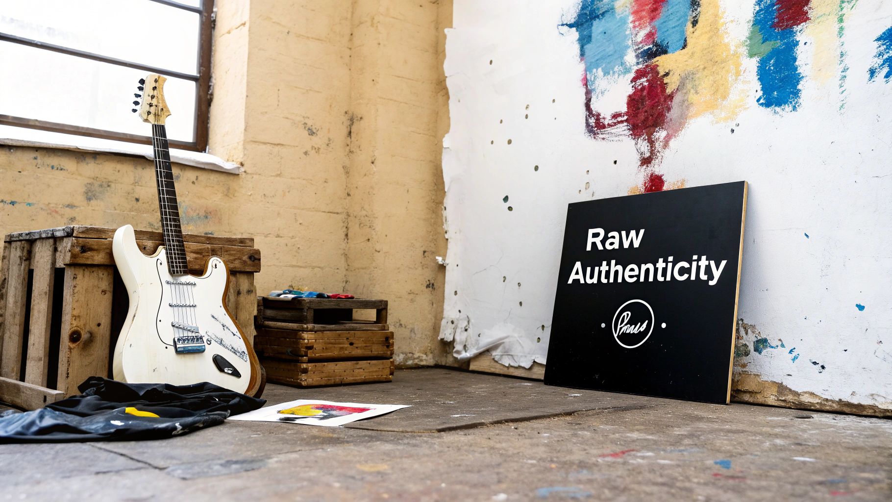
Think about a world just saturated with glossy, hyper-perfect ads and sterile corporate logos. Grunge style art crashed that party as the unfiltered, honest alternative. It doesn't try to be pretty; it tries to be real. This is a mindset that values genuine expression over some manufactured ideal, which makes it an incredibly potent tool for visual storytelling.
This approach is way less about following a strict set of rules and more about chasing a feeling. You want to create something that looks lived-in, used, and filled with its own story. It’s the difference between a pristine print and a well-worn concert ticket, a faded band t-shirt, or a hastily handwritten note—every single imperfection tells you something.
The Philosophy of Flaws
The central philosophy here is simple: flaws aren't mistakes, they're features. This design language intentionally grabs all the things traditional design would toss in the trash.
- Distressed Textures: Think scanned concrete, torn paper, rust, and wood grain. They all add a sense of decay and history.
- Chaotic Typography: We're talking broken, overlapping, and hand-drawn letters that put emotional impact way above perfect legibility.
- Muted Colors: Earthy tones and faded palettes create a somber, almost introspective mood.
- DIY Aesthetics: The use of collage, tape, and low-fidelity imagery gives the work a handmade, anti-corporate vibe.
The real power of this style is its ability to connect on a human level. By showing the cracks and imperfections, it feels more approachable and trustworthy than something that seems too perfect to be real. Nailing these core ideas is key before you start trying to apply them. It's all about communicating raw authenticity, a cornerstone of any effective visual communication.
Grunge art serves as a powerful reminder that beauty can be found in the messy, the chaotic, and the imperfect. It’s a celebration of authenticity in a world that often demands conformity.
Cultural Roots in Rebellion
This visual movement didn't just appear out of nowhere. It's deeply rooted in the underground music scenes of late 1980s Seattle—it was the visual voice of a generation.
By 1994, it was estimated that over 70% of alternative music album covers in the U.S. were rocking elements like distressed typography and a collage-based, DIY approach. This deep connection to music and counter-culture cemented its status as a visual form of rebellion that continues to inspire artists today.
From Seattle Sound to a Visual Uprising
To really get the soul of grunge style art, you can’t just look at a computer screen. You have to listen.
Picture the rain-soaked streets of Seattle in the early 1990s. The city was simmering with economic anxiety and a whole lot of youthful frustration. Out of that pressure cooker exploded a sound that was distorted, raw, and completely unapologetic. It was the sound of bands like Nirvana, Pearl Jam, and Soundgarden.
This wasn't just a collection of songs; it was the soundtrack to a massive cultural shift. The lyrics were drenched in angst, apathy, and a deep-seated craving for freedom. Forget the polished, over-the-top rock of the 1980s. This was stripped-down, brutally honest, and fiercely anti-establishment.
That same spirit bled right into the visual world. The art that went along with this music had to feel just as authentic and unfiltered as a Kurt Cobain scream. It was a gut reaction against the glossy, hyper-produced excess that had defined the decade before.
The DIY Counter-Culture
The whole aesthetic was born from a mix of necessity and philosophy. Indie zines, lo-fi concert posters, and album covers became the main canvases for this new visual language. They were often thrown together with whatever was lying around—photocopiers, scissors, glue, and found objects. This do-it-yourself approach wasn't just about saving money; it was a statement.
These rough-and-ready materials produced a look you could spot a mile away:
- Photocopy Degradation: Images were copied and re-copied until they were grainy, distorted, and beautifully imperfect.
- Physical Collage: Stuff was literally cut and pasted. You could see the tape, the staples, and the messy edges.
- Handwritten Text: Typography was often scrawled, scratched out, or made with stencils, kicking clean digital fonts to the curb.
This handmade quality was everything. It screamed that the art was made by a real person, not some faceless corporation. Every flaw and imperfection just added to its authenticity, creating a direct line from the artist to the music to the audience.
The Voice of a Generation
Grunge style art quickly became the banner for a generation that felt overlooked and totally disillusioned. It turned its back on the slick promises of consumer culture, finding beauty in the gritty, the broken, and the real. The style was messy on purpose, mirroring the complex and often chaotic emotions of the music itself.
Just think of those iconic album covers or the gritty pages of Ray Gun magazine, famously art-directed by the legendary David Carson. Carson was notorious for his wildly experimental typography, often shredding, ripping, and overlapping letters until they were barely readable. In one famous move, he set an entire article in the symbol-based font Zapf Dingbats, choosing raw feeling over easy function.
This visual chaos was the entire point. It forced you to engage, to feel the art instead of just passively looking at it. Grunge art wasn't meant to be easy on the eyes; it was meant to be felt in your gut.
The link between the sound and the visuals was absolute. The muted, earthy color palettes reflected the somber, introspective mood of the music. The distressed textures looked like they’d been through the same struggles the lyrics were screaming about. If you're curious about how different visual approaches can pack such a powerful punch, exploring the many different styles of illustration gives you a wider lens to see this kind of expression.
In the end, grunge art was way more than just a set of design rules. It was the authentic, unfiltered voice of a generation pushing back against a world they felt no longer represented them. It proved there was immense power—and a strange kind of beauty—in imperfection.
Cracking the Code of the Grunge Design Language
So, what exactly gives grunge art that signature gritty, lived-in feel? Once you know what to look for, the intentional chaos starts to make a whole lot of sense. It’s a visual language built on beautiful imperfection, where every scuff, smudge, and distorted letter tells a story.
This whole vibe is a deliberate pushback against the squeaky-clean, perfectly balanced compositions of mainstream design. Instead, it digs into a toolkit of visual elements that scream history, decay, and raw, unfiltered emotion. Let's pull apart the key pieces that make this aesthetic tick.
The Power of Distressed Textures
At its heart, grunge is all about texture. We're not talking about slick, digital patterns; this is about surfaces that feel real and worn down. The goal is to slap a layer of history and physicality onto the work, making it look like it's been around the block a few times.
Artists get that authentic grit from all sorts of places:
- Scanned Surfaces: They'll often scan real-world stuff like cracked concrete, rusty metal, wood grain, or peeling paint to capture that genuine texture.
- Paper and Fabric: Think torn paper, wrinkled cardboard, stained cloth, and yellowed book pages. These add a fragile, analog quality that you just can't fake.
- Photocopy Noise: The grain and messiness from old-school photocopiers are classic grunge. It creates a lo-fi, DIY vibe instantly.
This map breaks down how music, culture, and visuals all smashed together to create the grunge movement.
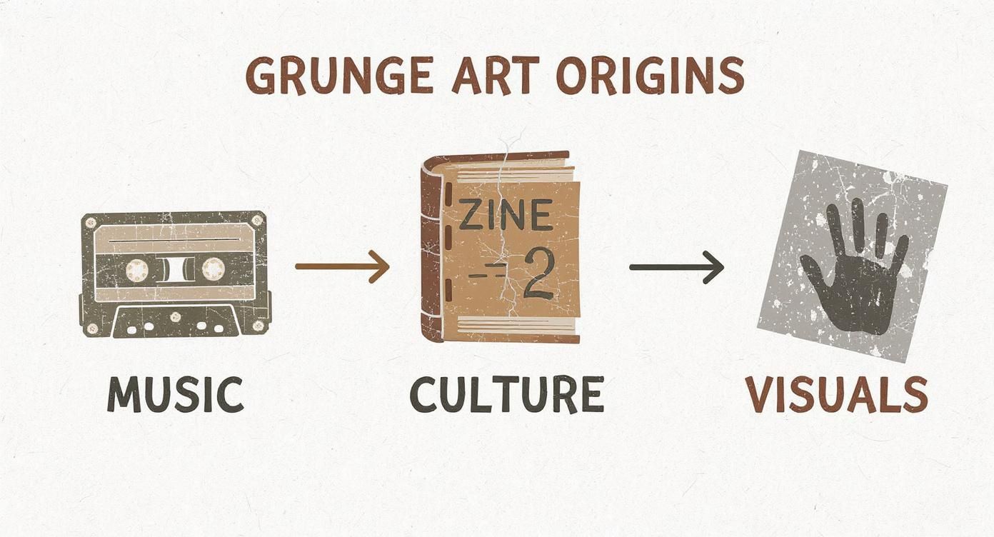
You can see a straight line from the raw sound of the music to the cut-and-paste ethos of zine culture, which then basically wrote the rulebook for the movement's visual identity on posters and album covers.
To get a better handle on these core components, let's lay them out. This table breaks down the essential visual elements that define the grunge art aesthetic, showing what they are and the feeling they're meant to evoke.
Key Elements of the Grunge Art Aesthetic
| Element | Description | Common Examples | Intended Effect |
|---|---|---|---|
| Distressed Textures | Gritty, imperfect surfaces that add a sense of age and physicality. | Scanned concrete, rust, torn paper, wood grain, photocopy noise. | Authenticity, history, rawness, anti-corporate feel. |
| Chaotic Typography | Type treated as a visual element, prioritizing emotion over readability. | Broken or distorted letters, mismatched fonts, irregular spacing. | Urgency, unease, emotional intensity, rebellion. |
| Muted Color Palette | Earthy, desaturated colors that create a somber, introspective mood. | Muddy browns, olive greens, faded grays, dark reds, washed-out blues. | Melancholy, introspection, anti-commercialism. |
| Messy Collage | Layering of found images, text, and objects in a spontaneous, handmade style. | Torn photos, visible tape or staples, overlapping elements. | DIY spirit, juxtaposition of ideas, personal artifact quality. |
| Low-Fidelity Imagery | Grainy, blurry, or overexposed photos that reject polished perfection. | Old magazine clippings, cheap camera shots, photocopied images. | Unfiltered reality, nostalgia, anti-slick aesthetic. |
Each of these elements works together, layering on top of one another to build that unmistakable grunge atmosphere. It’s a deliberate rejection of perfection in favor of something more human and real.
Typography That Breaks All the Rules
In the world of grunge, typography is less about clear communication and more about gut-punching emotional impact. Letters become expressive shapes, not just boring carriers of information. The "un-rules" here are all about deconstruction and throwing convention out the window.
You’ll see letters that are smashed, overlapping, scribbled by hand, or twisted into oblivion. Designers mix and match fonts with abandon, playing with weird spacing and chaotic layouts to create a sense of frantic energy or anxiety. It’s feeling over function, every time.
The big idea is that if the message itself is messy and complicated, the type should be too. It’s an honest reflection of the chaotic feelings behind the words.
A Muted and Earthy Color Palette
While its punk cousin was all about bright, clashing neons, grunge sank into a much more somber and moody color scheme. The palette is usually muted, earthy, and desaturated, which makes perfect sense—it mirrors the rain-soaked Pacific Northwest where the whole movement blew up.
Think colors like:
- Muddy browns and deep olives
- Faded grays and dirty beiges
- Dark, blood-like reds and washed-out blues
These colors set a melancholic, almost gloomy mood, a far cry from the cheerful optimism you see in most commercial design. A huge part of the grunge look involves distressing these colors, often with techniques like acid wash treatments. For any designer wanting to nail this vibe, a solid understanding of color theory for designers is your secret weapon for creating palettes that really hit home.
The Art of Messy Collage
Collage is the absolute soul of the grunge aesthetic. It perfectly captures that DIY, anti-corporate spirit. The technique is all about layering different things—photos, text, textures, found objects—to build a composition that feels handmade and totally spontaneous.
Forget clean grids. Grunge collage is meant to be messy. You'll see elements that are torn, visibly taped together, or even stapled right onto the piece. This approach lets artists smash together seemingly random images to create new, often startling meanings.
Low-fi imagery is a signature move here. Photos are often grainy, blurry, or overexposed, ripped from old magazines, run through a copy machine, or snapped with a cheap camera. This rejection of slick, high-quality photography hammers home the style's raw and unfiltered identity. The final piece feels less like a product and more like a personal artifact you’d find in a shoebox.
Creating Grunge Art in a Digital World
The raw, tactile spirit of grunge style art was born from physical stuff—photocopiers, scissors, tape, and ink. So, how do you capture that analog soul with today's squeaky-clean digital tools?
The secret is to intentionally break the software. You're not using modern tech for perfection. You're using it to recreate the beautiful, chaotic flaws that made the original movement so powerful. It's about translating those gritty, hands-on techniques into a digital workflow. Think of noise filters and texture overlays as your new grainy photocopier, and layering and blending modes as your digital scissors and glue. You’ve got to think like an analog artist, even with a mouse or stylus in hand.
From Analog Inspiration to Digital Execution
Before you jump into Photoshop, it helps to get your head around the old-school techniques that defined the grunge look. These methods were all about imperfection and happy accidents, which is exactly what we're trying to mimic on the screen.
- Photocopy Degradation: The original artists would just copy an image over and over. Each pass would add more grain, blow out the contrast, and add wild distortions. That’s how they got that signature gritty, lo-fi vibe.
- Physical Collage: Using actual tape, staples, and torn paper gave their work a tangible, handmade feel. You could see the seams and rough edges, and that was a core part of the style.
- Screen Printing Imperfections: When you screen print by hand, things get messy. You get misalignments, ink bleeds, and splotchy coverage. These so-called "mistakes" were what gave the art its character and human touch.
These analog methods are our blueprint. Once you understand why they worked, you can get way more creative mimicking their effects in a program like Adobe Photoshop or Procreate.
Mastering Digital Grunge Techniques
Getting that gritty feel on a computer requires a specific digital toolkit. This isn't about using default settings; it's about building custom tools and getting clever with your layers. You're essentially creating a digital box of scraps, dirt, and worn-out materials to play with.
The main goal is to add layers of history and wear to your digital canvas. This means strategically throwing on textures, roughing up your fonts, and messing with images to strip away their clean, digital perfection. For example, a good starting point can be using well-designed background patterns for websites as a base layer before you start the distressing process.
Here are the essential moves for your digital workflow:
-
Texture Overlays are Your Best Friend: Seriously. This is the fastest way to get instant grit. Find some high-res photos of concrete, rust, wrinkled paper, or wood grain. Slap them over your design and start playing with blending modes like Overlay, Soft Light, or Multiply. You'll see the texture start to interact with the layers underneath in some really cool ways.
-
Create Custom Grunge Brushes: Don't just stick with the standard brushes. Make your own. Use images of ink splatters, paint drips, scuff marks, or even coffee stains. These custom brushes are perfect for "dirtying up" edges, distressing your text, and adding random imperfections that feel way more organic.
-
Distort and Degrade Your Typography: Clean, perfect text is the enemy here. Once you've laid out your type, convert it to a smart object so you can mess with it non-destructively. Apply filters like Wave, Ripple, or Noise to add some subtle distortion. You can even use the Liquify tool to manually push and pull letters around for a more chaotic, handmade look.
-
Embrace Blending Modes and Layer Masks: The real magic happens in the layers panel. Stacking multiple textures and images, each with a different blending mode, builds up complex, rich surfaces. Use layer masks to selectively paint in or hide parts of a texture, which gives you total control over where the "damage" shows up.
The core principle of digital grunge is layering. A single texture looks fake; a dozen subtle textures, each with a different blending mode and opacity, create a believable and deeply textured final piece.
Bringing Your Digital Art to Life
Once your design is done, the final step is often to bring it into the physical world, especially for things like posters or T-shirts. After you’ve created your digital grunge art, you'll want to find a printing method that does it justice. To figure out what works best, you can compare various T-shirt printing methods to see which one will preserve all the gritty details you worked so hard on. Screen printing, for example, is a great fit because its own process can add another layer of authentic imperfection.
Ultimately, creating grunge style art digitally is a bit of a paradox. You’re using precise tools to make something that feels intentionally imprecise. But once you master these techniques, your work will carry the same raw, emotional weight as the analog originals that started it all.
Can Grunge Actually Work for Modern Brands?
It sounds a bit crazy, right? Pairing a rebellious, anti-commercial art style with modern branding. How can an aesthetic that was built on rejecting the mainstream possibly turn around and sell products?
The answer, in a word, is authenticity. We live in a world saturated with sterile minimalism and way too much polished perfection. Grunge style art cuts through all that noise. It’s a powerful way for a brand to feel real, human, and refreshingly honest.
Now, this approach isn't a silver bullet for everyone. A high-end luxury car brand or a buttoned-up financial firm would have a hard time pulling this off. But for the right kind of business, grunge becomes a secret weapon to connect with people who are just plain tired of being sold to. It tells a story of craftsmanship, of not conforming, and of pushing back against the corporate machine.
Who’s Nailing the Grunge Look in Branding?
Some industries are just a natural fit for this raw, unfiltered identity. These are usually brands that wear their independence, craft, and connection to a specific subculture like a badge of honor. They aren't just selling a product; they're selling an attitude.
- Craft Breweries: You see it all the time. They use distressed textures and gritty typography on their labels to signal a hands-on, small-batch process that feels miles away from their mass-produced competitors.
- Independent Coffee Shops: A grunge vibe helps create a cozy, lived-in atmosphere. It feels less like a sterile franchise and more like a community hub where you actually want to hang out.
- Streetwear Labels: This is the classic example. The style screams edgy, urban, and counter-culture—a vibe that hits home with their core audience.
- Music Festivals and Venues: Grunge visuals instantly tap into the raw energy of live music. It's a promise of an authentic, unfiltered experience.
For these brands, that imperfect look isn't a mistake—it's a deliberate choice that builds trust. It says to customers, "We're more focused on our craft than on some glossy, perfect image."
Building a Grunge Brand That Feels Real
Here’s the thing: you can't just slap a few dirty textures on your logo and call it a day. To do it right, you need to really get what the style represents and make sure it lines up with what your brand is all about. A brand's visual identity has to be a true reflection of its personality, and grunge speaks volumes. To see how all these visual pieces fit together, you should check out our deep dive on what is visual branding.
The key is making sure the edgy exterior matches the brand's soul. An independent skate shop using ripped paper textures in its ads feels genuine. A multinational bank doing the same thing? It just feels phony and completely disconnected.
When you get it right, grunge branding doesn’t just attract customers; it builds a loyal tribe. It draws in people who see your brand's values as a reflection of their own—people who value authenticity over polish and substance over style.
At the end of the day, bringing grunge style art into your brand is a declaration of who you are. It’s a way to stand out, attract a specific community, and build a following that loves you for being your raw, unfiltered self. When you understand when and how to use these elements, your business can cut through the noise and build a real, lasting connection with the people who matter most.
Inspiring Examples of Grunge Art Today
Theory is one thing, but seeing grunge style art out in the wild is where its raw power really clicks. From the iconic album covers that became the visual soundtrack for a generation to the digital art popping up in your feed today, this rebellious aesthetic has left its mark everywhere. This is a quick dive into how artists, then and now, have used grunge to make work that feels real, honest, and just plain unforgettable.
Each of these examples puts the concepts we've talked about into practice, showing just how flexible this style can be. We'll break down how they use texture, type, and layout to get a better feel for the intentional chaos that gives grunge its staying power.
Classic Grunge in Album Artwork
The 1990s music scene was the original playground for grunge visuals, and the album art from that time is still the benchmark. These weren't just cardboard sleeves for records; they were manifestos. They translated the raw, fuzzy sound of bands like Nirvana and Pearl Jam into something you could hold in your hands.
Think about the classic album covers from that era. They had a few things in common:
- Low-fidelity photography: Pictures were often blurry, grainy, or shot from a weird, unsettling angle. It was a direct rejection of the polished, airbrushed look of mainstream rock.
- Handwritten typography: Scrawled, messy, or scratched-out text gave everything a personal, urgent feel, almost like the artist scribbled the title on themselves right before it went to print.
- Layered textures and collage: Ripped paper, visible tape, and overlapping images created a sense of history and imperfection. It made the art feel like a cool artifact you’d just discovered.
These pieces created a visual language that screamed authenticity and anti-corporate defiance. They perfectly captured the angsty, melancholic mood of the music, creating a complete package that fans connected with on a deep level. The look was just as important as the sound.
The most powerful grunge art feels less like it was designed and more like it was found. It carries the weight of a lived experience, with every flaw and texture telling part of the story.
Grunge Style Art in the Digital Age
While its roots are firmly planted in the analog world of photocopiers and paste-ups, the grunge aesthetic has found a surprisingly comfortable home online. Today's designers and illustrators are using software to recreate and riff on the classic techniques, proving that the style’s core ideas of authenticity and rebellion are as relevant as ever.
Modern digital artists are masters of combining high-res textures with sophisticated tools to get that signature worn-out vibe. They’ll create custom brushes from real-world ink splatters, use blending modes to layer textures in a way that feels natural, and distort typography with just enough precision to feel chaotic but controlled.
Web Design and Digital Illustration
In web design, grunge elements are a great way to push back against sterile, cookie-cutter layouts. Brands are using subtle distressed backgrounds, textured buttons, and unconventional fonts to build websites that feel more human and interesting. It's a killer way to inject personality and stand out from a sea of minimalist clones.
Digital illustrators are also all over it, using the aesthetic to add depth and emotion to their work. By layering gritty textures over clean vector art or sticking to muted, earthy color palettes, they create pieces that feel both modern and timeless. It all goes to show that grunge style art isn't just some relic of the past—it’s a living, breathing visual language that creatives are still using to make incredible stuff today.
Got Questions About Grunge Art?
As grunge style art keeps popping up everywhere from websites to fashion racks, a few questions seem to come up again and again. Getting the details straight helps you see where it fits in the creative world and what makes it different from other rebellious looks. Let’s clear up some of the most common ones.
This little FAQ is here to give you a better feel for grunge's real-world uses, its cultural roots, and its signature look, so you can start using it with confidence.
Grunge vs. Punk: What's the Difference?
Both of these styles have a definite DIY, anti-establishment vibe, but they look and feel totally different. Think of it this way: punk is a sharp, loud scream, while grunge is more of a moody, distorted growl.
- Punk Art: Coming out of the 1970s, punk is way more in-your-face and political. You'll see a lot of ransom-note lettering, high-contrast black and white, and splashes of clashing, bright colors. It's aggressive and urgent.
- Grunge Art: This style emerged in the late '80s and hit its stride in the '90s. It’s more downbeat and introspective. It's all about those muted, earthy colors, heavy textures, and a general feeling of being worn-out and lived-in.
Can This Style Actually Work for Corporate Branding?
Yeah, it can, but you have to be smart about it. A grunge aesthetic works best for brands that want to feel authentic, a little edgy, and definitely not like every other cookie-cutter company out there. It’s a perfect match for a craft brewery, an indie record label, a streetwear brand, or a local coffee shop with some character.
On the other hand, it would probably be a terrible fit for a bank or a luxury watch brand that needs to look polished and precise. The key is making sure the visuals genuinely match the brand's personality and click with the people it's trying to reach.
Using grunge in your branding makes a statement. You’re telling people you care more about raw substance than a slick, polished surface, and that builds a real connection with customers who feel the same way.
What Are the Best Digital Tools for This?
Adobe Photoshop is still the king here. Its layering, blend modes, and custom brushes are just unmatched for creating authentic digital grunge style art. For those who live on their tablets, Procreate is also an incredible option.
A few go-to digital tricks include:
- Layering high-res texture files—think scanned paper, concrete, or rust—over your designs.
- Making your own custom "grunge" brushes to paint on scuffs, scratches, and stains.
- Using tools like warp and liquefy to mess up your fonts so they don't look so clean and digital.
Is Grunge Art Still Relevant Today?
For sure. Its 1990s heyday is over, but the soul of grunge—that focus on authenticity, raw feeling, and ditching sterile perfection—is more relevant than ever. Designers today are constantly pulling in grunge elements to give their work some depth, texture, and a much-needed human touch, especially as a reaction against super clean, minimalist design. You can still see its fingerprints all over modern posters, branding, and digital illustration.
Finding a creative who just gets the vibe you're going for can make all the difference for your brand. On Creativize, you can find and connect with talented local artists who specialize in grunge style art and other unique aesthetics. Why not browse portfolios on Creativize and find the perfect partner to bring your brand's vision to life?