Ever feel like you and your designer are speaking two different languages? You're not alone. Graphic design has its own vocabulary, a shared language that describes everything from the space between letters (kerning) to the color codes for printing (CMYK). Getting a handle on these terms is the secret to smoother collaboration and better results. Think of this guide as your personal translator.
Why You Need to Speak the Language
Trying to navigate a design project without knowing the lingo can get messy, fast. It often leads to confusion, endless revisions, and results that just miss the mark.
When a client tells a designer to "make the logo pop," what does that actually mean? Is it a contrast issue? Does it need a brighter color? A bolder font? Using precise terms gets rid of the guesswork. It ensures feedback is clear and actionable, keeping projects on track and on budget. It really is the foundation of every successful creative partnership.
A solid grasp of design terms helps in a few key ways:
- Better Teamwork: You can talk about concepts with total clarity, cutting down on those frustrating misunderstandings.
- Smarter Decisions: Knowing the difference between a raster and vector file, for instance, helps you pick the right tool for the job every time.
- Pro Credibility: Speaking the language shows you get it. It builds immediate trust with designers and other creative partners.
The term "graphic design" itself isn't ancient history. It was officially coined back in 1922 by William Addison Dwiggins in his essay, "New Kind of Printing Calls for New Design." This gave a name to a profession that had been evolving for decades, one dedicated to organizing visuals in print. You can actually dive deeper into the history in this detailed guide.
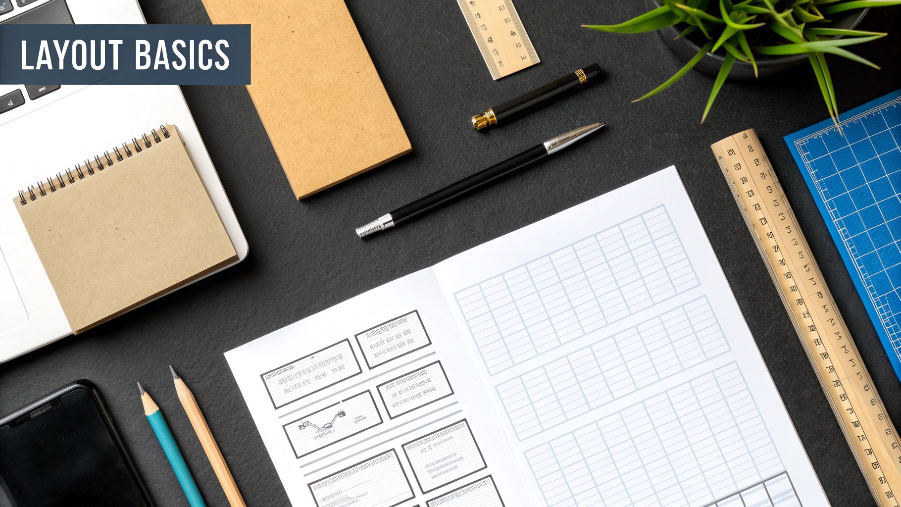
This little bit of history shows how the vocabulary grew right alongside the profession itself. Just look at the image below—it perfectly illustrates how interconnected all these different design elements really are.
You can see how typography, illustration, and photography are all part of the larger world of graphic design. Each one brings its own unique set of terms to the table, creating the rich, detailed language we use today. This guide is here to break it all down for you.
Core Principles and Design Fundamentals
Before you even think about picking fonts or playing with color palettes, we need to talk about the rules of the road. These are the core principles that underpin all good design, the foundational concepts that help you arrange things on a page so they look great and actually work.
Think of them as the grammar for the visual language you're speaking. Get these right, and you’re no longer just dropping elements onto a canvas—you're a real designer, strategically guiding your audience's eye and telling a clear story.
Establishing Visual Hierarchy and Balance
Hierarchy is all about showing what’s most important. You have to tell the viewer where to look first, second, and so on. Designers pull this off by playing with size, color, and placement to create a clear focal point.
It’s pretty intuitive when you think about it. The headline is almost always the biggest text on the page for a reason—it screams "look at me first!" Subheadings are a bit smaller, and body text is smaller still. This creates a natural pecking order that makes information super easy to scan.
Then there's Balance, which is how you distribute the visual weight in your work. It’s what gives a design a feeling of stability and structure, so it doesn’t feel like it's about to tip over.
You’ve got two main flavors of balance:
- Symmetrical Balance: This is when elements on both sides of a central line are a mirror image of each other. It feels very formal, orderly, and calm.
- Asymmetrical Balance: Here, the two sides aren't identical, but the elements are arranged to have the same visual heft. This approach usually creates a more dynamic and interesting layout.
Creating Unity and Structure
Repetition is just what it sounds like—reusing the same or similar elements throughout your design. This could be a specific color, a font, a shape, you name it. It's a fantastic way to tie everything together, creating a sense of consistency that really strengthens your overall message.
By repeating key elements, you build a visual rhythm that can make a brand instantly recognizable. It’s a subtle but incredibly powerful tool for building a solid brand identity.
Next up is Alignment. This is simply how you place text and graphics so their edges line up. Good alignment creates a clean, organized, and intentional look. It’s one of the most basic principles, but a slight misalignment can make a whole composition feel messy and amateur. You can see great principles of design examples that show just how crucial this is in a finished piece.
The Power of Contrast and Space
Contrast happens when two elements are total opposites. Think light vs. dark colors, large vs. small shapes, or a bold font next to a regular one. Contrast is your best friend for creating visual interest, establishing that all-important hierarchy, and making things easy to read. A design without enough contrast just feels flat and boring.
Finally, let’s talk about White Space. This is the empty area—sometimes called negative space—around and between your design elements. It's not wasted space; it’s an active ingredient! Good use of white space cuts down on clutter, makes text more legible, and helps create focus by giving every element room to breathe.
If you want to see how these fundamentals are applied in a specific field, it's worth exploring some fashion illustration techniques and concepts to see visual storytelling in action.
Essential Typography and Text Terminology
Typography is so much more than just picking a pretty font. It's the craft of arranging letters and words to make them clear, legible, and visually appealing. Think of it as giving your words a voice—and getting the details right is what separates an amateur design from a professional one.
This corner of the design world has its own language, covering everything from the tiny bits that make up a letter to the space between entire lines of text. Nailing these concepts can completely change the feel of a design, guide the reader’s eye, and make sure your message actually lands. When you ignore them, text just feels… off. Cluttered, awkward, and a chore to read.
The Building Blocks Of Letters
Every character is built from specific parts, and designers have a name for pretty much all of them. Knowing these terms helps you talk about and critique type with a shared understanding. Here are a few you'll hear all the time.
- X-Height: This is the height of the main body of a lowercase letter—your 'a', 'c', or 'x'. A typeface with a larger x-height often feels bigger and is usually easier to read at small sizes.
- Ascender: The part of a lowercase letter that pokes up above the x-height. Think of the tall stroke in a 'b', 'd', or 'h'.
- Descender: This is the opposite—the part that dips below the main line of text, like the tail on a 'g', 'p', or 'y'.
- Serif: That little decorative foot or stroke at the end of a letter's main stroke. Whether a typeface has them or not is one of the biggest ways we categorize them.
Understanding Typeface Versus Font
This is probably one of the most common mix-ups in design speak. People use typeface and font interchangeably all the time, but for a designer, they mean two different things.
A typeface is the design family—like Helvetica or Times New Roman. It’s the consistent visual style that ties all the letters and characters together. A font, on the other hand, is a specific member of that family. So, Helvetica Bold 12pt is a font. Helvetica is the typeface. Getting this right just makes conversations with other designers or printers a whole lot clearer.
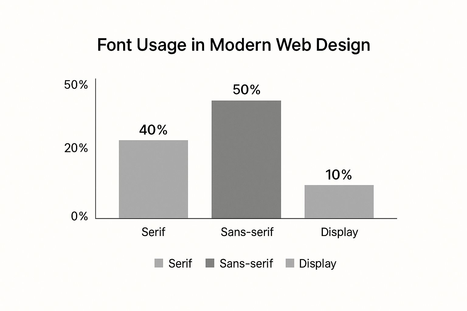
As you can see, Sans-serif fonts pretty much run the show in web design, mostly because their clean lines are so easy to read on screens. If you want to dive deeper into all the different styles, our guide to the various types of typefaces breaks it all down.
Mastering Typographic Spacing
The space around your text is just as critical as the letters themselves. Bad spacing can tank readability and scream "unprofessional." There are three main terms you need to know, and each one controls a different aspect of your layout.
Getting the spacing right isn’t just about making things fit. It’s about creating a visual rhythm that makes reading effortless. It’s the invisible glue holding your design together.
To help keep these straight, here's a quick cheat sheet:
Key Typographic Adjustments Compared
| Term | Definition | Primary Use Case |
|---|---|---|
| Kerning | Adjusting the space between two specific characters. | Fixing awkward gaps, like between an 'A' and a 'V' or a 'T' and an 'o'. |
| Tracking | Adjusting the space uniformly across a group of characters or words. | Making a headline feel more airy or tightening up a block of text to save space. |
| Leading | Adjusting the vertical space between lines of text. | Improving readability in paragraphs so the reader's eye doesn't get lost. |
Let's break them down a bit more.
Kerning is that super-detailed work of nudging individual letters closer together or farther apart for a better visual balance. You'll often need to kern pairs like 'AV' or 'To' so they don't look like they have a weird gap between them. It’s a subtle but powerful touch.
Tracking, sometimes called letter-spacing, is a broader adjustment. Instead of tweaking two letters, you're adjusting the spacing across an entire word, sentence, or paragraph. You might add some positive tracking to a headline to give it a more open, elegant feel.
Finally, there’s Leading (pronounced "ledding"). This controls the vertical space between lines of text. The term is a throwback to when printers used actual strips of lead to separate lines of metal type. Bumping up the leading makes big paragraphs way less intimidating and much easier to read.
Understanding Color and Image Terminology
Color and imagery are the real heart of visual communication. They pack emotion, information, and meaning into a single glance. Getting a handle on the language designers use for them is non-negotiable if you want your work to look pro, both on-screen and on paper.
Trust me, this stuff matters. It’s the difference between a logo that pops on your monitor but looks totally dead on a business card—a classic (and costly) mistake.
This shared vocabulary isn't new, either. It’s been evolving for centuries, hitting major milestones like Gutenberg's printing press around 1450, which kicked off mass communication. Later, lithography in the 18th century let artists reproduce images on a massive scale, cementing the power of visuals. It's a rich history, and if you're curious, you can dive deeper into the evolution of graphic design at RMCAD.
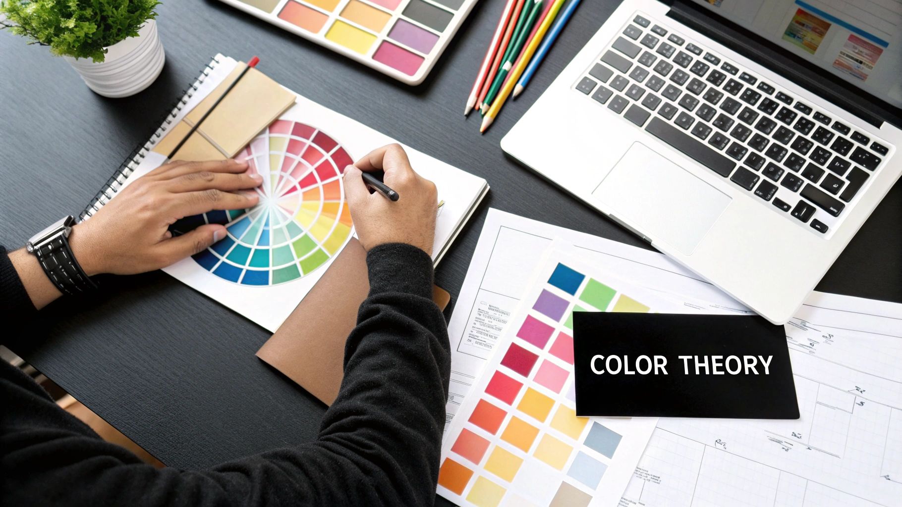
The Language of Color
Color is so much more than just picking something that "looks nice"—it's a science. These terms are what allow us to talk about, manipulate, and reproduce color with complete precision.
-
Hue, Saturation, and Value (HSV): Think of these as the three dials that control any color. Hue is the pure color itself (red, green, blue). Saturation is its intensity, from eye-searingly vivid to a muted grey. Value is simply its lightness or darkness.
-
Color Wheel: This is a designer’s foundational tool. It maps out the relationships between colors, showing you what works and what doesn't. You've got your Primary Colors (red, yellow, blue), Secondary Colors (what you get when you mix primaries: orange, green, violet), and Tertiary Colors (a mix of a primary and a secondary).
Understanding how these relate is the secret to building killer color palettes. If you're hunting for ideas, our guide to stunning https://creativize.net/blog/color-combinations-for-logos is packed with practical ways to put this theory to work.
Navigating Digital vs. Print Color Models
Here’s one of the biggest rookie mistakes in the book: confusing RGB and CMYK. Using the wrong one can absolutely wreck a print job or make your web graphics look washed out.
It all comes down to one thing: digital screens emit light, while printed paper absorbs it. This simple fact means we need two completely different systems to get colors to look right.
RGB (Red, Green, Blue) is what’s called an additive model. It’s built for digital displays—monitors, phones, cameras. It works by mixing red, green, and blue light in different amounts. Crank them all up to full blast, and you get pure white light.
CMYK (Cyan, Magenta, Yellow, Key/Black) is a subtractive model used for anything that gets printed. It creates colors by laying down inks that subtract (or absorb) brightness from white paper. The "K" stands for Key, which is the black ink used to get deep, rich shadows and contrast.
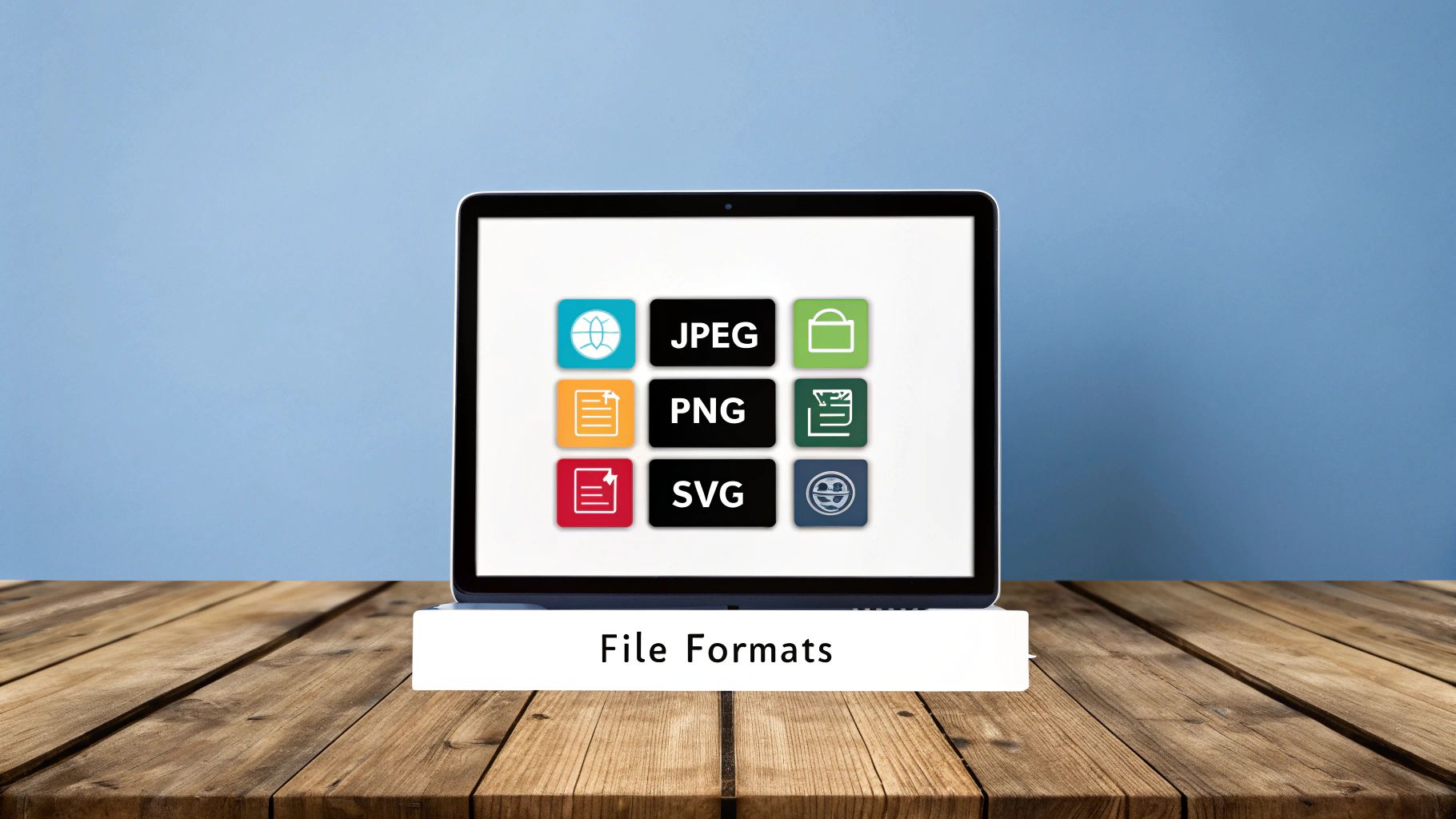
Decoding Image Types and Quality
Just like color, images have their own set of rules. The two main players you need to know are raster and vector, and they couldn’t be more different.
-
Raster Images: These are what you probably think of first. They're built from a grid of tiny squares called pixels. Photos and detailed digital paintings are always raster (think JPEGs, PNGs, GIFs). Their quality is locked to their resolution—try to make them bigger, and you’ll get a blurry, pixelated mess.
-
Vector Images: Instead of pixels, vectors are made with math. They use formulas to create points, lines, and curves. Logos and illustrations are almost always vectors (think SVGs and AIs). Because they’re just math, you can scale them to any size you want—from a tiny app icon to a giant billboard—with absolutely zero loss of quality.
Knowing the difference is huge. It ensures you’re using the right file for the right job, so your final designs always look crisp and professional.
Diving Into Layout and Print Speak
Jumping from a digital screen to a physical, printed page means you're playing by a whole new set of rules with its own special vocabulary. Getting these layout and print terms right is the key to making sure the design on your computer looks just as good on paper.
This lingo covers everything from how a page is structured to the weird little marks printers need to do their job. Honestly, mastering these terms will save you from expensive mistakes and make your conversations with print shops go a whole lot smoother.
Building a Strong Foundation with Grids and Guides
Look at any professionally designed page, and you'll find a grid system hiding just beneath the surface. Think of it as the invisible skeleton holding everything together. Grids give your work structure and consistency, making anything from a simple flyer to a complex magazine spread feel polished and intentional. To really get good at this, you have to know how to design pages with a solid structural base.
A grid is really just a few key parts working in harmony:
- Columns are the vertical strips that hold your content. You might use a simple two-column grid or get fancy with a twelve-column setup for more flexibility.
- Gutters are just the empty spaces between your columns. They're critical for giving your text and images room to breathe so they don't crash into each other.
- Margins are the blank spaces framing the entire page. They keep your content from feeling crowded and create a clean, finished edge.
Getting Your Designs Ready for a Professional Printer
When you hand off a file to a pro printer, they need more than just the pretty design. They need some technical info to make sure the colors are spot-on and the cuts are precise. This is where the real print-specific graphic design terminology comes in.
Heads up: Botching a print file is one of the most common—and costly—mistakes in this field. Terms like bleed, slug, and crop marks aren't just suggestions; they are non-negotiable instructions for the production line.
Bleed is the part of your artwork that stretches past the final trim edge of the page. Printing and cutting machines aren't perfect, so adding a bleed (usually 0.125 inches or 3mm) is your safety net. It guarantees you won't see any ugly white slivers on the final product after it's been cut down to size.
Crop marks are tiny lines you place at the corners of your design. They show the printer exactly where to make their cuts, defining the final dimensions of your piece.
And finally, there's the slug. This is an area outside the bleed where you can stick notes for the printer—things like file names, color bars, or contact info. None of this makes it to the final piece; it all gets trimmed off. For anyone tackling bigger projects, digging into professional book design and layout techniques can offer some really deep insights here.
Sketching it Out with Wireframes and Mockups
Before designers even think about colors and fonts, they use planning tools to map everything out. Wireframes are the first step—they’re super basic, low-fidelity blueprints that focus only on layout. They're just simple boxes and lines, meant to sort out the hierarchy and user flow without getting distracted by visuals.
Once the wireframe gets a thumbs-up, it’s time for a mockup. This is a high-fidelity, static preview of what the final design will actually look like. It has all the real typography, colors, and images, giving clients a realistic peek at the end product before any code is written or ink hits the paper.
Key Terms for Digital and Web Design
As our work has shifted from print to pixels, a whole new language has popped up to describe the user's journey online. If you want to create effective websites, apps, and digital experiences that actually connect with people, you've got to speak the language. This digital-first graphic design terminology is non-negotiable.
This vocabulary covers everything from how something looks to how it works. It’s the bridge between a creative idea and the code that brings it to life, making sure designers, developers, and clients are all on the same page. Without it, things can go off the rails fast.
The User-Centric Duo UI and UX
You hear these two thrown around all the time, and they're often mixed up: UI and UX. They're a team, for sure, but they handle very different parts of the design process.
-
UI (User Interface) Design: This is all about the visuals—what you see and interact with. UI designers are obsessed with the look and feel, picking color schemes, designing buttons, and choosing fonts. Their job is to make the interface beautiful and easy to navigate.
-
UX (User Experience) Design: This is the bigger picture. UX is about the entire feeling a person has when using a product. A UX designer's goal is to make the journey logical, seamless, and even enjoyable from the moment a user lands on the page until they leave.
Think of it this way: UI is the saddle, the stirrups, and the reins. UX is the feeling you get from a great ride on a horse you trust.
Core Web Layout Concepts
Once you've got UI and UX down, a few other terms define how a web page is actually built. First up is Responsive Design, which is pretty much mandatory these days. It just means a site’s layout automatically adjusts to look great on any screen, from a giant desktop monitor to your phone.
You'll also hear about the Hero Image. That's the big, eye-catching banner at the top of a homepage. It's usually paired with a Call-to-Action (CTA)—a button or link that gets you to do something, like "Sign Up Now" or "Learn More." Then there's Above the Fold, which is simply the part of the page you can see without scrolling. Your most important stuff has to go there.
A strong grasp of these digital terms is more than just a professional courtesy; it's a necessity in an industry where 60-70% of designers now work primarily in digital formats. The language of design constantly adapts to market trends and technological shifts.
This evolution shows up in the data, with terms like responsive design and user interface becoming central to the profession. You can dive deeper into how the graphic design industry is evolving on Preceden.com to see the full timeline.
Finally, let's touch on a couple of technical must-knows. A Hex Code is the six-digit code that tells browsers the exact color you want (for example, #FFFFFF is pure white). And CSS (Cascading Style Sheets) is the language that applies all those visual styles—colors, fonts, and layouts—to the HTML structure of a website. Mastering these is key to succeeding in the digital world and truly understanding what is visual communication online.
Got Questions About Design Lingo?
Jumping into the world of graphic design can feel like you're trying to learn a whole new language. It’s completely normal to feel a bit lost at first. Getting a handle on a few key terms not only boosts your confidence but also makes talking to designers, developers, and printers a whole lot smoother—and can save you from some pricey mistakes down the line.
Let's clear up some of the most common questions people have. These quick answers will help you speak the language of design more accurately and sidestep those little misunderstandings that can throw a project off course.
What's the Real Difference Between a Typeface and a Font?
This is easily one of the most mixed-up duos in design. A typeface is the design family—think Helvetica or Times New Roman. It's the overall look and feel. A font, on the other hand, is a specific style within that family, like Helvetica Bold in a 12-point size.
Here's a simple way to think about it: the typeface is the whole album, and a font is just one song on it.
Why Does Being Precise with Words Matter So Much for Print?
When you're working with printers, using the right terminology isn't just about sounding professional—it's absolutely critical for avoiding costly reprints. A simple mix-up over the term bleed (the extra bit of your design that gets trimmed off) can leave you with ugly white borders on your final prints. Same goes for color: if you forget to switch from RGB (for screens) to CMYK (for ink), your vibrant colors might come out looking dull and muddy.
Getting the language right is a functional necessity. It’s the best way to ensure what you see on your screen is exactly what you get in your hands, saving everyone time, money, and a lot of headaches.
How Can I Actually Learn and Remember All These Terms?
The best way to make the vocabulary stick is to start using it. When you're giving feedback on a design, challenge yourself to be specific. Instead of just saying "make it pop," try suggesting something like increasing the contrast or tweaking the visual hierarchy.
Here are a few tricks that work:
- Make some flashcards. Go old-school. Write the term on one side and its definition on the other. It really helps.
- Be an observer. Flip through a magazine or scroll through a website and actively try to spot design principles like alignment, repetition, and white space.
- Don't try to learn it all at once. Start small. Get comfortable with typography terms first, then maybe move on to color theory.
If you practice consistently, this language will start to feel like second nature before you know it.
Ready to team up with professionals who get your vision? Find top-tier creative talent on Creativize and start building your brand with total confidence. Your perfect designer is waiting at https://creativize.net.