
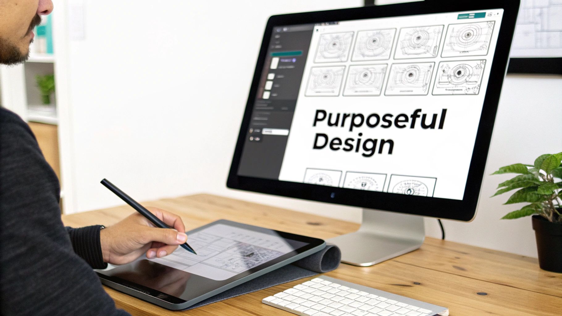
Let's be honest, when most people hear "visual design," their minds jump straight to pretty pictures and cool fonts. And sure, making things look good is part of the job. But that’s just scratching the surface.
Visual design is really about the strategic use of imagery, typography, and space to solve a problem. It’s the intentional craft of creating a visual experience that not only looks great but also guides a user and makes a brand’s story stick.
Understanding Visual Design Beyond Aesthetics
Think of a visual designer less like a painter and more like an architect for your digital presence. An architect doesn’t just pick out paint colors and curtains. They obsess over the flow of a building—how people move through hallways, interact with rooms, and feel inside the space.
That’s exactly what a visual designer does for a website, app, or digital product. They make deliberate, calculated choices that shape how you navigate, what you pay attention to, and how the entire experience feels.
The Purpose Behind the Pixels
Nothing in a great design is accidental. Every single element—the size of a button, the contrast between text and its background, the empty space around an image—is there for a reason. They all work together to make the product intuitive, effective, and maybe even a little delightful.
The goal isn't just to be functional, but to be memorable.
To get there, visual designers are always juggling a few key responsibilities:
- Establishing Hierarchy: They expertly guide your eyes to the most important information first.
- Creating Emotional Connection: They use color, imagery, and style to make you feel something that lines up with the brand.
- Ensuring Usability and Clarity: They make sure the whole thing is easy to understand and navigate without a second thought.
- Building Brand Identity: They weave a consistent look and feel through everything, making a brand instantly recognizable.
Visual design is the silent conversation between a product and its user. It’s the intentional arrangement of elements that speaks to intuition, builds trust, and ultimately makes an experience feel effortless and enjoyable.
Here’s a quick breakdown of what visual design really aims to accomplish.
Core Functions of Visual Design
| Core Function | Primary Goal | Example Outcome |
|---|---|---|
| Communication | Convey information and brand values clearly. | A user instantly understands a product's purpose and trusts the brand. |
| Guidance | Direct the user's attention and actions. | A prominent "Buy Now" button encourages a purchase. |
| Consistency | Create a unified, recognizable brand experience. | A user recognizes the brand's app, website, and social media at a glance. |
| Engagement | Evoke emotion and hold the user's interest. | An immersive, beautiful interface makes a user want to explore further. |
Ultimately, these functions come together to create a cohesive experience that feels both intuitive and memorable.
The Strategic Value in Business
This intentional approach pays off big time. In fact, over 90% of businesses believe strong design is a cornerstone of effective branding and marketing. When people land on a website, they often spend more time looking at the logo than anything else—a testament to the power of a solid visual identity.
Great visual design goes way beyond the surface. It’s about communicating purpose and values, much like crafting a logo for mission-driven brands. It’s the visual translation of a company’s entire story. When done right, it turns a simple digital tool into a powerful extension of the brand, creating a connection with the audience that lasts.
The Core Principles of Effective Visual Design
Great visual design feels effortless, almost invisible. But it never happens by accident. Behind every intuitive interface and beautiful layout is a set of timeless principles—not rigid rules, but foundational guides that designers use to create clarity and meaning.
Think of them as the grammar of a visual language. Just as grammar organizes words into understandable sentences, these principles arrange visual elements into a message that just clicks. They’re the invisible forces that turn a jumble of shapes, colors, and text into a coherent and compelling experience.
When designers master these fundamentals, they can build layouts that aren't just easy on the eyes, but are also dead simple to use.
Establishing Visual Hierarchy
At its heart, visual hierarchy is about controlling the conversation. It’s the art of arranging elements so people see the most important thing first, the next most important thing second, and so on. Without it, a page is just noise—a chaotic mess that makes users want to close the tab.
You see this play out perfectly in a classic newspaper. Your eyes snap to the massive headline, then drift to the subheadings, and finally settle on the body text. This isn't random; it's a deliberate structure designed to let you scan the day's top stories in seconds.
In the digital world, designers pull this off with a few key tricks:
- Size and Scale: Bigger elements feel more important. A massive, bold heading will always get read before a tiny paragraph of text. Simple as that.
- Color and Contrast: A bright, colorful button on a muted background practically screams "click me!" It signals an important action.
- Placement: We naturally see things at the top or center of a page as more important than things tucked into a corner.
This intentional guidance makes an interface feel like it’s reading your mind. It silently answers the question, "Okay, what do I look at next?"
"Good design is obvious. Great design is transparent."
– Joe Sparano
By making the path clear, the designer gets rid of the friction. The user shouldn't have to think about where to look; the design should do that work for them.
Creating Balance and Harmony
Balance is all about the distribution of visual weight. Every element on a page—an image, a block of text, a button—has a certain "weight" based on its size, color, and density. Balance makes sure no single part of the design throws everything off-kilter, creating a feeling of stability and harmony.
Designers usually work with two flavors of balance:
- Symmetrical Balance: This is when elements are mirrored across a central line. It feels formal, orderly, and very stable. Think of a classic wedding invitation.
- Asymmetrical Balance: This is where things get more interesting. You can balance a single large, heavy element with several smaller, lighter ones. This often creates a more dynamic and visually exciting layout.
It’s like a seesaw. You can balance it with two kids of equal weight on either end (symmetrical), or you can put a heavier kid closer to the middle and a lighter kid further out (asymmetrical). Both are balanced, but they give off a completely different vibe.
Using Contrast to Draw Attention
If hierarchy is the map, contrast is the bright red "You Are Here" marker. It’s all about making an element stand out by making it dramatically different from its surroundings. It’s one of the most powerful tools a designer has for grabbing a user's attention.
Contrast comes in many forms:
- Color Contrast: A light object on a dark background (or vice versa).
- Size Contrast: A huge photograph next to a small caption.
- Shape Contrast: A circular button on a page full of sharp-cornered boxes.
- Typographic Contrast: A heavy, bold headline paired with a light, airy body font.
Without enough contrast, a design feels flat, and important stuff gets lost. Text becomes unreadable, and calls-to-action disappear into the background. In fact, studies have shown that simply improving text contrast can significantly boost readability and user engagement. It’s not just about looks; it’s about making things work.
When used well, contrast makes a design pop and ensures the most important messages are seen and understood. To learn more about this and other key concepts, check out our deep dive into the principles of visual design.
Navigating the Design Landscape: UI, UX, and Graphic Design
The world of design can feel like a maze of overlapping acronyms. Is a visual designer just a graphic designer with a different title? Where do UI and UX fit in? It's easy to get confused because these fields are so closely related, often working together to create a single, cohesive product.
To clear things up, let's think about it like building a house. Each design discipline plays a specific, critical role in turning an empty plot of land into a home you actually want to live in.
The Architect and The Interior Designer
User Experience (UX) Design is the architect. A UX designer drafts the blueprint. They aren't worried about paint colors or furniture just yet. Their focus is purely on the functional flow of the house. They ask the big questions: Does the layout make sense? Can you get from the kitchen to the dining room without a hassle? Their job is to make the home logical, intuitive, and effortless to live in.
User Interface (UI) Design is the interior designer. The UI designer takes the architect's blueprint and places all the functional elements. They decide where the light switches, doorknobs, and faucets go. They’re focused on the practical touchpoints you interact with every single day, ensuring every control is easy to find and use. Understanding various user interface design frameworks is a huge part of making sure these touchpoints are consistent and effective.
The Stylist and The Artist
Visual Design is the aesthetic stylist. This is where the personality of the house comes to life. The visual designer curates the overall mood, selecting the color palette, the style of the fixtures, the textures of the materials, and the type of lighting. They ensure every single room feels like it belongs to the same home, creating an environment that’s not just usable, but emotionally resonant and beautiful.
Graphic Design is the artist creating specific pieces. While the visual designer sets the overall style, the graphic designer creates individual assets that fit within that style. Think of them as painting the art for the walls, designing the custom pattern on the kitchen tiles, or crafting the welcome mat at the front door. They produce the tangible visuals that populate the space.
To really nail down the differences, it helps to see them side-by-side. Each role has a distinct focus and set of goals, even when their work overlaps.
Comparing Key Design Disciplines
| Discipline | Primary Focus | Key Goal | Common Deliverables |
|---|---|---|---|
| Visual Design | The overall look and feel; aesthetic harmony and brand expression. | Create a cohesive, emotionally appealing visual identity. | Style guides, mood boards, color palettes, typography systems. |
| Graphic Design | Creating specific visual assets for communication. | Convey a message or information clearly through visuals. | Logos, icons, illustrations, marketing materials, social media graphics. |
| UI Design | The interactive elements and their layout on a screen. | Make the product intuitive and easy to interact with. | Wireframes, prototypes, screen layouts, design systems. |
| UX Design | The user's entire journey and experience with the product. | Ensure the product is functional, usable, and solves a real problem. | User personas, journey maps, usability reports, information architecture. |
As you can see, no single discipline can build the house alone. A great blueprint (UX) is useless without well-placed light switches (UI). A stylish home (Visual Design) feels empty without beautiful art on the walls (Graphic Design). They all work together, each informing the other.
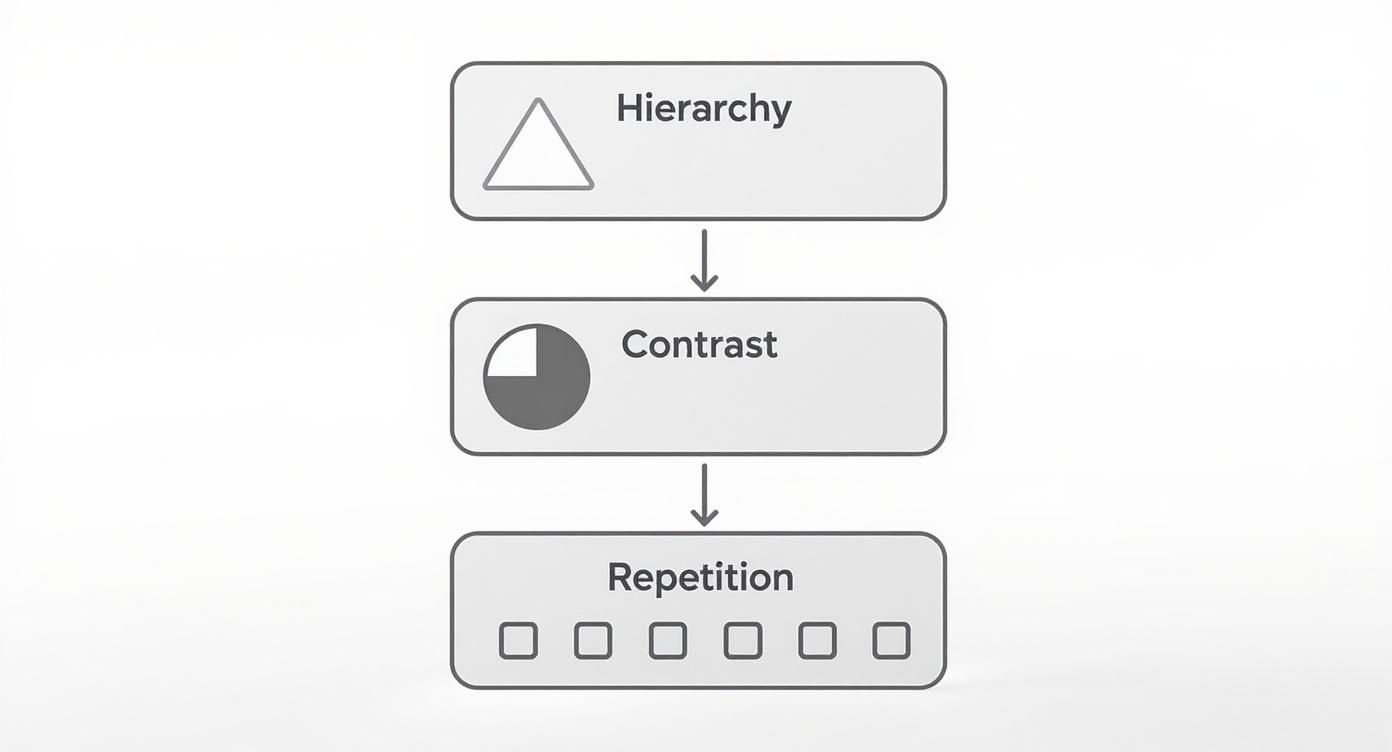
The diagram above shows how fundamental principles like hierarchy, contrast, and repetition are the tools a visual designer uses to build that coherent aesthetic layer, making sure everything feels unified.
The Real-World Impact
The value of these fields working together isn't just theoretical; it's massive. Visual design is a key part of what’s projected to be a $57.5 billion global graphic design industry by 2025. That number alone shows just how critical this work is to modern business.
Understanding the distinctions between UX, UI, visual, and graphic design isn't just academic—it's practical. It helps teams build better products by ensuring the right experts are focused on the right problems, from foundational structure to final aesthetic polish.
Ultimately, a visual designer's true power comes alive when they harmonize their work with these other disciplines. They apply the core rules of visual communication design to translate a brand's soul into a tangible look and feel. To see how these concepts connect more deeply, check out our guide on what is visual communication design. This synergy ensures the final product isn't just a collection of pretty elements, but a unified and purposeful experience.
The Visual Designer's Toolkit: Elements and Assets
So, how do designers actually do the work? It starts with a core set of building blocks that move ideas from abstract principles into real-world application.
Think of it like an artist's palette. A painter starts with a few primary colors, but their real skill is in how they mix them to create mood, depth, and focus. Visual designers do the same thing, blending typography, color, imagery, and structure to build a brand's entire visual story. These aren't just decorative choices—they’re fundamental tools.
The Core Building Blocks
Every great design you see is built on a foundation of four key elements. Each one has a distinct job, but they all work together to create a clear, consistent visual language that speaks directly to the right audience.
-
Typography: This is so much more than just picking a font. It's the art of making text legible, readable, and appealing. It involves choices about font families, size, spacing, and weight to create a clear hierarchy and set a specific tone—whether it's professional, playful, or elegant.
-
Color Palette: Color is a powerful shortcut to emotion. A well-chosen palette can instantly evoke feelings, guide a user's eye to important buttons, and build brand recognition. Designers carefully craft palettes with primary, secondary, and accent colors to create a balanced and memorable visual identity.
-
Imagery: Photos, illustrations, icons, and videos are all essential for telling a story quickly and connecting with people on a human level. The style of imagery you choose—from crisp, professional stock photos to quirky, custom illustrations—says a huge amount about a brand's personality.
-
Layout and Grids: This is the invisible scaffolding that brings order to the chaos. Grids provide a framework for aligning elements consistently, creating balance, and making information easy for our brains to scan. Without this structure, even the best-looking elements would feel messy and unprofessional.
From Elements to Tangible Deliverables
A designer's work doesn't just stop at arranging pixels on a screen. They also produce concrete assets that document every design choice and ensure everyone on a team stays on the same page. These deliverables are the practical, real-world outputs of the creative process.
For instance, they create mood boards to nail down a project's emotional and aesthetic vibe before any detailed design work even starts. These visual collections are absolutely crucial for getting the team and stakeholders aligned. If you want a closer look, you can learn more about creating an effective mood board in our article.
Other key assets include:
- Style Guides: These are the official rulebooks for a brand's visual identity. They document everything from the exact hex codes for colors and specific font weights to the right way to use the logo, making sure everyone creates on-brand materials.
- Design Systems: Think of this as a style guide on steroids. It’s a complete library of reusable components—buttons, forms, navigation bars—along with the principles for how and when to use them. It helps teams build high-quality, consistent products at scale.
- Mockups and Prototypes: High-fidelity mockups show exactly what the final product will look like. Interactive prototypes go a step further and demonstrate how it will actually function. Both are essential for testing ideas and getting feedback.
A visual designer’s toolkit is about more than just software and creative skill. It’s about building a systematic language of colors, shapes, and words that can be documented and replicated, ensuring a brand speaks with one clear voice, everywhere.
Ultimately, these tools and assets are what turn a strategic vision into something you can see and interact with. They provide the structure, consistency, and emotional appeal that define a successful brand experience, making visual design a powerful blend of both art and structured engineering.
The Visual Design Process From Brief to Final Product
Great visual design never just happens. It isn't a magical bolt of inspiration. It’s the outcome of a structured, thoughtful process that takes a simple idea and turns it into something polished, intentional, and effective.
Think of this workflow as a journey shared between the client and the designer. It’s built on clear communication and smart decisions at every turn. Each stage builds on the one before it, making sure the final product doesn't just look amazing, but actually hits its business goals.
Let's pull back the curtain on how this creative work gets done and see the logic behind every aesthetic choice.
Phase 1: Discovery and Briefing
It all starts with a conversation. The discovery phase is about digging into the "why" of the project. Before a single pixel gets placed, a designer needs to get inside the project's head: What are the goals? Who is this for? What is the competition doing? What feeling should it evoke?
This crucial information gets captured in a creative brief. A solid brief is the North Star for the entire project, getting everyone on the same page about goals and expectations. It's the best defense against misunderstandings and keeps the design work focused and on-point.
A strong brief is so important it can genuinely make or break a project. For a deeper dive into this foundational step, check out our detailed guide on how to write a creative brief.
Phase 2: Research and Ideation
With a clear brief in hand, the real digging begins. The designer will start analyzing competitors, exploring what’s trending in the industry, and gathering all sorts of visual inspiration. This research phase is what fuels the creation of mood boards—think of them as curated collections of images, colors, and fonts that start to define the project's vibe.
Then comes the fun part: ideation. This is where the designer starts sketching out initial concepts. These aren’t finished designs; they’re rough, quick explorations of different layouts and visual directions. It’s a time for creative freedom, where throwing a lot of ideas at the wall is the best way to see what sticks.
"Moving from execution to strategy as a designer is essential. The process isn't about just making things pretty; it's about solving problems with a clear, strategic approach from the very beginning."
This early exploration is vital. It helps pinpoint the strongest path forward before anyone invests too much time or money into building out the wrong idea.
Phase 3: Design and Prototyping
Once a promising concept gets the green light, the designer gets to work building high-fidelity mockups. This is where the visual design truly comes to life. Specific colors, typography, and imagery are applied to create a realistic preview of what the final product will look like.
After the mockups, an interactive prototype might be next. This lets stakeholders actually click through the design as if it were a live website or app. It provides a real, tangible feel for the user flow and overall experience.
This stage usually breaks down into a few key steps:
- Wireframing: Building the basic skeleton and structure for the layout.
- Mockup Creation: Dressing the wireframes with the detailed visual style.
- Prototyping: Making the mockups interactive to simulate how they work.
- Presentation: Sharing the designs with the client or team for review.
Phase 4: Feedback and Iteration
No design is perfect on the first try. The feedback and iteration phase is where the magic of refinement happens. The designer presents the mockups or prototype, gathers constructive feedback, and then heads back to the drawing board to make adjustments.
This cycle—present, get feedback, refine—repeats until the design checks all the boxes and everyone is happy with where it's landed. This back-and-forth ensures the final design is not only beautiful but also incredibly effective, perfectly aligning with the goals set out in the original brief. The result is a polished visual experience, ready for final delivery and to be brought to life.
How to Hire and Work With a Visual Designer
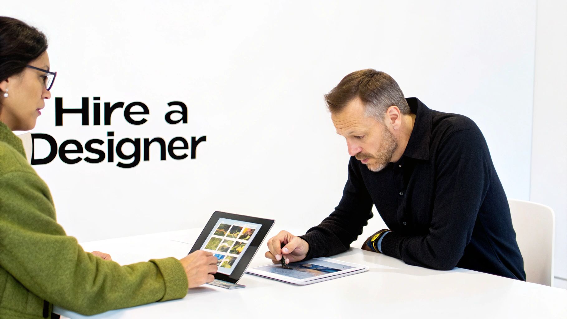
Finding the right visual designer can feel like a huge challenge, but when you click with the right person, it’s a partnership that pays off big time. The secret is looking beyond just a pretty portfolio. You need to find someone whose process and communication style really mesh with what your project needs.
A great place to start is on a specialized platform like Creativize. You can browse portfolios from local talent and find pros with real, verified experience. As you’re looking, don't just get wowed by the final product. Try to dig into the thinking behind it. The strongest portfolios don’t just show off; they include case studies that walk you through the problem, the process, and the solution.
What to Look for in a Portfolio
A truly great designer doesn’t just show you what they made; they tell you why they made it. You want to see portfolios that are packed with strategic thinking and a deep understanding of the brand’s goals.
Here’s what to keep an eye out for when you're vetting a potential hire:
- Problem-Solving: Do they frame their work around a business challenge? This is a huge sign that they connect beautiful design to actual results.
- Process and Rationale: Do they give you a peek behind the curtain? Look for evidence of research, brainstorming, and refinement. You want to see their thought process.
- Consistency Across Projects: Can they switch up their style for different brands while keeping the quality top-notch? Adaptability is key.
- Attention to Detail: Zoom in on the little things. Check for polished typography, balanced layouts, and smart color choices. The small details tell you a lot about their level of craft.
While hiring a visual designer has a lot in common with finding other creatives, the intense focus on brand feel and user perception is unique. For a broader perspective, our guide on how to hire a graphic designer has some extra insights that can help.
Writing an Effective Design Brief
Okay, you've found your designer. Now what? The single most important thing you can do to guarantee a smooth project is to write a solid design brief. Think of it as the roadmap for your project. It gets you and the designer on the same page from day one, cuts down on misunderstandings, and gives you a clear way to measure success.
A design brief isn't just a to-do list; it's a strategic document that captures the heart of your brand and the soul of your project. It gives your designer the power to make smart, creative choices that perfectly match your vision.
To get started, your brief needs to answer a few core questions with total clarity. This sets your project up for success by giving your designer the context they need to create something that truly works.
Key Questions for Your Brief:
- Who is your target audience? Get specific here. Talk about their demographics, what they need, and what their pain points are.
- What is the primary goal of this project? Are you trying to boost sign-ups, level up your brand's image, or launch a new feature?
- What are your core brand values and personality? Is your brand playful and energetic, or more sophisticated and trustworthy?
- Who are your main competitors? What do you love or hate about their design?
- What are the mandatory elements? This includes things like your logo, specific brand colors, or any copy that has to be included.
Common Questions About Visual Design
As you dive deeper into the world of visual design, a few practical questions almost always pop up. Getting these straight will sharpen your understanding and make collaborating with creative pros a whole lot easier.
Here are some no-nonsense answers to the questions we hear most often.
Do I Need a Visual Designer and a UX Designer?
Yep, for most projects, you need both. While their skills definitely overlap, their primary jobs are different.
Think of it this way: the UX designer is the architect. They draw up the functional blueprint for a house, making sure it’s logical and easy to move through. The visual designer is the interior stylist. They pick the colors, furniture, and lighting that turn that functional space into something beautiful, on-brand, and just plain enjoyable to be in. They work in tandem to create an experience that’s as seamless to use as it is great to look at.
What Software Do Visual Designers Typically Use?
Visual designers have a pretty versatile digital toolkit. For creating user interfaces, the big three are Figma, Sketch, and Adobe XD.
When it’s time to craft vector graphics like logos and icons, Adobe Illustrator is the undisputed king. Adobe Photoshop is still the powerhouse for editing photos, and Adobe InDesign comes into play for layout work, both for print and digital. A lot of designers also fire up Procreate for those initial sketches and brainstorming sessions.
Ultimately, effective visual design isn't measured by how good it looks, but by how well it helps a business achieve its goals. It's the strategic intersection of art and commerce.
How Do You Measure the Success of Visual Design?
Success is always tied back to the project's goals. Key metrics often tell the story: improved user engagement (think lower bounce rates or people spending more time on a page) is a big one. Higher conversion rates—more sign-ups, downloads, or sales—are an even more direct signal that the design is working.
But it’s not just about the hard numbers. Stronger brand recognition and positive feedback from users are just as crucial. A successful design doesn’t just grab your attention; it drives real, measurable business outcomes.
Ready to find the perfect visual designer to bring your brand to life? Explore portfolios from top local talent on Creativize and connect with a professional who can turn your vision into a stunning reality. Find your next creative partner.