
Ever look at a logo, an app icon, or a road sign and just get it? That’s the magic of visual communication design. It’s far more than just making things look good; it’s the art and science of using images, typography, and space to send a clear message, tell a story, and guide you without saying a word.
Defining Visual Communication Beyond Pretty Pictures
Think of a visual communication designer as a professional translator. But instead of turning French into English, they translate complex ideas, raw data, or a company's entire mission into a visual language everyone can understand in a heartbeat. It’s the silent conversation happening all around us, all the time.
This is exactly why a simple red octagon on a street corner instantly screams "STOP" across the globe, no text needed. It’s why you can find your way through a bustling airport in a country where you don’t speak the language, just by following the symbols. Or why a restaurant menu’s layout subtly nudges your eyes toward the chef’s specials. That’s all by design.
More Than Just Aesthetics
At its heart, visual communication design is a strategic process. It’s where artistic skill meets human psychology to hit a specific target. This isn’t about splashing on a nice color or picking a cool font—it's about creating clarity and purpose. This discipline pulls heavily from the foundational discipline of graphic design, but its focus is always on the message first.
A designer’s work aims to achieve four key things:
- Inform: Breaking down complex information into something you can actually digest, like a killer infographic or a clear data chart.
- Persuade: Crafting that ad that makes you click "buy now" or a poster that gets you fired up about a cause.
- Guide: Designing the user interface (UI) on your favorite app so seamlessly that you don't even have to think about how to use it.
- Identify: Building a memorable logo and color scheme that becomes the face of a brand. This is a huge part of what makes a brand stick, and you can dive deeper into this with our guide on what is visual branding.
To put it simply, here’s a breakdown of the core components at play.
Core Components of Visual Communication Design
| Component | Primary Goal | Common Examples |
|---|---|---|
| Typography | To create hierarchy, set a mood, and improve readability. | Fonts, kerning, layout, text size |
| Imagery | To evoke emotion, tell a story, and provide context quickly. | Photography, illustration, icons |
| Color Theory | To influence perception, create brand association, and guide focus. | Palettes, contrast, psychological meaning |
| Layout & Composition | To organize information and guide the viewer's eye. | Grids, white space, balance, hierarchy |
Each of these elements works together to build a complete message, turning a simple design into a powerful communication tool.
Visual communication design is the bridge between a message and an audience. A strong design ensures that bridge is sturdy, clear, and easy to cross, while a weak one leaves the audience confused on the other side.
Ultimately, this field shapes how we interact with the world every single day. From the app icon you tap on your phone to the book cover that draws you in, every visual element is a piece of a carefully constructed message. In a world full of noise, it’s one of the most powerful tools we have for creating clarity.
Tracing the Ancient Roots of Visual Storytelling
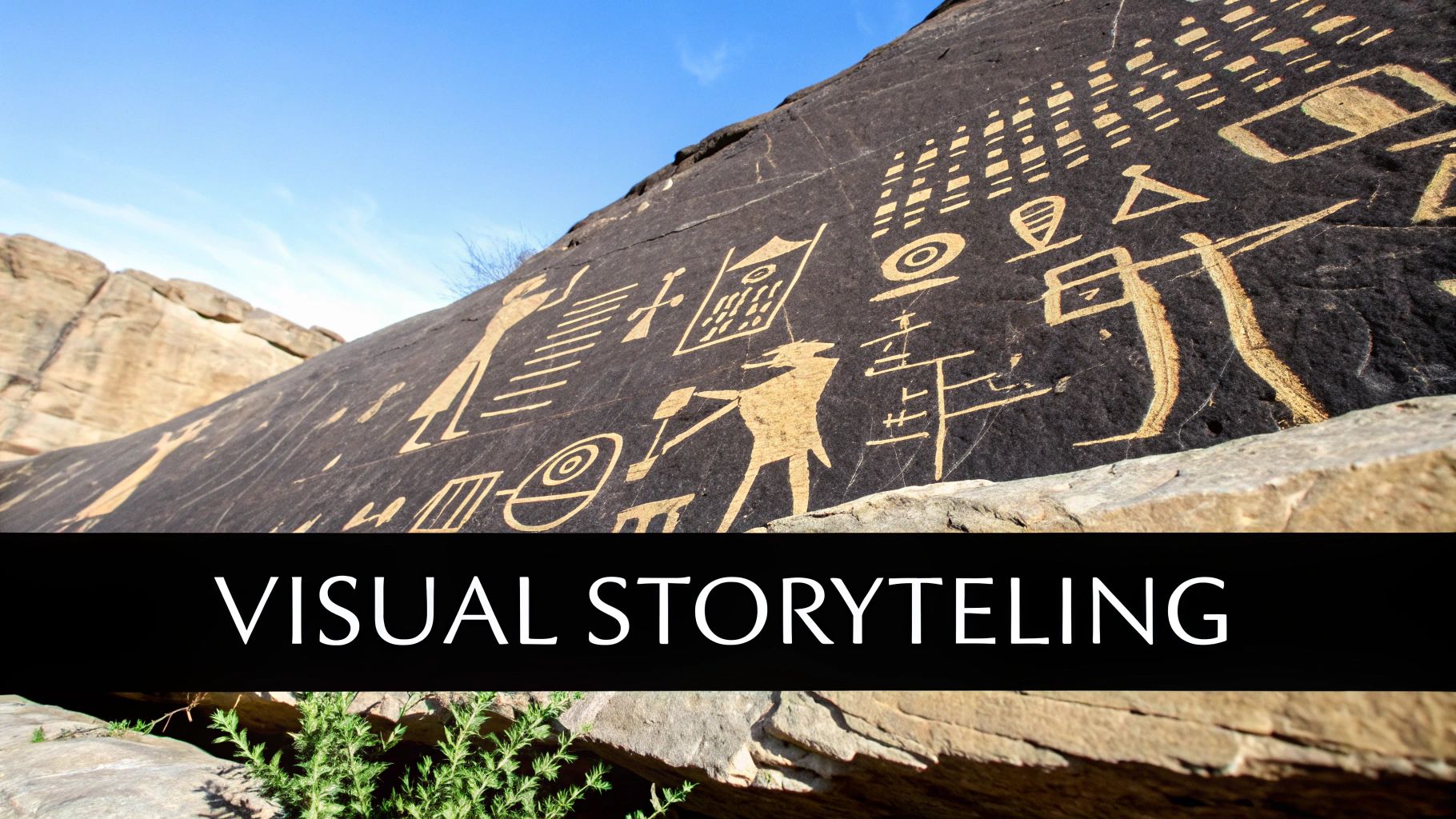
To really get what visual communication design is all about, you have to look way, way beyond your phone screen. This isn’t some newfangled digital trend. It’s a core part of being human, with roots stretching back tens of thousands of years. It’s our instinctual way of sharing knowledge, holding onto memories, and connecting with each other.
Think about it: our earliest ancestors were the original visual storytellers. They were in caves, using charcoal and ochre to record epic hunts, capture scenes of community life, or maybe even perform sacred rituals. These weren't just doodles; they were sophisticated messages meant to communicate complex ideas to the rest of the group.
This ancient drive to use images to share meaning is baked into our evolution. Long before written languages were a thing, visual stories were the main way we passed down critical survival info and cultural beliefs.
From Cave Walls to Coded Systems
That impulse didn't stop at the cave mouth. As civilizations popped up, they started refining this practice into structured systems. Take Egyptian hieroglyphs—a brilliant mix of pictures and phonetic sounds that could record laws, histories, and religious texts with incredible beauty and detail.
These systems were society’s first databases, built not with code but with carefully designed images that carried immense meaning. They laid the groundwork for how we organize and present information today, proving that a single, well-designed visual can say more than a page of text. It's the ancestor of the modern infographic.
The core purpose of visual communication has always been the same: to make a message understandable, memorable, and impactful. Whether it's a 30,000-year-old handprint on a cave wall or a modern app icon, the goal is to create immediate recognition and meaning.
An Enduring Human Need
The story of visual communication design is really a story of human ingenuity. It kicked off with cave paintings, like the art found in South Africa's Blombos Cave, dating back to around 70,000 BCE. As societies got bigger, so did the need for more complex visual systems, leading to written languages like hieroglyphs around 3200 BCE.
All these early efforts point to one universal truth: we are fundamentally wired to understand the world through what we see.
This long history shows that our modern focus on what is visual communication design isn't just a fleeting trend. It’s the next chapter in an ancient human story. Sure, the tools have changed—we’ve swapped burnt sticks for styluses and software—but the need to tell compelling stories visually is exactly the same. Learning how to tap into that power is a huge part of great brand storytelling and building real connections. To learn more, check out our guide on what is brand storytelling.
For most of human history, visual communication was a slow, handcrafted affair. A single book, a single poster—each was a one-off piece of art. But two massive shifts, one powered by ink and the other by steam, completely changed the game.
These revolutions didn't just give us new tools. They tore down the old walls, turning a niche craft into the commercial and cultural force we know today.
The Information Explosion
The first big domino to fall was Gutenberg's moveable-type printing press in the mid-15th century. Before this, if you wanted another copy of a book, someone had to write it out by hand. It was painstaking, expensive, and reserved for the elite.
The printing press was a game-changer. Suddenly, you could print thousands of copies of a book or pamphlet, and every single one was identical. This wasn't just about efficiency; it was about democratizing information. Ideas could now spread like wildfire, fueling the Renaissance and changing the face of Europe forever.
From Mass Production to Mass Persuasion
Fast forward a few centuries, and the Industrial Revolution hits. Factories are now churning out goods at an incredible rate, and for the first time, marketplaces are seriously crowded.
You’re no longer just selling your soap to the local village. You're competing with a dozen other soap makers in a bustling city. How do you make your product stand out? The answer was simple: branding.
The Industrial Revolution didn't just build factories for goods; it built a factory for desire. Visual communication became the assembly line for crafting that desire through posters, packaging, and logos.
New printing technologies like lithography made it possible to create huge, vibrant, colorful posters that turned city streets into public art galleries. The goal shifted from simply informing to actively persuading. This is when we start to see the birth of iconic brands and logos that are still with us more than a century later.
A Craft Becomes a Profession
This commercial boom is what turned designers from artisans into professionals. Think about the scale: the printing press, invented around 1439, led to an estimated 20 million books being printed in just its first 50 years.
By the early 1900s, this foundation gave rise to the first dedicated design agencies, like the Wiener Werkstätte, founded in 1903. Businesses were finally catching on to the power of a strong visual identity. Symbols like Coca-Cola’s logo, introduced way back in 1886, were becoming globally recognized fixtures of consumer culture. You can dive deeper into how tech pushed things forward by exploring the evolution of graphic design.
These two revolutions—one for information, one for industry—laid the groundwork for everything we do in visual communication design today. They set the stage for mass production, brand identity, and the art of commercial persuasion that defines the entire field.
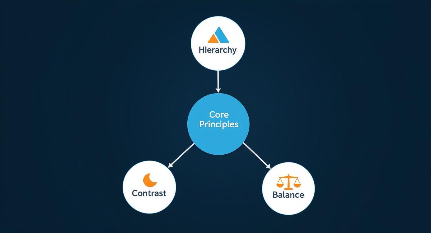
The Core Principles of Effective Visual Communication
Ever wonder why some designs just click while others feel like a jumbled mess? It’s not magic. The difference lies in a handful of foundational rules, all grounded in how our brains take in visual information.
These core principles are the invisible architecture behind every powerful piece of visual communication, whether it's a slick app interface or an unforgettable movie poster.
Think of it like cooking. You can have the best ingredients—gorgeous colors, cool fonts, stunning images—but without a solid recipe, you’ll just end up with chaos on a plate. By mastering these rules, designers can intentionally guide a viewer's eye, set a specific mood, and make sure their message hits home with absolute clarity.
Guiding the Eye with Hierarchy and Contrast
The most critical principle is visual hierarchy. This is the art of arranging elements to scream, "Look at me first!" and then gently whisper, "…now look here." Designers create this path for your eyes using tools like size, color, and placement. That massive, bold headline on a webpage? That’s hierarchy telling you what's most important before you even read the smaller text below it.
Working hand-in-hand with hierarchy is contrast. This is all about making different elements stand out from each other to grab attention and highlight key information. It’s more than just black and white. It can be a chunky, bold font next to a delicate, thin one. Or a single splash of vibrant color in an otherwise muted design. That bright red "Buy Now" button is a perfect example—it practically begs to be clicked because it stands out. That's contrast doing its job.
Effective visual communication isn’t about just decorating a screen; it's about organizing information so that it’s effortless to understand. When hierarchy and contrast are working together, the user doesn't have to think. They're simply guided right to the heart of the message.
Creating Order and Cohesion
Next up is balance, which is all about how the visual weight of elements is distributed in a design. A balanced layout feels stable and right. An unbalanced one? It just feels off, sometimes even stressful to look at.
There are two main flavors:
- Symmetrical Balance: Think of a wedding invitation. Elements are mirrored perfectly on either side of a central line, creating a feeling of formality and order.
- Asymmetrical Balance: This is a bit more dynamic. The elements aren't mirrored, but their visual weights still feel evenly distributed. Imagine a website with a large image on the left and a block of text on the right—it doesn't mirror, but it feels stable.
To tie it all together, designers lean on repetition. When you consistently use the same colors, fonts, or shapes throughout a design, you create a sense of unity and rhythm. This predictability not only makes the design easier to navigate but also strengthens brand identity. It’s why Coca-Cola’s red is instantly recognizable everywhere—repetition builds connection.
Finally, there’s white space—also called negative space. This is the empty area around the design elements. Far from being "wasted," it's one of the most powerful tools in a designer's kit. White space cuts through the clutter, makes text easier to read, and can create a sense of focus or even luxury. High-end brands use generous amounts of it to signal sophistication and quality.
To get a better feel for how these principles come together in the real world, let's look at a few examples.
Design Principles In Action
This table breaks down how these abstract ideas are applied in a practical setting, like a website homepage, and what happens when they're ignored.
| Principle | What It Does | Example Application (e.g., Website Homepage) | Impact When Ignored |
|---|---|---|---|
| Hierarchy | Establishes importance | The main headline is the largest text on the page. | User doesn't know what to look at first; key messages get lost. |
| Contrast | Creates focus and directs attention | A brightly colored "Sign Up" button against a neutral background. | Important actions are missed; the design feels flat and unengaging. |
| Balance | Provides stability and structure | A large hero image on one side is balanced by text blocks on the other. | The layout feels chaotic and unprofessional, making users uneasy. |
| Repetition | Unifies and strengthens the design | Using the same font style and color for all section headings. | The design looks disjointed and messy; brand identity is weakened. |
| White Space | Improves readability and reduces clutter | Ample spacing between paragraphs and around images. | The page feels cramped and overwhelming, causing users to leave. |
As you can see, these aren't just arbitrary rules—they're the grammar of visual language, turning simple elements into a compelling story. Applying these ideas effectively in a digital context is what separates a confusing site from a fantastic one. Gaining a solid grasp of what makes good website design is the key to creating user experiences that feel intuitive and natural.
If you're ready for a deeper dive, our guide on the core principles of visual design breaks down each concept even further.
The Modern Applications of Visual Communication Design
So, where does visual communication design actually show up in the real world? It's not some lofty, abstract concept—it’s the engine humming behind the brands, apps, and experiences you bump into every single day. From the logo on your morning coffee cup to the layout of the news site you scroll through, designers are constantly, and often invisibly, shaping your world.
You can think of the field as a massive tree with several major branches. Each branch is a specialized discipline where designers use the same core principles to solve very different problems. While they all share the same roots in visual theory, their applications are distinct and absolutely vital to modern business and life.
These applications run the gamut from building a company's entire identity from scratch to making a complex piece of software feel totally intuitive. Getting a handle on them clarifies exactly what is visual communication design and reveals just how much value it brings to the table. This concept map really highlights how interconnected these core principles are.
As you can see, things like hierarchy, contrast, and balance aren't just isolated rules. They're the foundational ideas that support every single one of these specializations.
Branding and Identity Design
This is the bedrock of how any organization presents itself to the world. Designers here create logos, color palettes, and typography systems that come together to form a cohesive visual language.
Think of Nike’s iconic swoosh or Tiffany & Co.'s unmistakable blue box. These aren't just pretty graphics; they are powerful assets that build trust, recognition, and a genuine emotional connection with people. This visual identity has to be consistent everywhere, from a business card all the way to a massive billboard.
A strong brand identity is a company's visual handshake. It's that first impression that communicates personality, values, and professionalism before a single word is ever spoken.
User Interface (UI) and User Experience (UX) Design
Every single time you tap through an app or browse a website, you're interacting with the work of UI and UX designers.
UI designers are focused on the visual stuff—the buttons, the icons, the layout—to make sure the interface is both attractive and clear. UX designers, on the other hand, map out the entire user journey to make sure the product is logical, efficient, and even enjoyable to use. When they work together, they create those seamless digital experiences that just work without you having to think about it.
Marketing and Advertising Design
This is probably the application you see the most. It’s all about creating the visuals for social media campaigns, web banners, print ads, and email newsletters that have to grab attention and persuade you to take action.
A great marketing design doesn't just look good; it understands its audience and uses psychological cues to drive clicks, shares, and sales. It directly impacts a business's bottom line.
Here are a few other key areas where visual communication design shines:
- Environmental Design: This involves creating the signs and wayfinding systems in physical places like airports, museums, and hospitals. The goal is to help people navigate complex environments without getting lost or frustrated.
- Motion Graphics Design: Designers in this field bring static elements to life with animation. It's perfect for creating slick explainer videos, dynamic logos, and eye-catching social media content. You can dive deeper into this with our guide on how to animate a logo to see it in action.
Navigating the Shift from Print to Pixels
The digital age didn't just hand designers a new set of tools; it completely rewired the entire craft of visual communication. For centuries, design was a physical act—it lived on posters, in books, on things you could touch. The process was hands-on, permanent. Now? It’s fluid, interactive, and lives entirely on our screens.
This monumental shift really started gaining steam in the 1970s, but the real explosion happened when personal computers and game-changing software landed on our desks. Tools like Adobe Photoshop and Illustrator put an unbelievable amount of creative power right into designers' hands, yanking the whole workflow out of the physical world and into the digital one. Suddenly, you could experiment in an instant and share your work with the entire globe.
Then came the internet, which created a canvas nobody had ever imagined. The first websites were pretty basic, but they cracked open a new frontier for designers—a space that was interactive and non-linear. This new world demands a whole different way of thinking about how people move through information, which is why fields like information architecture became so crucial. You can actually dive deeper into that in our guide on what is information architecture.
From Static Pages to Dynamic Platforms
This evolution wasn't just about trading X-Acto knives for a mouse. It fundamentally changed what designers do.
- Interactivity: A poster just hangs there. A digital design, on the other hand, can react when someone clicks or taps. This new reality gave birth to UI/UX design, which is all about crafting experiences that feel intuitive and genuinely engaging.
- Accessibility: Design isn’t just for the pros anymore. AI-powered platforms are opening the doors for anyone to create great-looking visuals, which is shaking up the whole industry.
- Immediacy: The feedback loop is now instantaneous. Designers can track how people are actually using their work in real-time, giving them the power to tweak, refine, and optimize on the fly.
The core principles haven't changed—hierarchy, contrast, and balance are still king. But the pixelated canvas forces us to apply them in a way that accounts for clicks, taps, and scrolls. The viewer isn't just a passive observer anymore; they're an active participant.
The journey from print to pixels has been incredibly fast. The launch of Photoshop in 1988 gave designers a new level of control. By 2020, the internet was connecting over 4.66 billion people to visual content every single day.
Now, platforms like Canva have blown past 100 million monthly active users, proving just how much demand there is for accessible design tools. At the same time, sites like Instagram and Pinterest have become global galleries, showcasing visual work on an unprecedented scale.
A Few More Things
As we wrap up, a couple of questions usually pop up. Let's clear the air on the big ones so you can see how all these ideas fit together in the real world.
So, Is This Just Another Name for Graphic Design?
Not quite, but they’re definitely related. Think of it this way: visual communication is the whole strategy—the why and how of sending a message with visuals. Graphic design is one of the most important tools you use to execute that strategy.
A graphic designer is the person crafting the beautiful logo, the perfect social media image, or the slick brochure layout. The visual communication designer is the one making sure that logo, that image, and that brochure all work together to tell the same cohesive story and achieve a specific goal.
You could say that all graphic design is visual communication, but not all visual communication is graphic design. The field is much broader, pulling in things like UI/UX for apps, motion graphics for video, and even the design of physical spaces.
What Kind of Jobs Are We Talking About Here?
The career paths are way more varied than you might think and go well beyond what people consider traditional design roles. Since visual communication is a skill every industry needs, the opportunities are everywhere.
You could find yourself in a role like:
- Brand Identity Designer: The architect of a company's entire visual world, from the logo to the color palette.
- UI/UX Designer: Crafting how people see, feel, and interact with websites and apps. It’s all about making digital experiences intuitive and beautiful.
- Marketing Designer: The creative force behind ads and social media campaigns that grab attention and get results.
- Motion Graphics Artist: Bringing static designs to life with animation, making everything from explainer videos to slick title sequences.
Each of these roles uses the core principles of visual communication to solve completely different kinds of problems.
Ready to bring your creative vision to life? Find talented local designers and animators on Creativize to build a brand that truly connects with your audience. Discover top creative professionals today at https://creativize.net.