
When people talk about a brand, the first thing that usually comes to mind is the logo. But that's just the tip of the iceberg. Your visual branding is the entire look and feel your company presents to the world—it’s the silent language that communicates your personality, your values, and what you stand for.
Think of it as the complete aesthetic experience of your business. It's the collection of visual signals that makes your brand instantly recognizable, even from a distance.
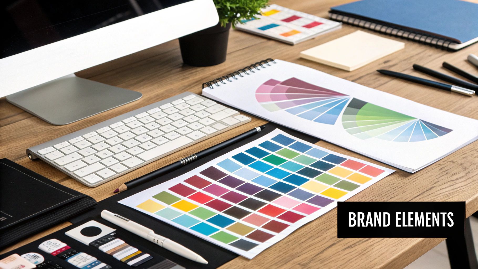
What Is Visual Branding Beyond a Logo
Imagine your brand is a person. Their logo might be their signature, but their visual branding is their entire personal style—their choice of clothing, their haircut, the way they carry themselves. All these elements work together to create a distinct first impression. Your brand’s visual identity does the same thing. It’s a silent storyteller, shaping perceptions before a single word is ever read.
This whole system is built on a few key components working together in harmony:
- Color Palette: The specific set of colors that trigger the right emotions and set the overall mood for your brand.
- Typography: The fonts you use give your brand a voice. Is it modern and minimalist? Or maybe it's classic and dependable?
- Imagery & Iconography: The photos, illustrations, and custom icons that tell your brand's story visually and reinforce what you're all about.
When you see these elements applied consistently everywhere—from your website and packaging to your social media posts—they create a powerful, unified presence. That consistency is what builds trust and recognition. For a deeper dive, you can find some additional insights into visual branding from other industry pros.
At the end of the day, powerful visual branding creates a real emotional connection with people. It builds trust, helps your business get noticed in a crowded market, and is a fundamental piece of learning how to build a strong brand identity that truly connects with your audience.
The Psychology of a Strong Visual Identity
Here's something wild: a strong visual identity speaks a language our brains already know, way before we have time to think. It turns out, the human brain chews through images 60,000 times faster than text. That means your branding makes a first impression long before a customer ever reads a single word of your copy.
It’s all about creating an immediate connection. This visual handshake triggers gut feelings and mental shortcuts that shape how people see you on a subconscious level.
Think of it like this: when you see a familiar logo or color scheme, your brain doesn't have to put in the work to figure out who's talking. It's an instant "oh, I know them." That sense of ease and familiarity is the bedrock of trust, making your brand a comfortable, reliable choice in a very crowded room.
The Power of Color and Consistency
Color is your secret weapon. Seriously. It’s not just about making things look pretty; it's about signaling your brand’s personality and intent in a flash. Believe it or not, up to 90% of snap judgments people make about products are based on color alone.
The right palette can instantly communicate what you're all about.
We see it all the time:
- Blue: Banks and tech companies love it. Why? It screams trust, security, and dependability.
- Red: This one gets the heart pumping. It creates urgency and excitement, which is why you see it everywhere in sales and the food industry.
- Green: Got a wellness or eco-friendly brand? Green instantly signals health, nature, and calm.
This is a huge reason why a brand’s signature colors can boost recognition by a massive 80%. The specific shades you pick—and how you use them—are a core part of the principles of design that make a brand stick in people's minds.
At the end of the day, a strong visual identity isn't just art—it's science. It’s about influencing how people feel about your business and building a connection that goes way deeper than words ever could.
The Building Blocks of a Cohesive Visual Brand
So, what actually is visual branding? Think of it like building a house. It's not just one wall or a single roof; it’s a whole system of interconnected parts, each with a specific job, all working together to create something strong and unified.
When you choose these elements with real intention and use them consistently, they create a powerful visual language that tells your brand’s story in a single glance.
Your Unmistakable Logo
The logo is the front door to your brand. It's often the very first thing people see, and it’s the piece they’ll remember most. A killer logo is way more than just a pretty picture; it’s a strategic symbol that packs your company's whole vibe into a simple, memorable mark. It needs to be distinctive and versatile, looking just as good on a massive billboard as it does as a tiny social media icon.
The Emotional Power of Your Color Palette
Color is probably the most powerful non-verbal tool you have. Your brand’s color palette sets the emotional temperature, shaping how customers feel about you on a gut level. These aren't random choices; they're strategic. Bright, energetic colors might be perfect for a fitness brand, while muted, earthy tones could better represent an organic skincare line.
A consistent visual brand relies on a clear hierarchy of its core elements. Each component—from logo usage to typography—plays a distinct role in building a recognizable identity.
This infographic shows how these key pieces fit together to nail that brand consistency.
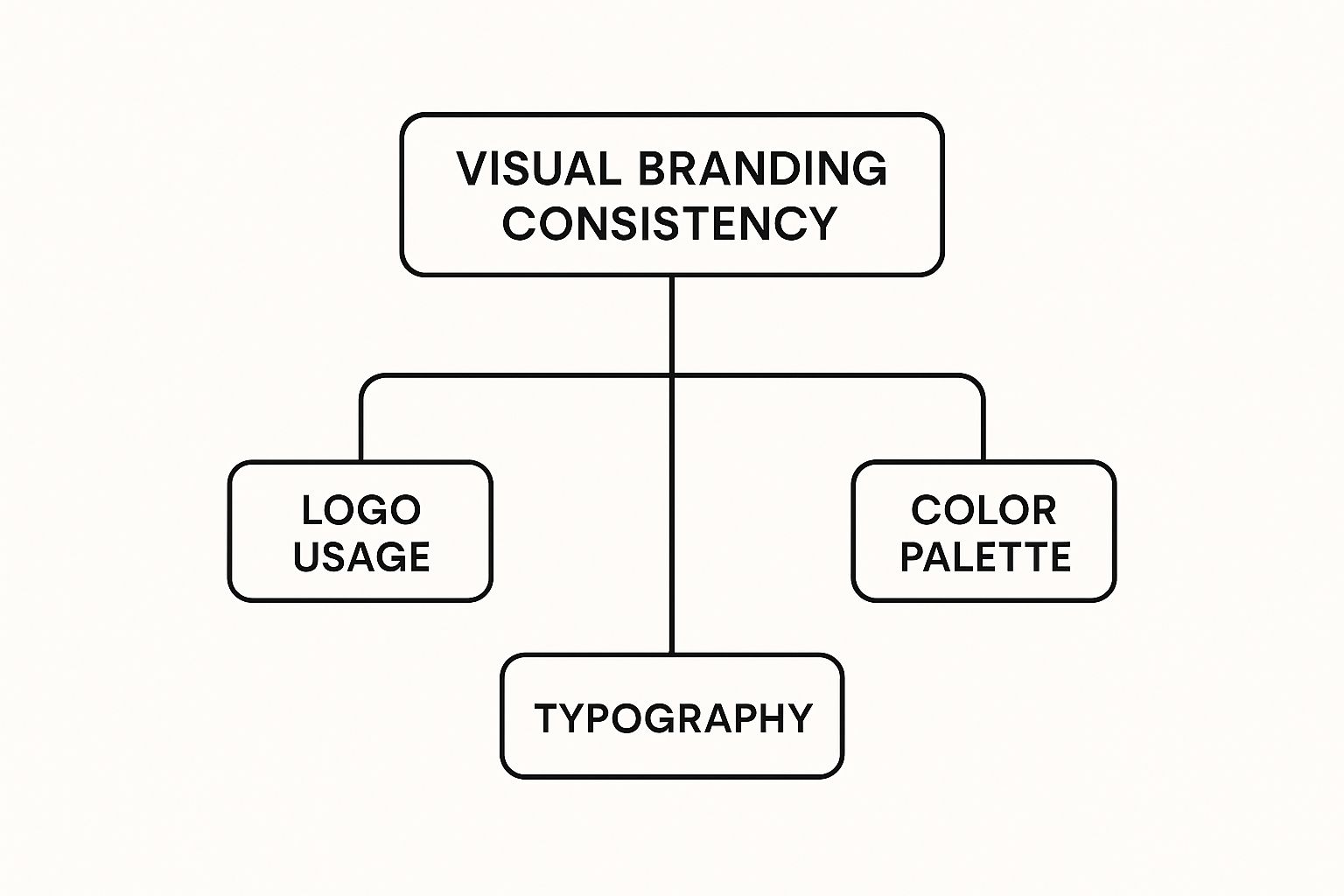
As you can see, consistency is the master principle that governs how your logo, colors, and fonts show up across everything you make. If you need a hand with this crucial step, check out our guide on choosing effective color combinations for logos.
Typography That Speaks Volumes
If color sets the mood, typography gives your brand its voice. The fonts you pick say a ton about your personality. Are you modern and sleek with a clean sans-serif? Or are you more traditional and trustworthy with a classic serif?
Key typographic elements to lock down include:
- Primary Typeface: Your main headline font that really grabs attention.
- Secondary Typeface: Used for all the body text, making sure everything is easy to read.
- Hierarchy: Using different font sizes and weights to guide the reader’s eye where you want it to go.
Imagery and Graphic Elements
Finally, the photos, illustrations, and icons you use are what bring your brand’s world to life. This isn't just about finding nice pictures; the content should always feel like it belongs to you. Whether it’s through a unique photo filter, a specific illustrative style, or a custom set of icons, your imagery should be instantly recognizable as part of your brand family.
How Winning Brands Use Visuals to Tell Their Story
The best visual branding does way more than just look good—it tells a story. Think about it. The brands we really connect with have mastered this, making sure every single visual element, from their color palette to the fonts they choose, works together to broadcast one single, powerful idea about who they are. It’s how they create that instant, gut-level connection with us.
Take a brand like Apple. Their whole visual strategy is a masterclass in minimalism and sophistication. They use clean lines, tons of white space, and stunning product photography to tell a story of innovation and elegance. It’s a silent message that their products aren't just gadgets; they're beautifully designed objects that fit into a certain lifestyle.
This screenshot from their website says it all.
See how there’s no clutter? The focus is all on that one heroic product shot. That choice alone reinforces their core message of simplicity and premium quality, all without a single word.
Different Stories, Different Visuals
But here's the thing: not every brand should try to be Apple. The real goal is to get your visuals to line up with your unique brand personality and what you want to say.
A brand's visual identity is its narrative in visual form. Coca-Cola tells a story of nostalgia and happiness, while Mailchimp’s quirky illustrations tell one of creativity and user-friendliness.
Let's look at a couple of totally different approaches:
- Coca-Cola: That iconic red and classic script font aren't just design choices; they're emotional cues. They’re meant to stir up feelings of timeless tradition, happiness, and moments shared with friends. Their visual story is all about nostalgia, and they've stuck to it for over 100 years.
- Mailchimp: On the flip side, Mailchimp uses playful illustrations, a bright, friendly yellow, and a quirky vibe. This tells a story of approachability, making a service that could feel complicated (email marketing) seem fun and genuinely easy to use.
These examples really drive home how central visual choices are to storytelling in marketing. When your visuals consistently tell your brand’s story, you build an identity that’s not just easy to recognize but one that truly resonates with the people you’re trying to reach.
How Visual Branding Drives Real Business Growth

It’s easy to think of visual branding as just a creative flourish—something that looks nice but doesn't really move the needle. But that couldn't be further from the truth. A strong visual identity is a direct investment in your bottom line, building the kind of instant recognition that lays the groundwork for customer loyalty and real trust.
Think about it. Every time someone sees your distinct colors, logo, and fonts, it reinforces their connection to you. That familiarity is powerful. It’s what makes them pick you over a competitor and stick around for the long haul. A polished, professional look also quietly signals quality, giving you the confidence to charge what you're truly worth.
From Cost Center to Value Creator
One of the biggest mistakes I see businesses make is treating branding as an expense. It's not. It's a long-term asset that builds tangible brand equity—the actual, measurable value your brand name holds. Getting this mindset right is everything.
It seems other businesses are catching on, too. By the end of 2023, more than 75% of businesses planned to pump more money into their brand strategy than into physical buildings. And it makes sense: brands that keep their visual story straight see their value jump by an average of 20%. The link between a cohesive look and real financial worth is crystal clear.
This isn't just theory; it’s about how these visuals directly impact key metrics:
- It boosts customer retention. Familiar visuals make people feel comfortable and build trust, which is why they keep coming back.
- It helps you stand out. In a sea of competitors, a unique visual identity is your lifeline. It makes you memorable.
- It lowers acquisition costs. When people already know and recognize your brand, you don't have to work as hard (or spend as much) to win them over. To see how this works, check out our guide on customer acquisition cost calculation.
And don't forget your physical space. For brick-and-mortar shops, mastering store signage design can turn your storefront into a 24/7 brand ambassador that pulls customers right off the street.
Alright, let's move from the "what" and "why" to the "how." This is where the magic happens—where you take all those big ideas about your brand and turn them into something people can actually see and feel.
Putting together a visual branding strategy isn't about just picking colors you like. It’s a thoughtful process, a bit like a translator converting your company's soul into a visual language everyone can understand.
First thing's first: define your brand's personality. Is it the life of the party, or the steady, dependable friend? Nailing this down sets the stage for every single visual choice you make. It's your anchor for authenticity.
Next up, you’ll want to pull together a mood board. Think of it as a creative playground. You're gathering images, colors, textures, and fonts that just feel right—the ones that capture the vibe you're aiming for. This isn't just for fun; it's your North Star for the entire design process.
Nailing Down Your Core Visuals
With your brand personality locked in and your mood board guiding you, it’s time to get specific. This is where you build the toolkit you'll use every single day.
- Logo Design: This is your handshake. It needs to be memorable and work everywhere, from a tiny favicon to a giant billboard.
- Color Palette: Pick your power trio—a primary, secondary, and accent color. These shades will do the heavy lifting in setting the mood.
- Typography System: Choose a couple of fonts that play well together. You'll need one for attention-grabbing headlines and another for easy-to-read body text. This creates a clear visual flow.
You'll also need to decide on your imagery style. Are you all about sleek, professional photos? Or maybe quirky illustrations are more your speed? And you absolutely cannot forget video. Seriously. A whopping 87% of online marketers now use it as a go-to tool for a reason.
It just works. In fact, tweets with videos get a staggering 10 times more engagement than those without. If you want to dive deeper, you can discover more about visual content statistics and see just how much it can move the needle.
The final, and arguably most important, step is to get all of this documented in a brand style guide. This is your rulebook, your single source of truth. It ensures that everyone—from your new intern to a freelance partner—uses your visual identity the exact same way, every time. Consistency is king.
Got Questions About Visual Branding?
If you're digging into visual branding for the first time, you probably have a few questions. It’s a big topic! Let's clear up some of the most common things business owners and marketers ask.
How Much Does Visual Branding Cost?
This is usually question number one, and honestly, the answer is "it depends." You could snag a simple logo from a freelance marketplace for a few hundred bucks. On the other end, a full-blown visual identity system from a top-tier agency can easily run into the thousands.
It all comes down to the scope of the project and the level of expertise you need. But think of it less as an expense and more as a long-term asset. A killer visual identity can help you charge a premium and builds brand equity that pays dividends for years to come.
How Long Does The Process Take?
Just like cost, the timeline hinges on how complex the project is. A basic logo design might get turned around in a week or two.
But a complete visual branding project—we're talking strategy, mood boards, design concepts, revisions, and a comprehensive style guide—usually takes somewhere between four to twelve weeks.
Rushing it is a classic mistake. You have to give your creative team the space to do their research, explore different directions, and really nail down an identity that connects with your audience and feels like you.
Can I Do My Own Visual Branding?
You absolutely can, but there are some trade-offs. DIY design tools have made it incredibly easy for anyone to create a logo and marketing materials. This is a solid starting point for new businesses running on a tight budget.
The thing is, a professional designer brings a level of strategic thinking and technical skill that a tool just can't match. They get the psychology of color, the nuances of typography, and how to build a cohesive system that grows with your business. If you find yourself reinventing the wheel for every new social post or flyer, it might be time to bring in an expert.
Ready to build a visual brand that turns heads and drives growth? Creativize connects you with top-tier creative professionals who can bring your vision to life. Find the perfect designer for your project today!