
Ever tried to find something on a website and ended up totally lost and frustrated? That's what happens when there’s no thought put into its structure. Information architecture (IA) is the secret sauce that prevents this chaos.
Think of it as the invisible blueprint for a website or app. It’s like the layout of a well-designed grocery store that guides you from the produce aisle to the checkout without a second thought.
So, What Is Information Architecture, Really?
Imagine walking into a massive library where all the books are just dumped in random piles on the floor. No signs. No categories. No librarian to ask for help. Finding the one book you need would be an absolute nightmare, right?
That chaotic library is exactly what a website feels like without solid IA.
Information architecture is the thoughtful process of making the complex clear. It has nothing to do with how a site looks—that’s visual design. Instead, it’s all about how a site works and how all its information is connected. The whole point is to build a structure that just feels right to the user, almost like it’s reading their mind and guiding them where they need to go.
The Foundation of User Experience
Good IA is the unsung hero of a great digital experience. When it’s done well, you don’t even notice it; you just find what you’re looking for effortlessly. But when it's bad, the user’s frustration is instant and overwhelming. This is why IA is so critical to overall user experience design best practices.
At its heart, IA is a balancing act between three key things:
- Users: Who are they? What do they actually need from you? This means getting to know your audience inside and out. A great starting point is learning how to conduct user research to get those crucial insights.
- Content: What information do you have? This involves taking stock of every page, article, and piece of media to figure out how it can be grouped logically.
- Context: What are the business goals? What are the technical limitations? The final structure has to work for the user and meet the needs of the organization.
From Blueprint to Digital Space
This whole idea of structuring information isn't brand new, even though we mostly talk about it in a digital context. The roots of IA go back to the 1960s, but the term itself was officially coined in 1976 by Richard Wurman, an architect who realized that the principles of building design could be applied to complex information.
He saw the "architecture of information" as the key to making things understandable—a core idea that still drives the field today.
"Information architecture is about making the complex clear, whether for end users, product teams or machines… This supports everyone to access the right information at the right time, when it matters most."
Ultimately, IA is the skeleton that the entire user experience is built on. It determines the navigation menus you click, the categories you browse, and the search results you see. Without that solid foundation, even the most beautiful website will fail at its most basic job: connecting people with the information they're looking for.
Exploring the Four Core Systems of IA
Information architecture might sound like a dense, academic concept, but it really boils down to four core systems that work together to bring order to chaos. If you can get your head around these, you'll move past the theory and into a much more practical way of thinking. Think of them as the pillars holding up any well-designed website or app.
These are the fundamental building blocks that dictate how people find, understand, and move through your content.
This map gives you a great visual of how IA helps people sort through information, find what they need, and actually make sense of it all.
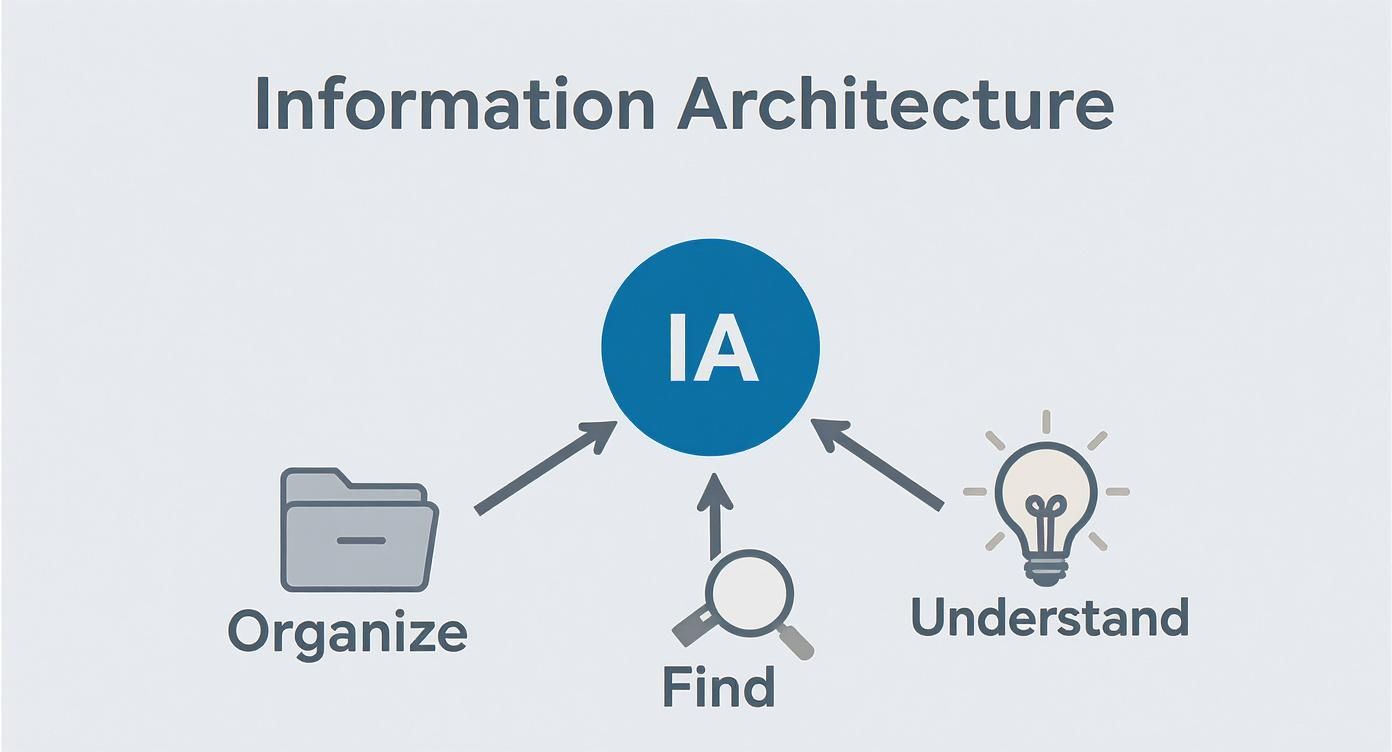
As you can see, the end goal is always to make information digestible and useful. The four systems are how we get there.
1. Organization Systems
First up, you have organization systems. This is all about how you group and categorize your content. The key here is to structure everything in a way that feels logical and predictable to your users, not just in a way that makes sense to your internal team.
Think about how you sort your music on Spotify. You might group songs by genre (rock, pop, jazz), by artist (alphabetically), or even by mood (workout, chill, focus). Each approach serves a different need, and the "right" one depends entirely on how you want to access your tunes. It's the exact same principle for a website—the content structure has to align with how users expect to find it.
A few common ways to organize information include:
- Alphabetical: A no-brainer for when people already know what they're looking for, like finding a brand name in a store's directory.
- Chronological: Perfect for time-sensitive content. Think blog archives, news feeds, or company updates.
- Topical: This involves grouping content by subject matter. A health website might have sections for "Nutrition," "Fitness," and "Mental Wellness."
- Audience-Specific: Tailoring content for different user groups. For example, a university site with separate sections for "Prospective Students" and "Current Students."
2. Labeling Systems
Next, we have labeling systems. This is simply the language you use to represent all that information. Labels are the signposts in your digital space—the words on your navigation menu, your page titles, and the text on your buttons. If your labels are confusing or inconsistent, people will get lost. Fast.
Just consider the difference between a button that says "Submit Query" and one that says "Send Message." The second option is so much clearer because it uses simple, everyday language that doesn't require a second thought.
Good labeling reduces cognitive load, meaning users don't have to spend mental energy trying to decipher jargon. The goal is to use language that aligns with your audience's vocabulary, not internal company terminology.
3. Navigation Systems
The navigation system is how people actually move through all the information you've so carefully organized and labeled. It's the collection of menus, links, and other pathways that guide them from point A to point B. If organization is the blueprint of a house, navigation is the hallways, doors, and staircases that let you get from room to room.
A solid navigation system gives users context and flexibility. A global navigation bar shows the main sections of the site, while breadcrumbs tell them exactly how they got to their current page. This keeps people feeling confident and in control, not like they've fallen down a rabbit hole. This kind of user-first approach is also a huge part of design thinking. You can dig deeper into this by understanding what is design thinking and see how it all connects back to putting the user's needs first.
4. Search Systems
Last but not least, there's the search system. This is for the users who know what they want and don't feel like browsing to find it. For any site with a lot of content, a good search function isn't just a nice-to-have; it's an absolute must. Just think about the search bar on Amazon—for many shoppers, it's the only way they interact with the site.
A powerful search system goes beyond simple keyword matching. It should offer things like filters, advanced search options, and maybe even helpful suggestions when a search comes up empty. It’s the ultimate safety net, catching anyone who couldn't find what they were looking for by clicking around.
When you get right down to it, these four systems—organization, labeling, navigation, and search—are all deeply connected. Nailing your information architecture is the bedrock for effective website content management, making sure everything is structured logically and is easy for every single user to find.
Mastering the Eight Principles of Great IA

So, how do we get from abstract concepts like organization and labeling systems to a real, working structure? We need some ground rules. Luckily, usability expert Dan Brown laid out eight principles that act as a brilliant toolkit for anyone trying to build intuitive, user-friendly digital spaces.
Think of these less as rigid commandments and more as a framework for making smart, user-centric decisions. They give your team a shared language to talk about—and shore up—the structural integrity of whatever you're building. Following them is the key to turning your IA ideas into something tangible and effective.
1. The Principle of Objects
Every bit of your content—an article, a product, a photo, a user profile—needs to be treated as a distinct object. It helps to think of it as a living thing with its own attributes, behaviors, and lifecycle. When you define your content this way, you create a system that’s consistent and predictable.
On an e-commerce site, for instance, a "product" object always has a price, a description, an image, and customer reviews. This consistency means users instinctively understand the structure, no matter which product page they land on.
2. The Principle of Choices
This one is simple but powerful: less is more. When people are staring at a massive wall of options, they often freeze up and can’t make a decision at all. It’s a classic case of choice paralysis. Good IA cuts through the noise by limiting choices to a manageable number, making the user’s journey feel purposeful, not overwhelming.
It's like looking at a restaurant menu. One with 100 items is just confusing, but one with 15 carefully selected dishes feels confident and easy to navigate. The same logic applies to your website's navigation.
3. The Principle of Disclosure
Don't dump everything on the user at once. The principle of disclosure is all about revealing information progressively as someone explores deeper. This strategy keeps things from getting too complex by showing only what’s needed for the task at hand.
An FAQ page is the perfect example. Instead of a massive wall of text with every answer, you just see the questions. Click one, and the answer appears. This keeps the initial view clean and lets users focus only on what they came for. A solid disclosure strategy often goes hand-in-hand with a clear understanding of what is visual hierarchy, which guides the eye to the most critical info first.
4. The Principle of Exemplars
When you create a category, show people what's inside. The principle of exemplars is built on the idea that showing a few examples is way more effective than writing a detailed description. We're wired for pattern recognition, and seeing examples helps us grasp a category's purpose in a split second.
Streaming services are masters of this. Under a category like "Award-Winning Dramas," you don’t get a paragraph explaining the genre; you see posters for The Godfather and Parasite. Those examples tell you everything you need to know, instantly.
5. The Principle of Front Doors
Here’s a hard truth: you can't assume everyone will walk in through your homepage. The principle of front doors recognizes that users will land on any page from a Google search, a social media post, or a shared link. Because of this, every single page needs to give a new visitor enough context to figure out where they are and what they can do next.
A blog post, for example, should clearly display the site's logo, offer a path back to the main blog page, and include the site-wide navigation. It gives visitors their bearings, no matter how they arrived.
6. The Principle of Multiple Classification
People think differently, so you need to let them search differently. The principle of multiple classification simply means you should offer several ways to browse the same information. This approach accommodates all the different mental models and search habits your users might have.
On an online clothing store, you might look for a shirt by:
- Size: Small, Medium, Large
- Color: Red, Blue, Green
- Brand: Nike, Adidas, Puma
- Style: T-shirt, Polo, Button-down
This flexibility ensures there's a clear path for every user, regardless of how they think about finding what they need.
7. The Principle of Focused Navigation
Navigation menus are for navigating. That's it. The principle of focused navigation insists that menus shouldn't be a junk drawer for tools, ads, or random links. When you keep your navigation clean and consistent, it becomes a reliable tool that users can learn and trust.
If a menu only contains links to other pages, its purpose is clear and predictable. Users will come to depend on it as their primary way of getting around.
8. The Principle of Growth
Finally, you have to assume your site is going to grow. The principle of growth is about building a scalable structure from the very beginning. Your IA needs to be able to handle new content and new categories down the road without becoming a complete mess.
Think about how you organize files on your laptop. A single "Documents" folder works great at first, but it doesn't take long before you need subfolders for "Work," "Personal," and "Taxes." A scalable IA anticipates this future growth from day one.
How Strong IA Drives Business Growth
Solid information architecture isn’t just a nice-to-have design element; it's a serious business tool that hits the bottom line. When people can find what they need on your site without a headache, they stick around. They engage more, and they’re way more likely to become a customer.
Think about it. Every confused click, every moment of frustration, and every abandoned search is a lost opportunity. A well-thought-out IA is your best defense against this, creating a clear, intuitive path that guides people where they need to go—and where you want them to go.
Boosting User Engagement and Conversions
Right off the bat, great IA delivers a much better user experience. When a website’s layout just makes sense, people feel confident and in control. That good feeling shows up in the numbers.
For starters, intuitive navigation slashes bounce rates. Instead of landing on a page and immediately hitting the back button in confusion, people are encouraged to explore. This leads to more time on your site, deeper engagement, and—you guessed it—higher conversions. Whether you want them to make a purchase, fill out a form, or sign up for a newsletter, good IA makes it easier.
Strong information architecture turns casual visitors into engaged users. By removing structural barriers, you make it easy for people to say "yes" to your call to action, ultimately driving revenue and growth.
Improving SEO Performance
Here’s a not-so-secret secret: Search engines like Google absolutely love organized websites. A logical site structure makes it incredibly easy for their crawlers to find, understand, and index all of your content. This whole process is called crawlability, and it’s a cornerstone of good SEO.
A smart IA builds clear relationships between pages through internal links and a sensible hierarchy. This helps search engines recognize your most important content and understand its context, boosting your authority on those topics. The payoff? Better visibility in search results, which means more organic traffic coming your way.
Creating Operational Efficiency
The perks of a strong IA aren't just for your customers; they make life a whole lot easier for your internal team, too. When your content structure is well-documented and logical, everyone from content creators to developers benefits.
- Faster Content Management: When everyone knows where new content is supposed to live, publishing becomes quicker and more consistent.
- Simplified Redesigns: Planning for future updates or a full website redesign checklist is far less painful when you’re building on a solid foundation.
- Enhanced Scalability: As your business expands, a scalable IA lets you add new products, services, or content without having to tear everything down and start over.
This internal clarity saves time, cuts down on mistakes, and helps maintain a consistent experience for users. The financial cost of getting this wrong is huge. Studies show that 50-60% of users will give up on a site if they can’t find what they’re looking for. By investing in a logical structure, you’re not just organizing content—you’re building a resilient, efficient digital asset that will pay you back for years.
Alright, theory is one thing, but seeing how information architecture plays out in the real world is where it all clicks. The funny thing about great IA is that it’s often completely invisible. When it’s done right, you don’t even notice the structure holding everything together—it just works.
Let's pull back the curtain on a few websites you probably use all the time. By deconstructing how they handle massive amounts of information, we can see the strategic thinking that makes them feel so effortless to navigate. Think of this as building a mental library of proven ideas for your own projects.
The E-commerce Giant: Amazon
Amazon is the undisputed heavyweight champion of e-commerce IA. They have a truly mind-boggling inventory, yet they make it surprisingly simple to find exactly what you’re looking for. The secret? They don't funnel you down one rigid path.
Instead, they give you options. You can start broad with the main navigation ("All," "Deals," "Best Sellers"), jump into a specific department ("Electronics," "Books"), or head straight for their legendary search bar. This mix of organization and search is brilliant because it works for everyone—from the person just browsing to the shopper on a mission.
Once you’re in a category, Amazon’s filtering system is where the magic really happens. This is the Principle of Multiple Classification in all its glory. You can slice and dice thousands of products by:
- Brand: Only see products from your favorite manufacturers.
- Customer Rating: Filter out the duds by showing only items with 4 stars and up.
- Price: Set your own budget.
- Specific Attributes: Narrow it down by screen size, color, or whatever matters to you.
This layered approach is key. It takes you from an overwhelming ocean of choice to a handful of perfect options without causing any stress.
The Content Hub: The New York Times
News sites have a tough gig. They’re dealing with a massive, constantly updating firehose of content that needs to feel organized and trustworthy. The New York Times nails this by creating a clean, hierarchical structure that not only guides you but also lets you discover new stories.
Their main navigation is refreshingly simple: "U.S.," "World," "Business," "Arts." These labels are unambiguous, which is a perfect example of the Principle of Focused Navigation. The primary menu is strictly for getting you to the big sections, no fluff.
Dig a little deeper, and you'll find they use sub-navigation and tags to organize articles further. A piece on a tech company's quarterly earnings might be filed under "Business," but it'll also be tagged with "Technology" and the company's name. This lets the same story pop up in multiple relevant places, making it dead simple for readers to follow threads they're interested in.
Information architecture is about making the complex clear. A news site's structure must bring order to the chaos of daily events, helping readers find what matters most to them.
This is exactly where you see how IA has to balance the needs of the user with the nature of the content and the goals of the business.

As the diagram shows, the sweet spot is right in the middle. A great structure has to work for the people using it, make sense for the content it holds, and fit the context of the business.
The Government Portal: GOV.UK
Let's be honest, government websites have a reputation for being confusing mazes. That’s what makes the UK's portal, GOV.UK, so remarkable. It's widely praised for its simple, user-first approach that cuts through the bureaucratic clutter.
Their breakthrough was realizing that people don't think in terms of government departments. So, instead of organizing the site around an internal structure, they organized it around real-life tasks. The labels are direct and action-focused—think "Visas and immigration" or "Driving and transport."
This approach is all about empathy. It anticipates what a person needs to do and gives them a clear path to get it done. It's a powerful reminder that having a solid IA is non-negotiable, especially before a big overhaul. Using a detailed website redesign checklist helps ensure these user-centered principles don’t get lost in the shuffle.
GOV.UK proves that with thoughtful IA, even the most complex information can be made clear and accessible.
Got Questions About Information Architecture?
As you start to explore information architecture, it's completely normal for a few questions to bubble up. The ideas are powerful, but let's be honest, they can feel a little abstract at first. This section is all about clearing up the common sticking points with simple, direct answers.
Think of it as the practical FAQ that closes the gap between knowing the theory and actually feeling ready to use it. We'll sort out the key differences and give you some solid advice on where to begin.
What's the Difference Between IA and UX?
This is probably the question I hear most often, and the answer is thankfully pretty straightforward. Let’s imagine you're building a house.
User Experience (UX) is the entire feeling of living in that house. It’s everything—the way the morning sun hits the kitchen, how comfortable the sofa is, whether the layout just feels right. It's the total emotional and practical experience a person has.
Information Architecture (IA) is the blueprint for the house. It’s the foundational plan that decides where the kitchen, bedrooms, and bathrooms go, and how the hallways connect them all. IA is purely about the structure and organization that makes the house livable and easy to get around in.
You simply can't have a good user experience without solid information architecture. It doesn’t matter how beautiful the house is if you can't find the bathroom. IA is a crucial part of UX, not something separate from it.
How Do I Start Creating an Information Architecture?
Jumping into the IA process can feel like a huge task, but it always kicks off with one thing: research. Seriously, don't even think about drawing sitemaps or designing menus until you understand the landscape. A good approach usually follows a few key steps.
First, you have to nail down the goals. This means sitting down with business stakeholders to get crystal clear on what they want to achieve, and then doing user research to figure out what your audience actually needs. These two things give you the 'why' behind every decision you'll make.
Next, you've got to do a content inventory. You can't organize what you don't know you have. A simple spreadsheet listing out all your current pages, documents, and media files is usually the best tool for the job.
Once you know the goals and the content, you can finally start structuring.
- Card Sorting: This is a classic IA method. You ask real users to group your content topics into categories that make sense to them. It’s a fantastic way to build a structure based on how your users think, not on your own internal jargon.
- Sitemaps: Next, you create a visual diagram—the blueprint—that shows the hierarchy of your pages. This maps out the main sections and how everything is connected.
- Wireframing and Testing: Build simple, low-fidelity wireframes to test out your proposed navigation. This lets you see if people can actually complete key tasks before a single line of code gets written.
What Tools Do Information Architects Use?
An information architect's toolkit isn't just one piece of software; it's a collection of tools for different stages of the job.
For the early stages—brainstorming, mapping out user flows, and group sessions—digital whiteboards are king. Tools like Miro or FigJam are perfect for getting ideas down and visualizing connections in a really flexible, collaborative way.
When it’s time to create more buttoned-up deliverables, other tools step up:
- Diagramming Software: To create polished sitemaps, flowcharts, and technical diagrams, pros often turn to tools like Lucidchart or Diagrams.net.
- Spreadsheets: Like we mentioned, Google Sheets or Microsoft Excel are your best friends for content inventories and audits. Don't underestimate their power.
- Prototyping Tools: To build and test interactive wireframes, you'll need UX design software. Figma, Sketch, or Adobe XD are the industry heavy-hitters here.
Is IA Still Relevant with Powerful AI Search?
Yes, 100%. In fact, good IA is more important than ever in a world buzzing with AI. Search engines and AI don't just magically find things; they need well-structured, organized, and logically connected data to pull from.
Think of AI as a brilliant librarian. If all the books in the library were just tossed in a giant, random pile on the floor, even the most amazing librarian would have a tough time finding what you need. IA is the work of organizing all those books onto shelves with clear labels, making the librarian's job possible in the first place.
Besides, search isn't the only way people find information. A lot of us still like to browse, explore, and discover things on our own. A logical site structure supports that kind of exploratory behavior in a way a search bar never could. Good IA provides the clean, organized foundation that makes everything—from human browsing to AI-powered search—work beautifully.
Ready to bring your creative vision to life with a team that understands the importance of clear, user-focused design? At Creativize, we connect you with talented local professionals who can build digital experiences that are not only beautiful but also intuitive and effective. Find the right creative partner for your next project.