
Color psychology is all about how different hues nudge our behavior and shape our perceptions. It’s the study of how colors can subconsciously sway our feelings, choices, and gut reactions to a brand or product. This makes it an incredibly powerful tool in the worlds of marketing and design.
Decoding the Silent Language of Hues
Think of color as a universal, unspoken language. Long before our brain processes a logo's shape or reads a single word of a product description, it’s already reacting to the color. This split-second impression is a fascinating mix of biological hardwiring, cultural conditioning, and our own personal histories.
So what does that look like in the real world? It's the reason fast-food chains drench their restaurants in red and yellow—colors known to rev up our appetites and create a sense of urgency. It's also why banks and financial apps almost always lean on blue to make us feel secure and stable. These aren't just happy accidents; they are strategic decisions rooted in how specific colors make people feel and act.
Color is a powerful communication tool and can be used to signal action, influence mood, and even influence physiological reactions. While perceptions of color are somewhat subjective, some effects have universal meaning.
Getting a handle on these connections is the first step toward creating marketing that resonates, branding that sticks, and interfaces that people actually enjoy using. It’s a core piece of the bigger picture of what is visual design, where every choice, right down to the shade of a button, serves a purpose.
The Building Blocks of Color Meaning
While context is everything, researchers have pinned down some common associations that act as a foundation for color psychology. Think of these as the starting point for any creative or marketing strategy.
- Emotional Impact: Colors can spark a whole spectrum of feelings, from the high-energy excitement of red and the pure joy of yellow to the calm of blue and the sophistication of black.
- Behavioral Triggers: Certain colors can actually prompt us to do something. That bright, contrasting color on a "Buy Now" button isn't just for decoration; it's designed to grab your attention and encourage a click.
- Brand Personality: A color palette is like a brand's personality in visual form. Does it feel rugged and down-to-earth (think browns and greens), or is it sleek and modern (like a sharp, monochromatic gray)?
To give you a clearer picture, the table below breaks down some of the most common color associations found in Western cultures. It’s a handy cheat sheet as we dive deeper into the science and strategy of using color to connect with your audience.
Quick Guide to Common Color Associations
| Color | Common Positive Associations | Common Negative Associations |
|---|---|---|
| Red | Passion, energy, excitement, love, urgency, power | Anger, danger, aggression, warning |
| Blue | Trust, stability, calmness, intelligence, security | Coldness, sadness, aloofness, unfriendliness |
| Yellow | Happiness, optimism, warmth, creativity, energy | Cowardice, deceit, anxiety, caution |
| Green | Nature, growth, health, wealth, harmony, freshness | Envy, jealousy, boredom, stagnation |
| Orange | Enthusiasm, fun, vitality, friendliness, confidence | Immaturity, frivolity, cheapness, loudness |
| Purple | Royalty, luxury, wisdom, spirituality, creativity | Arrogance, extravagance, moodiness |
| Black | Sophistication, power, elegance, formality, mystery | Death, evil, mourning, oppression |
| White | Purity, simplicity, cleanliness, innocence, minimalism | Sterility, coldness, emptiness, isolation |
Keep in mind, these are just general guidelines. The real magic happens when you consider how these colors work together and how they’ll be perceived by your specific audience.
Where Did Color Psychology Even Come From?
The idea that colors mess with our heads isn’t some new-age concept cooked up by marketing teams. Its roots go way, way back, starting as a weird mix of art, philosophy, and just plain curiosity. The journey of color psychology is really a story of it growing up—from a gut feeling to a more serious field that quietly shapes our world.
It all started with people looking past the basic physics of light and asking a much more interesting question: How do different colors make us feel? They didn't need a lab to know that a blazing red sunset and a calm blue sky hit differently. These early hunches weren't about controlled experiments; they were about recognizing the deep, almost primal connection we have with the colors around us.
From Poetic Musings to Scientific Questions
Things got a bit more formal in 1810 when the German poet and philosopher Johann Wolfgang von Goethe dropped his landmark work, Theory of Colors. He was one of the first to really try and pin down specific emotions to colors, calling yellow "serene" and describing blue as a blend of "excitement and repose." Goethe's work was a huge deal. It basically gave everyone a framework to talk about color in terms of human experience, not just wavelengths. You can dive deeper into this history and its modern impact in this guide to color psychology fundamentals.
Goethe’s philosophical groundwork set the stage for scientists in the 20th century to pick up the ball and run with it. Neurologists and psychologists started running actual experiments to figure out how our brains process color. One of them, a neurologist named Kurt Goldstein, found that different colors could actually trigger different emotional states in his patients. He saw firsthand that red was stimulating, while green seemed to have a calming effect.
Goldstein's work was game-changing. It was some of the first real clinical evidence that color wasn't just window dressing—it could cause measurable changes in our minds and bodies.
Putting It All into Practice
Once the science started catching up, the practical uses weren't far behind. The mid-20th century saw tools like the Lüscher color test, developed by Swiss psychotherapist Max Lüscher. It was a diagnostic tool that claimed it could reveal your personality and anxieties just by looking at which colors you preferred. Suddenly, color psychology was being used for personality assessments.
This shift from theory to real-world application got the attention of big industries looking for any edge they could get. The auto industry, for instance, jumped all over it. A sleek black car felt powerful and high-end. A bright red one screamed speed and excitement. A muted green suggested reliability, maybe a little nod to nature. These weren't random choices anymore; they were calculated moves based on budding psychological insights.
Before long, it was everywhere:
- Fashion: Designers started building entire seasonal palettes to sell a feeling, from the hopeful vibe of spring pastels to the cozy seriousness of autumn earth tones.
- Interior Design: Decorators began using color to define a room's purpose. Think calm blues for bedrooms or energetic yellows for creative spaces.
- Product Packaging: Brands quickly learned that the color of a box could be just as crucial as what was inside, using it to grab your eye and telegraph value in a split second.
This whole evolution shows how the principles of what we now call visual communication design have some seriously deep roots. Understanding this journey from a philosophical hunch to a data-backed strategy is the key to seeing why color is still one of the most powerful tools anyone can have in their back pocket. To learn more, check out our guide on what visual communication design is and why it matters.
How Specific Colors Shape Our Emotions and Behaviors
While the big picture is a great place to start, getting into the weeds of color psychology means looking at individual shades. Every color brings its own complex, sometimes contradictory, baggage to the table. The key thing to remember? No color is just "good" or "bad"—its impact is all about the context.
Think of colors like actors on a stage. The same person can play the hero in one movie and the villain in the next. It's the same with color. Its role shifts depending on the brand's story, who they're talking to, and the cultural backdrop.
This timeline gives you a bird's-eye view of how we got here, from Goethe's philosophical musings back in 1810 to modern science and industrial design.
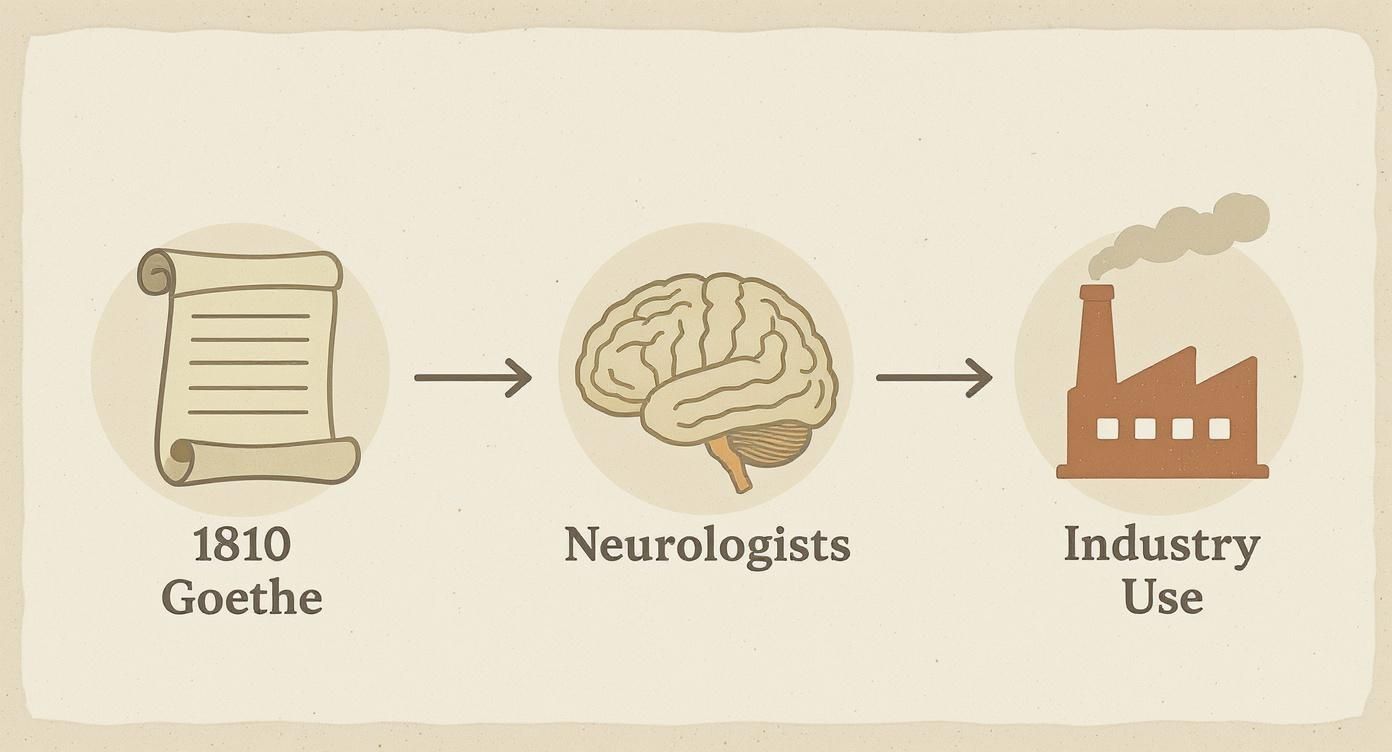
You can see a clear path from abstract ideas about color and emotion to its deliberate use as a tool to shape how people see and act.
The Power and Urgency of Red
Red is arguably the most powerful color in the entire spectrum. It’s a color of extremes, swinging from passionate love to intense anger. On a physical level, just seeing red can actually speed up your heart rate, creating a sense of urgency or excitement. That’s exactly why it’s plastered all over clearance sale signs and call-to-action buttons.
- Positive Vibes: Energy, passion, strength, love, excitement.
- Negative Vibes: Danger, anger, aggression, warning.
Take Coca-Cola or Target—they use red to scream energy and excitement. A red stop sign, on the other hand, taps into our built-in alertness to danger, demanding we pay attention right now.
The Trust and Calm of Blue
There’s a reason blue is the undisputed king of the corporate world. It's overwhelmingly tied to feelings of trust, stability, and security. This makes it a no-brainer for industries where dependability is everything, like finance, tech, and healthcare.
Unlike fiery red, blue actually has a calming effect. It can bring down blood pressure and create a feeling of peace. The flip side? Too much blue, or the wrong shade, can feel cold, impersonal, or even a bit sad.
Brands like Dell, American Express, and Pfizer all lean on blue to build a solid foundation of trust and professionalism with their audience.
The Balance and Growth of Green
Green is wired directly to the natural world, giving it a powerful, almost restorative, psychological kick. It represents health, new beginnings, and tranquility. This makes it the obvious pick for brands in the wellness, eco-friendly, or even financial spaces (think growth!).
As a bonus, green is one of the easiest colors for our eyes to process, which creates a feeling of balance and harmony.
- In Branding: An organic food company uses green to signal freshness and health.
- In Design: A "Go" button or a success message is almost always green, playing on its positive, forward-moving vibe.
But watch out—green can also signal envy or materialism, all depending on the shade and how you use it.
The Optimism and Caution of Yellow
Yellow is a pure burst of energy. It’s sunshine, happiness, and optimism all rolled into one. It gets the mental gears turning and sparks cheerfulness, making it a fantastic choice for brands that want to come across as friendly and fun.
And yet, yellow is a walking contradiction. Because it’s so bright and visible, it’s the universal color for caution signs and warnings. Overdo it, and yellow can stir up anxiety. Some studies even suggest babies cry more often in bright yellow rooms.
It all comes down to balance. As an accent, yellow grabs attention and creates a positive mood. Brands like McDonald's and Snapchat nail this, using it to feel immediate and fun. If you're playing with palettes, our guide on effective color combinations for logos can help you find that perfect harmony.
The Creativity and Luxury of Purple
Go back in history, and you'll find that purple dye was ridiculously expensive and hard to come by. That's why it's so strongly connected to royalty, wealth, and luxury. That vibe sticks around today, with deep purples often used to signal sophistication and top-tier quality.
Beyond its regal past, purple also gets the imagination going. It’s often linked to creativity, spirituality, and wisdom. Lighter shades like lavender can feel more nostalgic and sentimental.
For brands, purple can be a serious power move.
- Luxury Brands: Use deep purples to give off an air of exclusivity.
- Creative Services: Go with brighter purples to highlight innovation.
Hallmark is a great example. Their rich purple blends the "royal" feel of their crown logo with the heartfelt sentimentality their cards are known for. Once you get these nuances, you stop just picking colors you like and start using them as a strategic tool.
Applying Color Psychology in Branding and Marketing
Alright, knowing the emotional weight of different colors is one thing. But putting that knowledge to work is where the magic really happens. In branding and marketing, color isn’t just a pretty afterthought—it's a core piece of your brand’s identity and a ridiculously powerful tool for shaping how customers feel about you.
Think of your color palette as a visual shortcut to your brand’s personality. Before anyone reads a single word on your site, your colors have already made an introduction. Are you trustworthy and dependable like a bank? Energetic and urgent like a fast-food joint? Calm and natural like a wellness brand?
This strategic use of color is what separates the memorable brands from the ones that just fade into the background. It's the invisible force that shapes perception, builds recognition, and can ultimately be the nudge that turns a browser into a buyer.
Building a Brand Identity with Color
Your brand's color palette is one of its most recognizable assets. The truly iconic brands own their colors so completely that you could identify them from a single swatch of paint.
Just look at these powerhouses:
- Coca-Cola Red: That specific, vibrant shade of red isn’t just energetic; it’s bold, exciting, and known across the entire globe. It nails the feeling of urgency and happiness that perfectly matches what they're selling.
- Tiffany & Co. Blue: This distinct robin's egg blue is so tied to the brand that it’s actually trademarked. It screams elegance, luxury, and aspiration, making the box feel just as special as the jewelry inside.
- John Deere Green: Paired with that bright yellow, the color scheme instantly connects you to farming, nature, and pure durability. It feels reliable and deeply rooted in its industry.
These brands prove how a consistent and well-chosen color can cement a company’s identity in our minds. When you get it right, the color becomes the brand.
Influencing Consumer Behavior and Perception
Beyond just recognition, color has a real, measurable impact on how people act. Study after study shows that color choices directly affect consumer behavior. In fact, research shows that somewhere between 62% and 90% of a person’s initial snap judgment of a product is based on color alone.
That means the colors you pick for your website, packaging, and ads could literally be the deciding factor for a potential customer. It’s a pretty big deal.
A brand's color palette can do more than just attract attention; it can fundamentally alter how customers perceive the value, quality, and trustworthiness of a product or service.
The right color can make something feel more expensive, more reliable, or more fun. Black packaging, for instance, often signals sophistication and luxury, while a splash of bright orange might suggest affordability and playfulness. For any business trying to find its footing in a crowded market, this is a critical piece of the puzzle.
A Practical Framework for Choosing Your Colors
Picking a brand palette shouldn’t be a shot in the dark. It needs to be a thoughtful process that lines up your visual identity with your business goals and the people you’re trying to reach.
Here’s a simple, practical way to approach it:
- Define Your Brand Personality: Before you even glance at a color wheel, pin down your brand’s core traits. Are you sincere, exciting, competent, sophisticated, or rugged? Nailing this down first gives you a clear roadmap.
- Understand Your Audience: Think about the demographics, cultural backgrounds, and expectations of your target customers. A color that works wonders for one group might completely miss the mark with another.
- Analyze Your Competitors: Take a look at the color palettes of other players in your space. You can either align with industry standards to meet expectations or choose a contrasting color to carve out your own unique spot.
- Create a Cohesive Palette: Build a full palette with a primary color, one or two secondary colors, and a distinct accent color for things like calls-to-action. The key is making sure they all work together to create a balanced, professional look.
Once you’ve landed on a palette, documenting it is crucial for keeping things consistent. For a much deeper dive into this, check out our guide on creating a brand style guide template. And remember, it's just as important to ensure your chosen colors are reproduced accurately on physical materials by mastering color management in printing.
The Critical Role of Culture and Context in Color
One of the biggest mistakes you can make is treating color psychology like a universal rulebook. The idea that red always means excitement or that blue always signals trust is a massive oversimplification, and it’s a trap that can lead to some serious missteps in branding and design.
The truth is, a color’s meaning is fluid. It gets bent and shaped by culture, personal experience, and the context you see it in.
Think of it this way: color is like a language. The word "cool" can mean a low temperature, or it can mean something is stylish. You know which one it is based on the conversation. Color works exactly the same way. If you don't get the context right, your design could fall flat or, even worse, be downright offensive.
A one-size-fits-all approach is doomed from the start because our reactions to color aren't entirely hardwired. We learn them. Our responses are soaked in the traditions of the society we grew up in and the personal memories we tie to certain shades. This is precisely why a global brand can't just copy-paste its color strategy from one country to another and expect it to work.
When Meanings Get Lost in Translation
Cultural differences are where you see the most dramatic shifts in color meaning. A color that screams joy and celebration in one part of the world might be the official color of mourning somewhere else. Ignoring these deep-seated associations is a fast track to alienating your entire audience.
Take the color white, for example. In many Western cultures, it’s the go-to for weddings, symbolizing purity, innocence, and new beginnings. But in many Eastern and Asian cultures, white is the color of mourning, worn at funerals to show grief and respect for the departed.
And it doesn't stop there. Red can mean good fortune and celebration in China, but in South Africa, it's associated with mourning. These aren't just tiny nuances; they are fundamental shifts in meaning that completely change how a brand's visual identity is perceived. You can get a better handle on how these pieces fit together by understanding what is visual identity and why it matters so much.
To really bring this home, let's look at a few examples side-by-side.
Cultural Variations in Color Meaning
The symbolic meaning of a color can flip entirely depending on where you are in the world. This table shows just how different the interpretations can be, underscoring why context is everything.
| Color | Common Western Meaning | Common Eastern Meaning | Other Cultural Meanings (e.g., Africa, South America) |
|---|---|---|---|
| White | Purity, innocence, weddings, minimalism | Mourning, death, funerals, sadness | Peace, purity (some African cultures) |
| Red | Love, passion, danger, excitement, anger | Luck, prosperity, happiness, weddings (China, India) | Mourning (South Africa); revolution, communism (various) |
| Yellow | Happiness, warmth, caution, cowardice | Sacred, imperial, royalty (China) | Mourning (Egypt); strength, reliability (some African cultures) |
| Blue | Trust, calm, sadness, masculinity | Immortality, spirituality, femininity (Hinduism) | Mourning (Iran); virtue, protection (various) |
| Green | Nature, growth, money, envy, luck | New life, fertility, youth; infidelity (China) | Hope, national pride (many South American countries) |
| Purple | Royalty, wealth, luxury, spirituality | Wealth, privilege, nobility | Mourning (Thailand, Brazil) |
As you can see, simply picking a color off a chart without considering your audience's cultural background is a huge gamble.
Beyond Culture: Personal Experience and Context
Even inside a single culture, our own lives give us a unique filter for color. Maybe your best childhood memories were in a bright yellow kitchen, giving you a lifelong warm feeling for that shade. On the flip side, a bad experience connected to a certain hue can leave you with a lasting aversion.
The immediate context is also a huge player. Think about the color green:
- In finance? It’s all about wealth, growth, and cash.
- In healthcare? Now it’s about health, wellness, and natural healing.
- On a food package? It signals something is organic, fresh, or eco-friendly.
The psychological impact of a color is never decided in a vacuum. It is a dynamic interplay between the color itself, the cultural lens of the viewer, their personal history, and the specific situation in which they encounter it.
A perfect real-world example of this is in the specific meanings of graduation stole colors in academic and cultural contexts, where specific shades represent fields of study, academic honors, or cultural heritage. The context completely defines the message.
Ultimately, mastering color psychology isn’t about memorizing lists—it’s about embracing the complexity. You have to move beyond the simple charts and start asking the right questions: Who am I talking to? What are their cultural expectations? What’s the specific context for this design?
Answering those questions is how you use color with intelligence and empathy. It’s how you make sure your message truly connects, no matter who sees it or where they are in the world.
A Few Common Questions About Color Psychology
Alright, let's get practical. It's one thing to talk about the theory of color, but how does it actually play out when you're making decisions for your business or a new project? People ask us about this stuff all the time.
Here are some of the most common questions that pop up, with straightforward answers to help you put all this into action.
What’s the Most Trustworthy Color for a Logo?
Hands down, it's blue. There's a reason so many banks, tech giants, and healthcare companies lean on it so heavily. It just feels stable, secure, and calm. It projects dependability.
But the shade really matters. A light, sky blue can feel open and serene, while a deep navy communicates authority and serious professionalism. The only catch? Since blue is such a safe bet, you have to get creative to make your logo stand out from the crowd. The best choice always comes back to your specific industry and the vibe you want to give off.
Can Using the Wrong Color Really Hurt My Sales?
Oh, absolutely. It's not an exaggeration to say it can be a deal-breaker. Color is often the very first handshake with a potential customer, and if it feels off, it creates a weird disconnect that can kill a sale before it even starts.
Think about it: would you trust a high-end law firm with a bright, playful orange logo? It would probably feel unprofessional, right? Or a health food brand using artificial-looking neon green? It just screams unnatural. In fact, studies show that up to 90% of snap judgments made about products can be based on color alone.
Choosing a color that lines up with your product's value and what your audience expects isn't just a fun design task—it's a core business decision. Get it wrong, and you undermine your whole message without saying a single word.
That first impression happens in a blink. It can either pull someone in or push them away.
How Do I Pick a Color Palette for My Website?
Don't just throw darts at a color wheel. Picking a palette should be a deliberate process, starting with your brand's personality and the people you're trying to connect with.
Here’s a simple way to approach it:
- Nail Down Your Primary Color: This is your hero color. It should be the one that best reflects your brand’s soul. Green for an eco-friendly brand, maybe a sharp blue for a tech startup.
- Add Your Secondary Colors: Pick one or two colors that complement your primary one. These are for the supporting cast—think subheadings, secondary buttons, or background accents. They should add balance, not fight for the spotlight.
- Find Your Accent Color: This is the color you want people to notice. Use it sparingly for the most important actions, like your "Buy Now" or "Sign Up" buttons. Something high-contrast here does the trick, naturally drawing the eye where you want it to go.
And please, always test your final choices for accessibility. Make sure there’s enough contrast between your text and backgrounds so everyone, including people with visual impairments, can have a good experience.
Does Color Psychology Change Over Time?
Yep, it's always shifting. Color meanings are shaped by cultural trends, big historical moments, and even new tech. A color's meaning isn't frozen in time; it’s a living, breathing part of our culture.
Pink is the classic example. A century ago in the West, it was often seen as a strong, masculine color for little boys, while blue was considered delicate and feminine. That completely flipped by the mid-20th century.
It happens with trends, too. Certain shades will be everywhere for a few years and then feel dated. While some core responses are pretty stable (like red grabbing our attention), the cultural layers are constantly evolving. That’s why it’s so important to keep a finger on the pulse of what's current, instead of just relying on old assumptions.
Ready to bring your brand's vision to life with the perfect creative talent? At Creativize, we connect businesses with skilled professionals who understand how to use color and design to tell a compelling story. Find the right creative expert for your next project on Creativize.net.