
Dive Into the World of Type
From handwritten letters to the sleek digital interfaces we use every day, type has been essential to communication for centuries. Understanding typography, and the wide variety of typefaces, is no longer just for designers. For small businesses, startups, freelancers, marketing agencies, and even community organizations, the right typeface is crucial for clear communication and a strong brand identity.
The seemingly small differences between a serif and a sans-serif, the weight of a stroke, or the curve of a letter can greatly impact how your audience perceives your content. These choices affect readability, convey emotion, and shape your brand's aesthetic, both in print and online.
A Brief History of Type
The evolution of typefaces is closely tied to the history of printing and graphic design. From elegant, classical forms inspired by Roman inscriptions to the clean, modern lines of the Industrial Age, each typeface has a unique history and visual language. A typeface’s effectiveness depends on how well it works with the message, the medium, and the audience. Just as the printing press revolutionized communication, the digital age has expanded the possibilities of typography, making it more accessible and vital than ever.
Ten Essential Typeface Families
In this article, we'll explore ten essential typeface families, examining their distinct personalities and practical uses. We'll cover iconic typefaces, from timeless classics to modern marvels, each chosen for its enduring influence and versatility.
By the end of this article, you'll be able to choose typefaces strategically, strengthening your brand's visual voice and making a lasting impression on your audience.
1. Helvetica

Helvetica, a neo-grotesque sans-serif typeface, holds a significant place in the design world. Created in 1957 by Max Miedinger and Eduard Hoffmann at the Haas Type Foundry, its clean and neutral aesthetic, coupled with its remarkable legibility, has led to its international acclaim. Its impact on Swiss design and modernist typography is undeniable, making it a popular choice for businesses, organizations, and designers across the globe. This widespread use secures Helvetica's spot on our list of essential typefaces.
Helvetica’s enduring popularity stems from its defining characteristics. The neutral appearance, consistent stroke width, balanced proportions, large x-height, and tight character spacing contribute to a sense of order and clarity. This leads to impressive legibility across various sizes, from billboards to small print. This readability makes it a practical choice for applications requiring clear communication.
The Pros and Cons of Using Helvetica
The benefits of using Helvetica are many. It is remarkably versatile, projecting a clean, professional image suitable for diverse applications. Its readability at different sizes, combined with the availability of various weights and styles, offers detailed typographic control. Plus, its global recognition ensures consistent interpretation and understanding.
However, Helvetica also has its limitations. Its widespread use can sometimes make it feel generic or lacking a distinct personality. It's not as unique as some other fonts, and licensing can be costly. While legible at small sizes, its tight character spacing may not be ideal for lengthy body text.
Effective Implementation of Helvetica
For effective use, pair Helvetica with contrasting serif fonts for headlines to create visual interest. Utilizing different weights within the Helvetica family can help establish a clear hierarchy within your designs. It's a powerful choice for professional documents and presentations, excelling in minimalist designs. Its clarity also makes it perfect for signage and wayfinding systems, as seen in the New York City subway system, designed by Massimo Vignelli. For website navigation, consider our guide on sitemaps.
Helvetica’s Legacy in Design
Helvetica's prominence is largely due to its adoption by influential organizations like Apple (used in iOS until 2013) and its widespread use in corporate branding. Miedinger and Hoffmann, along with the Haas Type Foundry, played a vital role in its initial development and distribution. Designers like Massimo Vignelli further cemented its place in design history with projects like the NYC subway. The typeface continues to be a favored choice for many international corporations, solidifying its enduring legacy in design.
2. Times New Roman

Times New Roman enjoys a prominent position in the world of typography. This stems from its historical association with The Times newspaper and its enduring readability in print. Commissioned by the British newspaper in 1931, designers Stanley Morison and Victor Lardent crafted this serif typeface to address the need for a clearer, more efficient font for newspaper printing. Its creation marked a significant step towards functional yet elegant typography.
Times New Roman possesses distinctive features, including moderate contrast and a classic, traditional appearance. These contribute to its excellent readability in printed material. The clear separation between characters, combined with its efficient use of space, made it perfect for the dense columns of a newspaper. This focus on legibility explains its continued popularity for academic papers, legal documents, and traditional books.
For decades, Times New Roman served as the default font in Microsoft Word, solidifying its presence in business communications globally.
Features
- Serif typeface with moderate contrast
- Classic, traditional aesthetic
- High readability in print
- Efficient use of space
- Clear character distinction
Pros
- Excellent readability for body text
- Professional and authoritative look
- Wide availability across devices and systems
- Well-suited for academic and formal documents
- Multiple weights available
Cons
- Can appear overused or generic
- May seem dated in modern designs
- Less distinctive than some contemporary typefaces
- Not ideal for screen reading at small sizes
- Limited creative expression
Examples of Use
- The Times newspaper
- Academic papers and dissertations
- Legal documents
- Traditional book typography
- Formerly the default font in Microsoft Word
Tips for Implementation
-
Formal Documents and Academic Papers: Times New Roman excels in these settings due to its readability and professional look.
-
Optimal Readability: A 12pt font size is generally recommended for printed documents.
-
Modern Contrast: Pair Times New Roman body text with sans-serif headings for a contemporary feel.
-
Print vs. Digital: Remember Times New Roman is optimized for print, not digital design.
-
Traditional Contexts: The typeface is most effective in traditional or conservative settings.
Popularized By
- Stanley Morison
- Victor Lardent
- The Times newspaper
- Microsoft
- Academic institutions
While newer typefaces have emerged, Times New Roman's legacy and readability remain. For small businesses, startups, and community organizations creating printed materials like newsletters, reports, or formal letters, understanding its strengths and limitations is key. While perhaps not the most stylish choice, its familiarity and readability make it a dependable option for conveying professionalism and authority, particularly in print.
3. Futura
Futura, a geometric sans-serif typeface designed by Paul Renner in 1927, remains a powerful example of clean design. Based on the Bauhaus philosophy of form following function, Futura's structure uses simple geometric shapes, especially the circle. This gives it a modern look defined by perfect circles, straight lines, and long ascenders and descenders. Futura's focus on geometric form results in a typeface that communicates clarity, efficiency, and timelessness, keeping it relevant for almost a century.
Futura's use in everything from advertising to space exploration demonstrates its versatility. Its unique characters, like the lowercase 'a' and 'g', give it a recognizable identity. From the Volkswagen branding and the Louis Vuitton logo to the Apollo 11 lunar plaque, Futura is a mainstay in visual culture. Even Ikea used Futura for its branding until 2009, proving its adaptability. Its appearance in Stanley Kubrick films such as 2001: A Space Odyssey further solidified its popularity. It continues to be featured in contemporary media, including the works of Wes Anderson and artist Barbara Kruger. This ongoing relevance comes from the typeface’s ability to balance modern sensibilities and timeless elegance. For additional design and branding resources, check out Our Creative Category Sitemap.
Working With Futura
Futura comes in various weights, from light to extra bold, giving designers flexibility in creating visual hierarchy and impact. This range of weights makes it useful for headlines, display text, and logo design. While Futura excels in these areas, it has limitations. Its geometric purity, while a strength, can also make it less suitable for long blocks of body text. Certain characters are hard to read at small sizes, and the minimal stroke contrast can feel cold or mechanical. It can also use more space than other typefaces.
Features:
- Pure geometric construction
- Perfect circles and straight lines
- Long ascenders and descenders
- Many weights (light to extra bold)
- Distinctive lowercase 'a' and 'g'
- Minimal stroke contrast
Pros:
- Timeless, modern aesthetic
- Strong visual impact
- Excellent for headlines and display text
- Projects clarity and efficiency
- Distinctive character set
Cons:
- Not ideal for long body text
- Some characters are hard to read at small sizes
- Limited warmth
- Can appear cold or mechanical
- Uses more space than some alternatives
Tips for using Futura effectively:
- Ideal for logos and brand identities.
- Works well for headlines and short text.
- Pair with humanist sans-serifs or serifs for body text.
- Adjust tracking for optimal spacing.
- Use bold weights for strong visual statements.
Futura's lasting legacy and widespread use cement its place as an important typeface in design history. Its clean lines, geometric precision, and strong visual impact make it a valuable tool for designers creating modern and timeless communications.
4. Garamond
Garamond, a typeface synonymous with timeless elegance, encompasses a family of old-style serif typefaces. Its origins trace back to the 16th-century French type designer, Claude Garamond. Its enduring popularity is a testament to its readability, refined aesthetics, and historical significance. This makes Garamond a frequent choice in both classic and contemporary design projects. From books to marketing materials, its versatility secures its spot on this list.
Garamond's defining features include its graceful, flowing letterforms, characterized by a moderate contrast between thick and thin strokes. Angled serifs, open counters, and subtly condensed proportions all contribute to its distinct appearance and exceptional readability. These qualities make it an ideal choice for body text in printed materials like books, magazines, and reports.
One of Garamond's key strengths is its ability to enhance readability for large amounts of text. The comfortable letterforms and open counters help reduce eye strain, allowing readers to engage with the content for longer durations. This is why it's often preferred for academic texts, textbooks, and even by the U.S. Government Publishing Office. Garamond’s economical use of space also boosts its efficiency without sacrificing clarity—a valuable asset in print.
Beyond functionality, Garamond possesses undeniable elegance and sophistication. This inherent quality makes it a powerful tool for conveying a sense of history, trustworthiness, and classic appeal. Its use in prestigious publications, such as classic literature and even the early Harry Potter books (which used Adobe Garamond), further strengthens this association. Apple also used a custom Garamond variant for its printed materials from 1984 to 2002, highlighting its versatility.
However, Garamond does have some limitations. Its classic style may feel too traditional for some modern designs, and its lighter weights can sometimes disappear during printing. It may also lack the visual impact needed for headlines or display copy. Additionally, its effectiveness can diminish at smaller sizes on digital screens. Finally, the existence of multiple Garamond variations (such as Adobe Garamond, ITC Garamond, and Stempel Garamond) can present consistency challenges.
Pros:
- Excellent readability for extended text
- Elegant and sophisticated appearance
- Efficient use of space while maintaining clarity
- Reduces eye strain for longer reading periods
- Established historical credibility and timeless appeal
Cons:
- Can lack impact for headlines or display use
- Reduced effectiveness on digital interfaces at small sizes
- Multiple variations can lead to inconsistency
- May appear too traditional for contemporary designs
- Lighter weights can fade during certain printing processes
Tips for Implementation:
- An excellent choice for books and long-form content
- Pairs well with a geometric sans-serif font for a modern look
- Works best in print at 9-12pt sizes
- Suitable for projects requiring classic, refined aesthetics
- Consider Adobe Garamond Pro for extended character sets
You might be interested in: Our guide on sitemaps for more resources related to website structure and content.
Garamond’s lasting legacy, from its origins with Claude Garamond and Jean Jannon to its digital revival by Adobe Systems and Robert Slimbach, demonstrates its enduring appeal and practicality. Its continued use across diverse applications ensures Garamond will remain a cornerstone of typographic design for years to come.
5. Baskerville
Baskerville is a transitional serif typeface, holding a significant place in typography history. Bridging the gap between older serif styles and their modern counterparts, it was designed by John Baskerville in 1750s Birmingham, England. The typeface reflects the Enlightenment’s emphasis on order and rationality. Its lasting popularity comes from a balance of elegance and clarity, making it a versatile choice even today.
Baskerville's distinct features contribute to its timeless appeal. These include a higher contrast between thick and thin strokes compared to its predecessors, a more vertical stress, and wide, open characters. Crisp serifs and a unique italic design also add to its refined and legible appearance.
Why Baskerville Deserves Recognition
Baskerville represents a key moment in the evolution of typefaces. It reflects broader cultural shifts, such as the Enlightenment's focus on reason. Its continued use in various applications highlights its enduring relevance for modern designers and brands.
Pros and Cons for Businesses and Creatives
Pros:
- Authority and Refinement: Baskerville projects trustworthiness and professionalism, ideal for financial institutions, legal firms, or academic publications.
- Readability: Its clarity makes it suitable for long-form content like books, articles, and website copy.
- Strong Presence: Baskerville is effective for headlines, titles, and logos, particularly for luxury or heritage brands.
- Reverse Legibility: It maintains legibility when reversed (white on black).
- Historical Significance: The typeface adds classic elegance to projects.
Cons:
- Small Size Ineffectiveness: Its delicate serifs and contrast can be lost at smaller point sizes.
- Spacing Issues: Careful selection of the correct digital version is essential.
- Space Efficiency: Baskerville may require more space than compact typefaces.
- Formality: It can seem overly formal in casual settings.
- Limited Weights: Some digital versions offer limited weight options.
Real-World Examples and Case Studies
- Academic Publishing: Princeton University Press and Yale University Press use Baskerville.
- Branding: Abercrombie & Fitch uses a modified version.
- Financial and Legal: Its authoritative look makes it common in these sectors.
- Book Typography: Baskerville remains a classic choice for readability.
Tips for Implementation
- Formal Materials: Use it for invitations and certificates.
- Scholarly Projects: Baskerville adds an air of authority.
- Pairing: It works well with clean sans-serifs like Univers or Gill Sans.
- Pull Quotes: Use it to highlight key text passages.
- Luxury Branding: It reinforces a timeless brand identity.
Popularized By
John Baskerville's creation gained traction through figures like Benjamin Franklin. Its adoption by Cambridge University Press and other book publishers cemented its status. Today, many luxury and heritage brands continue to use this classic typeface.
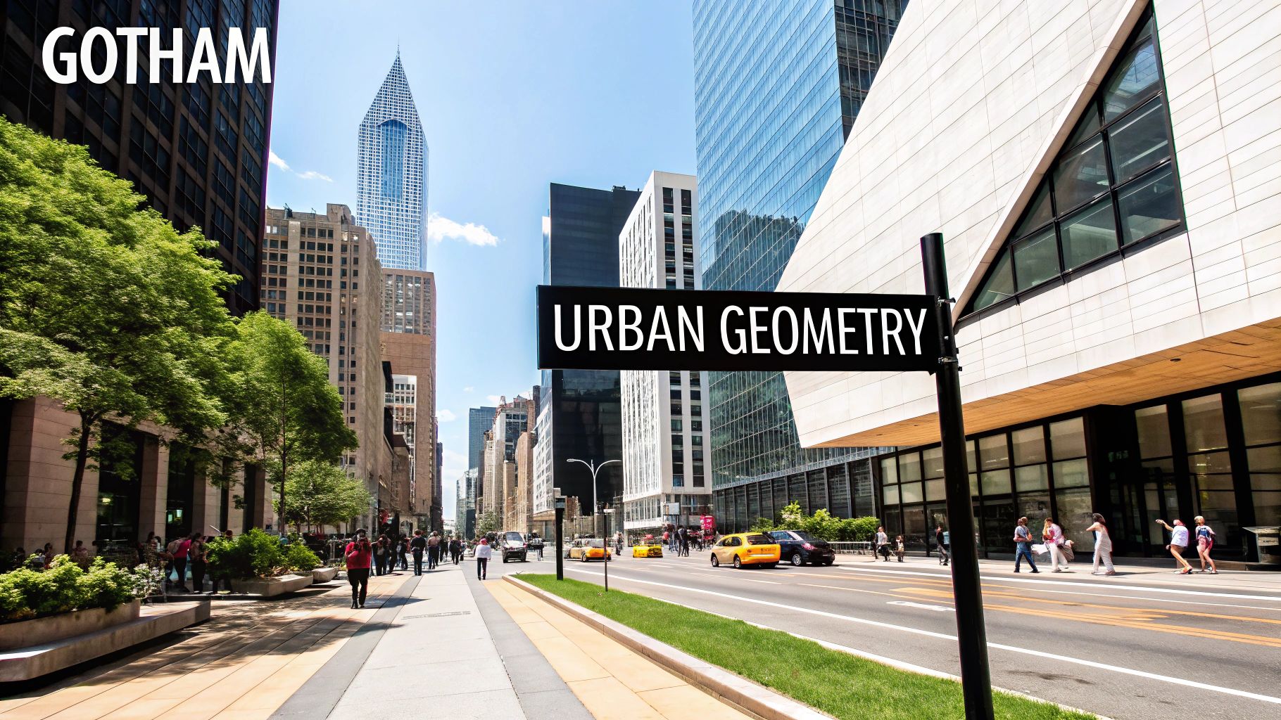
6. Gotham: The Modern Classic
Gotham, a geometric sans-serif typeface, has become a true 21st-century design icon. Commissioned by GQ magazine, designer Tobias Frere-Jones drew inspiration from the architectural lettering of mid-20th century New York City. This influence gives Gotham its characteristic blend of geometric precision and a subtle humanist warmth, making it both modern and timeless.
Its rise to fame is closely tied to its use in Barack Obama's 2008 presidential campaign. This high-profile exposure launched Gotham into the global design spotlight. It quickly became a popular choice for branding, signage, and editorial design.
Gotham's influence can be seen everywhere, from the One World Trade Center signage to the Saturday Night Live logo. Even Spotify used it in their branding from 2015 to 2022.
What Makes Gotham Unique?
Several distinct features contribute to Gotham's versatility and widespread appeal:
- Geometric construction with humanist touches: This balance creates a structured, yet approachable aesthetic.
- Wide proportions and open forms: These features ensure excellent readability, particularly at smaller sizes.
- Large x-height: This further enhances legibility and gives the typeface a strong, confident presence.
- Uniform character width: This results in a clean, consistent look and feel.
- Multiple weights and widths: From subtle body text to bold headlines, Gotham offers flexibility for diverse design applications.
- Circular forms with squared-off terminals: This unique detail adds a touch of personality and distinction.
Pros and Cons for Your Business
Gotham can be a powerful branding tool for small businesses, startups, and freelancers. Its extensive family allows for complex typographic hierarchies, and its versatility makes it suitable for a wide range of print and digital applications.
Pros:
- Extremely versatile: Gotham works well across various platforms and mediums.
- Projects authenticity and straightforwardness: It conveys a sense of trustworthiness and clarity.
- Strong presence in signage and display: The typeface commands attention without being overwhelming.
- Extensive family allows for nuanced typography: It provides many options for creating visual hierarchy.
Cons:
- Expensive licensing for the full family: Cost can be a barrier for smaller budgets. Free alternatives like Montserrat or Lato are excellent starting points.
- Ubiquitous use has reduced distinctiveness: Careful application is crucial to avoid a generic feel.
- Requires careful spacing at display sizes: Pay attention to kerning and tracking for optimal legibility at larger sizes.
- Heavy weights can feel imposing in text: Use heavier weights sparingly for body copy.
Tips for Implementing Gotham
- Contemporary Branding: Gotham is excellent for creating a modern and professional brand identity.
- Clear Hierarchies: Use the various weights to establish clear visual distinctions between headings, subheadings, and body text.
- Wayfinding and Signage: Its legibility and strong presence make it ideal for guiding people.
- Editorial Design: Pairing Gotham with old-style serifs creates a classic, yet contemporary look.
- Space Efficiency: Consider the narrow versions when space is limited.
Gotham's enduring popularity speaks to its well-balanced design and adaptability. While its widespread use requires mindful implementation, it remains a powerful tool for businesses and creatives seeking a typeface that communicates clarity, modernity, and professionalism. The full family comes at a price, but the investment can be worthwhile for establishing a strong and consistent brand presence. Explore free alternatives like Montserrat and Lato if budget is a concern.
7. Bodoni
Bodoni, a serif typeface, exudes elegance and sophistication, holding a significant place in typography. Created by Giambattista Bodoni in the late 18th century, this typeface reflects the Enlightenment's focus on rationality and order through its precise geometric forms and high contrast. Its lasting popularity, especially in fashion and luxury, makes it a powerful tool for brands aiming to project a refined, high-end image.
This high-contrast typeface is defined by the stark difference between its thick and thin strokes. It features unbracketed hairline serifs, perfectly circular dots, and vertical stress. These distinct characteristics contribute to Bodoni's strong presence, making it perfect for capturing attention in display settings.
Features That Define Bodoni
- Extreme contrast between thick and thin strokes: This dramatic contrast is Bodoni's defining feature.
- Vertical stress: The vertical axis of the letters is prominent.
- Unbracketed, hairline serifs: Thin, abrupt serifs without curves connecting them to the main strokes.
- Perfect geometric forms: Circles, straight lines, and sharp angles form the letterforms.
- Circular dots and punctuation: Maintaining geometric consistency.
- Vertical terminals: Stroke ends not terminating in serifs are generally vertical.
Pros
- Dramatic impact in display settings: Bodoni excels in headlines, logos, and titles.
- Conveys luxury and sophistication: Its use by high-end brands reinforces this image.
- Works well in large sizes: Intricate details and contrast stand out at larger point sizes.
- Strong historical background: Bodoni's history adds authority and timelessness.
- Many digital versions: Offers flexibility for diverse design needs.
Cons
- Poor legibility in small sizes: The high contrast hinders readability in small sizes or long text blocks.
- Thin strokes can disappear in printing: Requires careful printing techniques.
- Needs careful kerning and spacing: Due to the significant stroke weight variations.
- Not for extended reading: High contrast can strain the eyes.
- Can appear cold or aloof: Bodoni's formality can be perceived as distant.
Examples in the Real World
Bodoni's influence appears in iconic branding and publications. The Vogue magazine logo is a classic example. Luxury brands like Giorgio Armani, Elizabeth Arden, and Calvin Klein have also used Bodoni's sophisticated aesthetic. Its use is widespread in high-end advertising and luxury publications.
Tips for Implementation
- Use in larger sizes (16pt+): Ensures legibility and impact.
- Ideal for headlines and logos: Where its contrast shines.
- Pair with simple sans-serifs for body text: Creates balance and readability.
- Consider optical sizes: Optimize for specific sizes and contexts.
- Works well with generous white space: Allows the typeface to breathe and enhances elegance.
Popularized By
Giambattista Bodoni’s original design set the foundation. Figures like Morris Fuller Benton (ATF Bodoni), Massimo Vignelli, and Herb Lubalin (U&lc magazine) solidified Bodoni’s place in typography. The fashion industry, especially Vogue, significantly contributed to its recognition and association with luxury.
Bodoni earns its place on this list as a powerful design tool conveying elegance, sophistication, and a strong historical presence. Understanding its features, benefits, and limitations allows designers to effectively use Bodoni's unique qualities to create impactful and memorable designs.
8. Frutiger
Frutiger is a humanist sans-serif typeface that exemplifies clean, effective communication through thoughtful design. Created in 1975 by Adrian Frutiger, it was originally commissioned for signage at the Charles de Gaulle Airport in Paris. Its success there propelled it onto the global stage, establishing it as a go-to choice for wayfinding and information design.
Frutiger distinguishes itself through its balance of functionality and visual appeal. While prioritizing legibility at a distance—essential for airport signage—it avoids the sterile feel of many geometric sans-serifs. Its humanist proportions, open counters, and moderate stroke contrast create a welcoming, accessible aesthetic suitable for a wide range of projects.
Key Features and Benefits
- Humanist sans-serif proportions: Gives it a natural, less mechanical feel.
- Open counters and letterforms: Improve readability, particularly at smaller sizes.
- Clear distinctions between similar characters: Reduces confusion and supports legibility in busy environments.
- Moderate stroke contrast: Adds visual interest without impacting readability.
- Extended character set: Accommodates multilingual projects.
- Numerous weights: Provides flexibility for various design requirements.
Pros and Cons of Using Frutiger
Here's a quick overview of the advantages and disadvantages:
| Pros | Cons |
|---|---|
| Exceptional legibility | Licensing costs |
| Versatile application | Can appear subtle/lack impact |
| Warm and approachable | Institutional feel in some contexts |
| Excellent for information design | Not as space-efficient as other typefaces |
Real-World Applications
Frutiger’s enduring appeal is evident in its widespread use:
- Charles de Gaulle Airport: Showcases its effectiveness in a complex wayfinding system.
- NHS (UK National Health Service): Chosen for its accessible, clear character in a healthcare setting.
- Deutsche Bank: Used in its corporate identity, highlighting its branding versatility.
- Numerous transportation systems worldwide: Trusted for conveying critical information clearly and legibly.
Tips for Implementation
- Wayfinding and signage: Guide people effectively through environments.
- Information-dense interfaces: Ensure clear communication in crowded digital spaces.
- Forms and documents: Improve readability and minimize errors.
- Multilingual publications: Support diverse language needs.
- Frutiger Neue: Explore this updated version for an expanded range of styles and weights.
Legacy and Impact
Frutiger's widespread adoption stemmed from its early success at Charles de Gaulle Airport and advocacy by influential figures like Erik Spiekermann. Its association with Swiss design further cemented its reputation for clarity, functionality, and timeless elegance. Today, Frutiger remains a popular choice for designers who want a legible, versatile, and subtly sophisticated typeface. While licensing costs can be considerable, the investment is often worthwhile for businesses that prioritize effective communication and a professional image. For those seeking budget-friendly alternatives, similar humanist sans-serif typefaces exist, but few achieve the same balance of form and function.
9. Palatino: Timeless Elegance and Practical Readability
Palatino, a classic typeface, holds a special place in typography. Its exceptional readability and enduring elegance have made it a favorite for decades. Designed by Hermann Zapf in 1948, this old-style serif typeface draws inspiration from the humanist calligraphy and printing styles of the Italian Renaissance. It bridges the gap between traditional aesthetics and modern practicality, making it a versatile choice for both print and digital media.
Originally designed for metal typesetting, Palatino transitioned smoothly into the digital age. It became a staple in phototypesetting and later, digital formats. Its slightly wider proportions and larger counters compared to other old-style serifs contribute to its readability, even at smaller sizes or on lower-resolution screens. This clarity makes it ideal for extended reading, such as books, articles, and online publications.
Key Features and Benefits
-
Old-Style Serif with Renaissance Influences: Palatino carries a distinct classical refinement without being overly ornate. The calligraphic influence adds a touch of warmth.
-
Excellent Readability: This is Palatino's greatest strength. Its open counters, large x-height, and moderate stroke contrast ensure comfortable reading across various media and sizes.
-
Versatility: Palatino works beautifully in both headlines and body text, creating a consistent, sophisticated feel.
-
Wide Availability: As a standard font on most operating systems, Palatino is readily accessible.
Pros and Cons
| Pros | Cons |
|---|---|
| Excellent readability | Overuse can diminish its uniqueness |
| Elegant appearance | Digital versions can vary in quality |
| Versatile for headlines and body text | Italic style can be perceived as too ornate |
| Standard availability | Less impactful than more dramatic serif designs |
| Holds up well in poor printing conditions | Limited weight options in some installations |
Real-World Examples
Palatino's versatility is showcased in its diverse applications:
-
Default Font: Its presence as a default font in numerous applications highlights its widespread adoption.
-
Publishing: Academic and book publishers frequently choose Palatino for its readability and classic look.
-
Official Documents: The European Union uses Palatino for official documents, demonstrating its formal yet approachable quality.
-
Magazines & Menus: Palatino adds a touch of timeless elegance to everything from magazines to restaurant menus.
Tips for Implementation
-
Book Typography: Palatino's readability and elegant appearance make it an excellent choice for book design.
-
Print & Digital Harmony: Its strong performance in both print and digital environments makes it a practical option.
-
Font Pairing: Pair Palatino with geometric sans-serif fonts like Futura or Avenir for a balanced contrast.
-
Expanded Character Sets: Palatino Nova offers extended language support and additional glyphs.
-
Multilingual Publications: Its clear letterforms and broad character set make Palatino effective for multilingual projects.
Palatino's lasting presence in typography is a testament to its balanced design. Its blend of readability, elegance, and practicality makes it a valuable tool for designers and communicators seeking a timeless and dependable typeface.
10. Gill Sans
Gill Sans stands as a classic in the world of typography. This humanist sans-serif typeface beautifully blends traditional and modern aesthetics. Designed by Eric Gill in 1928, its lasting appeal comes from its versatility and rich cultural connections, making it a valuable asset for diverse design projects.
Taking inspiration from Edward Johnston's renowned typeface for the London Underground, Gill Sans is rooted in classical Roman proportions rather than strict geometric shapes. This gives it a humanist quality, injecting warmth and personality into its clean, sans-serif design. Its characteristic ‘a’, ‘g’, and ‘R’ add to its recognizable personality. The subtle stroke contrast brings a touch of elegance to the overall design.
This balance between geometric and calligraphic influences gives Gill Sans its unique identity. Available in a wide spectrum of weights, from Ultra Light to Extra Bold, it offers flexibility for various design needs.
Rise to Prominence
Gill Sans's widespread recognition is intertwined with its adoption by influential British institutions. Monotype typographer Stanley Morison advocated for its use, leading to its adoption by organizations like the BBC (for their logo and identity from 1997-2021), Penguin Books (featured on their iconic book covers), and British Railways (for their signage). These cultural associations solidified Gill Sans as a typeface that communicates authority and trustworthiness, with a distinctly British feel.
Features and Benefits
- Humanist sans-serif based on classical proportions: Offers warmth and readability.
- Distinctive characters: Creates a unique and easily identifiable look.
- Variable stroke contrast: Adds a subtle layer of sophistication.
- Wide range of weights: Provides adaptability for different applications.
- Strong cultural associations: Conveys a sense of British heritage and dependability.
Pros and Cons
| Pros | Cons |
|---|---|
| Projects authority with a human touch | Some weights can have legibility issues |
| Versatile across various applications | Inconsistencies in some digital versions |
| Good legibility in text sizes (medium weight) | Its "Britishness" may not suit all design contexts |
| Strong cultural associations | Spacing problems can occur in certain digital versions |
| Distinctive character | Light weights can disappear in poor printing conditions |
Examples and Case Studies
- BBC (1997-2021): The BBC's use of Gill Sans showcased its ability to project authority and approachability.
- Penguin Books: Its presence on Penguin book covers demonstrates its enduring appeal in publishing.
- British Railways: Its use in signage highlights its clarity and effectiveness in public spaces.
Tips for Implementation
- Ideal for projects needing a sense of British heritage.
- Works well in educational, cultural, and corporate settings.
- Pairs well with transitional serifs like Baskerville.
- Use medium weight for best text legibility.
- Consider Gill Sans Nova, a redesigned version, for improved digital performance.
For small businesses, startups, and freelancers, Gill Sans provides a versatile and recognizable typeface that can add a touch of classic sophistication to branding. Its history and cultural significance make it a strong choice for organizations wanting to project trustworthiness and authority. Be mindful of its British connotations and ensure it aligns with your brand's aesthetic. Testing different weights and being attentive to spacing are key for successful implementation.
10-Point Typeface Comparison
| Typeface | Implementation Complexity (🔄) | Resource Requirements (⚡) | Expected Outcomes (📊) | Ideal Use Cases (💡) | Key Advantages (⭐) |
|---|---|---|---|---|---|
| Helvetica | Moderate; many weights require careful use | High; licensing and varied styles | Clean, versatile, professional appearance | Branding, signage, corporate communications | High legibility and global recognition |
| Times New Roman | Simple; standard system integration | Low; widely available by default | Reliable, authoritative text for body copy | Academic papers, legal documents, print publications | Excellent readability and professional tone |
| Futura | Moderate; precise geometric adjustments | Moderate; balanced digital usage | Modern, impactful display and headline text | Logos, headlines, advertising displays | Timeless design with strong geometric clarity |
| Garamond | Easy-to-moderate; classic design benefits | Low to moderate; efficient for text layouts | Elegant, refined text with excellent readability | Book typography, long-form reading, classic documents | Timeless aesthetics with space efficiency |
| Baskerville | Moderate; attention to contrast and details | Low; efficient in print environments | Scholarly, refined appearance with high contrast | Academic publishing, formal invitations, luxury brands | Historical credibility and improved legibility |
| Gotham | Moderate–high; extensive family options | High; expensive licensing considerations | Bold, versatile visual impact across mediums | Contemporary branding, signage, corporate identity | Versatility and clear, modern presence |
| Bodoni | High; requires precise kerning and spacing | Moderate; specific display conditions | Dramatic, luxurious display with strong contrast | Fashion, high-end advertising, luxury branding | Striking contrast and sophisticated elegance |
| Frutiger | Moderate; optimized for legibility in signage | Moderate; investment in quality licensing | Exceptional clarity and readability at distance | Wayfinding, public signage, information design | Outstanding legibility and humanist warmth |
| Palatino | Simple; adaptable to both print and screen | Low; standard installation and efficient use | Elegant, readable text balancing tradition and modernity | Book typography, official documents, multilingual layouts | Classic elegance with practical readability |
| Gill Sans | Moderate; careful use of varying weights | Low; commonly available in digital libraries | Authentic, balanced design with a cultural touch | Educational, institutional, or culturally themed projects | Distinctive British charm and versatile legibility |
Typography: A Journey, Not a Destination
Throughout our exploration of typefaces, we've covered some essential principles. From the classic elegance of serif fonts like Times New Roman, Garamond, Baskerville, and Palatino, to the clean lines of sans-serif fonts such as Helvetica, Futura, Gotham, Frutiger, and Gill Sans, and the unique character of Bodoni, each typeface possesses its own distinct personality and function. Understanding these nuances is key to effective communication.
Remember that readability and legibility are paramount. Your chosen typeface should enhance, not hinder, your message. Consider the context, your target audience, and the desired tone. Pairing fonts thoughtfully, like a serif header with a sans-serif body, can also significantly improve your design.
Putting Typography into Practice
Putting these concepts into practice involves experimentation. Don't hesitate to explore different font combinations and observe their effects. Begin with a clear grasp of your project's goals and let these inform your typographic choices. The platform – print, web, or mobile – also impacts readability, so keep that in mind.
The Evolving Landscape of Typography
The world of typography is ever-changing, with trends continuously evolving and new typefaces constantly emerging. Maintaining a curious mindset and pursuing continuous learning through design blogs, following typographers, and attending workshops is invaluable. Adaptability is crucial. Variable fonts, which offer increasing flexibility and control, exemplify one of the exciting developments shaping the future of type design.
Key Takeaways:
- Purposeful Selection: Choose typefaces aligned with your message and target audience.
- Readability & Legibility: Prioritize clear and accessible typography.
- Context Matters: The platform and overall design influence typeface selection.
- Continuous Learning: The field is dynamic; stay curious and adaptable.
Ready to enhance your brand's visual identity and connect with skilled creative professionals? Creativize is your solution. We connect businesses with local creative experts specializing in branding, 2D animation, and more. Discover the ideal typeface and design expertise to realize your vision. Visit Creativize today and unlock your creative potential.