
Unlocking Design Brilliance: A Deep Dive into Visual Design Principles
This listicle reveals eight essential principles of visual design: balance, contrast, emphasis, proportion and scale, movement and rhythm, pattern and repetition, unity and harmony, and white space. Understanding these principles is crucial for creating effective and engaging visuals. Whether crafting a logo, website, or marketing material, applying these principles of visual design strengthens your brand and effectively communicates your message. Learn how to create impactful visuals that resonate with your target audience and achieve your design goals.
1. Balance
Balance, a cornerstone of visual design principles, refers to the distribution of visual weight within a composition. It's the silent force that creates stability, structure, and harmony in any design, ensuring that no single element overpowers others. A well-balanced design feels natural and aesthetically pleasing, guiding the viewer's eye through the content effortlessly. This principle is crucial for anyone involved in visual communication, from small businesses crafting marketing materials to startups designing their brand identity. Mastering balance is essential for creating designs that resonate with your target audience and effectively communicate your message.

Balance in design is achieved by strategically arranging elements to create a sense of equilibrium. This can be accomplished through several different approaches. Symmetrical balance, also known as formal balance, creates a mirror-like effect where elements are equally distributed on either side of a central axis. Think of the classic example of the Parthenon in Greece, a structure embodying perfect symmetry. Asymmetrical balance, or informal balance, on the other hand, achieves equilibrium through the use of different elements with equal visual weight, creating a more dynamic and interesting composition. A magazine layout, for instance, might balance a large image on one side with a block of text and smaller graphics on the other. Finally, radial balance arranges elements around a central point, like the spokes of a wheel or the petals of a flower, drawing the eye inwards.
Visual weight, a key concept in understanding balance, is not solely determined by an element's physical size. Factors like color, texture, and position also play a significant role. A bright, saturated color will have more visual weight than a pale, muted one. Similarly, a textured element will appear heavier than a smooth one, and an element placed higher on the page will seem lighter than one placed lower down. Understanding these nuances is crucial for achieving effective balance, especially when working with asymmetrical compositions.
The benefits of incorporating balance in your designs are numerous. Firstly, it creates visual stability and comfort, making the design feel resolved and professional. This sense of order subconsciously communicates trustworthiness and reliability, especially important for businesses trying to establish credibility. Secondly, balance guides viewer attention effectively, leading the eye through the design in a logical and engaging manner. This is particularly important for marketing materials and website design, where you want to direct the viewer towards specific calls to action. Thirdly, balance helps establish hierarchy and order, making it clear which elements are most important. By strategically placing elements of higher visual weight, you can emphasize key information and guide the user through the content hierarchy.
However, achieving perfect balance, especially with complex layouts, can be challenging. Perfect symmetry, while creating a sense of formality and stability, can sometimes appear static or boring. Overly symmetrical designs can lack visual interest and fail to capture the viewer's attention. Furthermore, achieving effective balance requires careful consideration of all elements in the composition and their interplay with each other. It's a constant balancing act, adjusting and readjusting until the design feels harmonious.
For small and medium businesses, startups, freelancers, and marketing agencies, understanding balance is paramount. Whether designing a website, creating social media graphics, or developing a brand identity, balance is essential for creating visually appealing and effective communication. By incorporating principles of visual design like balance, these organizations can enhance their brand image, attract more customers, and ultimately achieve their business goals.
Here are a few actionable tips for implementing balance in your designs:
- Use the rule of thirds as a starting point: This classic compositional technique divides the canvas into nine equal parts, creating natural focal points. Placing important elements along these lines or at their intersections can help achieve a balanced and visually appealing composition.
- Consider visual weight, not just physical size: Remember that color, texture, and position all contribute to visual weight. A small, bright element can balance a larger, less saturated one.
- Test balance by squinting at your design: This technique helps you see the overall distribution of visual weight by blurring the details. If one area appears significantly darker or heavier, you may need to adjust the balance.
- Use negative space to balance heavy elements: Whitespace, or negative space, can be just as important as the elements themselves. Strategically using negative space can help balance heavier elements and create a sense of breathing room in the design.
The principles of balance, as a core aspect of visual design, were popularized by movements like the Bauhaus and the Swiss International Style. Designers like Josef Müller-Brockmann, known for his grid systems, championed the importance of balance and structure in creating clear and effective visual communication. By understanding and implementing these principles, you can create designs that are not only aesthetically pleasing but also effectively communicate your message to your target audience.
2. Contrast
Contrast, a cornerstone of visual design principles, refers to the discernible difference between elements within a design. This difference isn't merely about aesthetics; it's a powerful tool that enhances visual interest, establishes a clear hierarchy of information, and directs attention to key elements. Without contrast, designs can appear flat, monotonous, and fail to communicate effectively. Contrast allows us to distinguish objects from their background and from one another, making the message clear and engaging. It leverages our natural tendency to notice differences and use those differences to understand the world around us.

Contrast can be achieved through a variety of design elements. Manipulating color is a common method, employing contrasting hues like complementary colors (e.g., red and green, blue and orange) or contrasting shades of the same color. Size contrast creates visual interest by juxtaposing large and small elements, instantly drawing the eye to the larger elements. Typographic contrast, implemented through variations in font weights (bold vs. light), styles (serif vs. sans-serif), or sizes, clarifies the hierarchy of text and improves readability. Texture can also contribute to contrast, with a combination of smooth and rough surfaces adding depth and tactile appeal to a design. Finally, varying the spacing between elements can create a sense of rhythm and emphasize certain areas.
Several well-known examples showcase the power of contrast in action. The stark simplicity of black text on a white background provides maximum readability, a testament to the effectiveness of high contrast. Netflix’s vibrant red logo stands out dramatically against dark backgrounds, ensuring instant brand recognition. Magazine layouts frequently use bold, large headlines against lighter body text to guide the reader's eye and establish a clear hierarchy of information. And in the realm of photography, masters like Ansel Adams harnessed strong contrasts of light and shadow to create dramatic and evocative images.
The benefits of effective contrast are numerous. It creates focal points and establishes a visual hierarchy, guiding the viewer through the information in a logical and engaging manner. This, in turn, improves readability and accessibility, making the content easier to digest and understand. Beyond functionality, contrast adds visual interest and dynamism, making the design more appealing and memorable. For businesses and organizations, it helps organize information effectively, presenting a professional and polished image.
However, contrast must be employed with care. Too much contrast can lead to visual chaos, overwhelming the viewer and making the design difficult to interpret. Conversely, insufficient contrast can hinder accessibility, particularly for individuals with visual impairments. A careful balance is required to leverage the power of contrast without creating an unpleasant or inaccessible experience. This is where understanding and applying principles of visual design becomes crucial. Learn more about Contrast
To effectively implement contrast in your designs, consider these practical tips: The 60-30-10 color rule offers a solid foundation for balanced color contrast, suggesting a dominant color (60%), a secondary color (30%), and an accent color (10%). Always test contrast ratios using online tools to ensure accessibility compliance, particularly for text and background combinations. Don't be afraid to experiment with unexpected element pairings to create unique and engaging contrasts. Finally, remember the core purpose of contrast: to guide the viewer's eye through the design. Use it strategically to highlight important information and create a clear visual narrative. Implementing these principles will significantly impact the effectiveness and aesthetic appeal of your designs, ensuring they resonate with your target audience. These principles are especially relevant for small and medium businesses, startups and entrepreneurs, creative freelancers, marketing agencies, and local community organizations seeking to create compelling and impactful visual content.
3. Emphasis
Emphasis, a cornerstone of visual design principles, directs the viewer's attention to the most crucial elements within a composition. It acts as a visual guide, establishing a clear hierarchy of information and ensuring that the intended message is received effectively. By strategically highlighting specific elements, designers can control the narrative and create a more impactful and memorable experience. Emphasis is achieved through a variety of techniques, including contrast, isolation, placement, and repetition. These techniques work in concert to create focal points, drawing the eye and emphasizing the importance of certain elements over others. In essence, emphasis is about making some elements stand out while others recede, creating a dynamic and engaging visual experience.

Understanding how emphasis functions within the principles of visual design is paramount for anyone creating visual content, from small businesses crafting marketing materials to startups designing their brand identity. It's the principle that dictates which parts of your design will grab attention first, second, and third, shaping the viewer's understanding and response. Without a clear emphasis, designs can feel cluttered, confusing, and ultimately ineffective in conveying their message. By strategically employing emphasis, designers ensure that their core message cuts through the noise and resonates with the target audience.
Consider the different ways emphasis can be achieved. Contrast leverages differences in size, color, shape, or texture to make an element stand out. A bright red call-to-action button on a muted background immediately draws the eye. Isolation strategically positions an element away from other elements, giving it prominence through its solitude. Think of a single, powerful image centered on a webpage with ample white space surrounding it. Placement utilizes the natural flow of the eye to guide attention. Placing important information at the top or center of a design often garners more attention. Finally, repetition uses recurring elements to reinforce a message or visual theme. A consistent logo across various marketing materials builds brand recognition through repeated exposure.
Successful implementation of emphasis can be seen across various media. Coca-Cola’s iconic red branding exemplifies the power of consistent color for instant recognition. Magazine covers often employ large, bold headlines to instantly capture the reader's interest. Movie posters strategically emphasize the star actors' names and faces, capitalizing on their fame to draw audiences. In website design, brightly colored call-to-action buttons use contrast and strategic placement to encourage clicks and conversions. These examples demonstrate the versatility of emphasis and its crucial role in effective visual communication.
When applying emphasis in your own designs, consider these actionable tips. First, limit your focal points. Too many points of emphasis can create visual clutter and dilute the impact of each individual element. Aim for 1-3 focal points per design. Second, utilize the "squint test". By squinting your eyes at your design, you can quickly identify which elements naturally stand out. This helps ensure your intended emphasis aligns with the viewer's perception. Third, combine emphasis techniques for a stronger impact. Pairing contrasting colors with strategic placement can create a powerful focal point. Finally, remember to consider cultural context. Certain colors or symbols may hold different meanings across cultures, so ensure your emphasis techniques align with your target audience's understanding.
Emphasis offers several benefits for designers. It guides viewer attention to key messages, enhancing communication effectiveness and creating memorable designs. By prioritizing information, emphasis helps organize complex information into digestible chunks. However, overusing or misusing emphasis can have drawbacks. Multiple, competing focal points can create confusion, while over-emphasis can appear aggressive or overwhelming. Therefore, understanding viewer psychology and behavior is crucial for effectively wielding the power of emphasis. By understanding the principles of emphasis and applying these tips, designers can create visually compelling and effective designs that resonate with their target audience.
4. Proportion and Scale
Proportion and scale are fundamental principles of visual design that significantly impact how viewers perceive and interact with a design. They dictate the relative size of elements within a composition and influence the overall aesthetic harmony, hierarchy, and visual comfort. Understanding and applying these principles effectively can elevate a design from simply adequate to truly captivating. For small businesses, startups, freelancers, marketing agencies, and community organizations, mastering proportion and scale can be a game-changer in creating visually compelling marketing materials, websites, and branding assets that resonate with their target audience.
Proportion refers to the size relationships between elements within a design. Imagine a website header with a logo and navigation menu. The proportion dictates how large the logo is compared to the navigation buttons, creating a visual balance. Scale, on the other hand, relates to the size of an element in relation to its surroundings or expected norms. For example, a large headline scaled up dramatically compared to the body text emphasizes its importance and creates a clear visual hierarchy.
These principles work together to establish a sense of order and visual interest. They are intertwined and often used interchangeably, yet their subtle distinction allows for nuanced control over the visual composition. A well-proportioned design feels harmonious and balanced, while the skillful use of scale can guide the viewer's eye, emphasize key information, and even evoke specific emotions.
Proportion and scale aren't merely aesthetic considerations; they directly impact usability and the user experience. For example, proper proportion in typography affects readability and visual comfort. A website with poorly scaled text can be difficult to read, leading to a frustrating user experience. Similarly, using appropriate scale for call-to-action buttons makes them stand out and encourages interaction. In the context of principles of visual design, proportion and scale contribute significantly to the overall effectiveness of a design.
Several techniques can be employed to achieve harmonious proportions and effective scaling. The Golden Ratio (1:1.618) and the related Fibonacci sequence are mathematical relationships found in nature that often lead to aesthetically pleasing proportions. While not a strict rule, they provide a helpful starting point. Modern design systems often utilize modular scales, which are systems of consistent proportional relationships based on mathematical ratios (like 1.2x or 1.5x multipliers), ensuring consistent scaling of typography and other elements across a design. This contributes to a cohesive and professional look, particularly crucial for branding.
Examples of successful implementation abound. Apple's product design is often cited for its adherence to the Golden Ratio, contributing to the perceived elegance and balance of their devices. Classical architecture, from the Parthenon to the Pantheon, relies heavily on proportional systems to achieve harmony and grandeur. Modern type designers, such as Adrian Frutiger, have used mathematical relationships to create visually appealing and highly legible typefaces. Even photography composition often employs proportional guidelines like the Rule of Thirds to create dynamic and engaging images.
While the benefits of employing proportion and scale are numerous, there are potential drawbacks to consider. Strict adherence to mathematical ratios can sometimes stifle creativity, limiting exploration of alternative proportions. Cultural differences also influence preferences for proportion, so what might be considered harmonious in one culture might not be in another. Finally, achieving perfectly calculated proportions can be time-consuming, especially in complex designs.
Here are some actionable tips for effectively using proportion and scale in your designs:
- Start with natural proportions: The Golden Ratio and Fibonacci sequence provide excellent starting points, but don't be afraid to deviate to achieve the desired effect.
- Use modular scales: Modular scales offer a systematic approach to scaling typography and other elements, ensuring consistency and harmony.
- Test proportions at different viewing distances: Ensure your designs maintain their proportions and visual hierarchy on various screen sizes and from different distances. This is especially important for responsive web design.
- Consider responsive design impacts: How will your proportions adjust on different devices? Plan for these variations early in the design process.
- Adjust for function: While aesthetics are important, prioritize functionality. A perfectly proportioned button that is difficult to click defeats its purpose.
By understanding the principles of proportion and scale and employing the tips provided, you can significantly enhance your designs, creating visually appealing, harmonious, and user-friendly experiences. These principles, integral to the overall framework of visual design principles, enable businesses and organizations to communicate effectively, build strong brands, and create lasting impressions.
5. Movement and Rhythm
Movement and rhythm are crucial principles of visual design that breathe life into static compositions. They guide the viewer's eye, creating a dynamic and engaging experience that enhances comprehension and retention. Understanding how to effectively utilize movement and rhythm is essential for anyone looking to create compelling visuals, whether it's for a website, a marketing brochure, or a product animation. These principles play a vital role in ensuring your message is delivered clearly and resonates with your target audience, be it small and medium businesses, startups, creative freelancers, marketing agencies, or local community organizations.
Movement, in the context of design, refers to the path the viewer's eye follows across the layout. This path is often invisible but strategically orchestrated by the designer using various visual cues. Rhythm, on the other hand, is achieved through the repetition of visual elements like shapes, colors, lines, and textures. This repetition establishes patterns and creates a sense of flow, similar to the rhythm in music. Together, movement and rhythm work in harmony to guide the viewer through the content in a logical sequence, making the design feel both purposeful and alive.
One of the most fundamental ways to control movement is through alignment and directional cues. Aligning elements creates a clear visual path, while elements like arrows, lines, and even the implied direction of a gaze can subtly direct the viewer's attention. Rhythm is established through consistent spacing and the repetition of elements. For instance, using a grid system in a magazine layout provides a predictable rhythm that makes the content easier to navigate. Varying the rhythm, through progressive changes in size or spacing, prevents monotony and adds visual interest while maintaining the overall flow.
Understanding common eye movement patterns, like the Z-pattern and F-pattern commonly observed in web browsing, is critical for effective design. The F-pattern, for example, indicates that users tend to scan the top and left side of a webpage more thoroughly. Designing website navigation and key content placement according to these patterns optimizes visibility and usability. You can learn more about Movement and Rhythm, particularly in the context of 3D product animation, to see how these principles enhance the viewer experience.
Successful implementation of movement and rhythm can be seen everywhere, from the dynamic title sequences of films created by motion graphics designers like Saul Bass, to the intuitive user interfaces of modern apps. Website navigation that adheres to the F-pattern eye movement, magazine layouts utilizing grid rhythm and visual flow, and animated interfaces guiding user attention are all examples of how these principles are applied to enhance user experience and achieve design objectives.
While movement and rhythm are powerful tools, their misuse can be detrimental. Poorly planned movement can create confusion and visual fatigue, while excessive, unchanging rhythm can quickly become monotonous. It's also important to consider cultural reading patterns, as the direction of eye movement can vary across different cultures. For example, languages read right-to-left will require a different approach to movement than left-to-right languages.
To effectively utilize movement and rhythm in your designs, consider these actionable tips:
- Use directional elements: Employ arrows, lines, or the natural gaze direction of images to guide the viewer’s eye through the composition.
- Create rhythm through consistency: Establish predictable patterns by using consistent spacing and repeating visual elements like shapes, colors, and sizes.
- Test your designs: Utilize eye-tracking software or conduct user observation sessions to analyze how viewers interact with your designs and identify areas for improvement.
- Vary the rhythm strategically: Introduce progressive changes in size, spacing, or color to maintain interest and prevent monotony while preserving the overall flow.
Movement and rhythm deserve their place among the core principles of visual design because they bridge the gap between static visuals and dynamic user experience. By understanding and applying these principles, designers can create engaging, informative, and memorable experiences that resonate with their target audience and effectively communicate their intended message. These principles are not just abstract concepts; they are practical tools that can significantly impact the success of any visual communication effort, adding energy and life to otherwise static designs and contributing significantly to improved content comprehension and retention. Mastering these principles is key to creating designs that are not only visually appealing but also functionally effective.
6. Pattern and Repetition
Pattern and repetition are fundamental principles of visual design that contribute significantly to a design's overall effectiveness and aesthetic appeal. This principle leverages the power of consistency and predictability to create a sense of unity, reinforce brand identity, and enhance the user experience. Understanding how to effectively utilize pattern and repetition is crucial for anyone working in visual design, from small business owners crafting marketing materials to large corporations developing complex design systems. This principle plays a crucial role in creating visually appealing and effective designs, securing its place amongst the core principles of visual design.
At its core, pattern involves the systematic repetition of visual elements like colors, shapes, lines, textures, and even typographic styles. This repetition can be exact, creating a regular pattern, or it can be varied, forming an irregular or progressive pattern. The key is the consistent recurrence of these elements, establishing a visual rhythm and predictability that guides the viewer's eye and creates a sense of harmony. Repetition, in turn, reinforces these elements, creating a sense of cohesion and professionalism within the design. By consistently using specific design elements, you create a visual language that becomes associated with your brand or message.
The impact of pattern and repetition on a design is multifaceted. Firstly, it creates unity and cohesion across different design elements. By repeating specific visual cues, you tie the design together, making it feel more organized and less chaotic. Secondly, it strengthens brand recognition and memorability. Think of the iconic Nike swoosh or the Apple logo – their simple, repeated forms are instantly recognizable and deeply associated with their respective brands. Thirdly, it adds visual interest without overwhelming the viewer. A well-executed pattern can add depth and complexity to a design without making it overly complicated or cluttered. Finally, pattern and repetition provide structure and organization to layouts, guiding the viewer's eye through the content in a logical and predictable manner.
Examples of successful implementation of pattern and repetition abound in both the physical and digital worlds. McDonald's golden arches, consistently repeated across its global branding, are a prime example of how repetition builds brand recognition. The intricate geometric patterns found in Islamic architecture and art demonstrate the aesthetic power of regular patterns. Website design systems, with their repeated button styles, color palettes, and typographic choices, rely heavily on pattern and repetition to create a consistent user experience. Even wallpaper and textile designs utilize pattern repetition to create visually appealing and engaging surfaces.
While the benefits are numerous, it's important to be aware of the potential downsides of overusing pattern and repetition. Excessive repetition can lead to monotony and predictability, making the design feel stale and uninteresting. It can also stifle creative expression if applied too rigidly, limiting the designer's ability to explore new ideas and approaches. Finally, if not carefully controlled, repetition can create visual noise, distracting the viewer and undermining the design's overall effectiveness.
To effectively utilize pattern and repetition in your designs, consider the following actionable tips:
- Establish a limited palette of repeated elements: Don't try to repeat everything. Choose a few key elements – colors, shapes, textures – and focus on repeating those consistently.
- Vary repetition slightly to maintain interest: While consistency is important, introducing subtle variations in the repetition can prevent the design from becoming too predictable.
- Use the 'rule of three' for effective repetition: Repeating an element three times is often enough to establish a pattern and create a sense of rhythm.
- Create pattern libraries for consistent application: For larger projects or brand identities, developing a pattern library can ensure consistent application of patterns and repetition across all design materials.
Learn more about Pattern and Repetition to explore how background patterns can specifically enhance website design. This article provides valuable insights into incorporating patterns effectively in a digital context.
The principle of pattern and repetition, popularized by figures like William Morris of the Arts and Crafts movement and corporate identity pioneers like Paul Rand, continues to be a cornerstone of effective visual design. Today, digital design system creators at companies like Google and IBM further demonstrate the power of this principle in creating cohesive and user-friendly digital experiences. By understanding the principles of pattern and repetition, and by applying these tips, you can elevate your designs, creating visually appealing and effective communications that resonate with your target audience, whether they are small business owners, entrepreneurs, freelancers, marketing agencies, or community organizations. These principles are integral to creating successful visual design that effectively communicates and resonates with your audience.
7. Unity and Harmony
Unity and harmony are fundamental principles of visual design that contribute significantly to a design's overall effectiveness and aesthetic appeal. They play a crucial role in creating designs that feel complete, professional, and intentional. Understanding these principles is essential for anyone involved in visual communication, from small businesses crafting marketing materials to large corporations developing brand identities. This is why unity and harmony deserve a prominent place in any discussion of the principles of visual design.
Unity refers to the sense of oneness and cohesion within a design. It's the feeling that all the elements belong together and contribute to a unified whole. Harmony, on the other hand, describes the pleasing arrangement and interaction of those elements. While unity focuses on togetherness, harmony focuses on the quality of that togetherness. A unified design might technically have all elements working together, but a harmonious design ensures they do so in a way that is visually appealing and balanced. Think of an orchestra: unity ensures all instruments are playing the same piece, while harmony ensures they're playing it in tune and in time with each other.
This principle operates on the idea that a design is more than the sum of its parts. By thoughtfully connecting individual elements – typography, color palettes, imagery, layout – you create a synergistic effect. This synergy makes the message more impactful and the design more memorable. Imagine a website with clashing fonts, inconsistent colors, and haphazardly placed images. It would likely feel unprofessional and confusing. In contrast, a website employing unity and harmony would present a polished, consistent, and easily navigable experience.
Features that contribute to unity and harmony include:
- Consistent use of colors, fonts, and styling: A limited and carefully chosen color palette, a consistent font family, and similar styling applied across all elements build a strong sense of visual coherence.
- Elements that complement rather than compete: Images, graphics, and text should work together in a supportive manner, rather than vying for attention.
- Cohesive visual language across all design components: From a business card to a website, maintaining a consistent visual language strengthens brand identity and recognition.
- Balanced integration of content and visual elements: Content and visuals should be thoughtfully integrated, ensuring neither overshadows the other, but rather that they work in tandem to communicate the intended message.
Leveraging unity and harmony offers numerous benefits:
- Creates professional, polished appearances: Designs that are unified and harmonious exude professionalism and attention to detail, boosting credibility.
- Improves brand recognition and trust: Consistency in visual communication reinforces brand identity and fosters trust with the audience.
- Enhances user experience through consistency: A harmonious design is easier to navigate and understand, leading to a positive user experience.
- Makes complex information more digestible: By visually organizing information through unity and harmony, complex concepts can be presented in a clear and accessible manner.
However, it's important to be aware of the potential drawbacks:
- Can lead to monotonous designs if taken to extremes: Overemphasis on unity can result in designs that lack visual interest and become repetitive.
- May suppress creative experimentation: Strict adherence to pre-defined styles can stifle creativity and innovation.
- Requires careful planning and systematic thinking: Achieving unity and harmony necessitates thoughtful planning and a systematic approach to design.
Examples of successful implementations of unity and harmony are abundant. Apple's ecosystem, with its consistent use of minimalist aesthetics and clean typography, demonstrates the power of a unified visual language. Airbnb’s branding, consistent across its website, mobile app, and print materials, creates a recognizable and cohesive brand experience. Learn more about Unity and Harmony to see other examples. Even something like a well-curated museum exhibition relies on unity and harmony to present a coherent narrative.
Here are some actionable tips for applying these principles:
- Develop comprehensive style guides and design systems: These resources establish rules and guidelines for maintaining visual consistency across all platforms and projects.
- Use consistent spacing, typography, and color schemes: Adherence to these basic elements creates a solid foundation for unity and harmony.
- Ensure all elements serve the overall design purpose: Every visual element should contribute to the message and not distract from the overall goal.
- Regular design audits to maintain unity across projects: Periodic reviews help identify and correct any inconsistencies that may have crept in over time.
Pioneers like the Swiss International Style designers, Massimo Vignelli with his corporate identity systems, and design system pioneers at companies like IBM and Google have all championed and popularized the importance of unity and harmony in design. Their work serves as a testament to the lasting impact of these principles. By understanding and implementing unity and harmony, businesses and individuals can elevate their visual communication and create designs that are not only aesthetically pleasing but also effective in achieving their intended purpose.
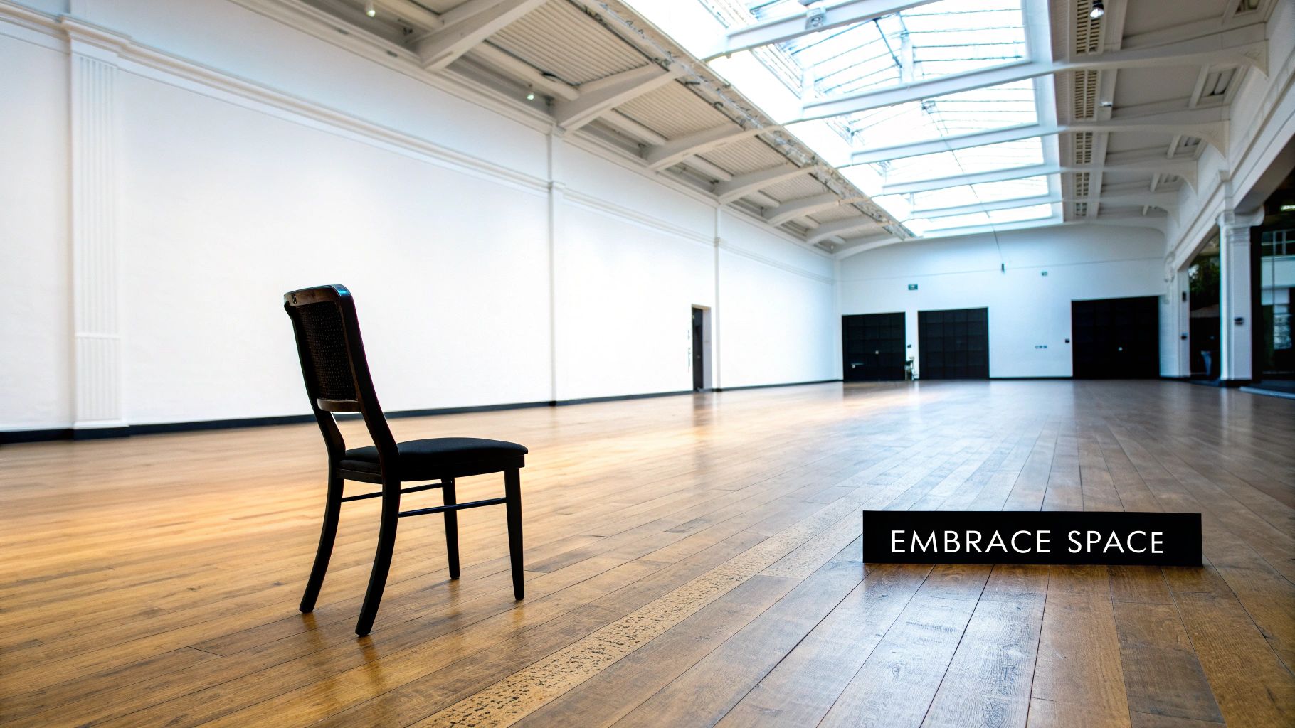
8. White Space (Negative Space)
White space, also known as negative space, is a fundamental principle of visual design that significantly impacts how users perceive and interact with a design. It refers to the empty or unoccupied areas surrounding and between elements in a composition, such as images, text, logos, and other design components. While it might seem counterintuitive to leave areas blank, white space is far from "empty" or "wasted." It's a powerful tool that enhances readability, improves visual hierarchy, and creates a sense of elegance and sophistication. Understanding its strategic use is crucial for anyone involved in visual communication, from small businesses creating marketing materials to large corporations designing websites. This principle plays a vital role in achieving effective and aesthetically pleasing designs, solidifying its place among the core principles of visual design.
White space works by providing visual breathing room for the eye. It separates elements, allowing them to stand out and be more easily processed by the viewer. Without adequate white space, designs can feel cluttered and overwhelming, making it difficult for the user to focus on the intended message. By strategically incorporating white space, designers can guide the user's eye through the layout, highlighting key information and creating a more enjoyable and engaging experience.
There are different types of white space to consider:
- Macro white space: This refers to the large areas of empty space between major layout sections, such as the space between a website's header and main content area, or the margins of a printed brochure. Macro white space defines the overall structure and flow of a design.
- Micro white space: This refers to the smaller pockets of space between individual elements, such as the spacing between letters (kerning), lines of text (leading), and smaller design elements like icons and buttons. Micro white space contributes significantly to readability and overall aesthetic appeal.
- Active white space: This is intentionally used to create specific effects, such as directing the viewer's gaze or emphasizing a particular element. It's a deliberate design choice used to shape the user experience.
- Passive white space: This occurs naturally around elements and within the layout. It's not explicitly planned but contributes to the overall balance and harmony of the design.
The benefits of effectively using white space are numerous:
- Improved Readability and Comprehension: By separating text and other elements, white space makes content easier to scan and digest. This is especially crucial for websites, brochures, and other materials with a significant amount of text.
- Premium Brand Perception: Abundant white space is often associated with luxury and sophistication. Think of high-end fashion websites or minimalist product packaging. White space creates a sense of elegance and exclusivity.
- Reduced Cognitive Load and Visual Fatigue: A cluttered design forces the user to work harder to process information, leading to fatigue and frustration. White space reduces this cognitive load, making the experience more pleasant and efficient.
- Emphasis and Focus: Strategically placed white space isolates and draws attention to important elements, ensuring the viewer doesn't miss key information or calls to action.
However, there are also potential drawbacks to consider:
- Perceived as "Wasted Space": Clients or stakeholders unfamiliar with design principles may view white space as unused space, potentially leading to disagreements about its implementation.
- Not Suitable for Information-Dense Designs: In situations where maximizing information density is paramount, such as technical manuals or data-heavy reports, extensive white space may not be practical.
- Requires Confidence and Restraint: Using white space effectively requires a good understanding of design principles and the confidence to resist the urge to fill every available space.
Examples of successful white space implementation are readily apparent in the digital world. Google's minimalist search page, with its vast expanse of white space, is a prime example. Similarly, Apple's product photography and marketing materials leverage white space to create a sense of elegance and focus on the product itself. High-end fashion brand websites and advertisements, along with museum and gallery displays, also demonstrate the power of white space in creating a sophisticated and impactful visual experience.
To effectively incorporate white space in your designs, consider these tips:
- Create Visual Hierarchy and Flow: Use white space to guide the user's eye through the layout, establishing a clear visual hierarchy and guiding them to the most important information.
- Don't Fill Every Inch: Resist the urge to cram every bit of space with content. Embrace the power of emptiness.
- Treat White Space as an Active Element: Consider white space as a design element in itself, not just an empty void.
- Test and Iterate: Conduct user testing to ensure your use of white space enhances usability and achieves the desired effect.
Learn more about White Space (Negative Space)
White space is a powerful tool for any designer. By understanding its principles and applying them effectively, you can create visually appealing and user-friendly designs that communicate effectively and leave a lasting impression. White space plays a crucial role in various visual design principles, including typography, layout, and overall composition, ensuring a clean and uncluttered appearance. It helps create a sense of balance and harmony, allowing the viewer's eye to easily navigate the design and understand the message being conveyed. Its effective utilization contributes to a positive user experience and enhances the overall effectiveness of the design. This makes it an essential principle for small businesses, startups, freelancers, and marketing agencies seeking to create professional and impactful visuals.
Principles of Visual Design Comparison
| Principle | Implementation Complexity 🔄 | Resource Requirements ⚡ | Expected Outcomes 📊 | Ideal Use Cases 💡 | Key Advantages ⭐ |
|---|---|---|---|---|---|
| Balance | Moderate – requires careful element consideration | Medium – involves size, color, texture, positioning | Visual stability and harmony | Layouts needing stability and hierarchy | Guides attention, professional and intentional feel |
| Contrast | Low to Moderate – managing color, size, typography | Low – mostly design choices | Strong visual interest and hierarchy | Readability, focal points, accessibility | Enhances readability, adds dynamism |
| Emphasis | Moderate – needs understanding of viewer behavior | Low to Medium – uses contrast, placement, isolation | Clear focal points and communication effectiveness | Highlighting key messages, calls to action | Directs viewer attention, memorable impact |
| Proportion and Scale | High – involves math and ratios like golden ratio | Medium to High – requires calculation and testing | Harmonious, visually pleasing designs | Product design, architecture, typography scaling | Enhances readability, establishes hierarchy |
| Movement and Rhythm | High – understanding eye flow and patterns | Medium – may involve animation or alignment | Dynamic compositions, guided viewer flow | Navigation, animated interfaces, storytelling | Engages viewers, improves comprehension |
| Pattern and Repetition | Low to Moderate – consistent element reuse | Low – mostly design consistency | Unity, cohesion, and brand recognition | Branding, textile, web design systems | Builds consistency, creates visual interest |
| Unity and Harmony | Moderate to High – requires systematic planning | Medium – style guides and design systems | Cohesive, polished, and professional designs | Brand identity, multi-platform consistency | Enhances user experience, boosts brand trust |
| White Space | Low to Moderate – requires restraint and confidence | Low – design decision on spacing | Improved readability, elegance, focus | Minimalist design, luxury brands, user interfaces | Reduces fatigue, elevates perceived quality |
Putting Principles into Practice: Elevating Your Design with Creativize
Mastering the principles of visual design—balance, contrast, emphasis, proportion and scale, movement and rhythm, pattern and repetition, unity and harmony, and white space—is crucial for creating impactful and effective visuals. These principles aren't just abstract concepts; they are the building blocks of compelling design, transforming ordinary graphics into powerful communication tools that resonate with your target audience. By understanding how these principles work together, you can elevate your brand, strengthen your marketing messages, and create a cohesive and memorable visual identity. Whether you're crafting a simple social media graphic or a complex website layout, applying these principles of visual design will significantly enhance the viewer's experience and drive better results.
The most important takeaway is that effective design is not accidental. It's the result of a conscious and skillful application of these core principles. From achieving visual balance to harnessing the power of white space, each element plays a critical role in guiding the viewer's eye and conveying the intended message. By thoughtfully considering each principle, you can ensure your visuals are not only aesthetically pleasing but also strategically designed to achieve specific communication goals. This understanding is invaluable for small and medium businesses, startups, entrepreneurs, creative freelancers, marketing agencies, and local community organizations alike, enabling them to create compelling visuals that truly connect with their audiences.
Ready to take your designs to the next level? Creativize connects you with talented professionals who understand these principles and can bring your vision to life. Explore the platform and discover a wealth of resources and top-tier creative talent to empower your design projects. Visit Creativize today and unlock the potential of the principles of visual design for your brand.