
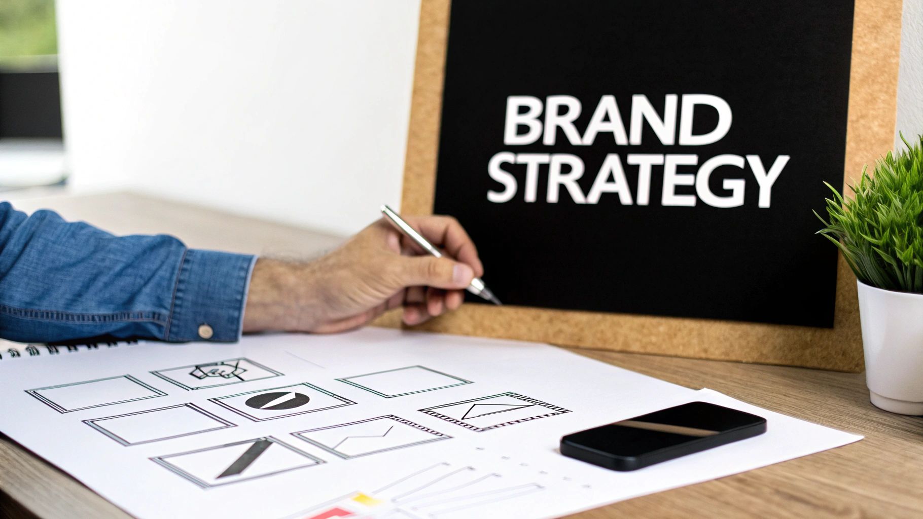
Every great logo starts long before you pick up a pencil or open up Illustrator. It starts with a plan. Think of it less like drawing a picture and more like building a foundation—without a solid strategic blueprint, whatever you build on top is destined to crumble.
This phase is all about discovery. It's where you dig deep into the brand's core identity to make sure the final logo isn't just a pretty visual, but a powerful tool that actually works.
Nail Down the Brand Personality
First things first: you have to get a feel for the brand's character. Is it a playful startup or a serious, established institution? Modern and edgy, or classic and trustworthy? How it feels will dictate every choice you make, from colors to typography.
- Innovative and Tech-Focused: This might call for clean lines, sharp geometric shapes, and a minimalist color scheme.
- Trustworthy and Established: Here, you might lean on classic serif fonts, symmetrical layouts, and dependable colors like navy blue or dark grey.
- Playful and Creative: This is your chance to break out the custom illustrations, vibrant color palettes, and maybe a hand-drawn script font.
Getting this right is crucial, and it often helps to have a structured way to pull this information out of stakeholders. I always start with a questionnaire to get everyone on the same page. If you're looking for a solid starting point, this branding questionnaire template covers all the bases.
Before jumping into the creative part, it helps to map out the foundational elements of your design. Think of these as your strategic pillars.
Core Logo Design Elements and Their Purpose
| Element | Purpose | Key Question to Ask |
|---|---|---|
| Typography | Conveys personality and tone | What font style (serif, sans-serif, script) best matches our brand's voice? |
| Color Palette | Elicits emotion and sets the mood | What feelings do we want our audience to associate with our brand? |
| Shape & Form | Creates visual interest and symbolism | Do we want to appear structured (geometric) or organic (curvy)? |
| Imagery/Icon | Provides a memorable, symbolic shorthand | What single, simple image could represent our core mission or name? |
Considering these elements from the get-go ensures your design is intentional, not just a collection of cool-looking parts. It's about making sure every piece serves the larger brand story.
Scope Out the Competition
Next, you've got to see what everyone else is doing. Pop open a few tabs and look at the logos of direct competitors and industry leaders. The goal here isn't to find things to copy—it's to find a way to be different. If every other brand in the space is using a blue, circular logo, that’s your cue to explore sharp angles and a fiery orange. Carve out a visual space that’s uniquely yours.
A well-designed logo isn’t just decoration; it’s a shortcut to recognition and trust. In fact, 75% of consumers recognize a brand by its logo alone. Getting that visual identity right can even boost revenue by up to 23%. It's a small asset with a huge impact.
Brainstorm the Big Ideas
Okay, now you have the personality, and you know how you want to stand out. It’s finally time to brainstorm concepts. But hold on—we're still not sketching just yet. This part is about ideas, not execution.
Start a word map. Create a mood board on Pinterest. Just get all the related concepts out of your head and onto a page. If the brand is all about speed, you might jot down things like lightning bolts, wings, arrows, or a cheetah. If it's about growth, maybe you explore ideas like trees, upward-swooping lines, or a rising sun.
This initial planning pays off everywhere, whether you're creating a corporate identity or designing logos for t-shirts where clarity is king. With this strategic foundation in place, you’re ready to start turning those concepts into tangible sketches.
Translating Ideas into Initial Sketches
Okay, you've done the strategic heavy lifting. Now for the fun part. This is where we get to ditch the spreadsheets and brand briefs and actually start making things. It’s time to move from the abstract world of ideas to concrete, visual marks on a page.
Honestly, this is the most freeing part of the entire logo design journey. Give yourself permission to silence that inner critic and just play. The goal right now isn't perfection; it’s pure, unadulterated exploration.
Grab a pencil and some paper. Or your iPad. Whatever you're comfortable with. The tool itself doesn't matter nearly as much as the mindset. Your job is to churn out a ton of small, super-quick sketches—what we call thumbnail sketches. Don't spend more than a minute or two on any single one. Seriously.
This rapid-fire approach is a classic technique for a reason. It lets you explore dozens of visual directions without getting bogged down in the tiny details. Just think about your core concepts—words like "speed," "growth," or "community"—and try to translate them into simple shapes and forms.
Brainstorming with Visuals
Feeling stuck? It happens. Try a little exercise called word mapping. Write your main brand keyword smack in the middle of a page. Then, start branching out with any related words, ideas, or symbols that pop into your head. This little trick is a fantastic way to unlock visual metaphors you might not have thought of otherwise.
Let's say you're designing for a coffee brand that’s all about "community." Your word map might lead you to sketch out things like:
- Coffee cups that interlock with each other
- A wisp of steam shaped like a conversation bubble
- A pattern of coffee beans that forms a welcoming circle
See? The whole point is to just let your mind wander and your hand follow. Try to fill at least one entire page with these tiny, diverse ideas. It's a foundational step in pretty much any creative field, which we touch on in our bigger guide to the design process steps.
The Power of Black and White
You might have noticed we haven't talked about color at all yet. That’s completely on purpose.
One of the most important habits you can build as a logo designer is starting your sketches in monochrome. Just black and white. No distractions.
Working in black and white forces you to focus on what truly matters: the form, balance, and silhouette of your design. A logo that works without color will almost always work with it. The reverse is rarely true.
A truly great logo has to be recognizable in its absolute simplest form. Think about the Nike swoosh or the Apple logo—their silhouettes are iconic and instantly identifiable. By stripping away color from the get-go, you're pressure-testing the fundamental strength of your own design.
This simple constraint helps you answer the really critical questions:
- Is the shape clear and memorable on its own?
- Does it feel balanced? Visually stable?
- Will it still be recognizable when it’s shrunk down to the size of a favicon?
From Many to a Few
Once you’ve got a page full of thumbnails, take a step back. Literally. Look at them from a distance. Which ones catch your eye? Circle the three to five sketches that feel the most promising. You're looking for the concepts that are unique, simple, and do the best job of communicating the brand's personality.
Now, take those top contenders and give them a bit more attention. Draw them again, but a little larger this time. Clean up the lines. Experiment with tiny variations—maybe you make a line thicker or adjust the spacing between two elements. This is where you start to polish your best ideas, getting them ready for the next phase: taking them into the digital realm.
Infusing Personality with Color and Typography
You’ve got a solid black-and-white sketch. That’s the blueprint. Now it's time to give it a soul. Color and typography are what transform that structure into something people can connect with, turning a simple shape into a memorable brand mark. This is where you move from form to feeling.
The right color palette can instantly broadcast what a brand is all about. Just think about the jolt of energy you get from a vibrant orange versus the quiet confidence of a deep navy blue. These aren't just aesthetic choices; they're psychological triggers, and making the right call is a huge part of the design process.
Choosing a Strategic Color Palette
Color is incredibly persuasive in branding. It's so powerful that research shows color alone accounts for about 80% of brand recognition. This is a massive piece of the puzzle when you're learning how to draw a logo that actually works in the real world.
The world’s top brands get this. It’s why about 95% of them use just one or two colors in their logos. Sticking to a simple palette creates clarity and ensures your logo looks good everywhere, from a tiny app icon to a massive billboard.
When you're picking out colors, think beyond what just looks good. What do you want to say?
- Blue: This is the color of trust, security, and cool professionalism. It's no wonder you see it everywhere in tech and finance.
- Red: Want to shout passion, energy, and excitement? Red is your go-to for brands that need to feel bold and dynamic.
- Green: Green is tied to nature, growth, and health. It’s a natural fit for wellness brands, eco-friendly products, or anything organic.
- Yellow: This one screams optimism and friendliness. It’s an attention-grabber that feels warm and approachable.
Don't just default to your favorite color. Dig into what makes for effective color combinations for logos and find a palette that truly communicates your brand's message.
The Art of Font Pairing
Typography does for words what color does for emotion—it sets the entire tone. The font you choose can instantly make your brand feel timeless, modern, playful, or high-end.
A serif font, with those little "feet" on the letters, feels classic and trustworthy. Think of established newspapers or luxury fashion houses. On the flip side, a clean sans-serif font feels modern, accessible, and no-nonsense, which is why it's a favorite for tech companies and startups. Then you have script fonts, which can add a personal, handcrafted feel—perfect for brands that want to seem artisanal or unique.
A huge mistake I see people make is trying to do too much with their typography. Just like with color, less is almost always more. Stick to one killer primary font, or pair two that have a really clear contrast—like a bold, modern sans-serif for a headline and a simple, readable serif for the tagline.
In the end, your color and typography need to feel like they belong together. Every choice you make should reinforce the personality you defined in your initial creative brief. That's how you make sure the final logo doesn't just look good, but also speaks the right language to the right people.
Vectorizing Your Design for a Professional Finish
You’ve got a sketchbook full of killer monochrome concepts. Now for the fun part: bringing that raw creative energy into the digital world. This is where we turn your best sketch into a clean, professional, and infinitely usable vector graphic. Think of it as translating your idea into a universal language that works on anything from a tiny app icon to a massive billboard.
This is probably the most technical piece of the logo design puzzle, but it’s where your design really takes shape. We're trading pencil lines for perfect curves and using specialized software to build a flawless final asset.
Choosing Your Vector Software
The undisputed industry heavyweight is Adobe Illustrator, but don't feel locked in. Powerful free options like Inkscape or the browser-based Figma are more than capable of producing pro-level work. Honestly, the specific tool matters less than understanding the core idea: you’re not coloring pixels anymore. Instead, you're defining paths, points, and curves with math.
That mathematical precision is what makes a vector logo scalable.
This quick visual breaks down how a design evolves from its simple black-and-white form into a polished final version with color and typography.
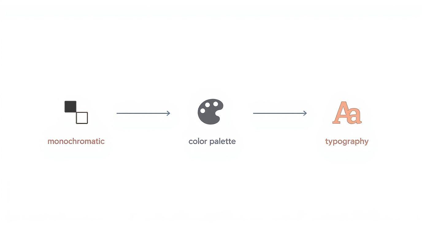
It really drives home the point that a rock-solid monochromatic foundation is non-negotiable before you start playing with color and fonts.
Before we dive into the "how," it's crucial to understand why vector is the only way to go for professional logo work. Here’s a quick breakdown of vector vs. raster graphics.
Vector vs. Raster Logo Formats
| Feature | Vector (e.g., SVG, AI) | Raster (e.g., JPG, PNG) |
|---|---|---|
| Scalability | Infinitely scalable without quality loss. Crisp at any size. | Loses quality and becomes pixelated when scaled up. |
| File Size | Generally smaller files, as they only contain math data. | Can be very large, especially for high-resolution images. |
| Editability | Shapes, colors, and paths can be easily edited at any time. | Editing is difficult and often destructive to the original pixels. |
| Best For | Logos, illustrations, icons, and typography. | Photographs, detailed digital paintings, web graphics. |
| Creation | Built with points, lines, and curves in vector software. | Composed of a fixed grid of pixels. |
In short, a raster logo is a dead end. A vector logo gives you, and your client, the flexibility to use it anywhere and everywhere, forever.
Mastering the Pen Tool
Get ready to meet your new best friend (and maybe your temporary nemesis): the Pen Tool. At first, it feels completely unnatural, almost like learning to write again. Instead of drawing freely, you’ll be placing anchor points and manipulating Bézier curves to create surgically precise lines and arcs.
My best advice? Just practice. A lot. Open your software of choice and just trace stuff—letters, simple icons, your own sketch. Get a feel for how clicking versus clicking-and-dragging creates different kinds of curves. The goal is to recreate your sketch using the fewest anchor points possible. This is the secret to getting those buttery-smooth, clean lines.
Pro Tip: Don’t try to draw the whole logo in one go with a single, continuous path. That's a recipe for frustration. Instead, break it down into simpler, overlapping shapes. Then, use tools like Illustrator's Shape Builder to merge, subtract, and combine those basic forms into your final, complex mark.
From Sketch to Polished Vector
Once you’re feeling more comfortable with the tools, the workflow itself is pretty straightforward.
First, import a clean, high-contrast photo of your best sketch. Drop it onto its own layer in your software and lock it so it doesn't move around.
On a new layer right on top, start tracing your design.
- Build the bones first. Focus on getting the main shapes and outlines in place. Don't sweat the small stuff yet.
- Then, refine everything. Zoom way in and nudge those anchor points and handles until every single curve is perfect.
- Check your connections. Make sure all your paths are closed (no gaps!) and that shapes align exactly where they should.
This meticulous process is what separates an amateur-looking logo from a truly professional one. Plus, working digitally makes getting feedback way easier. If you're on a team, checking out some of the best design collaboration tools can make this whole stage smoother.
Once your logo is looking sharp, it’s time to show it off. Finding one of the best portfolio sites for designers is the next step to getting your work in front of clients. A clean vector logo is a must-have centerpiece for any design portfolio. The final piece of the puzzle is exporting your file into all the right formats—usually SVG, AI, EPS, and PNG—so it’s ready for anything.
Getting a Feel for Modern Logo Design Trends
To create a logo that actually connects with people today, you've got to know what's going on in the design world. This isn't about chasing fads—it's about making smart, informed choices that feel current while staying true to your brand's soul. When you see what’s working for others, you can find a unique angle for your own design.
One of the biggest, most powerful movements you’ll see everywhere is minimalism. This whole approach is about stripping away the fluff and getting down to what matters: clean lines, simple shapes, and a focused color palette. It’s not popular by accident. In a world screaming for our attention, simplicity cuts right through the noise and just oozes confidence.
The Staying Power of Simplicity
Minimalism has been a dominant force in logo design for years, and frankly, it isn't going anywhere. Just look at giants like TikTok and Clubhouse. They prove how simple, clean type and a single, recognizable element can create a memorable logo that works everywhere, especially on tiny mobile screens. You can dig into even more of these logo design trends on wix.com.
A simple logo is also a chameleon. It looks just as sharp on a business card as it does embroidered on a hat or animating on a website. That kind of adaptability is non-negotiable for any brand that wants to look consistent across all the different places it shows up.
A minimalist approach forces you to boil down your brand’s entire story into its purest visual form. It’s a tough design challenge, but when you nail it, you get a timeless and incredibly effective logo.
Expressive and Nature-Inspired Marks
Beyond minimalism, a couple of other major trends have bubbled up that speak to our desire for something more authentic and human.
First up is expressive typography, where the font is the main event. We're talking custom lettering that's packed with a unique personality, turning the brand name itself into a piece of art. It’s a fantastic way to stand out.
Then there are the nature-inspired designs. These logos use organic shapes, earthy colors, and imagery pulled straight from the natural world to signal things like sustainability, wellness, and growth. This style helps brands build a real emotional bridge with people who care about authenticity and the environment. Getting familiar with the different styles of illustration can spark some great ideas for how to weave these natural elements into your work.
At the end of the day, understanding these trends gives you a whole toolkit of visual languages to play with. You can then pick the one that tells your brand's story best—whether that’s with the clean confidence of minimalism, the bespoke feel of custom type, or the grounded vibe of a nature-inspired mark.
Look, as you start learning how to draw a logo, a few questions always seem to surface. Getting good answers to these common sticking points can save you a world of frustration and keep things moving.
Whether you're on your first sketch or getting ready to export final files, it's totally normal to have questions. The goal is to get solid info so you can make decisions you feel good about as you go.
What’s the Best Software for Drawing a Logo?
For any logo that needs to look professional, vector software is non-negotiable. The long-reigning champ is Adobe Illustrator. It’s packed with precise, powerful tools for creating graphics that scale perfectly, and honestly, it’s what the pros use for a reason.
But you don't have to shell out big bucks to get started. Free options like Inkscape and the browser-based Figma are ridiculously capable. Both give you everything you need to create a high-quality vector logo that’ll look sharp on a business card or a billboard.
When you're just brainstorming, the tool doesn't really matter. A simple pencil and paper, or even an app like Procreate on an iPad, are perfect for just getting ideas out. The critical move is always taking that final sketch and building it in a vector format. That's what makes it scalable and professional.
How Many Logo Concepts Should I Create?
There isn’t a magic number, but I can tell you this: quantity breeds quality in the early stages. You should aim to sketch at least 20-30 rough ideas. This rapid-fire approach helps you explore a ton of different directions and keeps you from getting too attached to your first idea—which, let's be honest, is rarely the best one.
From that big pile of thumbnail sketches, the goal is to find the real gems.
- Pick Your Top Contenders: Find the 3-5 sketches that feel the most unique, memorable, and in sync with the brand’s vibe.
- Take Them Digital: Bring these chosen few into your vector software and start building them out.
- Polish and Present: Refine these concepts into something you'd actually be proud to show. This gives you solid, distinct choices without overwhelming yourself (or your client).
What Files Do I Need for a Finished Logo?
A complete, professional logo package is all about being ready for anything. You need to make sure the logo can be used correctly no matter where it shows up, from a tiny favicon to a giant trade show banner.
Your final handover should always include these essentials:
- The Original Source File: This is your master vector file, usually an .AI, .EPS, or .SVG. It’s the fully editable "master key" and the most important file you'll create.
- Web-Ready Formats: You’ll want an SVG for crisp display on websites and a PNG with a transparent background for digital use.
- General Use Formats: A high-resolution JPG is also handy for situations where you don't need transparency.
And don't forget color variations! A truly complete logo package has to include the full-color version, an all-black version, and an all-white (or knockout) version. This is the only way to guarantee the logo will look great no matter what background it’s placed on.
Ready to bring your business vision to life with a stunning brand identity? The talented professionals on Creativize specialize in everything from logo design to full-scale branding. Find the perfect creative partner for your project on Creativize and start building a brand that stands out.