
A great logo isn't just cooked up in a design program.It’s the result of a deliberate, strategic process that starts long before you ever touch a pixel. It begins with digging deep into your brand's identity—your mission, your audience, your place in the market. This groundwork is everything. It transforms your logo from a simple picture into a powerful business asset that truly connects with people.
Every decision, from the psychology of your color choice to the personality of your font, flows from this initial strategic work. Get this part right, and you'll end up with a brand mark that’s not only memorable but genuinely effective.
Building Your Brand’s Strategic Foundation

Before you even think about sketching, you need to lay down a solid strategic foundation. This is non-negotiable. Skipping this discovery phase is like trying to build a house without a blueprint—sure, you might end up with something that looks interesting, but it's guaranteed to be unstable. Your logo is the visual cornerstone of your entire brand, and every single element has to be intentional.
This initial work isn't about drawing; it’s about asking tough questions. What's the real mission behind your business? Who are you actually trying to talk to? The answers you uncover are the raw materials for a logo that means something. With the global graphic design market valued at over $60 billion as of 2025, it’s clear that getting this right has a massive economic impact.
Defining Your Brand Personality
First things first: think of your brand as a person. If your brand walked into a room, how would people describe it? Is it a bold innovator, or more of a quiet, trustworthy traditionalist? You have to nail down this personality, because your logo is its visual handshake.
A clearly defined personality becomes your filter for every design choice you make later on. Let’s say you’re building an outdoorsy, rugged brand. You wouldn't use delicate script fonts and soft pastels, would you? Of course not. You’d lean into strong, earthy tones and bold, sturdy typography. This alignment is what creates a cohesive, believable brand experience. If you need help zeroing in on this, our guide on https://creativize.net/blog/building-a-strong-brand-7-expert-strategies offers some great starting points.
Identifying Your Target Audience
Here's a hard truth: your logo isn't for you. It's for your customers. To design a logo that actually resonates, you have to get inside their heads. Go beyond the basic demographics and really think about their values, their aspirations, and what they find visually appealing. A logo for Gen Z tech nerds is going to look and feel completely different from one targeting retirees who need financial planning advice.
Jot down a quick audience profile to keep your design thinking on track:
- Demographics: Age, location, income. The basics.
- Psychographics: Hobbies, values, lifestyle, and what keeps them up at night.
- Communication Style: Do they expect formal, professional language, or are they more comfortable with casual, witty banter?
A logo that tries to be for everyone ends up being for no one. Getting specific is your single greatest advantage in creating a design that forges a real, lasting connection with the right people.
Analyzing Your Competitors
Looking at your competition isn’t about copying what they do. It's about finding a way to do something different—and better. Pick your top three to five competitors and break down their logos. Look for patterns. Are they all using the same colors? Similar fonts? The same overall vibe?
Once you see the trends, your job is to zig where they zag. If every competitor in your space has a blue, corporate-looking logo, maybe a warmer, more approachable color palette is your ticket to standing out. This strategic positioning ensures your logo isn’t just another face in a crowded room.
As you build this foundation, it's also a good time to think about the bigger picture. Understanding the value of creating a comprehensive design system from the start will ensure your logo and all other visual elements work together seamlessly for years to come.
From Brand Strategy to Visual Ideas
Alright, you've done the hard work and laid a solid strategic foundation. Now for the fun part: turning those abstract ideas into something you can actually see. This is where your brand’s personality really starts to emerge.
But hold on. Before you fire up Illustrator, resist the temptation to go digital. I can't stress this enough: the most original, powerful concepts almost always start with a pen and paper.
This low-fi, freeform stage is non-negotiable in my book. It lets you explore a ton of possibilities without getting bogged down in pixels and anchor points. The goal here is pure volume—get a flood of raw ideas down, knowing the gems will surface from that initial chaos.
Unlocking Ideas with Mind Maps and Wordplay
Start by putting your core brand concept right in the middle of a blank page. Now, branch out with related words, feelings, and ideas. This is called mind mapping, and it’s a killer technique for organizing your thoughts and stumbling upon connections you wouldn’t have seen otherwise.
Let’s say you're working on a coffee brand. Your central idea might branch into themes like "Community," "Energy," and "Craftsmanship." Don't stop there.
- Community could lead to words like "Gathering," "Friends," and "Comfort."
- Energy might spark ideas like "Morning," "Focus," and "Spark."
- Craftsmanship could connect to "Artisan," "Bean," and "Process."
This web of words is your creative fuel. Start looking for visual metaphors. Could "Spark" become a starburst? Could "Gathering" be represented by a few interconnected shapes? These are the exact prompts that will feed your first round of sketches.
Know Your Logo Types
Before you start doodling, it helps to know the main categories of logos. Each one communicates differently, and the right choice is all about your brand's name, industry, and the vibe you're going for.
- Wordmarks (or Logotypes): These are all about the typography, focusing on the business name itself. Think Google, Visa, or Coca-Cola. They’re perfect for companies with a distinct and memorable name.
- Lettermarks (or Monograms): A close cousin to the wordmark, these use the brand's initials. This is a go-to for businesses with long names, like HBO (Home Box Office) or NASA.
- Pictorial Marks (or Logo Symbols): These are straight-up icons—a literal or abstract picture of the brand. Apple's iconic apple and Twitter's bird are prime examples.
- Abstract Marks: These are symbols that aren’t a literal representation of anything but instead capture a feeling or mission. The Nike swoosh and the Pepsi globe are masters of this. They create a completely unique visual.
- Combination Marks: This is the best of both worlds, pairing a wordmark with a pictorial or abstract mark. Brands like Adidas and Burger King use this style, giving them the flexibility to use the symbol and text together or on their own.
Choosing a logo type is a strategic move. A wordmark hammers home name recognition, while a powerful symbol can cross language barriers. The trick is to pick a format that lines up with where you want your brand to go long-term.
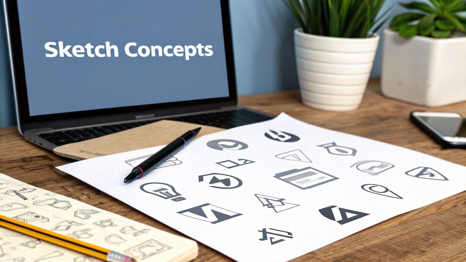
The Magic of Messy Sketches
With your mind map in one hand and your knowledge of logo types in the other, it’s finally time to sketch. Seriously, don't worry about your drawing skills. This isn't about creating a masterpiece. It's about getting as many rough ideas on paper as you can, as fast as you can.
Embrace a "quantity over quality" mindset at this stage. Fill a page with tiny, thumbnail-sized sketches. Explore different concepts from your brainstorm. What if you combined the "Spark" idea with a monogram? What would a wordmark that feels "Comfortable" look like? How could you represent "Focus" with an abstract mark?
This process is incredibly liberating. You’re not married to any single idea, so you’re free to explore weird, bold, and even "bad" concepts without any pressure. You’d be surprised how many of the best final logos are born from a mashup of these early, unfiltered doodles. Jumping to a digital tool too soon just shuts down this essential exploration and usually leads to more predictable, generic results.
Mastering the Psychology of Color and Typography
Let’s be honest: color and typography are the soul of your logo. Long before anyone even reads the name, they feel it. They’re not just decoration; they’re the emotional handshake between your brand and your audience.
This is where the rubber meets the road—your brand strategy bleeds directly into your visual design. It’s all about making sure your logo speaks the right language to the right people from the very first glance.
Tapping Into the Power of Color Psychology
Colors hit us on a gut level. They trigger feelings and associations almost instantly, a fundamental part of how our brains work. Using color psychology is your chance to align your logo with the exact emotions you want your brand to stir up.
Think about it. A new fintech app will almost certainly lean on blue to signal trust and security. On the other hand, an energy drink brand is going to grab reds or oranges to scream excitement and power. The right color choice does the heavy lifting for you, reinforcing your message without a single word.
This subconscious communication is no joke. Research shows that a whopping 80% of people think color boosts brand recognition. And when your logo has just a few seconds to make an impact, your color choices are everything.
When you're building your palette, here are some of the classic associations to keep in mind:
- Red: Passion, energy, urgency
- Blue: Trust, stability, calm
- Green: Growth, nature, health
- Yellow: Optimism, happiness, clarity
- Orange: Friendliness, enthusiasm, creativity
- Purple: Luxury, wisdom, imagination
- Black: Sophistication, power, elegance
- White: Simplicity, cleanliness, modernity
The goal isn’t to just pick a color you like. It’s about choosing a hue that embodies your brand's personality and mission. Get this wrong, and you risk sending a seriously mixed message.
Building a Cohesive Color Palette
One color is a start, but a full palette gives your brand real depth and flexibility. A solid palette usually has a primary color, one or two secondary colors, and a neutral to tie it all together.
You have to think about how these colors will play together everywhere—on your website, in your app, on a business card. A primary blue might get paired with a light gray for a corporate vibe, or you could throw in a vibrant orange for a more tech-forward, dynamic feel.
For some killer ideas on how different shades can work together, check out our guide on 10 winning color combinations for logos in 2025.
Choosing Typography That Speaks Your Language
Fonts have personalities, just like colors do. The typeface you pick is a huge part of your brand’s voice. Is your brand classic and authoritative? Or is it more modern and approachable? Your font choice needs to amplify that vibe.
There are three main buckets of fonts to get familiar with, and each brings a totally different feel to the table.
- Serif Fonts: These are the ones with the little "feet" (serifs) on the ends of the letters. They tend to feel traditional, reliable, and sophisticated. Think Tiffany & Co. or Rolex.
- Sans-Serif Fonts: Clean, modern, and straight to the point, these fonts don't have the decorative feet. They project simplicity and are a go-to for tech companies like Google and Netflix.
- Script Fonts: These look like handwriting, running the gamut from elegant and formal to super casual and fun. They add a personal, human touch, which is perfect for brands that want to feel creative or artisanal.
The Art of Pairing Fonts
If your logo has a name and a tagline, you'll need to pair fonts that work well together. The secret is to create contrast while keeping things harmonious. A classic move is to pair a bold, attention-grabbing font for the main name with a simpler, easy-to-read font for the tagline.
For example, a strong serif for the headline and a clean sans-serif for the tagline creates a clear visual hierarchy. It tells the eye what to read first. Just try to avoid pairing two fonts that are too similar or both wildly decorative—that just creates a visual mess and tanks legibility. Your logo has to be readable whether it's on a tiny app icon or a giant billboard.
Choosing Your Digital Design Toolkit
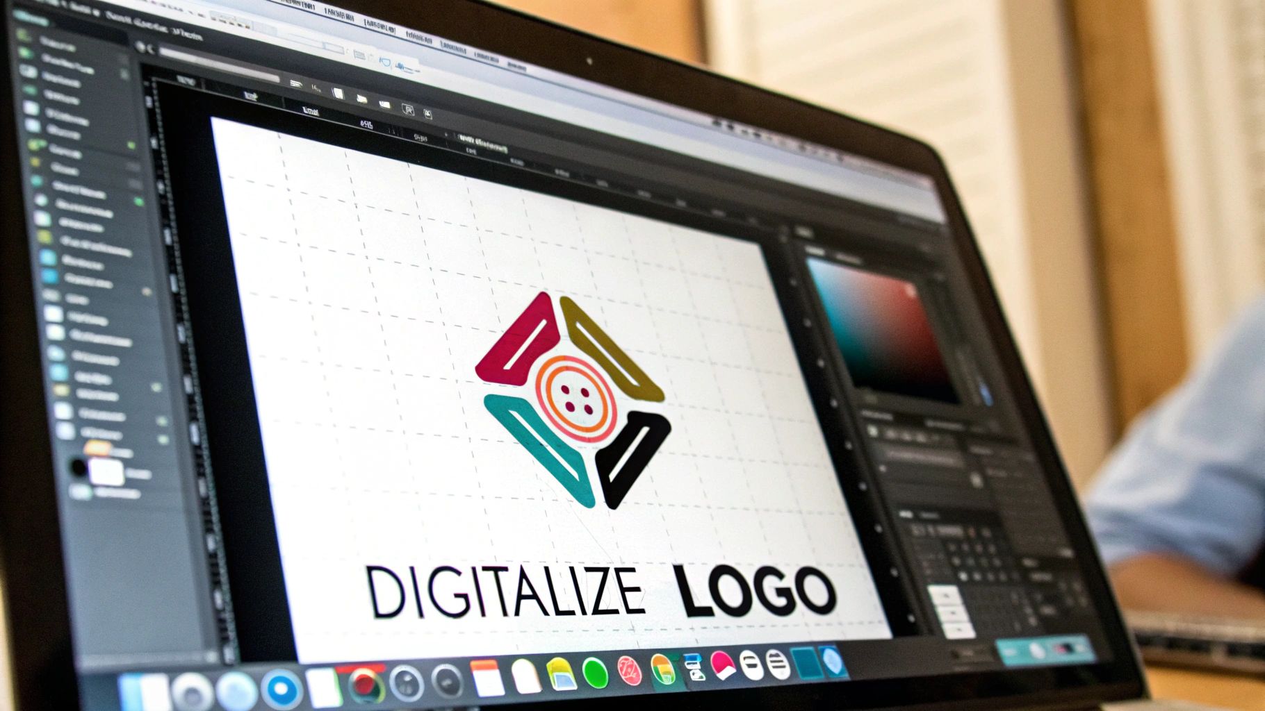
Alright, you’ve done the hard work of research and sketching. Now it's time to bring those ideas to life on the screen. This is the moment where your concepts transform from rough paper drawings into polished, professional graphics. Picking the right digital tools is the critical next step in making a logo that isn't just nice to look at, but actually works in the real world.
Before we dive into software, there’s one non-negotiable concept you have to grasp: vector vs. raster.
Think of a raster image (like a JPG or a photo from your phone) as a tiny mosaic made of pixels. When you try to make it bigger, you’re just stretching those little squares out. The result? A blurry, pixelated mess. It’s a dead end for professional logo work.
A vector graphic (like an SVG or EPS file), on the other hand, is built with math—points, lines, and curves defined by equations. This means you can scale a vector logo to any size imaginable, from a favicon on a website to a giant billboard in Times Square, and it will stay perfectly sharp and crisp. No exceptions.
Your final logo absolutely must be in a vector format. This isn't a suggestion; it's a fundamental rule of professional logo design. It guarantees your brand looks sharp everywhere, at any size.
Selecting Your Design Software
So, what should you use? The tool you choose really comes down to your budget, your skills, and how much creative control you’re after. There's no single "best" option, but there are clear winners for different scenarios.
- Professional Vector Editors: Tools like Adobe Illustrator and Affinity Designer are the industry standard for a reason. They give you total, granular control over every single point and curve, allowing you to build a truly unique logo from scratch. Yes, they come with a learning curve (and a price tag), but the professional power they offer is unmatched.
- User-Friendly Design Platforms: Platforms like Canva have opened up the world of design to everyone. They’re fantastic for beginners or anyone needing a quick, decent-looking logo without getting bogged down in design theory. The trade-off, however, is less originality and limited customization. You're often working within a template-driven world.
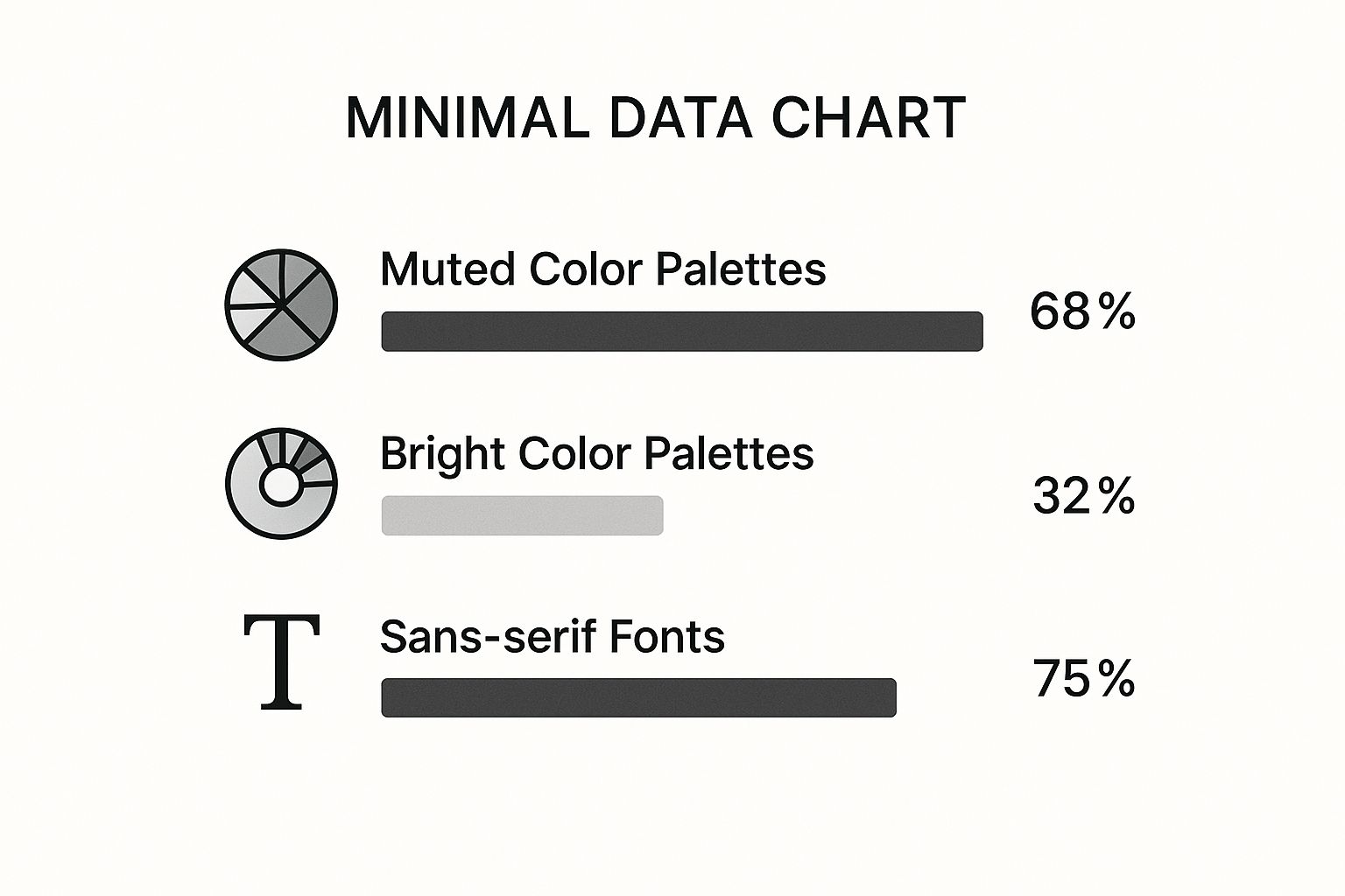
The chart below gives a great snapshot of what’s trending in logo design right now, showing a clear preference for muted colors and clean, sans-serif fonts. It’s a minimalist vibe that’s taking over.
Luckily, this clean, modern aesthetic can be achieved with any of the tools we've mentioned, whether you're a pro in Illustrator or just starting out on Canva.
To make the choice a bit clearer, here’s a quick breakdown of your options.
Comparing Logo Design Tools and Methods
Choosing the right path for your digital logo creation can feel overwhelming. This table breaks down the most common methods to help you decide which one aligns best with your budget, skill level, and project goals.
| Method | Best For | Pros | Cons |
|---|---|---|---|
| Professional Vector Software | Designers, businesses needing a unique, scalable brand identity. | Unmatched creative control, fully custom results, industry-standard file formats. | High cost, steep learning curve. |
| User-Friendly Platforms | Beginners, DIYers, small businesses on a tight budget. | Low cost (or free), easy to use, fast results. | Limited customization, risk of generic-looking logos, potential file format issues. |
| AI Logo Generators | Brainstorming, startups needing quick concepts, non-designers. | Generates dozens of ideas in minutes, great for inspiration. | Lacks strategic thinking, often requires human refinement. |
| Hiring a Freelance Designer | Businesses wanting a professional, strategic logo without the hands-on work. | Expertise, creativity, and a strategic process from a pro. | Higher cost, requires finding the right designer. |
Ultimately, the best tool is the one that gets you from concept to a professional, usable logo without causing a massive headache. Be realistic about your skills and needs.
What About AI Logo Generators?
There's a new player in the game, and it’s a big one: AI logo generators. These aren't just glorified template libraries. Think of them as creative sparring partners that can help you churn through ideas at lightning speed.
You feed them keywords, color palettes, and style notes, and they'll spit back dozens of unique concepts in minutes. According to recent findings, in 2025, these AI tools are allowing designers and businesses to create multiple concepts—often dozens at a time—with huge variations in fonts, layouts, and symbols. This shift is seriously speeding up the creative process. You can find out more about how AI is shaping logo design trends.
For instance, if your brand is "Solstice Coffee," you could ask an AI tool for logos that are "minimalist, warm, and feature a sun icon." The results might not be your final logo, but they can be an incredible way to break through a creative block. You might stumble upon a concept you'd never considered, sparking a whole new direction.
The key is to use these tools for what they are: idea machines. They’re for rapid inspiration, not a replacement for thoughtful design strategy. The best logos will still need a human touch to refine the details and ensure they truly connect with your brand’s core message.
How to Refine Your Logo with Real Feedback
Designing a logo in a vacuum is a classic mistake. You can pour all the strategy and creativity you have into your concepts, but the real test doesn't start until other people lay eyes on them. This is the moment a good idea has the chance to become a truly great logo—one that actually connects with the right people.
Just to be clear, this isn't about design by committee or letting your cousin's personal taste derail the whole project. Think of it more as a focused effort to gather constructive, actionable insights that will only strengthen your design. It's about stress-testing your work against the real world to see if it holds up before you commit.
The goal here is to filter through all the opinions to find the objective truths. These are the insights that will elevate your logo from just looking good to performing brilliantly for your brand.
Who to Ask for Input
Choosing your feedback group is a strategic decision in itself. Showing your designs to the wrong people can send you down a rabbit hole of useless, subjective comments. "I don't like blue" isn't helpful. What you need is a small, diverse group that offers different, valuable perspectives.
Your feedback circle should ideally include a mix of these people:
- Target Audience Members: Find people who actually fit your ideal customer profile. Their gut reactions are gold because they're the ones you’re ultimately trying to win over.
- Stakeholders: This includes key team members, investors, or partners who live and breathe the brand’s mission. They’re your gut check for whether the design aligns with the core business strategy.
- Fellow Designers or Creatives: Another designer can offer technical feedback on things like balance, scalability, and execution that a non-designer would completely miss. They speak the language.
If you're running this process solo but crave that professional gut check, you might want to look into how to hire designers for a one-off consultation. Sometimes a fresh, expert eye is exactly what you need.
Asking the Right Questions for Actionable Insights
Generic questions like, "So… do you like it?" are completely useless. They invite vague, personal opinions that give you nothing to work with. To get feedback you can actually use, you have to ask specific, targeted questions that tie back to your original design brief.
Instead of going for a simple thumbs-up or thumbs-down, frame your questions to dig deeper:
- "What are the first three words that pop into your head when you see this?"
- "Does this feel more like a luxury brand or an everyday, affordable one?"
- "If this brand were a person, what kind of personality would they have?"
- "Where would you expect to see a logo like this?"
Questions like these force people to think critically about the message the logo is sending, which gives you much more valuable data. To really make sure your logo connects, you can learn more about how to effectively gather customer feedback and apply those principles here.
Don’t just show the logo on a blank white page. Context is everything. Present your designs in real-world mockups—on a website, a t-shirt, a business card. This helps people visualize the logo in action and provide much more practical feedback.
Filtering Feedback and Making Final Decisions
Let's be real: not all feedback is created equal. Your job is to be an objective filter, sorting through the noise to find the nuggets of gold.
Look for patterns. If three different people from your target audience say the logo feels "outdated" or "confusing," that’s a red flag you absolutely cannot ignore.
But if one person just happens to hate the color green? That’s probably just personal taste. At the end of the day, always weigh the feedback against your original strategic brief. A strong logo is where creative execution and strategic goals meet, and this refinement process is your final quality check.
Getting Your Logo Package Ready for the Real World
Once you get that final, triumphant sign-off on a logo design, it’s easy to feel like you've crossed the finish line. But hold on—the project isn’t quite done yet. Now comes one of the most critical steps: building a comprehensive, professional logo package.
This is the official handover, the master key that ensures your brand’s new visual identity stays consistent and looks sharp, no matter where it shows up. If you skip this or cut corners, all that hard work can unravel fast. A logo that looked perfect on your screen can end up fuzzy on a t-shirt or print with bizarre colors on a brochure. A proper package stops these problems before they ever start.
File Formats and Color Profiles: The Technical Nitty-Gritty
First things first, you have to get a handle on the technical differences between files made for screens and those destined for print. They are absolutely not interchangeable. Using the wrong one is a classic rookie mistake that kills quality.
- RGB (Red, Green, Blue): This is the color space for all things digital. Think websites, social media graphics, app icons, and slide decks.
- CMYK (Cyan, Magenta, Yellow, Key/Black): This is the four-color model used for anything that gets physically printed, like business cards, posters, and product packaging.
Exporting your logo in both profiles is non-negotiable. It’s what ensures the vibrant red on your website doesn’t transform into a dull, muddy maroon on your freshly printed business cards.
Just as important are the file formats themselves. You need to provide a mix of vector and raster files to cover every conceivable scenario.
- Vector Files (SVG, EPS): These are your master files, the holy grail of your logo package. Because they're built with mathematical formulas instead of pixels, they can be scaled to any size—from a tiny favicon to a massive billboard—without losing a shred of quality.
- Raster Files (PNG, JPG): These are pixel-based files, perfect for everyday digital use. PNGs are especially vital because they support transparent backgrounds, which lets you place your logo cleanly on top of photos or colored backgrounds.
A professional logo package is your brand's insurance policy. It guarantees that anyone—from a web developer to a print shop—has the exact file they need to represent your brand flawlessly every single time.
Building a Complete Set of Logo Variations
A single logo file just won't cut it. To give the brand maximum flexibility, your final package absolutely must include several key variations. This allows the logo to adapt to any background, fit into any layout, and work in any application without looking weird or forced.
Your final checklist should have every version below, exported in all the necessary file formats (SVG, EPS, PNG) and color profiles (RGB, CMYK).
The Must-Have Logo Variations:
- Full-Color Primary Logo: This is your main, go-to version. The default.
- All-White (Reversed-Out) Version: Absolutely essential for placing your logo on dark or colorful backgrounds where the primary version would disappear.
- All-Black Version: A simple, high-contrast option for one-color documents or applications where full color isn't necessary or possible.
- Logomark/Icon Only: If your design includes a distinct symbol, provide it as a standalone file. This is perfect for favicons, social media profile pictures, and app icons.
The final touch is delivering these assets in a clearly organized folder system. This package becomes a cornerstone of your brand’s toolkit. To see how these files fit into the bigger brand strategy, check out our deep-dive on how to create brand guidelines that actually work.
Even after you’ve got a solid process down, there are always a few lingering questions that pop up. Let's tackle some of the most common ones I hear from people diving into the world of logo design.
How Much Should a Professional Logo Actually Cost?
This is the big one, and the answer is… it depends. The price can swing wildly from totally free (if you’re using an AI tool) to tens of thousands for a top-tier agency.
A skilled freelance designer will typically land somewhere between $500 and $2,500. If you’re looking at an established design agency, their starting point is often closer to $3,000. The final number really comes down to the designer’s experience, how complex the project is, and how deep they're going on brand strategy.
What’s the Single Most Important Quality of a Great Logo?
You'll hear a lot about simplicity and memorability, and those are definitely key. But if I had to pick just one thing, it’s appropriateness.
A great logo has to feel right for the brand. It needs to fit the industry, connect with the target audience, and capture the company’s unique personality. It also has to be a workhorse—looking just as sharp on a tiny website favicon as it does blown up on a massive trade show banner.
Can I Just Design My Own Logo if I’m Not a Designer?
You absolutely can. Tools like Canva and all the new AI logo generators have made design more accessible than ever before. Go for it.
But your success will hinge on whether you nail the strategic thinking we've talked about—really getting to the heart of your brand, your audience, and where you fit in the market. A professional designer doesn't just know how to use the software; they bring a deep understanding of visual theory and brand strategy that a tool alone can't replicate.
Ready to find the perfect creative partner to bring your vision to life? Explore a community of talented local designers on Creativize and get your project started today at https://creativize.net.