
Hopping into a new design project without a clear plan is a recipe for disaster. It's like trying to build a house without a blueprint. Before you get lost in a sea of color palettes and font pairings, the absolute first step is to lay a solid foundation. This is what separates a pretty picture from a design that actually works.
Laying the Groundwork for a Successful Design
Every great design starts by answering one simple question: why?
Without a clear purpose, your design is just decoration. But when you anchor it to a specific goal, it becomes a powerful tool for communication. This strategic thinking is why the global graphic design market is booming, projected to hit $55.7 billion by 2025. It’s also why 73% of companies are investing more in design than ever before—they know it’s essential for connecting with their audience.
Define Your Primary Goal
First things first, you need to nail down the single most important thing you want someone to do after seeing your design. Are you trying to sell tickets to a festival? Get people to sign up for a newsletter? Or maybe just build some buzz around a new product launch?
Get specific. "Increase engagement" is too vague. Instead, aim for something you can actually measure, like, "Get 100 new email subscribers from the link in our Instagram bio." This clarity will be your guiding light for everything that follows, from the headline you write to the color of your call-to-action button. A huge part of this is knowing how to write a creative brief that gets everyone on the same page from day one.
Identify Your Target Audience
Okay, you know what you want to achieve. Now, who are you talking to?
You have to go deeper than generic labels like "millennials" or "small business owners." Sketch out a quick profile of your ideal person. What do they care about? What kind of visuals do they gravitate towards? A design for a high-end financial advisor is going to feel completely different from one for a local skate shop, and that's because their audiences have completely different tastes and expectations.
To get the ball rolling, think about:
- Demographics: Age, location, job title—these details matter.
- Motivations: What problem are you solving for them? What are their pain points?
- Visual Language: What other brands do they follow? What's the general aesthetic they're into?
This simple flowchart shows how these pieces fit together. Your Goal and Audience are the foundation that informs your core Message.
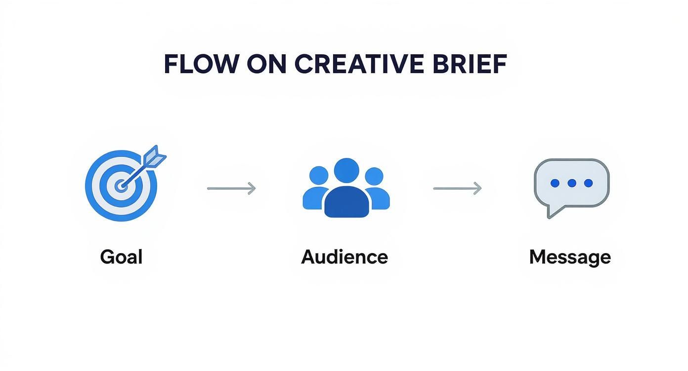
This process keeps you from just making things that look cool and pushes you toward creating things that actually connect with the right people.
Key Takeaway: A design brief isn't just bureaucratic paperwork. It’s your project’s North Star. It keeps everyone aligned and saves you from endless, frustrating revisions down the line.
To make this process even easier, we've broken down the essential components every brief should have.
Core Components of a Design Brief
A great brief doesn't have to be a novel, but it does need to cover the essentials. Think of it as a cheat sheet for your project.
| Component | Key Question to Answer | Example |
|---|---|---|
| Project Goal | What is the #1 thing this design needs to accomplish? | "Drive 200 sign-ups for our upcoming webinar." |
| Target Audience | Who are we trying to reach, specifically? | "Tech-savvy marketing managers, aged 28-40, who follow industry blogs." |
| Core Message | What is the one key takeaway for the audience? | "Our new software saves you 10 hours of manual work each week." |
| Deliverables | What specific assets do you need? | "One Instagram carousel post (1080x1350px) and three animated Stories (1080x1920px)." |
| Tone & Voice | What personality should the design convey? | "Professional and innovative, but also approachable and friendly." |
Having these details documented before you start is a game-changer. For a more structured approach, you can grab our creative brief template. It’ll keep your project on track and ensure the final result doesn’t just look good, but delivers real results.
Finding Inspiration and Defining Your Visual Direction
With your project goals locked in, it’s time to shift from the what to the how. This is where strategy meets style, and honestly, it’s one of the best parts of the process. You get to dive into the visual world and see what’s out there.
But this isn't about aimless scrolling. You're on a mission. The goal is to hunt down visual cues—colors, fonts, photo styles, layouts—that resonate with the feeling you want your project to evoke. Think of it like a chef gathering ingredients before touching a single pan. You’re building a library of ideas that feel right for your audience and your message.
How to Gather Inspiration Effectively
The trick here is to look with a critical eye. When you're browsing, don't just "like" something and move on. Stop and ask yourself why a design is catching your attention. Is it the confident, chunky typography? The calm, minimalist color scheme? The way the layout guides your eye through the page?
Here are my go-to spots for quality inspiration:
- Behance: This is fantastic for seeing the whole story. Designers often post full case studies, showing you their process from the initial concept to the final product. It’s way more insightful than just seeing a single, polished image.
- Dribbble: Perfect for quick hits of inspiration. It’s a goldmine for UI elements, slick animations, and branding concepts. It gives you a great sense of what trends are currently making waves.
- Pinterest: Don't underestimate it. It's basically a visual search engine, and it’s brilliant for collecting broad ideas. You can create different boards for "Color Palettes," "Logo Ideas," or "Web Layouts" to keep everything organized.
Here's a look at the kind of curated work you’ll find on a platform like Behance.
See how it's not just a random feed? It's a gallery of diverse styles all in one place, which lets you quickly pinpoint visual themes that click with your project.
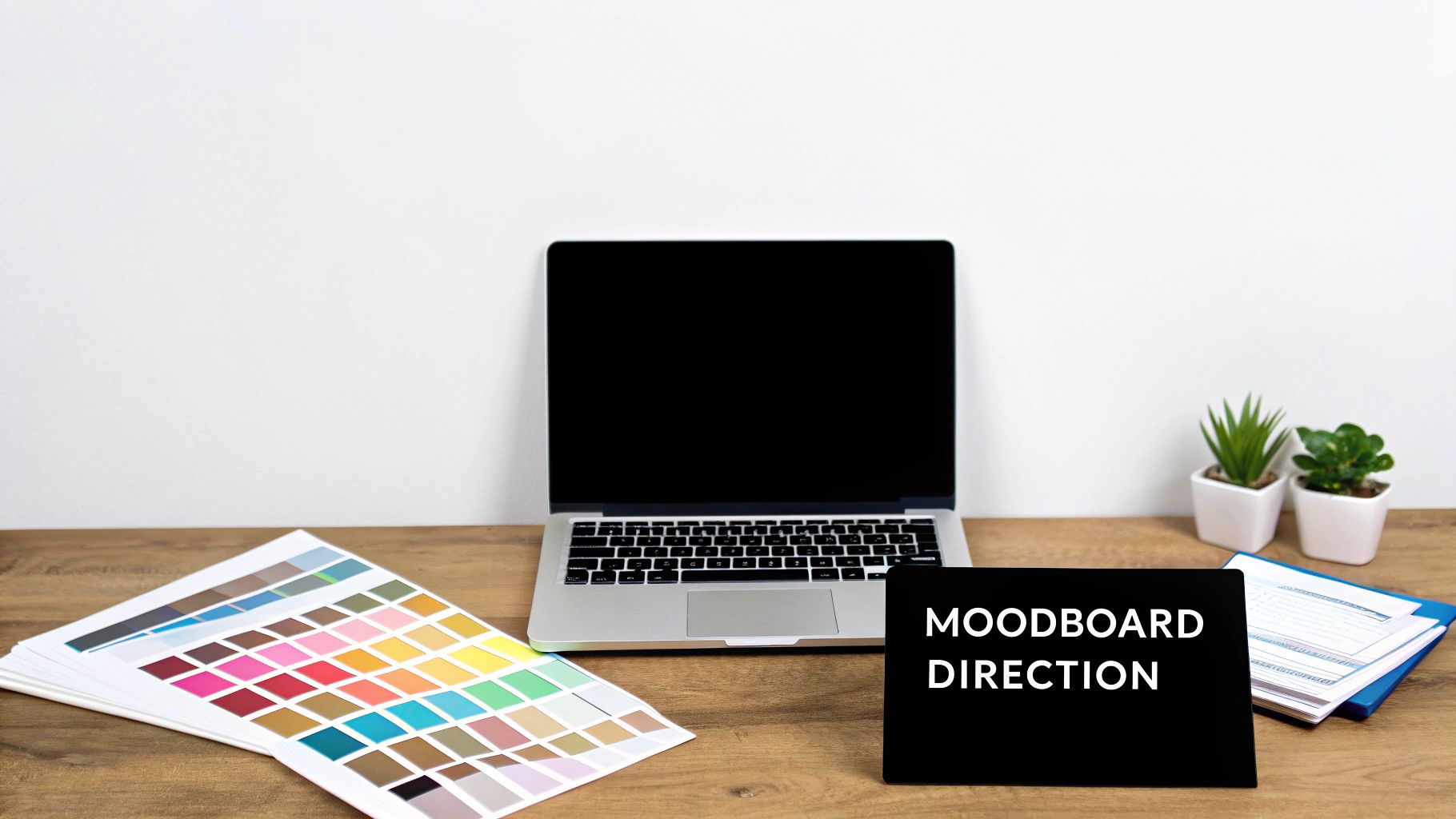
Building a Cohesive Moodboard
Once you have a nice collection of images and ideas, it’s time to bring them all together into a moodboard. This isn't just a pretty collage; it's your project's visual mission statement. It’s the single document that ensures every choice you make—from colors to fonts—feels consistent and intentional.
A good moodboard tells a clear, focused story. If you're designing for a serene meditation app, your board shouldn't be cluttered with jarring, high-energy visuals. Every single element needs to support that core feeling of calm.
Nailing this step is foundational to creating a design that feels professional. If you want a deeper dive, our guide on what is a mood board walks you through the process step-by-step. Think of your moodboard as your visual compass—it'll keep you pointed in the right direction from start to finish.
Choosing the Right Tools for Your Project
The software you use is more than just a tool; it’s an extension of your creative process. Picking the right one isn't about chasing the fanciest features—it's about finding a workflow that just clicks and lets you bring your ideas to life without a fight. This is where a good design goes from concept to a polished, professional-looking reality.
For a long time, the design software world was pretty predictable. Adobe products have traditionally owned the space, commanding over 80% of the market share. But things are shifting. You’ve got platforms like Canva seeing explosive growth—growing its user base by 40% in the last year alone—which proves that powerful design is no longer locked behind a steep learning curve.
This is great news for you. It means more choice, but it also means you need to be smart about matching the tool to the task.
Vector vs. Raster: The Only Technical Bit You Really Need to Know
Before you download anything, let’s clear up one fundamental concept: the difference between vector and raster graphics. This isn't just nerdy jargon. It directly impacts what you can do with your final design.
- Raster Graphics: Think of these as digital photos. They're made of tiny squares called pixels. Tools like Adobe Photoshop are the king here, perfect for editing photos and creating rich, textured digital paintings. The catch? If you try to blow them up, they get blurry and pixelated.
- Vector Graphics: These are built with math—lines, points, and curves. Software like Adobe Illustrator is the go-to. Because they're based on formulas, vectors can be scaled to any size, from a tiny app icon to a massive billboard, and stay perfectly crisp.
Here’s the simple way to remember it: a raster image is a mosaic of colored tiles, while a vector is a set of instructions for drawing a shape.
Selecting Your Design Software
With that out of the way, let's look at the main players. Most pros don't just stick to one; they have a toolkit and pick the right one for the job.
Which Design Tool Is Right for You?
Feeling overwhelmed by the options? This table breaks down the most popular choices to help you figure out where to start.
| Tool | Best For | Learning Curve | Cost |
|---|---|---|---|
| Adobe Illustrator | Logos, icons, and illustrations that need to scale perfectly. | Steep | Subscription (from $22.99/mo) |
| Adobe Photoshop | Photo editing, web graphics, and social media visuals. | Moderate | Subscription (from $22.99/mo) |
| Canva | Quick social media posts, presentations, and simple marketing. | Low | Free (Pro plan available) |
| Figma | UI/UX design, wireframing, and real-time collaboration. | Moderate | Free (Pro plan available) |
| Affinity Designer | A powerful, one-time-purchase alternative to Illustrator. | Moderate | One-time fee ($69.99) |
Each of these has its place in a designer's arsenal. Your project's needs will point you to the right one.
For Professional-Grade Control
If you’re designing a logo from scratch or laying out a print-ready brochure, you need the precision of a vector program. Adobe Illustrator is the industry heavyweight for a reason. It gives you incredible control for creating sharp, scalable, and professional assets.
For Photo-Centric Designs
When your design revolves around a photograph—like a social media ad, a website banner, or a flyer—Adobe Photoshop is your playground. Its power in photo manipulation, layering, and blending is second to none for raster-based work.
For Speed and Accessibility
Need to whip up something beautiful, fast? For beginners or anyone on a tight deadline, Canva is a lifesaver. It’s a browser-based tool with a simple drag-and-drop interface that makes it incredibly easy to create graphics for social media, presentations, or basic marketing materials.
Your choice of software should always be driven by the project's final destination. A logo for a billboard needs a vector tool. A quick Instagram story graphic? Canva will get you there beautifully.
Modern design workflows are also getting a boost from new tech. It’s worth exploring the best AI tools for designers to speed up tedious tasks and spark new ideas. And as your projects get bigger, keeping your team on the same page is crucial. Our guide to the best design collaboration tools can help you find platforms that make teamwork feel effortless.
Alright, you’ve got your moodboard and you’re fired up. Now what? This is where we take all that inspiration and start building something real. It’s less about some stroke of artistic genius and more about applying a few timeless design rules to make your ideas look polished and professional.
This is the stuff that separates a simple graphic from a piece of communication that actually works. We're not just filling a canvas; we're intentionally guiding the viewer's eye, creating a feeling, and delivering a message clearly. This is how you make a design that connects.
https://www.youtube.com/embed/iQWTSupSrko
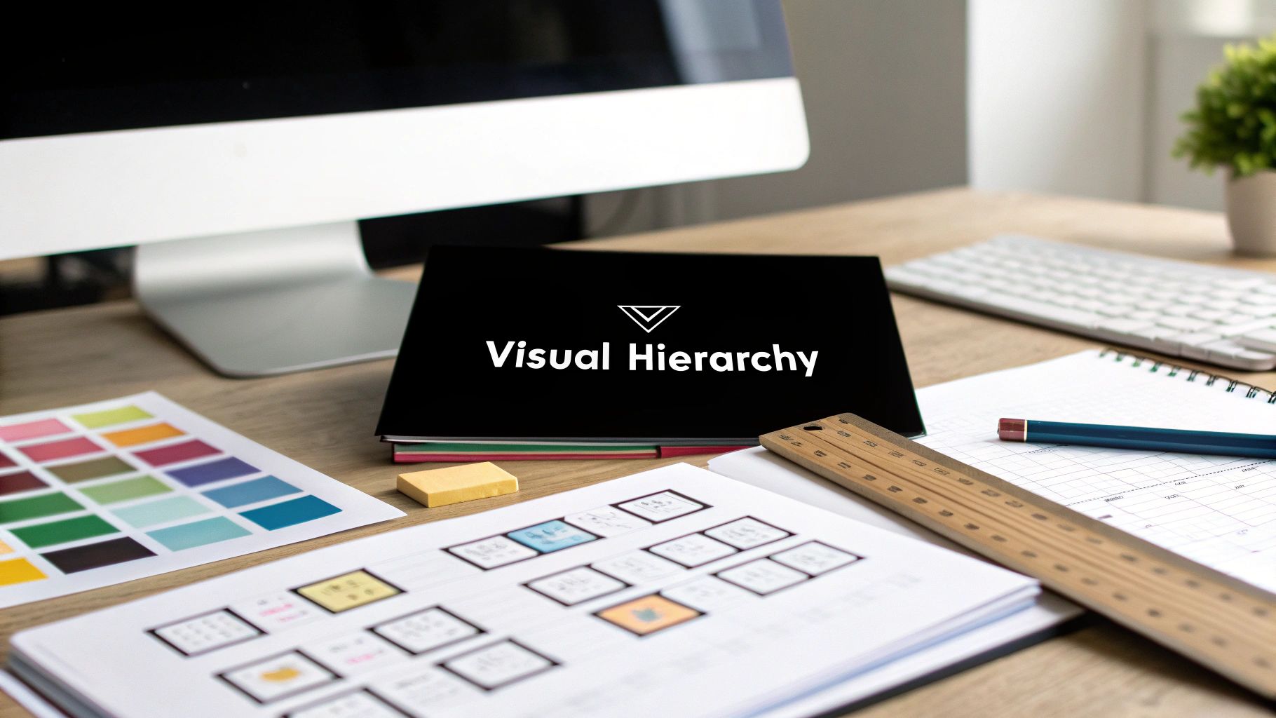
Creating a Clear Pecking Order (Visual Hierarchy)
Visual hierarchy is the secret sauce. It’s all about arranging things to show what's most important, telling the viewer exactly where to look first, second, and third. Get it wrong, and your design is just a confusing mess where nothing stands out.
Think about a concert poster. The band's name is probably the most important thing, right? So, it should be the biggest, boldest thing on the page. After that, you'd probably want people to see the date and venue. Ticket price? That can be smaller.
You can pull this off with a few simple tricks:
- Size & Scale: Bigger things grab attention. Your headline should dwarf your body text. It’s that simple.
- Color & Contrast: A pop of bright color against a muted background is impossible to ignore. This is perfect for a call-to-action button.
- Placement: Things at the top or in the center of a design just feel more important. It’s human nature.
Getting Your Layout and Composition Right
How you arrange everything on the page—your layout—is the difference between chaos and calm. One of the best ways to get an organized look is to use a grid. It's an invisible structure that helps you line up your text and images, giving everything a sense of order.
Whitespace is your other best friend here. Don't be afraid of empty space! It gives your elements room to breathe, makes things easier to read, and helps your design feel way more modern and less cluttered. For a deeper dive, our guide to the core principles of visual design has some great real-world examples.
Pro Tip: When in doubt, take something away. Simplifying your design is almost always more powerful than adding more stuff. A clean, focused design will win every time.
Picking Fonts and Colors That Say Something
Your fonts and colors are what give your design its personality. Typography isn’t just about readable words; it’s about setting a tone. A bold, sans-serif font can feel modern and confident, while a fancy script font might feel more luxurious and traditional. Just try to stick to two (or maybe three) fonts that work well together so you don't create visual chaos.
Color works the same way, tapping into emotions and creating associations. A super effective and easy-to-remember technique is the 60-30-10 rule:
- 60% is your main, dominant color.
- 30% is your secondary color, something that provides a nice contrast.
- 10% is your accent color, used for small highlights like buttons or key icons.
This simple formula is a fantastic starting point that helps create a balanced color palette that supports your message instead of overwhelming it.
Preparing and Exporting Your Final Files
You’ve poured your heart and soul into the design, but the job isn't over until you’ve handed off a flawless final file. This last mile is so often overlooked, yet it’s what makes your work look polished and professional out in the wild. A brilliant design can be completely torpedoed by a simple export mistake, like a blurry image or wonky colors.
Before you even dream of hitting that export button, run through a quick quality check. Proofread every single word. Then do it again. Nothing tanks a beautiful design faster than a glaring typo. You'll also want to zoom in on your image resolutions to make sure they’re crisp and not pixelated, especially if the design is headed for print.
Choosing the Right Color Mode
One of the most common technical slip-ups I see involves color modes. Your choice here is dictated entirely by where the design will live. Getting this wrong can lead to some seriously dull, disappointing colors when your project goes to print or gets uploaded.
- RGB (Red, Green, Blue): This is your go-to for anything that will be viewed on a screen. Think websites, social media graphics, digital ads, and presentations.
- CMYK (Cyan, Magenta, Yellow, Black): This is the industry standard for anything destined for a printing press. Use this for business cards, flyers, brochures, posters, and merch.
Sending an RGB file to a professional printer is a classic rookie mistake. The result? Muted, inaccurate colors that look nothing like what you saw on your screen. Always confirm the final destination of your design and set your color mode accordingly right from the start.
Key Takeaway: Double-checking your color mode is non-negotiable. Using RGB for print will make your vibrant colors look muddy, while using CMYK for digital can make them appear dull on screen.
Understanding Essential File Formats
Knowing which file format to use is critical for delivering a usable, high-quality product. Each format has a specific job, and sending the wrong one can cause massive headaches for your client or printer.
| File Format | Best Used For | Key Characteristic |
|---|---|---|
| JPG (or JPEG) | Photos and web images with complex colors. | Great for compressing file sizes, but it’s a “lossy” format, meaning it loses a tiny bit of quality each time it's saved. |
| PNG | Web graphics needing a transparent background, like logos or icons. | A “lossless” format that keeps all its quality and supports transparency, but usually results in larger file sizes. |
| Documents for print or multi-page layouts. | Preserves fonts, images, and layout, making it the universal standard for sharing and printing designs reliably. | |
| SVG | Logos, icons, and illustrations for web use. | A vector format that stays perfectly sharp at any size. Absolutely essential for responsive websites. |
By mastering these final steps, you ensure the quality of your hard work is preserved all the way to the finish line. This kind of attention to detail is what separates the pros and is essential when you create a graphic design for a client.
Knowing When to Hire a Professional Designer
Learning the ropes of graphic design is a powerful skill. There’s no doubt about it. But knowing your own limits is just as crucial. Some projects are just too high-stakes for a DIY approach, and honestly, bringing in an expert can be the smartest investment you make.
Recognizing that moment is key. Are you building a complete brand identity from the ground up? Launching a massive marketing campaign? If the project's success is tied directly to your revenue or how people see your brand for years to come, it's probably time to call in a pro. Their insight goes way beyond just making things look pretty—they build visual strategies that actually hit your business goals.
Finding the Right Creative Partner
The good news is that finding incredible talent is easier than ever. The freelance world has exploded, with nearly 50% of designers now working for themselves. Platforms like Upwork are booming, connecting businesses with skilled creatives to the tune of $4.1 billion in services in 2023 alone. (You can dig into more stats about the freelance design world over at Cropink.com).
When you’re ready to hire, the goal is to find someone whose style and experience just click with your vision. Here’s what I always look for:
- A Solid Portfolio: Look past the pretty pictures. Does their work solve problems similar to yours? A great portfolio showcases strategic thinking, not just slick visuals.
- Curiosity and Clear Communication: The best designers ask the best questions. They should be genuinely curious about your audience, your goals, and your business. It's a massive green flag.
- A Detailed Proposal: A pro will send you a proposal that outlines their process, exactly what you'll get, and when you'll get it. No room for confusion.
Your project brief is your secret weapon for attracting top-tier talent. Be crystal clear about your goals, audience, and what you need. A well-written brief tells a designer you’re a serious client who respects the process.
Ultimately, hiring a designer isn’t just about handing off a task; it's about starting a collaboration. For a deeper dive on this, check out our complete guide on how to find graphic designers who will absolutely kill it for your brand.
Common Graphic Design Questions
Jumping into your first few design projects can feel like learning a whole new language. You’re bound to have questions, and honestly, getting clear answers is the quickest way to start feeling like you know what you’re doing.
Let's break down some of the most common hurdles people face.
The first question is almost always about money: How much should this cost? And the answer is… it depends. A lot. The cost swings wildly based on how complex the job is and the designer's experience level. A quick social media graphic might only set you back a hundred bucks or so, but a full-blown brand identity package? That can easily run into the thousands.
Choosing Fonts and Avoiding Newbie Mistakes
Another big one is typography. How in the world do you pick the right fonts? A solid starting point is to pair a clean, super-readable sans-serif font for your main text with something more expressive—like a serif or a display font—for your headlines.
The trick is to limit yourself to two, maybe three, fonts at most. Any more than that and things start looking chaotic fast.
This actually brings me to the biggest mistake most beginners make: trying to do way too much. It's so tempting to cram your work full of cool colors, a bunch of different fonts, and every design element you can think of.
Remember, whitespace isn't just empty space; it's an active part of your design. Giving your content room to breathe is one of the fastest ways to make your work look more professional and polished.
A few other common pitfalls to watch out for:
- Poor Contrast: Think light gray text on a white background. If it's hard to read, it's a problem.
- Inconsistent Branding: Using different logos, colors, and fonts across your stuff confuses everyone. Keep it consistent.
- Ignoring Hierarchy: When everything is the same size and weight, nothing stands out. You need to guide the viewer's eye.
Ready to skip the learning curve and just get it done right? You can connect with a professional designer who already knows all this stuff. Find vetted local talent on Creativize and bring your vision to life without the headache. Find your creative partner on Creativize.net.