Alright, let's cut through the jargon. Welcome to the only graphic design glossary you'll ever need. Think of this as your go-to reference for decoding the language of visual communication, from the basic building blocks to the nitty-gritty technical stuff. Getting these terms right is the secret to a smooth creative project and making sure everyone's speaking the same language.
Your Definitive Guide to Design Vocabulary
We've set this guide up like a classic A-Z glossary, so you can quickly find what you're looking for. It's built for everyone—students just starting out, seasoned pros who need a quick refresher, and marketers trying to nail their creative briefs. Our goal is simple: give you the exact words to bring your ideas to life and work seamlessly with designers.
Here’s a taste of what we'll get into:
- The core design principles that are the foundation of literally all visual work.
- The big three: typography, color theory, and layout composition.
- All the technical specs you need to know for image formats and branding elements.
And if you want to see how graphic design plays a bigger role in the digital space, it helps to understand what UX/UI design entails. It's a great way to connect the dots and see how all these creative fields fit together.
Understanding Core Design Principles
Before we get into the nitty-gritty of design terminology, we need to talk about the fundamentals. Think of these core principles as the unspoken rules that make a design just feel right. They’re the invisible architecture guiding how we arrange elements to create something that’s not just pretty, but actually works.
Honestly, these principles are like the grammar of visual language. Without them, you might have all the right words (or images, or colors), but the story you’re trying to tell will come out as a jumbled mess. Getting these right is what separates a chaotic, amateurish layout from a professional one that speaks clearly to its audience.
Creating Order and Focus
Alignment is all about creating a visual connection between elements. When you place text or graphics so they line up along a common edge or center, you instantly create a sense of order. It’s why left-aligning a block of text feels so much cleaner and easier to read—it gives the eye a consistent line to follow.
Next up is Proximity, which is simply the idea of grouping related things together. When elements are close to each other, our brains automatically see them as a single, related unit. This is a game-changer for organizing information, cutting down on clutter, and showing viewers what’s important.
And then there's Contrast. If you want something to pop, you need contrast. This could be a bold, chunky headline paired with a light, airy body font. Or a splash of bright color against a muted background. You're creating a deliberate difference to draw the eye.
A smart use of contrast is one of the quickest ways to create a focal point. It’s how you tell the viewer, “Hey, look here first!”
The value of good design isn't just aesthetic; it's big business. The global graphic design market is expected to hit $57.8 billion by 2026. With over 90% of companies saying design is crucial to their brand, and 67% of small businesses willing to pay a premium for it, mastering these principles has some serious real-world payoff.
Achieving Visual Harmony
Balance is about distributing the visual weight of your design. It doesn't always have to be perfectly symmetrical, like a mirror image. You can have asymmetrical balance, where different elements on each side feel equally weighted, or even radial balance, where everything is arranged around a central point. The goal is to make the composition feel stable and grounded.
Repetition is your best friend for creating consistency. By reusing a specific color, font, or shape throughout a design, you build a sense of unity and rhythm. It ties the whole piece together and makes it feel like a cohesive whole.
Finally, let's talk about White Space. This is the empty area—the negative space—around all your design elements. It's anything but wasted. Good use of white space is what keeps a design from feeling claustrophobic, makes text more readable, and helps your key elements stand out.
Want to go a bit deeper on this stuff? We have a whole guide on the basic design principles. And if you're curious how these ideas translate to the web, this is a great read on what makes good website design.
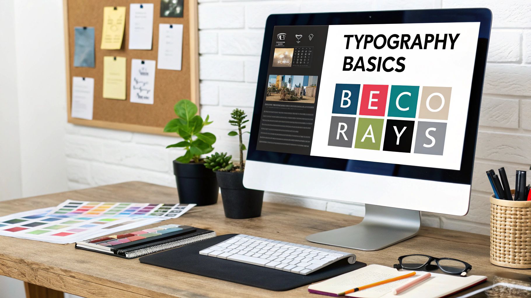
Mastering the Language of Typography
Typography is where design gets incredibly detailed. It's the art of arranging letters and text to be legible, readable, and just plain beautiful to look at. Tiny, almost invisible adjustments can completely transform a message’s vibe and impact, so getting the language right is a huge step for any designer.
Let's start by clearing up one of the most common mix-ups in design: Typeface vs. Font. A Typeface is the whole family—the complete design of a set of characters. Think of Helvetica or Times New Roman as the family name.
A Font, on the other hand, is a specific member of that family. For example, Helvetica Bold in a 12-point size is a font. So is Helvetica Light Italic. Grasping this distinction is foundational; it's the kind of detail that separates amateurs from pros.
Getting Spacing Just Right
The real magic happens when you start playing with the space in and around your text. Three core terms run the show here: Kerning, Tracking, and Leading. They all deal with spacing, but each one controls something different.
Kerning is the art of adjusting the space between two individual letters. Some letter pairs, like "AV" or "To," just look awkward next to each other without a little manual tweak. Good kerning is so subtle you don't even notice it, but bad kerning screams "unprofessional" from a mile away.
Tracking (also called letter-spacing) is a broader adjustment. Instead of tweaking individual pairs, tracking modifies the spacing uniformly across a whole word, a line, or even an entire paragraph. You can crank up the tracking to give text an airy, sophisticated feel or tighten it up for a bold, impactful headline.
Finally, there’s Leading (pronounced "ledding," like the metal). This term refers to the vertical space between lines of text. Its name is a throwback to the old days of printing when typesetters used strips of lead to separate lines. Getting the leading right is critical for readability—too tight and your text feels suffocating, too loose and the lines feel totally disconnected.
To help keep these straight, here's a quick cheat sheet.
Key Typographic Adjustments Explained
| Term | Definition | Primary Use Case |
|---|---|---|
| Kerning | Adjusting the space between two specific letters. | Fixing awkward gaps in logos, headlines, and display text (e.g., "AV", "Wa"). |
| Tracking | Adjusting the space uniformly across a group of letters or words. | Creating an airy, open feel in a paragraph or a dense, impactful headline. |
| Leading | Adjusting the vertical space between lines of text. | Improving the readability of body copy and multi-line text blocks. |
Mastering these three adjustments gives you an incredible amount of control over how your text feels and performs.
The Anatomy of a Letterform
Every letter has its own unique anatomy, and knowing the parts helps you make smarter choices about which typefaces to use. Let's look at a few key terms.
An ascender is the part of a lowercase letter that stretches up above the main body (the x-height) of the character. You see them on letters like 'b', 'd', and 'h'. A descender is the opposite—the part that dips below the baseline, like in 'g', 'j', and 'p'. The style of these ascenders and descenders plays a huge role in a typeface's personality.
Of course, no typography discussion is complete without mentioning Serif vs. Sans-Serif.
- Serif: These typefaces have little decorative strokes (or "feet") at the ends of the main character strokes. They tend to feel traditional and are fantastic for readability in long blocks of printed text.
- Sans-Serif: Just like the name says ("sans" means "without"), these typefaces have clean, unadorned letterforms. They look modern and are the go-to choice for digital screens and punchy headlines.
The choice between them really sets the mood for an entire design. If you want to dive deeper, you can explore more about the different types of typefaces and see which ones are right for your next project.
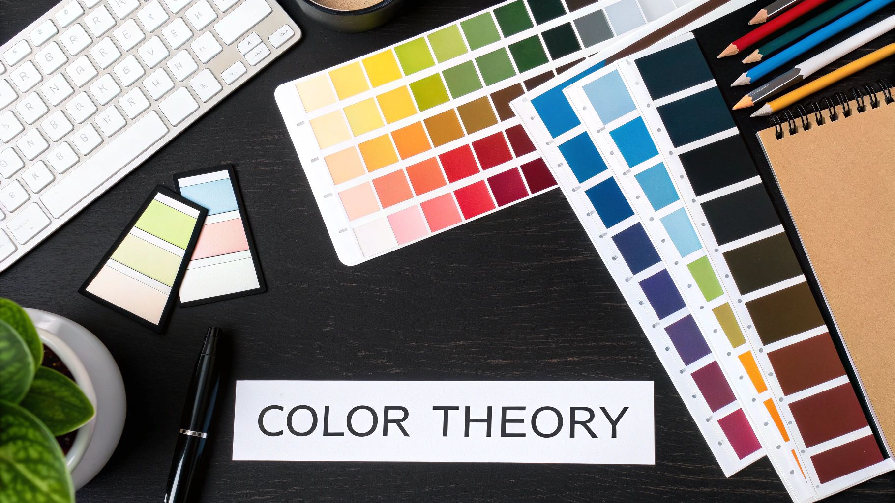
Applying Color Theory with Confidence
You could argue that color is a designer’s most powerful tool. It has this incredible ability to set a mood, guide a person’s eye, and get a message across faster than almost any other design element. Getting a handle on the key terms related to color isn't just about sounding smart—it's about creating work that actually works.
It all starts with the basics. Think of color in terms of the HSV model, which breaks it down into three simple parts: Hue (the pure color itself, like red or blue), Saturation (how intense or muted that color is), and Value (how light or dark it is). When you start thinking this way, you gain a ton of control over your color palettes.
And in a professional setting, that kind of precision is everything. The global graphic design industry is on track to hit around $55.7 billion by 2025, largely because brands are all fighting for attention. Smart color choices are a huge part of winning that fight, making these terms way more than just vocabulary. They're business tools. You can read more about the growth of the graphic design industry if you're curious.
Bridging Digital and Print Color Models
One of the first hurdles for any new designer is wrapping your head around the difference between designing for a screen versus designing for print. They speak two totally different color languages.
- RGB (Red, Green, Blue): This is the language of screens. It’s an additive model, meaning red, green, and blue light are combined to create a whole spectrum of colors. When they're all mixed at full strength, you get pure white.
- CMYK (Cyan, Magenta, Yellow, Key/Black): This is what printers use. It’s a subtractive model where inks are layered on paper to absorb light. You start with white paper and subtract colors to get what you want, with black (Key) added to get deep, rich darks.
Knowing this distinction is what saves you from that gut-sinking feeling when the vibrant colors you saw on your monitor look dull and muddy on the final printed piece.
Building Harmonious Color Schemes
Once you've got the technical stuff down, the real fun begins: building color schemes that evoke a specific feeling. These tried-and-true combinations give you a solid foundation for any project.
A Monochromatic scheme, for instance, just uses different shades and tints of a single hue. It’s a great way to get a clean, sophisticated look. An Analogous scheme pulls in colors that sit right next to each other on the color wheel, which almost always feels serene and harmonious.
Want something with more punch? A Complementary scheme pairs colors from opposite sides of the wheel. This creates high contrast and a ton of visual energy. For a look that’s vibrant but still feels balanced, a Triadic scheme uses three colors that are evenly spaced on the wheel.
Ensuring Color Consistency in Your Projects
In any professional workflow, consistency is king. There are a few key terms that help designers lock in exact colors across different platforms and materials. You’ve probably seen a Hex Code—it's that six-digit code used in web design to define a specific RGB color.
For anything printed, the Pantone Matching System (PMS) is the gold standard. It’s basically a universal library of colors that ensures "Coca-Cola Red" looks like Coca-Cola Red whether it’s on a business card printed in New York or a billboard in Tokyo.
Finally, a Gradient is just a smooth blend between two or more colors. It's a simple way to add a bit of depth and dimension to your work. If you really want to go deep on all this, check out our complete guide on color theory for designers.
Getting a Handle on Image Formats and Tech Specs
Picking the right image format is one of those behind-the-scenes decisions that can honestly make or break a design. Whether you’re prepping a graphic for a website, a social media feed, or a glossy brochure, the file type you choose has a huge impact on quality, file size, and what you can do with it. Getting these terms straight is the first step to making sure your final work looks exactly like you envisioned.
The biggest concept you need to wrap your head around is the difference between Raster and Vector graphics. This one distinction changes everything about how an image behaves and how you can use it.
The Great Divide: Raster Versus Vector
Raster images, which include pretty much any photograph you’ve ever seen, are built from a grid of tiny colored squares called pixels. Think of it like a mosaic. Common raster formats are JPEGs, PNGs, and GIFs. Because they’re made of a fixed number of pixels, they start to look blurry or "pixelated" when you blow them up too much. They’re absolutely perfect for complex, detailed images like photos.
Vector graphics work completely differently. They're constructed using mathematical formulas that create points, lines, and curves. Formats like SVG and EPS are your go-to vectors. Their superpower is infinite scalability. You can take a vector logo and stretch it to fit on a billboard, and it will stay perfectly crisp and clean. This is why they’re the undisputed standard for logos, icons, and illustrations that need to show up in a bunch of different sizes.
To make it even clearer, here’s a quick rundown of the fundamental differences between raster and vector files. This should help you figure out which format is the right tool for the job.
Raster vs Vector Graphics Comparison
This table highlights the fundamental differences between raster and vector image types to help you choose the right format for your project.
| Attribute | Raster | Vector |
|---|---|---|
| Composition | Made of pixels | Made of mathematical paths |
| Scalability | Loses quality when enlarged | Infinitely scalable without quality loss |
| Best For | Detailed photographs, complex digital paintings | Logos, icons, illustrations, typography |
| Common Formats | JPEG, PNG, GIF, TIFF | SVG, EPS, AI |
At the end of the day, neither is "better"—they just have different jobs. You wouldn't use a screwdriver to hammer a nail, and you wouldn't use a vector for a photograph.
A Quick Guide to Common Image File Types
Now that you know the difference between raster and vector, let's look at the most common file formats you’ll run into. Each one has its own strengths and is built for specific situations.
-
JPEG (Joint Photographic Experts Group): This is your workhorse for photos on the web. It uses lossy compression, which means it cleverly discards a little bit of image data to shrink the file size. The trade-off is a slight dip in quality, but it's perfect for getting photos to load quickly online. Just remember, JPEGs don't support transparency.
-
PNG (Portable Network Graphics): The hero of web graphics. PNGs use lossless compression, so they reduce file size without sacrificing a single pixel of quality. Their biggest selling point? They fully support transparency, which makes them the go-to for logos, icons, or any graphic that needs to sit on top of a colored background without a clunky white box around it.
-
GIF (Graphics Interchange Format): GIFs are famous for one thing: simple animations. They’re limited to a palette of just 256 colors, so they aren't great for detailed photos. But for short, looping animations or simple icons, they’re still king.
-
SVG (Scalable Vector Graphics): Built for the modern web, SVGs are a vector format that stays sharp on any screen, no matter the resolution. From a tiny phone to a massive retina display, they look perfect every time. This makes them ideal for logos, icons, and simple illustrations that need to be responsive.
-
EPS (Encapsulated PostScript): This is more of a legacy vector format, but you'll still see it a lot, especially in the print world. It was the standard way to send a logo to a printer for years. While many designers now prefer to send native Adobe Illustrator (AI) files or PDFs, EPS files are still very much in circulation.
Choosing the right format from the get-go saves so many headaches down the road. A tidy, well-organized library of your assets in the right formats is a true cornerstone of an efficient workflow. For a deeper dive on this, check out our guide on digital asset management best practices.
Understanding the Tech Specs
Finally, let's quickly touch on a few technical terms that pop up all the time. Resolution is all about the level of detail in a raster image. It's measured in PPI (Pixels Per Inch) for digital screens and DPI (Dots Per Inch) for anything printed. As a rule of thumb, 72 PPI is the standard for the web, while professional print jobs demand a much sharper 300 DPI to avoid looking fuzzy.
Aspect Ratio simply describes the shape of an image by comparing its width to its height. You’ll see it written as a ratio, like 16:9 for a widescreen TV or 1:1 for a perfect square on an Instagram post. Keeping the aspect ratio consistent is crucial when you resize things—otherwise, you’ll end up with stretched, distorted images.
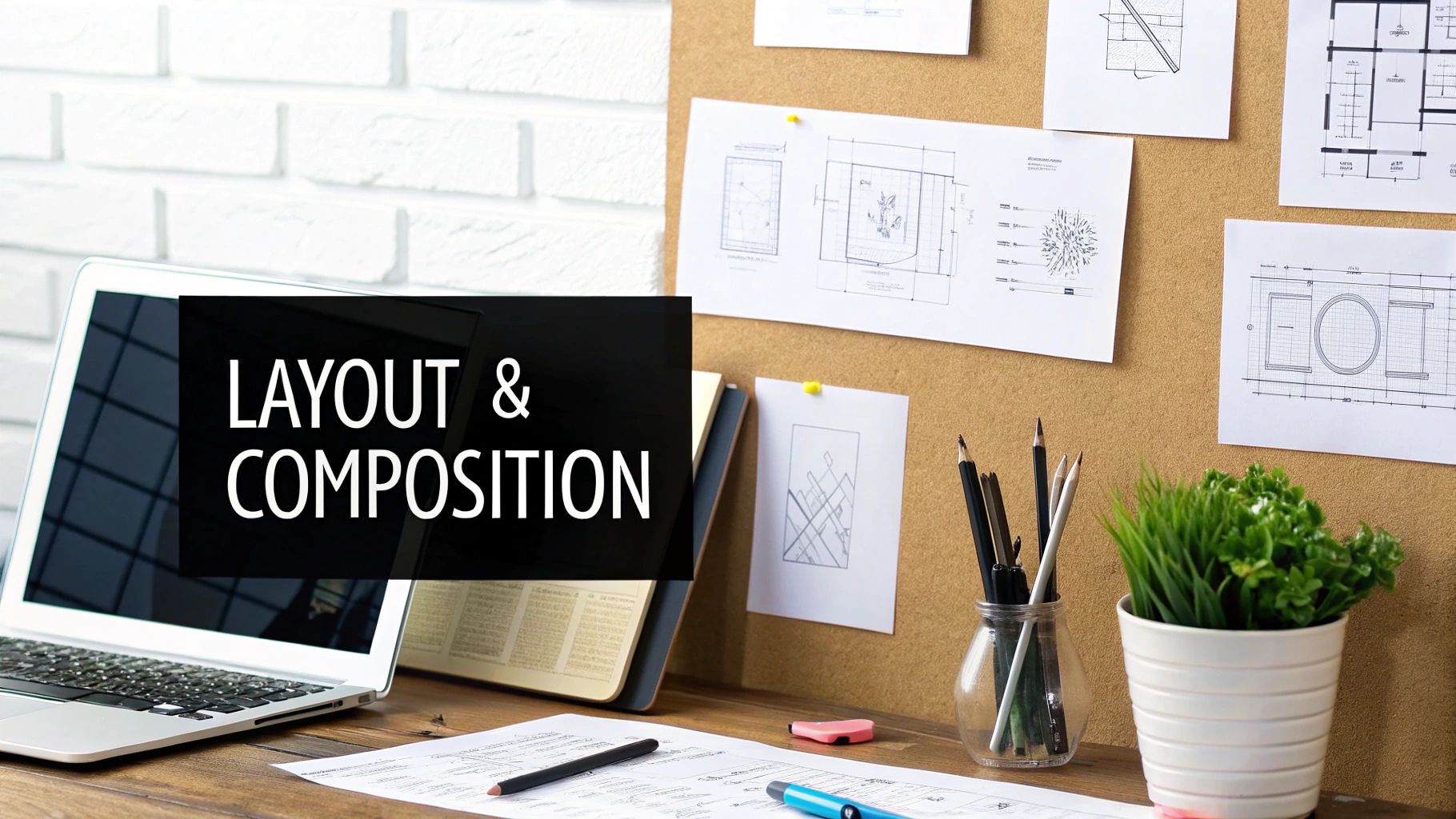
Diving into Layout and Composition
Layout and composition are the secret sauce that turns a bunch of separate elements into a design that just works. If you want to create visuals that guide your viewer's eye and get your message across clearly, you've got to understand how to structure your content. Think of these concepts as the architectural blueprint for every page or screen you design.
This infographic gives you a great overview of the major categories in graphic design, showing exactly where layout and composition fit into the big picture.

As you can see, design principles—which are all about composition—are a core pillar of design, right alongside the basic elements and the tools you use. It's truly foundational stuff.
Getting Your Canvas in Order
At the core of almost every professional layout is the Grid. This is basically an invisible framework of intersecting lines that helps you align all your elements with precision. Using a grid brings a sense of order and consistency to what could easily become a chaotic mess of text and images. It's the silent partner behind pretty much every well-designed website or magazine you've ever seen.
Within that grid, a few other key spacing terms come into play:
- Margins: This is simply the empty space around the outer edges of your design. Good margins keep your content from feeling suffocated and make everything easier to read.
- Gutters: This term refers to the space between columns of text or other elements. Getting the gutter width right is crucial for helping people distinguish one block of content from another.
If you're working on a print project, there's one more term you absolutely can't ignore: Bleed. This is a small extra area of your design that extends past the final trim line of the page. Because physical paper cutters are never 100% perfect, the bleed ensures you won't see any ugly white edges if the cut is just a tiny bit off.
A classic rookie mistake is forgetting about the bleed, which can lead to some really disappointing (and expensive) print results. Always, always check the bleed requirements with your printer before you send off the final files.
Composing for Visual Punch
Beyond the technical grid structure, there are a few timeless rules of composition that help create balance and draw the viewer in. One of the most famous is the Rule of Thirds. Just imagine your canvas is split into nine equal squares by two horizontal and two vertical lines. The rule says you should place your most important elements along these lines or at the points where they intersect.
This one simple trick creates a much more dynamic and interesting composition than just plunking everything in the center. It just feels more natural to the human eye, and it's a go-to principle for designers, photographers, and filmmakers alike.
Another powerful concept is the Golden Ratio, a mathematical ratio of about 1.618 that pops up all over in nature and is considered inherently beautiful. When you use this ratio in your design's proportions, it tends to create a feeling of harmony and balance. It's a bit more complex to apply than the Rule of Thirds, but it can result in incredibly sophisticated layouts that just feel right to people, even if they don't know why.
Defining Branding and Identity Design Terms
When you start looking beyond single design projects, you step into the world of branding. This is where a whole new set of terms comes into play, all focused on how a company shows up in the world. To build a brand that people recognize and trust, designers and clients need to be speaking the same language. Getting these core terms down is the first step.
At the very center of it all is the Logo. This is the main symbol everyone associates with a company. But a logo isn't always just one thing; it's often made of two key parts. You have the Logotype, which is just the company’s name in a specific, stylized font (think of the classic Coca-Cola or Google wordmarks). Then there's the Logomark (sometimes called a brandmark), which is the pure symbol without any words, like the Apple icon or the Nike swoosh.
Depending on where they're being used, a lot of brands will use these pieces separately or together. The real sign of powerful brand recognition is when a logomark can stand entirely on its own and everyone still knows who it is.
Building a Cohesive Visual System
While the logo is a company's face, the Brand Identity is its entire visual personality. It’s a much bigger idea that covers every single visual piece that represents the business.
A full brand identity system includes:
- The complete logo suite (logotype, logomark, and all their approved lockups)
- A clearly defined color palette
- A specific set of typefaces
- Established styles for photography and illustration
- A unique family of icons and other graphic elements
All these pieces have to work together to create a consistent vibe everywhere the brand appears, from its website to its business cards. You can see just how crucial this consistency is when you look at the design industry itself. The global graphic design market is expected to hit around $43.4 billion in 2025 and has kept growing even through economic downturns, which just goes to show how essential strong branding is for any business that wants to stick around. You can dig into more of these graphic design industry trends if you're curious.
Establishing Rules with Brand Guidelines
So, how do you make sure everyone uses these visual elements the right way? That's where Brand Guidelines come in. This is the official rulebook, a document that spells out exactly how to use—and just as importantly, how not to use—the brand's identity.
Brand guidelines are the single source of truth for keeping a brand consistent. They stop things like a stretched logo, the wrong colors creeping in, or a random font showing up in a marketing campaign.
This document is indispensable for internal teams, outside agencies, and pretty much anyone creating stuff for the company. It ensures that no matter who’s doing the work, the brand always looks and feels like itself. Putting together a solid set of rules is a huge part of managing a brand, and our guide on how to create brand guidelines can walk you through that whole process.
Got Questions About Design Terms? We've Got Answers.
Even with a whole glossary at your fingertips, some design terms just seem to cause more headaches than others. We get it. This section is all about tackling those common points of confusion with quick, clear answers so you can start using these concepts like a pro.
Think of it as a rapid-fire round to really nail down your understanding. Getting these distinctions right is a game-changer for talking with designers and stakeholders. When everyone shares the same vocabulary, you avoid those costly misunderstandings and make sure the whole team is on the same page from day one.
What's the Real Difference Between a Font and a Typeface?
This is easily one of the most common mix-ups in the design world.
A typeface is the design family—think Helvetica, Times New Roman, or Futura. It's the overall style and feeling of a complete set of characters.
A font, on the other hand, is a specific style and size within that family. So, Helvetica Bold at 12pt is a font. The easiest way to remember it? The typeface is the album, and the fonts are all the individual songs on it.
When Do I Use RGB vs. CMYK?
This one's crucial, and the answer all comes down to where your design will end up.
- RGB (Red, Green, Blue) is your go-to for anything that will be seen on a screen. It’s an additive color model, which means it builds color with light. Use it for websites, social media graphics, and digital presentations.
- CMYK (Cyan, Magenta, Yellow, Black) is the standard for anything headed to the printer. This is a subtractive model, meaning it creates color by absorbing light on paper. Stick with CMYK for brochures, business cards, posters—any physical item. Getting this right from the start ensures your colors look exactly how you imagined them.
"White space is to be regarded as an active element, not a passive background." – Jan Tschichold
Why Is Everyone Always Talking About White Space?
White space (often called negative space) is simply the unmarked area around and between the elements in your design. It's not just "empty" space; it's one of the most powerful tools a designer has.
Properly used, white space makes text much easier to read by giving it room to breathe. It cuts down on visual clutter, helps create a clear focal point by guiding the viewer’s eye, and gives the whole design a clean, professional, and uncluttered feel. It’s the quiet hero of great composition.
Ready to bring your creative vision to life? Find the perfect local designer for your next project on Creativize. Explore portfolios and connect with top talent today at https://creativize.net.