Think of the last time you walked into a room where everyone was shouting at once. It's just noise, right? Impossible to pick out a single voice or make sense of anything.
That’s exactly what a design without hierarchy feels like to a user. It's a visual mess where every single element—every headline, button, and image—is fighting for attention, but nothing actually wins. The result is pure confusion.
So, What Is Graphic Design Hierarchy Anyway?
Graphic design hierarchy is the art of telling a visual story in the right order. It’s how designers make sure you see the most important information first, then the next most important, and so on, guiding your eye on a deliberate path through the page.
It's less about rules and more about directing a conversation. The designer acts as a guide, using visual cues to control the flow of information. By making certain things bigger, bolder, or brighter, a designer can lead a viewer's eye from the main point to the supporting details, and finally, to whatever it is you want them to do next.
This Is Way More Than Just Pretty Pictures
It’s easy to mistake hierarchy for just another tool to make things look good. And sure, a well-structured design is almost always more attractive. But its real job runs much deeper—it’s all about communication and making things work for the user.
When done right, a strong visual hierarchy delivers on some critical business goals:
- It creates instant clarity. Your main message lands in a matter of seconds.
- It keeps people engaged. An organized layout doesn't feel overwhelming, so users stick around longer.
- It drives people to act. By making that "Buy Now" button or contact form stand out, it points users exactly where you want them to go.
At its core, graphic design hierarchy is a powerful communication tool. It turns a passive glance into an active, guided journey, ensuring your design doesn't just look professional—it actually gets the job done.
Whether we're talking about a website, a poster, or a mobile app, this intentional organization is non-negotiable. It’s one of the bedrock ideas you’ll find in any solid guide to the principle of design, and it forms the backbone of every layout that truly works. Without it, even the most beautiful visuals are just noise.
The Core Principles That Guide The Eye
Think of visual hierarchy less like a rigid rulebook and more like a designer's toolkit. Each principle is a specific tool you can use to grab someone's attention and guide their eye exactly where you want it to go. Mastering these is the secret to turning a confusing, flat layout into a clear visual story.
These principles aren't arbitrary—they tap into the fundamental ways our brains process visual information. They’re the invisible strings that pull our focus from one element to the next, making sure the story unfolds in just the right order.
Let's break down the most essential tools in this kit.
Size and Scale Megaphone Your Message
This one’s the most straightforward, and often, the most powerful. Larger elements feel more important and demand attention first. It’s that simple. Think of size as the volume control for your design; a massive headline shouts, while the tiny legal text at the bottom whispers.
By scaling elements based on their importance, you instantly create a pecking order. Your hero image, main headline, or that critical call-to-action button should be visibly larger than any secondary info. This simple move tells the viewer, "Look at me first!" before they’ve even processed a single word.
Good visual hierarchy isn’t just about making your designs look better—it makes them work better. It’s the difference between a website that converts visitors into customers and one they immediately click away from.
This graphic really breaks down how hierarchy funnels the user's attention from the main point all the way to the final goal.
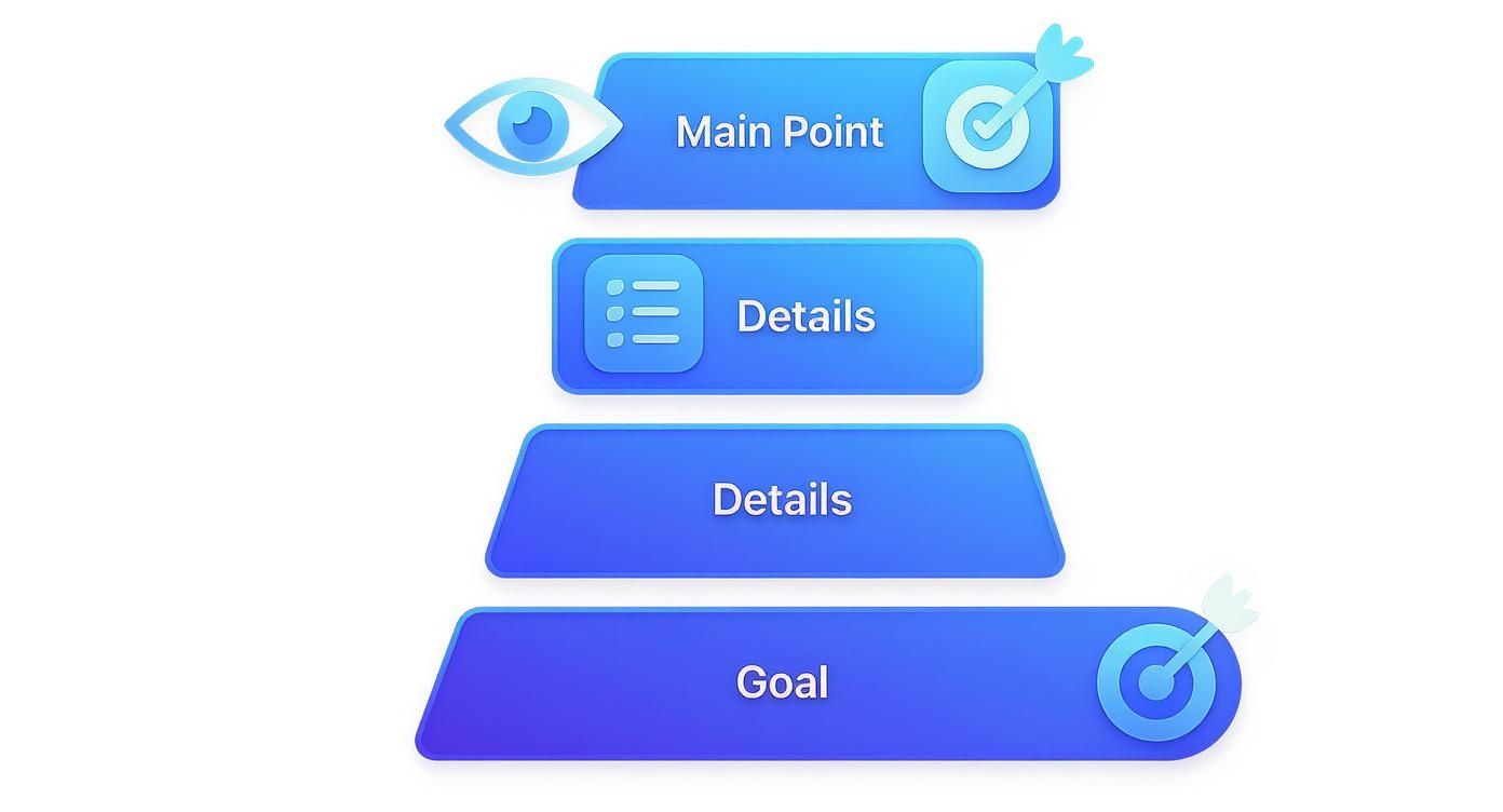
You can see a clear path, starting with grabbing attention, then feeding in the necessary details, and finally leading to a specific action.
Color and Contrast Act as a Spotlight
Our eyes are hardwired to notice things that stand out. Color and contrast are the perfect tools for creating those "look here!" moments. A bright, bold button on a muted background is like a spotlight on a dark stage—it's almost impossible to ignore.
This doesn't mean your design needs to be a chaotic rainbow of loud colors. Even subtle contrast can do the heavy lifting. A dark heading against a light background creates a clean separation that makes your content instantly scannable.
Used strategically, color can:
- Highlight key information like links, sale prices, or new features.
- Create an emotional connection by using color psychology to influence how people feel.
- Group related items without needing clunky boxes or lines, which keeps the layout feeling clean.
You can see these ideas in action when you look at the key principles for effective banner design. It's a great example of how contrast and color work in the real world to grab attention in a split second.
Typography Gives Words a Voice
Typography is so much more than just picking a pretty font. It’s about giving your words a distinct voice and a clear structure. A solid typographic hierarchy tells readers what to read first, what's next in line, and what's just supporting detail.
You can build this structure using a few key variables:
- Weight: Bolding text or using a heavier font weight makes it jump off the page compared to lighter text.
- Style: Using italics or switching up the font family can set apart things like quotes or captions.
- Size: Just like with scale, bigger text signals a headline, while smaller text indicates body copy.
The rise of digital design in the '80s and '90s completely changed the game for typographic hierarchy. By 1998, a whopping 67% of major magazines were using at least three levels of typographic structure, a huge jump from just 32% in 1980. This shift really shows how vital clear visual organization became as media got more crowded. To get the full picture, you can explore the various types of typefaces and see how each one brings its own personality to a design.
Key Principles of Visual Hierarchy at a Glance
To make this all a bit more concrete, here's a quick cheat sheet that breaks down the core principles we've covered, what they do, and how you might see them used.
| Principle | Primary Function | Practical Example |
|---|---|---|
| Size and Scale | Establishes importance and grabs initial attention | A huge headline for an article or a large "Buy Now" button. |
| Color and Contrast | Creates focus points and guides the eye | A brightly colored CTA button on a neutral background. |
| Typography | Organizes text and creates a readable flow | Using bold, larger text for headings and smaller, plain text for paragraphs. |
| Proximity | Groups related elements together visually | Placing a caption right next to the image it describes. |
| White Space | Reduces clutter and improves readability | Adding extra space around a logo to make it stand out. |
| Alignment | Creates a sense of order and connection | Aligning all text to a left margin for a clean, organized look. |
Think of these principles as ingredients. A great designer knows how to mix and match them to create a layout that's not only beautiful but also incredibly effective at communicating a message.
A Brief History of Visual Hierarchy
You might think of visual hierarchy as a modern design concept, but its roots run surprisingly deep. It was born out of pure necessity, long before anyone had a computer. The original pioneers? Early newspaper and advertising designers.
Imagine being faced with a dense, chaotic page of text. How do you grab a reader’s attention and instantly signal the most important story of the day? They figured it out. A massive headline, a bolded price, or a simple box drawn around an ad could direct the eye and carve out a sense of order. This wasn't about making things pretty; it was about function. In a cutthroat print world, clarity was the only way to make a sale or get a story read. These gut-driven practices laid the entire foundation for the formal design principles we use today.
The Rise of Modernist Order
The early 20th century was the turning point. All those scattered, intuitive ideas started to coalesce into a structured philosophy. Modernist design movements, which were a direct reaction against the ornate and overly decorative styles of the past, began championing a simple but powerful idea: form must follow function. This became the bedrock for a whole new way of thinking about visual communication.
The idea of deliberately organizing elements to guide a viewer’s attention was officially locked in during this time, most notably by the Bauhaus school in Germany in the 1920s. They taught designers to use typography, color, and layout with clear purpose. A couple of decades later, the Swiss International Style of the 1940s and '50s took these principles and refined them even further, becoming famous for strict, grid-based layouts that put legibility above everything else. In fact, research shows that a staggering 85% of Swiss design publications from 1945 to 1960 used a rigid grid system to enforce a clear visual path. You can dig deeper into these key moments in design history over at Thinkpro.net.
This wasn't just an aesthetic shift. It was a philosophical commitment to clarity. Designers started to treat the page like an architectural blueprint, where every single element had a specific place and a job to do in guiding the user's journey.
From Print to Pixels: Timeless Principles for the Digital Age
When design made the leap from print to pixels, these foundational principles didn't just survive—they became more critical than ever. The chaotic, blinking, everything-at-once web pages of the early internet taught designers a hard and fast lesson: on a screen, a user's attention is a fragile, fleeting thing.
It turns out the principles of size, contrast, and alignment honed by the modernists were perfectly suited for creating the clean, navigable websites and apps we expect today. A user who can’t immediately spot the "buy" button or the search bar is gone in a flash. The challenge of guiding a user through a digital interface—from a headline to a feature list to a final call-to-action—is a direct descendant of the newspaper editor's need to guide a reader's eye down a column of text. The technology is completely different, but the human psychology behind it all hasn't changed one bit. Strong visual hierarchy is, and always has been, about turning visual chaos into a clear, compelling, and effective story.
Seeing Hierarchy In Action With Real Examples
Theory is one thing, but seeing graphic design hierarchy in practice is where the concepts really start to click. Let’s move past the principles and look at how intentional organization transforms everyday designs from confusing to crystal clear. The difference often comes down to a few strategic tweaks that make a world of difference.
We'll break down a few common assets to see what a lack of hierarchy looks like and how applying these ideas creates a much stronger result. By pinpointing the exact changes, you'll get a real feel for how to put this into practice in your own work.
Analyzing a Website Landing Page
A landing page has one job: get the user to take a specific action. Without a clear visual path, that goal is almost impossible to achieve.
-
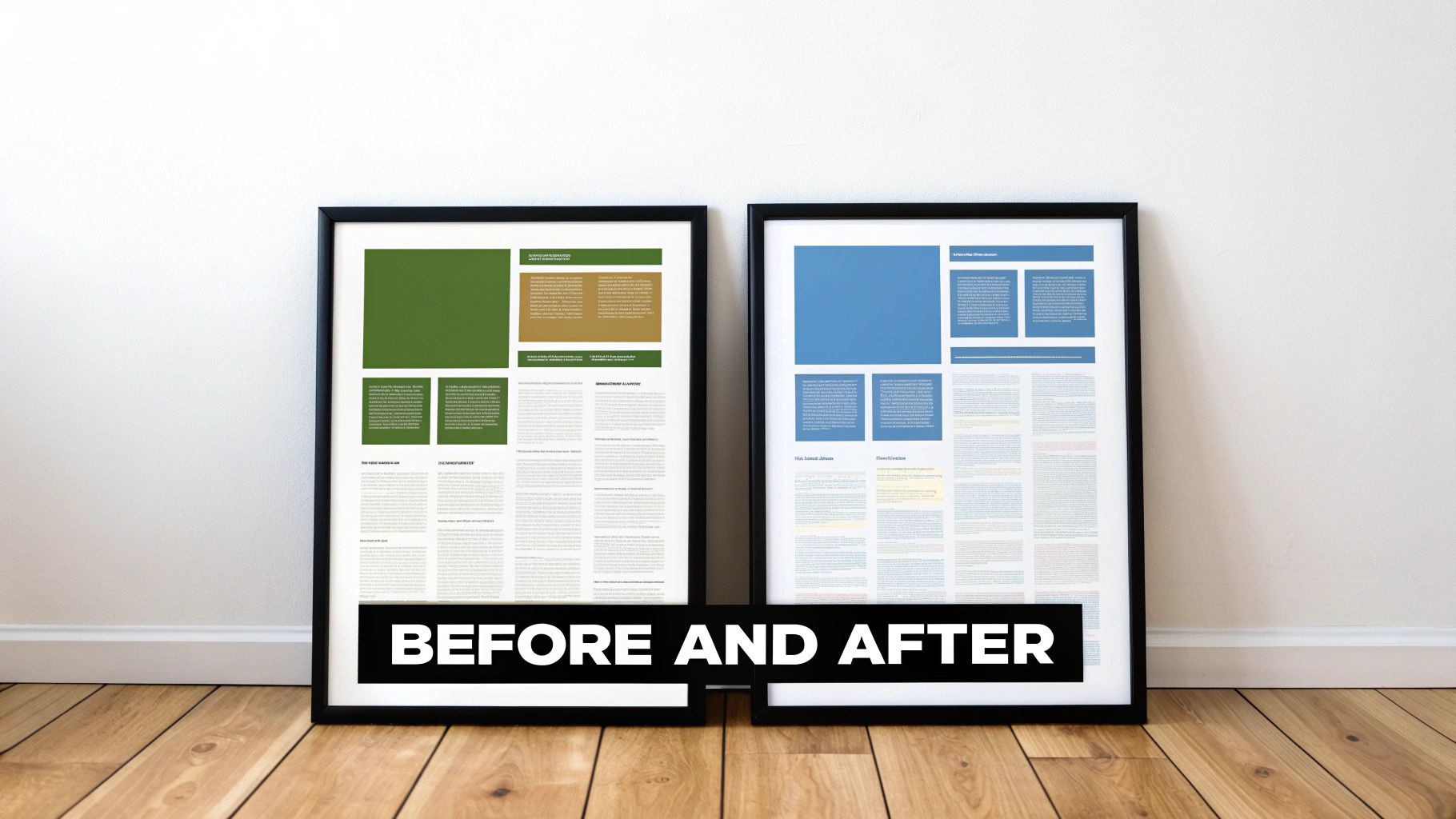
Before Hierarchy: Picture a webpage where the headline, an intro paragraph, a "Sign Up" button, and three feature descriptions are all the same size and color. Your eye doesn't know where to land first. You’re forced to work just to figure out what the page is about, and the call-to-action gets completely lost in the noise.
-
After Hierarchy: Now, imagine the headline is 50% larger in a bold, attention-grabbing font. The "Sign Up" button is a bright, contrasting color that pops off the page. The supporting text is smaller, and plenty of white space separates the feature descriptions, making them easy to scan. Just like that, you instantly get the value proposition and see a clear path to conversion. For more great layouts, check out these excellent creative portfolio website examples.
A successful design doesn’t make the user think. It gently guides their attention, making the desired path feel like the most natural and obvious choice.
Deconstructing a Business Card
A business card packs a lot of information into a tiny space, which makes hierarchy even more critical. You only have a few seconds to make an impression and get your key details across.
A card with poor hierarchy might list the company name, your name, phone number, and email in one centered block of text, all in the same font size. The person holding it has to hunt for the most important info—who you are and what you do.
A well-designed card, on the other hand, establishes immediate order:
- Your Name: The largest and most prominent text element.
- Your Title/Company: Slightly smaller, sitting right below your name.
- Contact Details: Grouped together in a smaller, but still legible, font at the bottom.
This simple structure lets someone process the information logically: who you are, what you do, and how to get in touch. It's that simple.
Transforming a Social Media Graphic
On a fast-scrolling feed, you have less than a second to stop someone in their tracks. Hierarchy is your best tool for getting a message across instantly. A weak graphic might have a busy background image with text of a uniform size slapped on top, making it impossible to read quickly.
An effective graphic, however, uses strong graphic design hierarchy to its advantage. It leads with a bold, punchy headline that pops against the background. A high-contrast color highlights the key message (like "50% OFF"), and the brand logo sits discreetly in a corner. The most critical information is delivered in a flash, giving the user a reason to pause and engage. If you want to see how this works on a larger scale, exploring what makes a good book cover is a masterclass in using hierarchy to communicate a core idea in a crowded space.
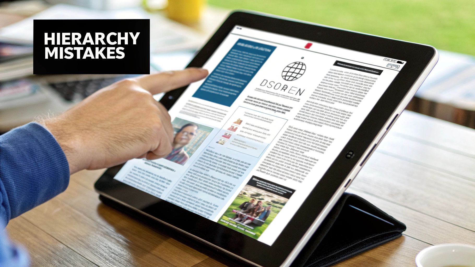
Common Hierarchy Mistakes To Avoid
Knowing the principles of visual hierarchy is one thing, but actually putting them to work is a whole different ballgame. So many well-intentioned designs just fall flat because they stumble into a few common traps—the kind that muddy the message and leave viewers completely lost.
The biggest offender? Trying to make everything important.
When every element on the page is screaming for attention with bold fonts, bright colors, and huge sizes, you don’t get emphasis. You get noise. Your audience has no idea where to look first, and your main point gets completely buried in the chaos.
The core rule of emphasis is simple: if everything is important, then nothing is important. Effective hierarchy demands that you make clear, deliberate choices about what truly matters most in your design.
You have to be ruthless with your priorities. Pinpoint the single most critical piece of information and give it the visual weight it deserves. Everything else should fall in line, guiding the viewer's eye from one point to the next in a way that just makes sense.
Forgetting About Whitespace and Contrast
Another classic mistake is underestimating the power of negative space and good contrast. Too often, designers feel the need to cram something into every available pixel. The result is a cramped, overwhelming layout that’s a nightmare to read.
Here’s where that goes wrong:
- Cluttered Layouts: Without enough whitespace, or negative space, your design elements can't breathe. Everything feels jammed together, making it tough for a user’s eye to distinguish one section from another.
- Poor Readability: Low contrast between text and its background is a deal-breaker. If the text is hard to read, people will just skip it, no matter how vital the message. This isn’t just bad design; it’s an accessibility failure that can shut out a huge portion of your audience.
This isn’t just about aesthetics, either. Research shows that 76% of consumers prefer websites that offer a clear visual path, all thanks to better readability. And the proof is in the numbers—another study found products with strong label hierarchy saw a 30% higher sales conversion rate. The principles behind this have been evolving for a long time, as you can see by checking out this graphic design timeline.
Overlooking Inconsistent Styling
Finally, inconsistency is the silent killer of good design.
When the styles for your headings, links, and buttons change randomly from one page to the next, it shatters the user's trust and creates a frustrating, confusing journey. A strong hierarchy is built on a consistent visual language.
People learn to recognize that a certain color means "clickable link" or that a specific font size signals a major headline. When you break those patterns, you force them to re-learn the rules on every screen, which is the fastest way to get them to give up.
Using a thorough design review checklist before you finalize a project is a great way to catch these slip-ups. It helps you double-check that all your visual cues are working together, not against each other.
Hiring Designers With Strong Hierarchy Skills
As a business owner or manager, you know that great design gets results. The thing is, a great designer doesn't just make things look good—they build powerful communication tools. When you’re looking to bring on a new designer, their grasp of graphic design hierarchy should be one of the first things you check for.
It's easy to get wowed by flashy visuals in a portfolio. But you need to look deeper for signs of intentional, strategic organization. Look at their work. Does each piece have an obvious focal point that grabs your attention? Can you follow the flow of information logically, from the main headline down to the smaller details?
Pay close attention to how they use typography, color, and contrast. These elements should work together to create a clear sense of order, not a jumble of competing ideas.
What to Ask in an Interview
Forget the generic questions. The best way to vet a designer is to have them talk you through their own work. Pull up a project from their portfolio and ask them to explain their thinking.
Here are a couple of questions that cut right to the chase:
- "Can you walk me through the hierarchical decisions you made on this project?" This simple question forces them to articulate their strategy and prove they had one.
- "What was the main goal here, and how did you use hierarchy to make sure you hit it?" This connects their design skills directly to real business outcomes.
Asking the right questions can make all the difference. For a deeper dive, check out our guide on how to hire designers for more tips.
Got questions? Good. Even when you get the hang of the theory, putting graphic design hierarchy into practice brings up a few common sticking points. Let’s clear those up right now.
Think of this as your quick-reference guide for when you’re stuck staring at a design, trying to figure out what’s not quite clicking.
What’s the Single Most Important Principle in Visual Hierarchy?
If you had to pick just one, it’s size and scale. Hands down.
Our brains are just wired to see bigger things first. It’s the most direct, powerful tool you have to tell someone, "Hey, look here!" You can have beautiful colors and perfect typography, but if everything is the same size, the design will feel flat, and your audience won't know where to start.
How Many Levels of Hierarchy Do I Actually Need?
There isn't a magic number, but for most projects, a simple three-level structure is your best bet. It’s enough to create a clear path without making things complicated.
- Level 1 (Primary): This is your showstopper. Your main headline, your hero image. It’s the one thing you want everyone to see immediately.
- Level 2 (Secondary): These are your supporting actors. Think subheadings, important callouts, or key graphics that give context to the main event.
- Level 3 (Tertiary): This is the fine print. Body copy, photo captions, and all the other detailed bits of information that people can explore once they’re hooked.
This simple framework keeps visual clutter at bay and makes sure your message gets across smoothly.
Visual hierarchy isn't about making one thing important; it's about making a series of things important in the correct sequence. The goal is to create a guided journey, not just a single destination.
Finding a designer who instinctively gets this stuff can completely change the game for your brand. Creativize is where you'll find them—local, vetted creative pros who have a proven mastery of building a clear visual path. Take a look at their portfolios and find the right talent to bring some serious clarity to your next project at https://creativize.net.