
Illustration is a powerful tool, a visual language that turns abstract ideas into compelling images that inform, delight, and persuade. But just like spoken languages have distinct dialects, the world of illustration contains a vast spectrum of styles, each with its own unique grammar, tone, and ideal application. For any business, creative, or marketer, selecting the right one is critical. The perfect style ensures a message connects deeply with its intended audience, while a poor choice can cause it to be completely overlooked.
This guide is your practical roadmap to navigating the most influential and versatile different styles of illustration used today. We will demystify the core characteristics, common applications, and unique strengths of nine distinct approaches, from the clean simplicity of Flat Illustration to the nostalgic charm of Vintage/Retro styles. Our goal is to provide a clear framework, helping artists diversify their portfolios and businesses pinpoint the ideal visual identity for their brand or project. For creatives on platforms like Creativize, mastering and showcasing multiple styles can dramatically increase your appeal to clients searching for specific, high-impact visual solutions. Let's dive into the visual language that will elevate your next creation.
1. Flat Illustration: The Language of Digital Clarity
Flat illustration is a minimalist design style defined by its use of two-dimensional elements and simple, geometric shapes. This approach strips away three-dimensional effects like shadows, gradients, and textures, prioritizing clarity and direct communication. It leverages bold, solid colors and clean lines to convey concepts efficiently, making it a cornerstone of modern digital design, especially in user interfaces and branding.
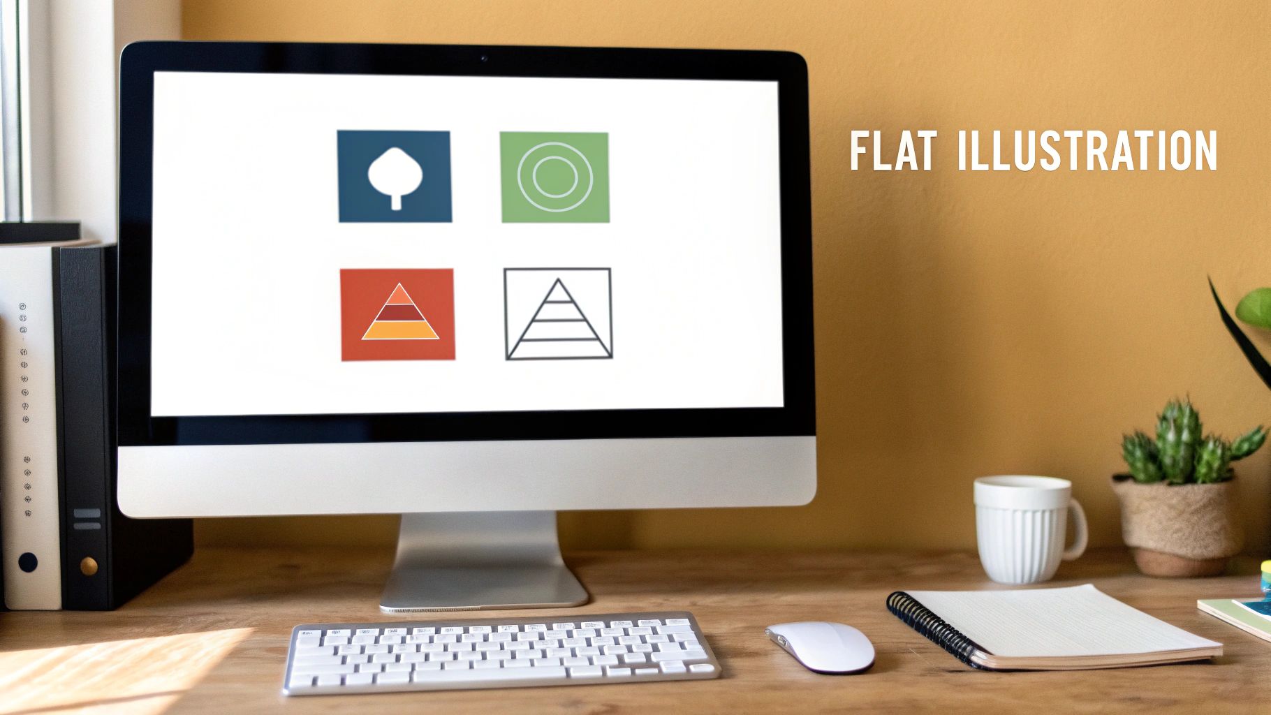
Its rise in popularity, heavily influenced by Google's Material Design and Apple's iOS 7 redesign, is tied to its functional benefits. Flat graphics load quickly and scale perfectly across various screen sizes, making them ideal for responsive web and app design. Companies like Dropbox, Mailchimp, and Spotify use this style to create a clean, approachable, and instantly recognizable brand identity.
Key Characteristics & Best Practices
To effectively implement this style, focus on its core principles of simplicity and function. Strong composition is vital; without depth, the arrangement of shapes and negative space carries the visual weight.
- Limited Color Palette: Stick to a cohesive palette of 3-5 colors to maintain a clean, uncluttered look.
- Focus on Composition: Use strong shapes and strategic placement to guide the viewer's eye and create visual interest.
- Ensure Accessibility: Maintain high contrast between colors to ensure your illustrations are legible for all users.
- Embrace Whitespace: Use negative space intentionally to give elements room to breathe and enhance readability.
- Test for Scalability: Verify that your illustrations remain clear and effective when resized for different devices, a key principle in modern web design. Explore how to best integrate these visuals by reading more about how to design effective pages.
Flat illustration is one of the most versatile and functional different styles of illustration available, excelling in contexts where clear communication is paramount, such as in UI/UX design, infographics, and corporate branding.
2. Line Art Illustration: The Power of Pure Form
Line art illustration relies exclusively on distinct straight or curved lines placed against a plain background, without gradations in shade or color to represent objects. This ancient technique has experienced a renaissance in contemporary design, valued for its elegance, versatility, and ability to convey complexity through simplicity. Its applications range from minimalist single-line drawings to intricate, detailed compositions.
From Pablo Picasso's iconic continuous line drawings to IKEA's universally understood assembly instructions, line art excels at clear communication. Modern brands like Apple use crisp line drawings in technical documentation to showcase product features with precision and sophistication. Its clean aesthetic makes it a popular choice for editorial illustrations, minimalist branding, and elegant packaging design.
Key Characteristics & Best Practices
To master line art, an artist must focus on the expressive potential of the line itself. The quality, weight, and flow of each line carry the entire visual narrative, making deliberate practice essential.
- Vary Line Weight: Use thicker lines to create emphasis and draw attention to focal points, and thinner lines for details and texture.
- Master Negative Space: Pay as much attention to the empty space around your lines as you do to the lines themselves; this defines the form.
- Practice Gesture Drawing: Improve fluidity and confidence by quickly capturing the essence of a subject with continuous, expressive strokes.
- Experiment with Tools: Explore different pen weights, digital brushes, and drawing tools to discover how they impact the final look and feel.
- Imply Form with Breaks: Strategically break or overlap lines to suggest depth, volume, and layering without using any shading.
Line art is one of the most fundamental different styles of illustration, perfect for projects demanding clarity, elegance, and a timeless feel. Dive deeper into the core principles of visual design by exploring key graphic design terminology.
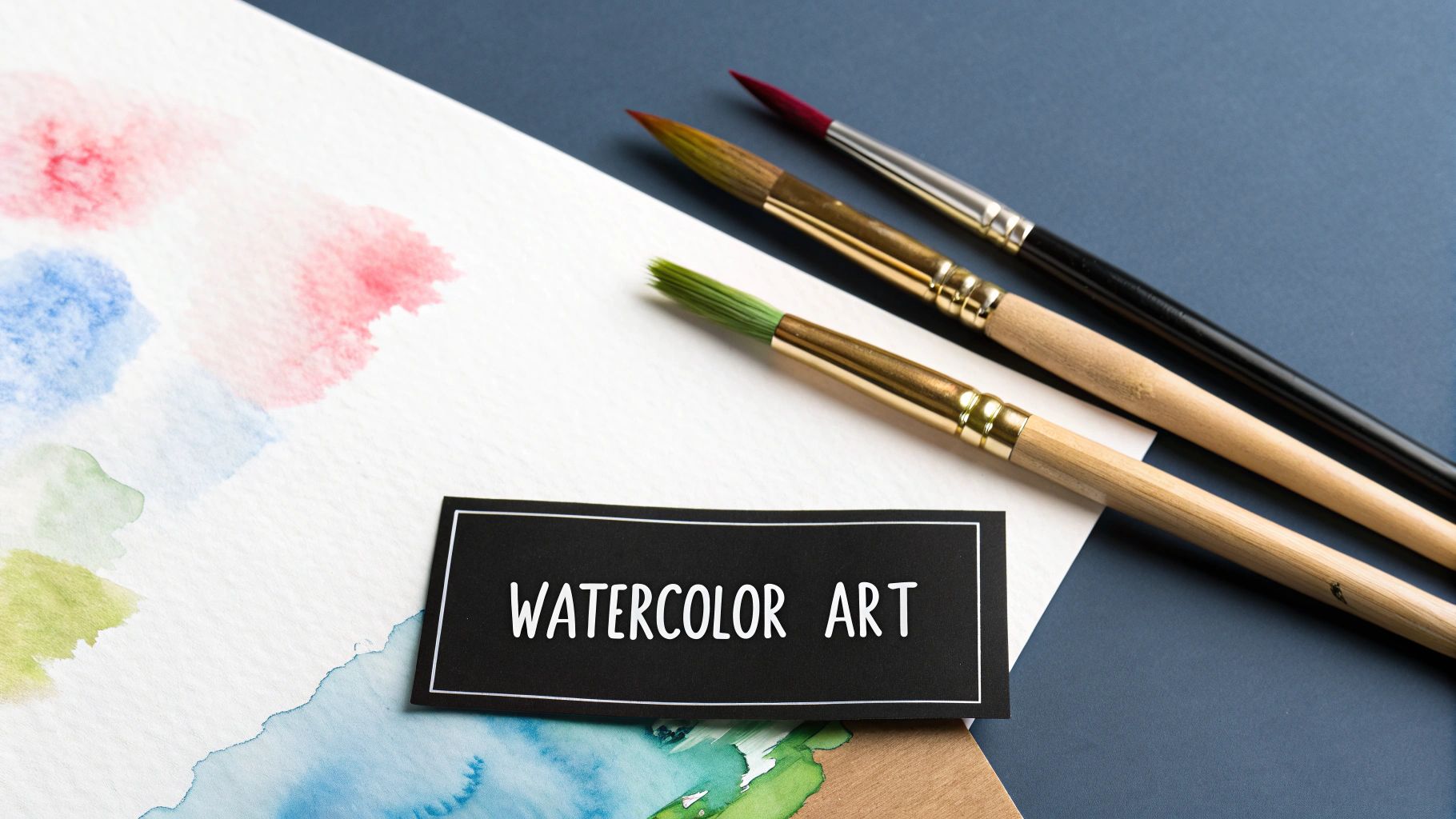
3. Watercolor Illustration: The Beauty of Translucent Hues
Watercolor illustration is a traditional art technique that uses water-soluble pigments to create soft, translucent, and often dreamy images. This style is characterized by its fluidity, luminosity, and the beautiful, organic effects that occur when pigment and water interact. In the digital age, this aesthetic has been masterfully adapted for digital tools, maintaining the spontaneous, handcrafted quality that makes the medium so appealing.
The style’s gentle and expressive nature makes it a popular choice for everything from Beatrix Potter's timeless children's books to high-end fashion illustrations for brands like Dior. Its elegant and personal feel is perfect for wedding invitations, food illustrations, and botanical art, where it adds a touch of sophistication and warmth. The inherent unpredictability of the medium often results in unique, one-of-a-kind pieces.
Key Characteristics & Best Practices
To master watercolor, one must learn to balance control with spontaneity. Understanding how water and pigment behave is crucial for achieving the desired luminous, layered effect, both traditionally and digitally.
- Work from Light to Dark: Build up colors in gradual, translucent layers, allowing each to dry completely before adding the next.
- Embrace "Happy Accidents": Allow the water to create natural blooms and bleeds, as these often add character and charm to the artwork.
- Preserve Whites: In traditional watercolor, the white of the paper is your brightest white. Plan your composition to leave these areas untouched.
- Control Pigment Ratios: Pay close attention to the water-to-pigment ratio to manage color intensity and transparency effectively.
- Practice Color Mixing: A solid grasp of color mixing is essential to avoid muddy results and create a vibrant palette. Further your skills by exploring detailed guides on color theory for designers.
As one of the most expressive and delicate different styles of illustration, watercolor excels in applications that call for a gentle, artistic, and human touch, lending an air of classic elegance to any project.
4. Isometric Illustration: Depth Without Perspective
Isometric illustration is a method for creating three-dimensional objects in two-dimensional space without using traditional perspective. It uses a specific 30-degree angular projection where all three axes (height, width, and depth) appear equally foreshortened. This technical style provides a clear, systematic way to represent complex systems, architecture, and environments, offering depth and detail while maintaining visual consistency and a distinct, organized aesthetic.
This style moved from engineering blueprints to digital design and is now famously associated with the visual language of games like Monument Valley and technical diagrams for brands like IKEA. Its strength lies in showing how parts of a whole fit together, making it perfect for infographics, cityscapes, and exploded-view product diagrams. Designers like Jing Zhang and Matt Stevens have popularized its use in creating engaging, informative visuals that feel both technical and playful.
Key Characteristics & Best Practices
To create effective isometric illustrations, you must adhere to its geometric rules. The foundation is an isometric grid, which ensures every line and shape aligns correctly to the fixed 30-degree angles. This precision is what gives the style its unique, clean, and structured appearance, allowing viewers to see multiple sides of an object simultaneously.
The infographic below highlights the core technical principles of this style.
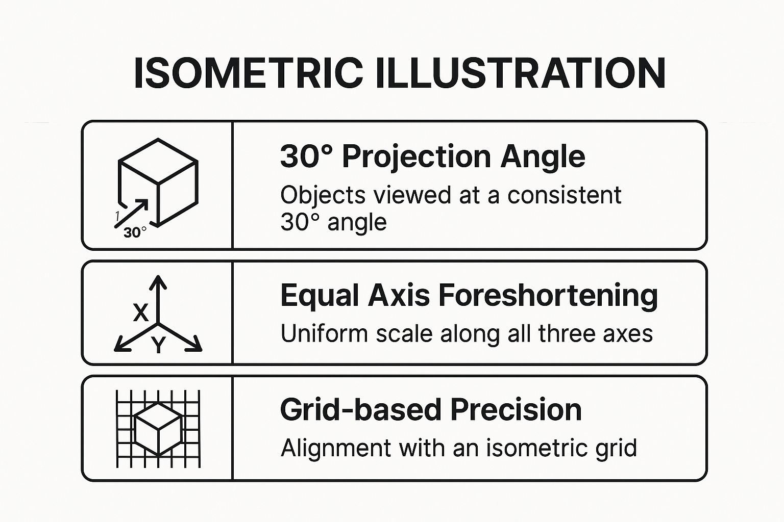
As the visualization shows, these three concepts work together to create the illusion of depth without the complexity of vanishing points.
- Start with an Isometric Grid: Always use a grid as your foundation to maintain consistent 30-degree angles for all planes.
- Keep Lines Parallel: Lines that are parallel in a 3D object must remain parallel in your illustration; avoid converging lines.
- Use a Limited Color Palette: A simple, cohesive color scheme with clear value distinctions helps define different planes and adds depth.
- Add Subtle Shadows: Apply consistent, simple shadows on the same planes to enhance the illusion of three-dimensionality.
- Plan Your Composition: Start with the largest structural elements and build smaller details on top of them.
Isometric illustration is one of the most effective different styles of illustration for conveying technical information, visualizing systems, or creating detailed worlds in a structured, easily understandable format.
5. Hand-Drawn/Sketchy Illustration: The Charm of Imperfection
Hand-drawn or sketchy illustration celebrates the organic qualities of traditional drawing, showcasing visible pencil strokes, rough edges, and the authentic character of human creation. This approach can vary from loose, gestural sketches to refined, hand-rendered artwork, but it always retains a tactile, personal quality that connects with viewers emotionally. It offers a warm, authentic alternative to the pristine finish of digital design.
The style’s appeal lies in its humanity and relatability. Brands like Innocent Smoothies and Moleskine use it to build a friendly, approachable persona, while artists like Quentin Blake and Gemma Correll have built careers on its expressive power. Its rawness feels genuine, making it perfect for storytelling, concept art, and any context where a touch of personality is desired.
Key Characteristics & Best Practices
To capture the essence of this style, focus on embracing imperfections and expressive mark-making. The goal is to convey feeling and movement, not digital precision.
- Vary Line Weight: Use different pressures and tools (pencils, pens, charcoal) to create depth and focus.
- Show Your Work: Leave some construction lines visible; these "mistakes" add authenticity and character.
- Scan at High Resolution: Capture your work at 600 dpi or higher to preserve the subtle textures of the paper and drawing tools.
- Embrace Spontaneity: Practice gesture drawing to develop a confident, fluid hand that gives your sketches energy.
- Combine with Digital: Add color digitally on a separate layer to preserve the integrity of your original hand-drawn linework. Learn more about creative techniques at a masterclass with Illustrator Mattias Adolfsson.
Hand-drawn illustration is one of the most expressive different styles of illustration, ideal for editorial content, packaging, and branding that aims to feel personal, creative, and human-centric.
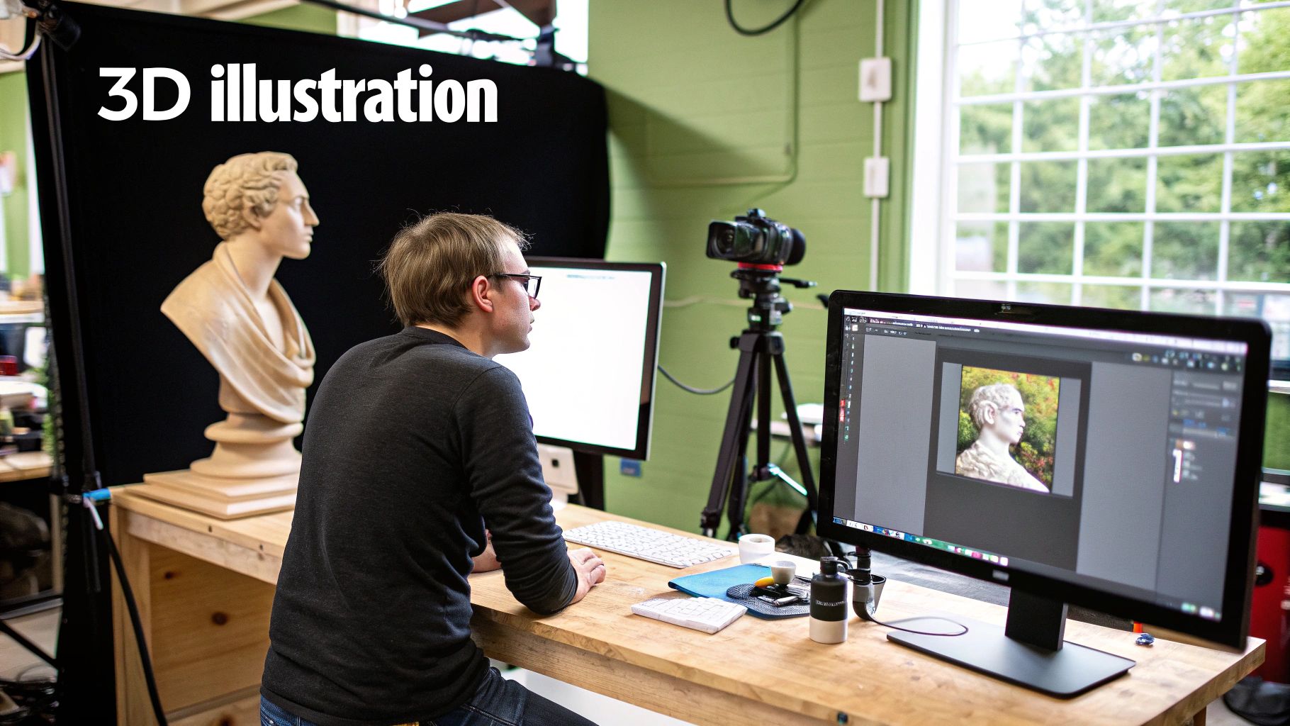
6. 3D Illustration: Sculpting Digital Realities
3D illustration involves creating artwork in a three-dimensional digital space using specialized modeling, texturing, and rendering software. Unlike 2D art, this style builds objects and environments as actual digital models that can be lit dynamically, viewed from any angle, and animated. This approach has become a powerhouse in modern design, offering unparalleled flexibility for creating both photorealistic and highly stylized visuals.
The style’s impact is visible across industries, from the hyper-realistic product visuals used by Apple and Nike to the imaginative worlds seen in Pixar films and video games like Fortnite. Artists like Beeple and Peter Tarka have pushed its creative boundaries, making it a go-to for advertising, branding, and entertainment. This depth and realism offer a unique way to engage audiences with immersive visual storytelling.
Key Characteristics & Best Practices
Mastering 3D illustration requires both artistic vision and technical skill. The key is to build a solid foundation in the software and an understanding of how light, materials, and form interact in the real world to create believable results.
- Start with Simple Forms: Begin by mastering basic shapes and gradually build complexity rather than attempting intricate models from the start.
- Study Real-World Materials: Pay close attention to how light reflects, refracts, and scatters on different surfaces to create realistic textures.
- Optimize Your Models: Balance polygon count for performance against visual quality, especially for animation and real-time applications.
- Use Reference Images: Always use extensive references for anatomy, objects, and environments to ensure accuracy and believability.
- Master UV Mapping: Understand the fundamentals of UV mapping and texturing, as this is crucial for applying detailed surfaces to your models.
3D illustration stands out among the different styles of illustration for its ability to create depth, realism, and dynamic visuals that are impossible to achieve in 2D. It is ideal for product visualization, architectural renderings, and complex conceptual art. Explore how to harness its power for commercial projects by reading more about 3D product animation.
7. Vintage/Retro Illustration: Evoking Nostalgic Charm
Vintage or retro illustration draws inspiration from past design eras, particularly the mid-20th century, to recreate the aesthetic characteristics and artistic sensibilities of those periods. This nostalgic style leverages specific color palettes, printing artifacts, and typographic choices to evoke cultural associations, making it powerful for brands communicating heritage, authenticity, or a connection to a specific time. The approach ranges from faithful historical reproductions to contemporary designs with a vintage flavor.
This style's effectiveness is seen in the heritage advertising of Coca-Cola, the promotional artwork for shows like Stranger Things, and the packaging for countless craft breweries. Brands like Levi's and Anderson Design Group use it to create a sense of timeless quality and craftsmanship. The goal is to tap into the positive emotions and memories associated with a particular decade, from the screen-printed feel of the 1970s to the Art Deco elegance of the 1920s.
Key Characteristics & Best Practices
To successfully create a retro look, you must pay close attention to the details that defined a specific era. Authenticity is key, even when blending vintage aesthetics with modern design principles for clarity and impact.
- Research Your Era: Thoroughly study the period you want to emulate. Look at original advertisements, posters, and print media to understand its visual language.
- Use Period-Appropriate Palettes: Colors are a powerful signal. Research historical color trends, such as the muted tones of the 1940s or the vibrant hues of the 1960s.
- Embrace Authentic Textures: Incorporate subtle textures that mimic old printing techniques, like misregistration, halftones, or paper grain, to add depth and realism.
- Focus on Typography: Fonts are one of the quickest ways to establish an era. Use typefaces that were popular during your chosen period for instant recognition.
- Strive for Subtle Distressing: Avoid overdoing aging effects. A light touch often feels more authentic and less like a caricature.
Vintage illustration is one of the most emotionally resonant different styles of illustration, ideal for branding, packaging, and promotional materials where storytelling and nostalgia are central to the message.
8. Minimalist Illustration: The Art of Less is More
Minimalist illustration embodies the principle of ‘less is more,’ distilling subjects down to their absolute essence. This sophisticated style is defined by extreme simplification, a drastic reduction of detail, and the strategic use of negative space. It strips away all non-essential elements, relying on a limited color palette and fundamental shapes to communicate a message with powerful clarity and elegance.
Rooted in modernist art and Japanese aesthetics, minimalism has a timeless appeal. Its influence is clear in the work of iconic designers like Saul Bass and Paul Rand, whose film posters and corporate logos remain powerful examples of visual reduction. Modern brands like Apple and Muji leverage this style to project an image of sophistication, quality, and user-centric simplicity, creating an uncluttered and focused brand experience that resonates deeply with consumers.
Key Characteristics & Best Practices
Effective minimalism isn't about emptiness but about intention. Every line, shape, and space must serve a distinct purpose. The goal is to remove elements systematically until the design communicates its core idea with the minimum viable information, making the remaining components more impactful.
- Embrace Negative Space: Treat whitespace not as a background but as an active compositional element that shapes and defines the subject.
- Restrict Your Palette: Limit yourself to one to three colors maximum to maintain focus and create a strong, cohesive visual statement.
- Prioritize Balance and Alignment: With so few elements, precision is key. Use grids to ensure proportion, balance, and alignment are flawless.
- Test for Recognition: Ask a simple question: can viewers easily identify your subject? If not, you may have simplified too much.
- Remove, Don’t Just Add: The creative process is one of subtraction. Deliberately consider what you can take away while preserving meaning.
Minimalism is one of the most challenging yet rewarding different styles of illustration, perfect for logos, branding, and icon design where immediate recognition and elegance are crucial.
9. Character Design Illustration: Crafting Memorable Personalities
Character design illustration is the specialized art of creating original characters with distinct personalities, visual appeal, and consistent features. This discipline merges anatomy, psychology, and storytelling to build memorable figures that resonate with an audience. It's the foundation of animation, gaming, comics, and branding, turning abstract ideas into relatable beings.
This style's power lies in its ability to forge an emotional connection. Iconic characters like Disney's Mickey Mouse, Nintendo's Mario, or brand mascots like Tony the Tiger become cultural touchstones because their designs effectively communicate their core traits. Great character design, as seen in Pixar films or Studio Ghibli's masterpieces, ensures a figure is not just seen but felt, making them the heart of a narrative.
Key Characteristics & Best Practices
To succeed in this style, the focus must be on creating a figure that is both visually appealing and narratively functional. Every line, shape, and color choice should serve the character's story and personality.
- Start with Basic Shapes: Use foundational shapes to define personality: circles for friendly, squares for strong, and triangles for dynamic characters.
- Design in Silhouette: Ensure your character is instantly recognizable from their outline alone. This tests the strength and uniqueness of the design.
- Develop a Character Sheet: Create comprehensive reference sheets showing the character from multiple angles and with various expressions to maintain consistency.
- Let Story Drive Design: Consider the character's backstory, motivations, and role when making visual decisions about their appearance and attire.
- Test for Clarity: Check that the design remains clear and readable even when scaled down to a small size, such as for an icon or avatar. You can dive deeper into these core principles by reading about character design fundamentals.
As one of the most engaging different styles of illustration, character design is essential for projects that rely on storytelling, brand personification, and audience connection, including animated series, video games, and marketing campaigns.
9 Styles of Illustration Comparison
| Illustration Type | Implementation Complexity 🔄 | Resource Requirements ⚡ | Expected Outcomes ⭐📊 | Ideal Use Cases 💡 | Key Advantages ⭐ |
|---|---|---|---|---|---|
| Flat Illustration | Moderate; uses vector tools, simple shapes | Low to Moderate; standard digital tools | Clear, simple visuals; fast loading | Web/mobile apps, infographics, UI elements | Scalable, cost-effective, timeless, highly readable |
| Line Art Illustration | Variable; from simple to highly detailed lines | Low; traditional or digital drawing tools | Elegant, versatile line-based visuals | Logos, tattoos, editorial, technical documentation | Versatile, timeless, easy printing, adaptable |
| Watercolor Illustration | High; requires mastery of fluid medium | Moderate to High; quality art supplies or advanced digital tools | Soft, expressive, organic visuals | Children's books, wedding invites, fashion, botanical art | Emotionally evocative, unique, warm, handcrafted feel |
| Isometric Illustration | High; precise, grid-based geometry and angles | Moderate; vector & 3D software plugins | Clear 3D-like visuals with consistent scale | Infographics, architecture, games, technical diagrams | Precise, modular, clear visualization of complex systems |
| Hand-Drawn/Sketchy | Moderate to High; depends on drawing skill | Low to Moderate; traditional/digital | Authentic, personal, imperfect aesthetics | Concept development, editorial, indie branding | Human connection, uniqueness, flexible, quick ideation |
| 3D Illustration | Very High; requires advanced 3D modeling skills | High; powerful hardware/software required | Photorealistic or stylized 3D visuals | Product design, games, animation, advertising, VR | Versatile, dynamic views, animation capable, photorealistic |
| Vintage/Retro Illustration | Moderate; involves period-specific techniques | Moderate; digital and texture packs | Nostalgic, culturally rich visuals | Branding, packaging, entertainment, heritage communications | Evokes nostalgia, authenticity, strong emotional appeal |
| Minimalist Illustration | High; requires advanced design sensibility | Low to Moderate; vector software | Strong, clear, restrained visuals | Logos, brand identity, signage, luxury branding | Timeless, versatile, high clarity, cost-effective |
| Character Design Illustration | High; requires anatomy, psychology, storytelling | Moderate to High; digital painting tools | Memorable, expressive characters | Animation, gaming, comics, mascots, merchandising | Emotional connection, IP value, versatile across media |
Finding Your Visual Voice and Connecting with Opportunities
We've journeyed through a vibrant landscape of visual communication, from the clean, modern lines of Flat Illustration to the nostalgic warmth of Vintage/Retro aesthetics. Each of the different styles of illustration explored in this guide, including the intricate perspectives of Isometric art and the relatable charm of Character Design, represents more than just an artistic choice. They are powerful tools for storytelling, branding, and problem-solving.
For creative professionals, mastering multiple styles transforms your skill set from a single instrument into an entire orchestra. It grants you the versatility to tackle diverse client briefs, whether a project calls for the organic feel of Hand-Drawn textures or the sleek sophistication of 3D Illustration. This adaptability not only makes your portfolio more compelling but also positions you as a strategic partner who can select the perfect visual language to meet a specific business objective.
For businesses and entrepreneurs, this understanding is equally critical. Knowing the difference between Minimalist and Watercolor styles is the first step toward commissioning artwork that genuinely reflects your brand's voice and connects with your target audience. The right illustration can make your marketing materials more memorable, your user interface more intuitive, and your brand story more emotionally resonant.
Actionable Next Steps: Cultivate Your Style and Build Your Presence
The journey doesn't end here. The next phase is about application and connection. Use this newfound knowledge to actively shape your creative or business strategy.
-
For Illustrators: Challenge yourself by creating a single piece of art in three different styles you've learned about. This exercise will stretch your creative muscles and provide excellent portfolio content. As you develop your unique visual voice, consider practical ways to showcase your work and reach potential clients, such as by leveraging AI image generators for visual content on platforms like Pinterest to create mockups or promotional graphics.
-
For Businesses: Audit your current visual assets. Do they align with a specific style? Does that style match your brand identity and goals? Use the examples in this article to create a mood board for your next project, giving you a clear visual direction to share with a creative professional.
Ultimately, the power of illustration lies in its ability to translate complex ideas into universally understood visuals. Whether you are creating the art or commissioning it, a deep appreciation for the different styles of illustration empowers you to communicate more effectively, build stronger brand identities, and forge meaningful connections. Continue to explore, experiment, and find the visual voice that best tells your story.
Ready to put your knowledge into action? Whether you're a business searching for the perfect illustrator or a creative ready to showcase your stylistic range, Creativize is the platform where talent and opportunity connect. Find and hire local creatives who specialize in the exact illustration style you need by exploring portfolios on Creativize.