It’s one of the most common mix-ups in the design world, but getting it right is crucial for clear communication. The difference between font and typeface really comes down to a matter of hierarchy.
To put it simply, a typeface is the design family—the shared creative vision for a set of letters, like Helvetica. A font is a specific file or variation within that family, like Helvetica Bold 12pt. Think of it this way: a typeface is the entire album, and a font is just one song on it.
Defining Typeface and Font

Let's break that down a bit more. The typeface is the actual creative work. It's the artistic style and the set of design rules that give characters a unified look. It’s the name you actually recognize, like Times New Roman or Arial.
A font, on the other hand, is the specific file you install and use—the tangible package containing the typeface in a particular weight, style, and size. When you click that dropdown menu in Photoshop or Word, you're choosing a font.
This distinction has deep roots, stretching back to the days of old-school metal typesetting. The 'typeface' was the designer's artistic creation, while a 'font' was a very real, physical tray of metal blocks cast in one specific size and weight, like a set of Garamond 12-point italic. You can find more on how this history shapes today's design lingo in Toptal.com's deep dive into the history of typefaces.
Quick Guide to Font vs Typeface Terminology
Sometimes seeing it all laid out helps it click. Here’s a quick-glance table to clear things up.
| Attribute | Typeface | Font |
|---|---|---|
| Concept | The design, the style, the art. | A specific variation of that design. |
| Scope | The entire family of styles. | One member of that family. |
| Example | Garamond | Garamond Italic, 10pt |
| Analogy | The blueprint for a house. | One specific set of printed plans. |
At the end of the day, a typeface is the "what" (the design family), and a font is the "how" (the specific file you use to bring a particular style, weight, and size to life).
Getting these terms straight is foundational for any creative project. It ensures that when you ask your designer for a "different font," you're both on the same page and speaking the same language. To build out your vocabulary even further, check out our complete guide to graphic design terminology.
How History Shaped Modern Typography
To really get the difference between a typeface and a font, you have to go way back. We're talking 15th-century, metal-press-and-ink-stained-hands typography. Back then, the line between the two wasn't just clear; it was physical.
A typeface was the creative vision—the design of the letters themselves. Think of it as the artistic soul of the characters. Typefaces like Garamond or Jenson were masterpieces, named after the trailblazing designers who created them, like Nicolas Jenson.
The font, on the other hand, was the actual, tangible thing you used. It was a complete set of metal blocks for one specific size and style of a typeface. So, "12-point Garamond Italic" was one font. The word itself comes from the French fonte, which means "something that has been cast," a direct nod to the molten metal poured into molds for each letter. Every single font was its own heavy, physical kit.
This image of a metal type case says it all. Each little compartment held a character for one specific font.
When you see the actual blocks, it clicks. You couldn't just tell the printer to make your 10-point type bigger. If you wanted a 14-point version, you needed a completely new set of cast metal blocks—a whole new font.
The Digital Shift Blurs the Lines
Then, computers came along and changed the game entirely. Physical blocks were out, and scalable vector files were in. Suddenly, a single digital file like Helvetica.otf could hold all the data needed for every possible size and a bunch of styles—bold, light, condensed, you name it. The practical need to have separate fonts for every size just evaporated.
This digital convenience is where all the modern confusion comes from. The software file we now call a "font" often contains the entire typeface family, collapsing a once-clear distinction into a single digital package.
Today, when you pull down a menu in your design software and select "Helvetica," you're choosing the typeface. But the program uses a font file to actually draw it on your screen. This technical mashup is why most people now use the words interchangeably.
While the original definitions are still super important for designers and typographers, the digital age has pretty much fused the two concepts for everyone else. If you're curious to see how these designs differ, you can explore the main types of typefaces and what makes each one unique.
Training Your Eye to See the Difference
Theory is one thing, but the best way to really get the hang of this is to see it in action. You have to start training your eye to see the typeface as the design family—the shared DNA—and the fonts as all the individual family members. A great way to practice this is to pick a popular typeface and just look at all its variations.
Take Roboto, a sans-serif typeface you’ve probably seen a thousand times. When you decide to use Roboto in a project, you're picking the design system. But to actually type anything, you have to choose a specific font from within that system.
Analyzing the Roboto Family
Imagine you have all these options lined up. They all clearly share Roboto's core design—the same basic letter shapes and proportions—but each font is built for a different job.
- Roboto Thin: Super lightweight. It’s perfect for those big, elegant headlines that need to feel airy and delicate.
- Roboto Regular: This is your workhorse. It’s built for readability, making it the go-to for body text.
- Roboto Bold Italic: Here you're combining two attributes—weight (Bold) and style (Italic)—to create some serious emphasis.
- Roboto Black: This one is extra heavy. You use it when you need a header to grab all the attention in the room.
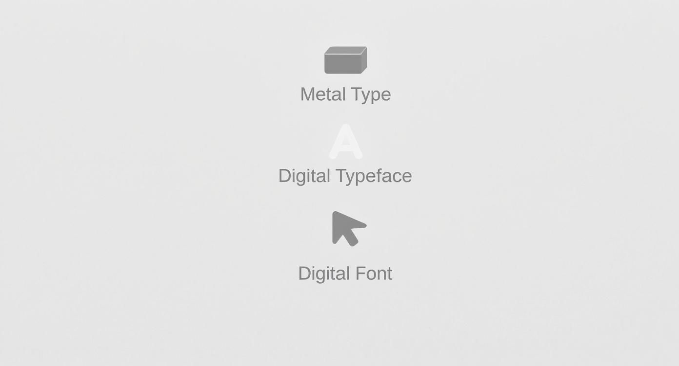
This whole concept makes a lot more sense when you see how we got here, moving from physical blocks of metal to the digital files we use today.

You can see the clear line from the old days of physical type to the flexible, file-based system we have now.
Think of each font within the Roboto typeface as a specific tool in your toolbox. The real secret to creating contrast and a solid structure in your designs is knowing how to mix and match fonts from the same family.
Once you start consciously choosing fonts for their specific weight, style, and width, you’re on your way to mastering typography. It's a foundational skill for creating designs that are clear, effective, and just plain work. This is a huge part of building a strong visual hierarchy in any project you tackle.
Why This Distinction Is So Critical for Branding
Okay, so why does any of this matter beyond a bit of design trivia? Getting the difference between a typeface and a font is actually a massive deal for branding and design work. This isn't just something for designers to obsess over; it’s a core concept for anyone trying to build a memorable brand. If you want to see this in action, just explore various design portfolios and you'll quickly spot how pros use typographic systems to build completely distinct identities.

Your choice of typeface is what sets the entire emotional vibe. A sturdy, traditional serif like Garamond instantly communicates reliability and heritage. On the flip side, a clean, modern sans-serif like Montserrat gives off a feeling of innovation and approachability. This is the strategic foundation of your brand’s visual voice.
Creating Hierarchy and Consistency
Once you’ve locked in a typeface, the real magic happens when you use its various fonts to build a functional, consistent visual system. This is where the hard work of branding gets done. You’re using the different fonts from the same family to create a clear hierarchy—guiding the reader’s eye and making your content a breeze to scan.
For example, a brand might use:
- A bold font for headlines that need to grab attention immediately.
- A regular font for body text to keep things clean and readable.
- An italic font for little details like captions or quotes, adding a touch of emphasis without disrupting the flow.
This kind of consistency makes sure that everything—from your website to your business cards—feels like it’s coming from the same place. This system becomes a central part of your visual identity, and our guide on how to create brand guidelines can walk you through documenting these choices.
Communicating Powerful Brand Signals
The typeface you pick also sends out deeper signals about who you are. A fascinating 2019 study found that serif typefaces are often linked to trustworthiness and are a popular choice in professional services, correlating with higher household incomes. In contrast, sans-serif typefaces tend to dominate in industries all about modernity and innovation. These small choices can completely position your brand in the market.
By picking a single, versatile typeface and then using its various fonts with real purpose, a brand can forge a powerful, unified, and instantly recognizable identity. This isn't just about making things look pretty—it's about turning typography into a strategic business tool.
Communicating Typography in Design Briefs
Nothing grinds a new project to a halt faster than a vague request. When you’re putting together a design brief, getting the language right from the get-go is everything. It saves you from endless, costly revisions and makes sure everyone on the team is on the same page from day one. This is especially true when it comes to talking about type.
We’ve all seen it: "Find us a new font for our website." That one line leaves way too much room for error. Does the client want just a single, new font weight, like a beefier headline style? Or are they really asking for a complete typographic overhaul?
From Vague to Actionable
Let’s rephrase that request. Imagine asking a designer to, "Select a versatile sans-serif typeface with multiple font weights." Now that gives them clear, strategic direction. You’ve just told them you need a whole family of styles—regular, bold, italic, and maybe even a light version—to create a consistent look across the entire site.
That small shift in wording turns a guessing game into a focused mission. It’s not just about knowing the difference between a font and a typeface; it’s about understanding how typography builds intuitive user interfaces. Seeing examples of effective UI/UX design really drives home how articulating these details leads to incredible results.
Saying "typeface" signals you're thinking about the big picture—a complete design system. "Font" points to a specific tool for a specific job. Nailing this distinction is the secret to a smooth, collaborative workflow.
To make sure your needs are crystal clear, think about these points for your next brief:
- Brand Personality: Are you going for a modern and clean feel (sans-serif) or something more classic and trustworthy (serif)?
- Target Audience: What kind of typographic style will connect with the people you’re trying to reach?
- Required Fonts: Get specific. List out exactly what you need, like a bold font for headlines, a regular font for body text, and an italic font for captions.
Clarifying these details upfront builds a much stronger foundation for collaboration. If you need a hand getting organized, using a solid design brief template ensures all your critical typographic needs are spelled out from the very beginning.
Common Questions About Fonts and Typefaces
Even after you nail down the definitions, a few practical questions always seem to pop up. Let’s clear up the common points of confusion so you can talk about type with confidence.
Is It Incorrect to Use Font Instead of Typeface?
In a casual chat, nobody’s going to call you out for using "font" when you really mean "typeface." It's one of those industry terms that has bled into popular use, and everyone gets the gist.
But in a professional setting—especially when writing a design brief or talking to a developer—that precision really matters. Getting it right shows you know your stuff and, more importantly, prevents mix-ups that can cost time and money.
Think of it this way: typeface is the design family (like Lato), while a font is a specific member of that family (like Lato Bold). Sticking to the correct terms makes for a much smoother ride when working with clients and other designers.
What Is a Font Family?
In the digital world we live in now, "font family" is basically a synonym for typeface. It's the term most design software, like Adobe Fonts or Figma, uses to group all the related fonts that share a common design.
When you click the dropdown menu for Open Sans, you’re looking at the font family. That folder holds all the individual font files you can choose from:
- Open Sans Regular
- Open Sans Italic
- Open Sans Light
- Open Sans Bold
It’s the digital container for all those different styles.
How Do I Choose the Right Typeface for a Project?
This is where the art meets the science. Start by thinking about the vibe of the project. Who is the audience? What feeling are you trying to evoke?
For something that needs to feel timeless and serious, a classic serif typeface like Garamond is a safe bet. If you're building a brand that’s modern, clean, and friendly, a sans-serif like Montserrat is a fantastic choice.
But looks aren't everything. You have to test your choice for legibility at all sizes, from tiny captions to giant headlines. Crucially, make sure the typeface offers the font weights you need (like bold, regular, and light) to build a clear visual hierarchy. The perfect typeface has both the right personality for the job and the functional chops to get it done.
Ready to put all this typographic knowledge to work? Find the perfect creative professional on Creativize to translate your vision into a powerful and cohesive brand identity. Explore talent on Creativize.net.

