
Level Up Your Online Presence
A compelling online portfolio isn't just an asset—it's a necessity. For creative professionals, startups, agencies, and even community organizations, your website is often the first impression a potential client or collaborator has of you. It's a virtual handshake, the ultimate showcase of your capabilities, and the key to unlocking new opportunities. Understanding the core principles of effective online portfolio design is crucial for converting visitors into clients or collaborators.
This understanding goes beyond simply showcasing your work. It involves crafting an immersive and engaging experience that truly reflects your individual or brand identity. The evolution of online portfolios, from static HTML pages to today’s dynamic, interactive experiences, reflects this shift in focus. Early portfolios emphasized simply having an online presence. Now, the emphasis is on creating a narrative.
What makes an approach effective? It's the perfect blend of captivating visuals, intuitive navigation, and a clear story that resonates with your target audience. Think of it as applying design theory – balance, contrast, hierarchy, and unity – to the digital canvas of your website. Your portfolio needs to leave a lasting impression.
Inspiring Examples of Online Portfolios
In this article, we’ll explore ten exceptional portfolio website examples that push the boundaries of online presentation. These sites represent the best of web design, offering invaluable insights for crafting your own standout online presence. From interactive 3D experiences and cursor-reactive designs to cinematic narratives and innovative uses of WebGL, they demonstrate a variety of techniques for engaging visitors. Get ready to be inspired and discover the strategies that will transform your website from a simple online gallery into a powerful tool for growth and success.
1. Robby Leonardi's Interactive Portfolio
Robby Leonardi's portfolio (http://www.rleonardi.com/interactive-resume/) has become an iconic example of interactive web design. Instead of a typical static resume, Leonardi created a side-scrolling platformer game reminiscent of Super Mario. Users navigate a colorful, animated world, with each level showcasing different aspects of his career. This approach transformed the portfolio experience from passive viewing to active engagement.
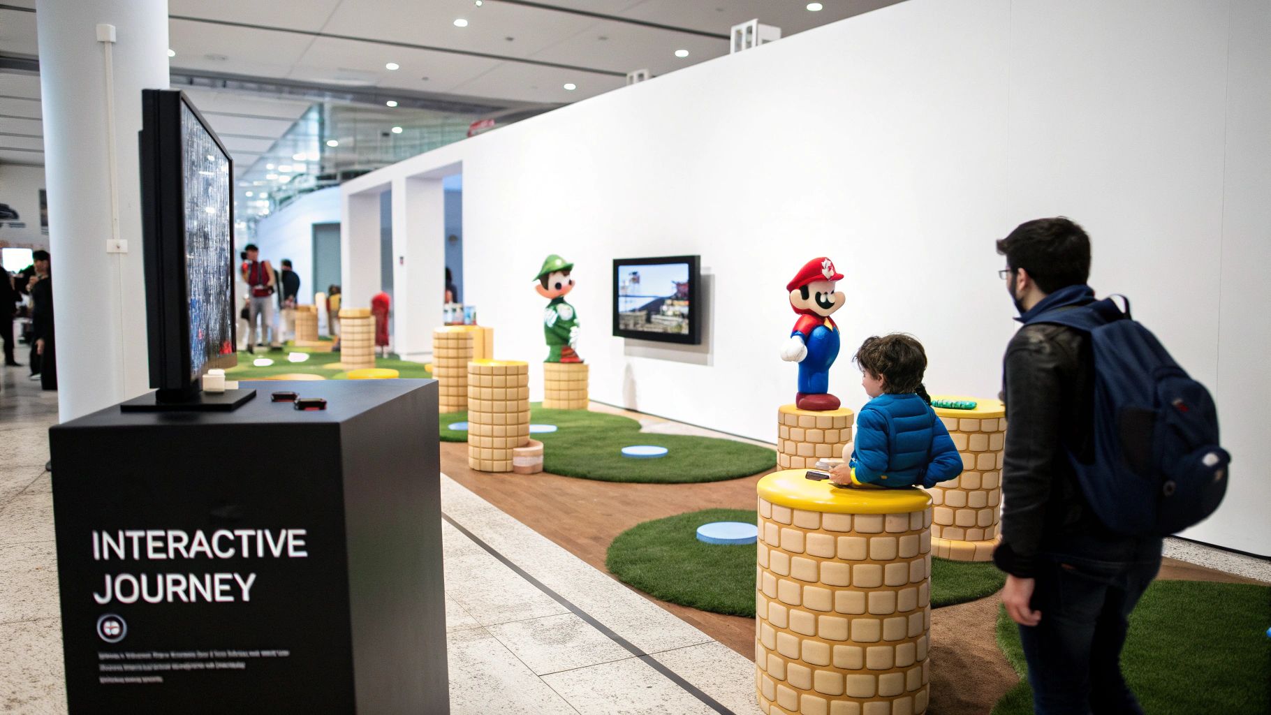
This innovative concept quickly gained widespread recognition, including features on Awwwards and numerous design awards. The portfolio effectively demonstrates Leonardi’s skills in character animation, game development, and responsive design. The gamified user experience, incorporating elements like skill visualization, creates a memorable connection with visitors and communicates his personality alongside his work. It's a unique approach that leaves a lasting impression. For more resources on creative portfolio development, check out Our Sitemap of Posts.
Features
- Side-scrolling interactive game interface
- Character animation
- Gamified UX for displaying portfolio items
- Skill visualization through game elements
- Responsive design
Pros
- Memorable and unique user experience: The interactive format stands out.
- Demonstrates technical skills: Showcases abilities beyond static designs.
- Creates an emotional connection: The game fosters engagement and interest.
- Showcases personality: The interactive format allows personality to shine through.
- Iconic status: The portfolio has become a recognized achievement in the design community.
Cons
- Complex to build and maintain: Requires significant technical expertise.
- Potential loading time issues: Large files can impact loading speed.
- Accessibility challenges: May not be suitable for all users.
- Risk of overshadowing content: The game could distract from the actual portfolio work.
Tips for Implementation
- Focus on showcasing technical skills: Ensure interactive elements demonstrate your abilities.
- Cross-device functionality: Test on various screens and browsers for a consistent experience.
- Balance entertainment and content: The game should enhance, not overshadow, your work.
- Provide alternative navigation: Offer options for users who prefer traditional browsing.
Leonardi’s portfolio sets a high bar for creative professionals. It demonstrates that innovation can lead to significant recognition. While this level of complexity isn't required for everyone, it highlights the potential of interactivity in portfolios. This example is especially relevant for small and medium businesses, startups, freelancers, marketing agencies, and community organizations seeking to establish a distinctive online presence.
2. Bruno Simon's 3D Interactive Portfolio
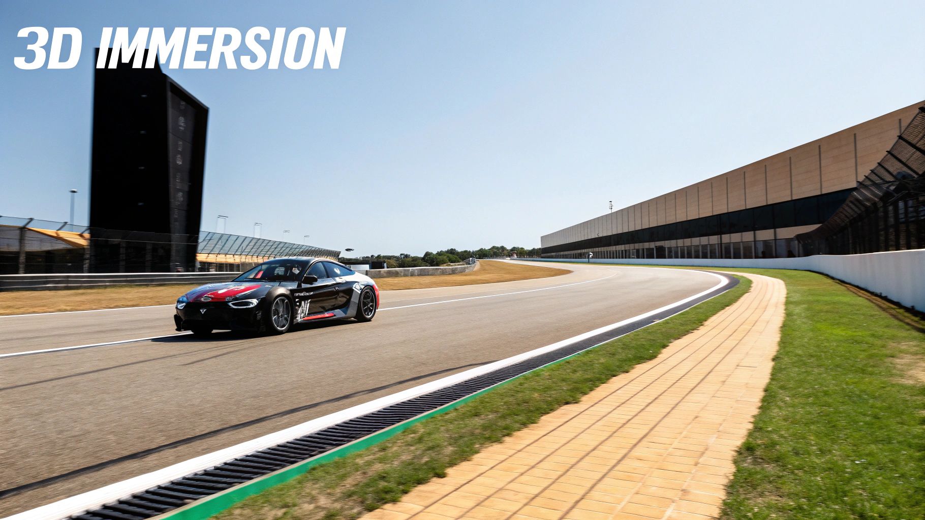
Bruno Simon's portfolio (https://bruno-simon.com/) transcends the typical online resume. It's a fully immersive, interactive experience. Simon's innovative use of a 3D environment quickly garnered attention and set a new standard for online portfolios. Visitors navigate a stylized landscape in a virtual car, discovering project details seamlessly integrated into the world.
Simon built this unique experience using WebGL and the Three.js JavaScript library, showcasing his expertise in creative development and 3D web experiences. A physics engine governs the car's movement, adding a layer of realism. The custom-built world features themed areas and interactive objects, making exploration engaging. This immersive approach lets potential clients experience his skills directly, rather than passively reading a list of achievements.
The portfolio quickly became a viral sensation among developers, earning accolades on platforms like Awwwards and widespread recognition for its innovative web design. It demonstrated how game-like environments can effectively showcase professional work, proving portfolios can be playful and impactful.
Features
- 3D environment built with WebGL and Three.js
- Physics engine for realistic car control
- Interactive objects within the landscape
- Custom-designed world with themed areas
- Keyboard navigation controls
Pros
- Exceptional Skill Demonstration: The portfolio itself showcases Simon's technical abilities.
- High Engagement: The unique experience is highly memorable.
- Contextual Project Integration: The environment adds depth and meaning to his work.
- Playful Professionalism: Simon strikes a balance between creativity and serious skill.
Cons
- Resource Intensive: The 3D environment requires powerful hardware.
- Mobile Limitations: Performance on some mobile devices might be affected.
- Complex Implementation: Replicating this design requires advanced skills.
- Accessibility Concerns: Navigating the 3D space may present challenges for users with disabilities.
Tips for Similar Implementations
- Optimize for Performance: Thorough testing and asset optimization are crucial for a smooth experience across devices.
- Alternative Navigation: Offer alternative navigation options for users who may find 3D navigation difficult, such as a traditional menu.
- Meaningful Connections: Ensure the environment enhances, rather than distracts from, the presentation of your projects.
- Balance Creativity and Usability: Prioritize user experience while pushing creative boundaries.
Bruno Simon's portfolio demonstrates how pushing creative and technical boundaries can create a memorable online presence. While resource-intensive, the impact and memorability make it a valuable case study for businesses and freelancers. It redefines the portfolio as an interactive experience that captivates and leaves a lasting impression.
3. Aristide Benoist's Cursor-Reactive Portfolio
Aristide Benoist's online portfolio (https://aristidebenoist.com/) showcases how subtle interaction design can transform a simple website into a captivating experience. It goes beyond just presenting work; it invites users to interact and play. Benoist achieves this through cursor-reactive typography and visuals, creating a tactile feel that sets his portfolio apart. As your cursor moves, elements respond dynamically, offering a sense of control and immersion not typically found on traditional portfolio sites. This approach not only highlights his interaction design skills but also creates a memorable visit for users.
The portfolio's effectiveness lies in its elegant execution of kinetic typography and cursor-triggered animations. Smooth transitions, a minimalist black and white color palette, and custom scrolling enhance the interactivity while keeping the focus on Benoist's work. The restrained colors ensure the dynamic movement remains prominent, preventing visual clutter. The kinetic typography, in particular, makes browsing the portfolio feel engaging and playful.
Benoist's innovative style has garnered recognition on platforms like Awwwards and sparked conversations among interaction design professionals. His work demonstrates how progressive enhancement, adding interactive elements to standard portfolio features, can significantly boost user engagement.
Pros and Cons of This Approach
Here's a quick overview of the advantages and disadvantages of this design style:
| Pros | Cons |
|---|---|
| Creates a tactile digital experience | Relies heavily on mouse interaction (less effective on mobile) |
| Demonstrates interaction design expertise | Can be processor-intensive, potentially impacting performance |
| Clean aesthetic maintains focus on the work | May be disorienting or distracting for some users |
| Progressive enhancement of standard portfolio elements |
Tips for Implementing Cursor-Reactive Elements
- Subtlety is Key: Focus on interactions that enhance, not distract from the content.
- Graceful Degradation: Ensure alternative interactions for touchscreens.
- Simple Color Palette: Emphasize movement with a minimalist color scheme.
- Performance Optimization: Implement throttling to prevent excessive resource consumption.
For small businesses, startups, freelancers, and agencies seeking a memorable online presence, Benoist's portfolio provides valuable inspiration. It exemplifies how thoughtful interaction design can transform a static portfolio into a dynamic, engaging experience. However, it’s important to consider the potential drawbacks and implement these techniques thoughtfully to ensure a positive user experience.
4. Femme Fatale Studio's Cinematic Portfolio
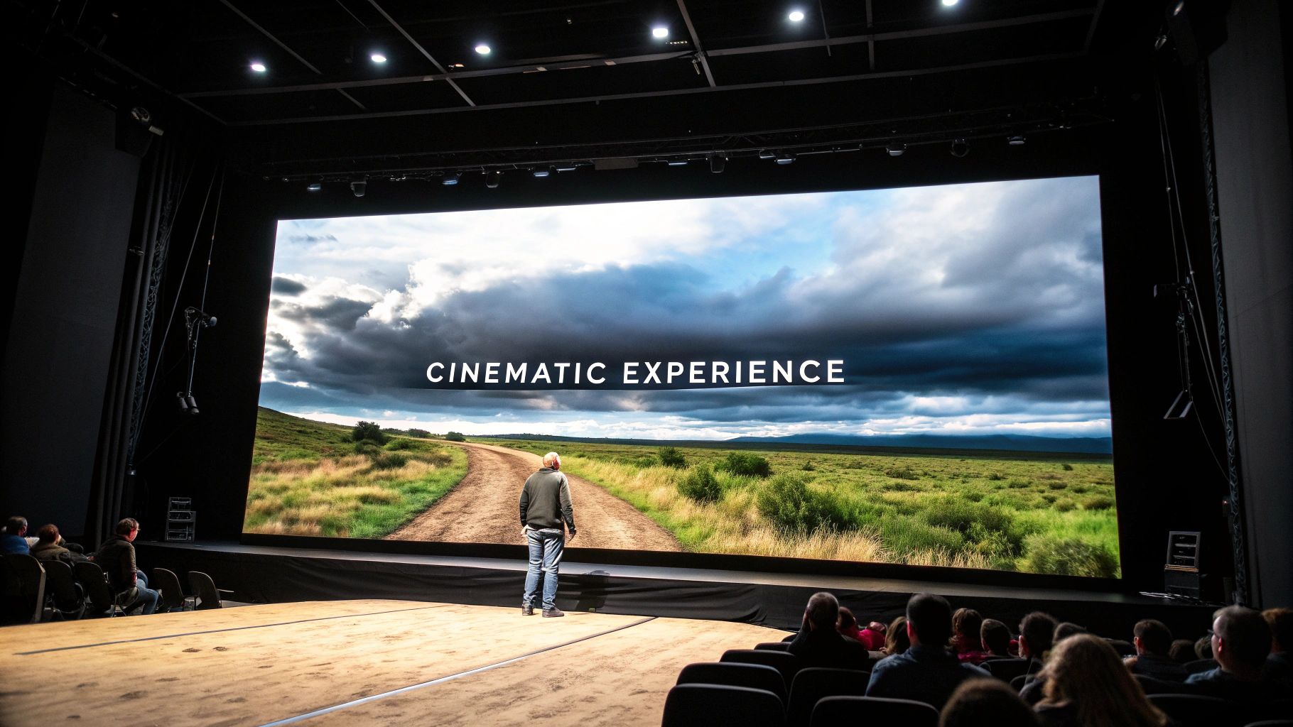
Femme Fatale Studio (https://www.femmefatale.paris/en) has taken the online portfolio to a new level, creating an experience that feels like a cinematic production. Instead of a typical static display of projects, they present a narrative journey. This approach uses dramatic transitions, full-screen video backgrounds, and carefully considered pacing to draw the visitor into their world.
This transforms the usual portfolio viewing experience into something more like watching a compelling movie trailer. Each project is revealed through meticulously arranged sequences. This distinctive method has garnered them recognition, including being highlighted as "Site of the Day" on numerous platforms. This solidifies their status as innovators in web design.
This cinematic approach is more than just visually appealing; it strategically emphasizes the studio's key strengths. The dynamic presentation effectively demonstrates their skill in storytelling and visual artistry, precisely the qualities clients seek when looking for video production services. By showcasing their work within this cinematic framework, Femme Fatale Studio immediately establishes its expertise and creative vision.
Key Features of the Cinematic Experience
Several key features contribute to this immersive cinematic experience:
- Full-screen video backgrounds: These instantly capture attention and create an engaging atmosphere.
- Cinematic transitions between sections: Smooth transitions enhance the flow and maintain a cohesive, immersive narrative.
- Custom video players: Tailored video players add a professional touch and give the studio greater control over the presentation.
- Film-inspired typography and layout: These design elements strengthen the cinematic theme and create a consistent visual identity.
- Atmospheric sound design: Sound plays a vital role in creating emotion and amplifying the overall impact. Offering mute/unmute functionality is essential for user control.
Pros and Cons of the Cinematic Approach
Like any design choice, this approach comes with its own set of advantages and disadvantages:
Pros:
- High Emotional Impact: The cinematic style captivates viewers from the start, making a memorable impression.
- Natural Showcase of Capabilities: The format inherently demonstrates the studio's video production skills in a compelling manner.
- Clear Context and Specialization: Positioning their work within a cinematic context elevates the perception of their projects and communicates their specialization.
- Memorable Branding: The unique approach ensures the portfolio stands out and resonates with potential clients.
Cons:
- Bandwidth Demands: Video content requires significant bandwidth, potentially posing challenges for users with slower internet speeds.
- Potential Loading Time Issues: Large video files can lead to longer loading times, which can negatively affect the user experience.
- Sound Dependence: While sound enhances the effect, providing control over audio playback is crucial for accessibility.
Tips for Creating a Cinematic Portfolio
For those inspired by Femme Fatale Studio, here are a few tips for implementing a similar approach:
- Optimize Video Files: Compress videos for web use without sacrificing quality to minimize loading times.
- Mute/Unmute Control: Always provide users with the option to control audio playback.
- Elegant Loading States: Use visually appealing loading animations to keep users engaged while content loads.
- Preload Critical Assets: Prioritize loading essential elements to enhance perceived performance.
Femme Fatale Studio's portfolio is an excellent example for businesses that prioritize visual storytelling, especially those in creative fields. While bandwidth requirements should be carefully considered, the impact and memorability of this cinematic style make it a valuable tool for showcasing creative work and establishing a strong online presence. It's a worthy addition to our list of creative portfolio examples, providing valuable lessons for businesses, freelancers, and agencies seeking to make a lasting digital impression.
5. Melissa Mitchill's Layered Canvas Portfolio
Melissa Mitchill's portfolio (https://www.melissamitchell.art/) captivates visitors with its distinctive layered canvas approach. This design choice creates a digital experience that mirrors the depth and texture of a physical art gallery. Instead of a typical flat, scrolling presentation, Mitchill uses parallax scrolling and overlapping elements to give each piece a sense of presence within a three-dimensional space. This technique isn't merely aesthetic; it cleverly reflects Mitchill's own mixed media artwork, blurring the lines between digital representation and the physical piece.
The layered canvas design involves multiple canvases stacked atop one another. As users scroll, these layers shift at varying speeds, producing a compelling parallax effect. This, along with strategically placed overlapping elements, fosters the illusion of depth and physicality. Custom cursor interactions add another layer of engagement, offering subtle feedback as users navigate this virtual gallery. Project thumbnails, enhanced with hover animations, provide enticing glimpses into individual works.
Why It's on This List
Mitchill's portfolio is featured here because of its unique and effective presentation. It showcases how a website can be more than just a portfolio; it can be an extension of the artist's style and a digital embodiment of their creative process. This approach offers a welcome departure from template-based portfolios, delivering a memorable and immersive experience.
Features and Benefits
- Multiple layered canvases: Establish a sense of depth and three-dimensionality.
- Parallax scrolling effects: Inject dynamic movement and visual appeal.
- Overlapping elements: Strengthen the layered effect and contribute to the sense of spatial arrangement.
- Custom cursor interactions: Boost user engagement and provide subtle feedback.
- Project thumbnails with hover animations: Give previews of projects and encourage further exploration.
Pros
- Creates a gallery-like viewing experience: Projects are showcased in a curated and contextualized way.
- Spatial arrangement adds context to projects: Visitors understand the scale and relationship between pieces.
- Visually distinctive: Sets the portfolio apart, reinforcing the artist's individual brand.
- Mimics physical art presentation digitally: Bridges the gap between the digital and physical art worlds.
Cons
- Potential for disorientation: Excessive parallax can be confusing or overwhelming.
- Responsive design complexity: Requires careful adaptation for various screen sizes and devices.
- Accessibility challenges: Dynamic elements and complex layouts can present difficulties for some users.
Tips for Implementation
- Subtlety is key: Use parallax scrolling thoughtfully to enhance, not overwhelm, the user. Avoid extreme movements.
- Mobile responsiveness: The layered effect must adapt seamlessly to smaller screens.
- Readability: Maintain clear contrast and legible text, regardless of element position or movement.
- Performance: Optimize images and code to ensure smooth loading and interaction with multiple canvas elements.
Popularity and Evolution
While layered interfaces have existed for a while, Mitchill's implementation pushed this technique to the forefront of portfolio design within art and creative fields. It's been highlighted in various design publications and has served as inspiration for other artists and designers. This approach reflects the growing movement towards using web technologies to create immersive and interactive online experiences that go beyond traditional portfolio layouts.
6. Rafael Rozendaal's Abstract Interactive Art Portfolio
Rafael Rozendaal's portfolio (https://www.newrafael.com/websites) isn't just a place to display his work; it is the work. Rozendaal, a Dutch-Brazilian artist, presents his creations as a collection of interactive, abstract digital art pieces built directly into the browser. Each click, hover, or scroll reveals a new digital experience, blurring the lines between the portfolio and the art itself. This elevates his digital work to fine art, reimagining the very concept of an online portfolio.
Rozendaal champions code as a creative medium. Each project on his website exists as a standalone web artwork, minimally presented with simplified navigation. The focus remains firmly on the art, inviting exploration and interaction. This abstract visual language, combined with the interactive elements, creates a truly memorable and unique visitor experience.
This approach has garnered significant attention in the digital art world, with Rozendaal's pieces featured in exhibitions and acquired by museums and collectors. His portfolio's success showcases the power of the web as an artistic canvas, pushing the boundaries of traditional portfolio presentation.
Features and Benefits
- Browser-Based Interactive Art Pieces: The portfolio is instantly accessible and immediately engaging.
- Code as a Creative Medium: Rozendaal uses coding as an artistic tool.
- Standalone Web Artworks: Each project functions as a self-contained artistic piece.
- Minimal Navigation: Distractions are eliminated, allowing the art to take center stage.
- Abstract Visual Language: A distinctive and memorable aesthetic is created.
Pros
- Portfolio Demonstrates Artist's Capabilities: The portfolio itself acts as a showcase of the artist's skills and vision.
- Creates Memorable, Unique Experiences: Visitors are actively engaged with the artwork.
- Positions Work as Fine Art: The portfolio elevates the perceived value of the digital creations.
- Challenges Conventional Portfolio Formats: Rozendaal offers a fresh perspective on how to present creative work online.
Cons
- May Confuse Visitors Expecting Traditional Navigation: The unconventional structure might not resonate with everyone.
- Less Effective for Communicating Specific Skills or Services: This approach may not be ideal for showcasing technical skills or client-based projects.
- Difficult to Capture in Portfolio Examples: Static images can't fully convey the interactive nature of the artwork.
Tips for Implementing Similar Concepts
While Rozendaal's style is highly specialized, the core principles can be adapted. Consider these tips:
- Consider Your Target Audience: Balance creative expression with clear communication. Consider incorporating interactive elements to engage visitors, even if full abstraction isn't suitable for your field.
- Include Familiar Navigation Patterns: Even within highly creative portfolios, some recognizable navigation elements can improve user experience.
- Document Interactive Experiences: Use video, GIFs, or detailed descriptions to showcase interactivity if direct access isn't possible.
- Balance Artistic Expression with Usability: Ensure your portfolio is user-friendly and accessible.
Rozendaal’s portfolio stands out as a powerful example of how a portfolio can be an extension of artistic vision. While this highly artistic approach might not be suitable for everyone, it provides valuable inspiration. Even for businesses and freelancers, the core idea of weaving interactivity and unique experiences into a portfolio can transform it from a static display into a dynamic representation of capabilities.
7. Active Theory's WebGL Particle Portfolio
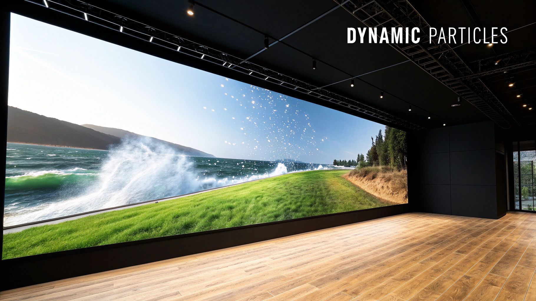
Active Theory's portfolio website (https://activetheory.net) is a striking example of how to push the boundaries of web design. Using the power of WebGL particle systems, they've created a digital experience that is both visually stunning and technically remarkable. The site features flowing, organic particle animations that represent their work, dynamically revealing project details and information through user interaction.
This approach not only showcases Active Theory's mastery of web technologies like WebGL, physics-based animations, and dynamic color systems, but it also crafts a captivating user experience. It's a truly unique way to present a portfolio and makes a strong statement about their capabilities.
The key to Active Theory's success is their ability to show rather than tell. Instead of static images or descriptions, they utilize interactive 3D elements and fluid transitions between projects. This provides visitors with a real sense of their design prowess. This immersive approach leaves a lasting impression, communicating their expertise far more effectively than traditional portfolio websites. The seamless integration of 3D elements within the particle system adds another layer of depth and interactivity.
Recognition and Influence
Active Theory’s innovative use of WebGL particles has earned them significant recognition, including awards from platforms like Awwwards and FWA. This acclaim has popularized the technique, inspiring other agencies and freelancers to explore the creative potential of particle systems in web design. Considering your site structure? You might find this helpful: Our guide on Sitemap related content for more information on website navigation.
Is This Portfolio Style Right for You?
This style is ideal for businesses looking to establish themselves as innovative leaders in their field. It's particularly suitable for creative agencies, technology startups, and freelancers specializing in interactive design. It clearly demonstrates a high level of technical skill and a commitment to pushing creative boundaries.
Pros and Cons of WebGL Particle Portfolios
Pros:
- Demonstrates technical expertise in web technologies
- Creates a memorable and unique visual identity
- Showcases capabilities through interactive experiences
- Positions the agency as an innovation leader
Cons:
- Can be performance-intensive, especially on older devices
- Complex implementation requiring specialized skills
- Requires careful optimization to maintain usability
Tips for Implementation
- Progressive Enhancement: Offer fallback experiences for browsers that don't support WebGL. Optimize particle counts based on device performance to ensure accessibility.
- Performance Optimization: Manage particle counts carefully and consider using level-of-detail techniques to maintain acceptable performance on lower-powered hardware.
- Brand Identity Integration: Consider how particles can reflect your brand. Experiment with color palettes, movement patterns, and interaction styles that align with your brand's values.
- Fallback Solutions: Ensure a graceful fallback for users on older browsers or devices that might not fully support WebGL. A simplified site version or a static image-based portfolio are good alternatives.
Active Theory's portfolio has earned its place on this list because it demonstrates the power of WebGL to create truly memorable and engaging online experiences. It sets a new standard for creative portfolio websites.
8. Georgie Luhur Cooke's Accessible Creative Portfolio
Georgie Luhur Cooke's portfolio (https://georgiecooke.com/) is a perfect example of how creativity and web accessibility can work together. It powerfully demonstrates that inclusive design isn't limiting, but rather a chance to connect with a larger audience and showcase ethical design. This portfolio earns its spot on this list by setting a new standard for a modern, accessible, and engaging online presence.
This portfolio isn't just visually appealing; it's built with accessibility at its core. Features include high contrast mode options, allowing users to customize the site's visuals for optimal readability. All interactive elements are keyboard navigable, ensuring those who can't use a mouse can still fully explore the site.
The site adheres to WCAG (Web Content Accessibility Guidelines) AA standards, a widely recognized benchmark for web accessibility. Fast loading times and readable typography with appropriate scaling contribute to a smooth user experience across devices and internet speeds. The semantic HTML structure further enhances accessibility for assistive technologies like screen readers.
What Makes This Approach So Impactful?
Georgie Luhur Cooke's work has earned praise within accessibility communities for its championing of inclusive design. It proves that accessibility doesn't have to compromise aesthetics. The site uses thoughtful animations and interactive elements that enhance engagement without excluding users with disabilities.
This approach is essential for businesses, freelancers, and organizations looking to build an inclusive online presence.
Pros:
- Wider Reach: Accessibility features allow individuals with disabilities to access and interact with the portfolio, expanding its reach.
- Ethical Design: Prioritizing accessibility demonstrates a commitment to inclusivity and social responsibility.
- Cross-Device Performance: Fast loading times and responsive design ensure a positive experience on desktops, tablets, and smartphones.
- Inclusive Design in Action: The portfolio is a practical example of how to integrate accessibility from the start of the design process.
Cons:
- Potentially Fewer Visual Effects: While the site uses animations, the focus on accessibility might limit the use of some complex effects that could create accessibility challenges.
- Increased Development Time: Implementing and testing accessibility features requires more time and resources.
Tips for Implementing Accessible Design:
- Early Integration: Accessibility should be considered from the beginning of a project, not as an afterthought.
- Testing: Test with screen readers and keyboard navigation to identify potential barriers.
- Alternatives for Visual Elements: Provide text descriptions for images, captions for videos, and transcripts for audio.
- Documentation: Highlight your accessibility efforts to show your commitment and help users find and utilize these features.
By prioritizing accessibility, you can create a portfolio that's not only visually stunning but also ethically sound and reaches a wider audience. Georgie Luhur Cooke's portfolio is a great example and inspiration for anyone wanting to build a truly inclusive online presence.
9. Anton & Irene's Storytelling Portfolio
Anton & Irene's portfolio (https://antonandirene.com/) offers a compelling example of how narrative can elevate a simple showcase of work. They present projects not as static visuals, but as engaging stories, complete with narrative arcs, character development (their clients/users), and satisfying resolutions (the project outcomes). This transforms their portfolio from a basic gallery into a dynamic testament to their strategic thinking and problem-solving abilities.
This approach effectively communicates the what, why, and how of each project, showcasing both the journey and the impact. Each project becomes a meticulously crafted case study, using editorial layout and typography, long-form descriptions, and a sequential revelation of information, often interwoven with powerful photography. This provides visitors with context, outlining the challenges and solutions in a way that static images simply can't achieve. For more portfolio inspiration, you might find this helpful: Our guide on various creative categories.
The benefits of this approach are numerous. It adds depth and context, demonstrating strategic thinking alongside strong visual design skills. By showcasing their understanding of client challenges and their ability to create effective solutions, Anton & Irene foster a deeper emotional connection with potential clients. This positions them not just as designers, but as valuable problem-solvers and strategic partners.
However, this narrative-driven approach also presents challenges. It requires significantly more content creation than a traditional portfolio, potentially leading to longer page load times due to the rich media involved. Furthermore, this detailed style might not suit every visitor, especially those looking for a quick visual overview.
Key Features and Considerations
-
Features:
- Editorial layout and typography
- Long-form case studies
- Sequential revelation of information
- Strong photography integration
- Narrative structure for projects
-
Pros:
- Provides depth and context to work
- Demonstrates strategic thinking alongside visual design
- Creates emotional connection with clients' challenges
- Positions designers as problem solvers
-
Cons:
- Requires more content development
- Longer page load due to rich media
- May not appeal to visitors seeking quick visual browsing
Tips for Implementing a Storytelling Portfolio
- Structure Case Studies: Use clear narrative arcs – beginning (the challenge), middle (the process), and end (the solution).
- Guide the Reader: Employ typography hierarchies – headings, subheadings, and varied font weights for a clear visual flow.
- Maintain Visual Appeal: Balance the narrative with the visual appeal of your work; don't let the story overshadow the design.
- Demonstrate Impact: Include measurable results and client testimonials to add credibility and showcase the impact of your work.
- Improve User Experience: For longer case studies, consider chapter-based navigation to break down lengthy narratives into digestible chunks.
Popularized by Anton Repponen and Irene Pereyra themselves, and featured across various design publications, this storytelling approach has become highly influential. It's particularly effective for small and medium businesses, startups, creative freelancers, marketing agencies, and local community organizations seeking a more engaging and persuasive way to present their work. This detailed and narrative-rich approach earns Anton & Irene's portfolio a deserved spot on this list of creative portfolio website examples.
10. Yoichi Kobayashi's Code Art Portfolio
Yoichi Kobayashi's online portfolio (https://www.tplh.net/) offers a compelling example of how generative art and creative coding can become the very foundation of a portfolio's design. Instead of static images, Kobayashi showcases his skills through live-rendered algorithmic art that evolves with every visit. This dynamic presentation creates a captivating experience, distinguishing it from more traditional portfolios.
The core strength of this approach lies in its interactivity. Visitors aren't just passive viewers; they become active participants, able to manipulate parameters and witness the art transform in real-time. This showcases Kobayashi’s technical skill while providing a unique, ever-changing experience. His work, ranging from math-based visualizations to intricate WebGL and Canvas implementations, highlights the versatility of code as an artistic tool.
Kobayashi further enhances his portfolio by sharing open-source code examples. This provides an educational element for other coders and underscores a transparent approach to his creative process. This resonates with the growing creative coding community and reflects a broader shift towards dynamic, interactive experiences in web design and digital art. It’s particularly appealing to audiences interested in technology, innovation, and the fusion of art and code.
Pros of a Generative Portfolio
- Unique Visitor Experience: The generative nature guarantees a fresh and engaging experience with every visit.
- Showcase of Technical and Artistic Skills: The portfolio demonstrates not just artistic vision, but also proficiency in coding and algorithmic thinking.
- Educational Value: Open-source code offers valuable learning opportunities and promotes transparency.
- Automated Evolution: The dynamic content eliminates the need for constant manual updates.
Cons of a Generative Portfolio
- Niche Appeal: This approach might not be suitable for showcasing all types of creative work, particularly those outside the digital realm.
- Performance Demands: Complex generative art can be resource-intensive for visitors' devices.
- Client Comprehension: Some clients may not fully appreciate the technical complexity and artistic merit of this style.
Tips for Implementing Generative Elements
- Explain the Algorithms: Provide clear explanations of the underlying principles for a non-technical audience.
- Offer User Controls: Empower visitors with interactive controls to manipulate the artwork.
- Consider Partial Integration: Even if a fully generative portfolio isn't appropriate, consider incorporating dynamic elements into more traditional sections.
- Optimize for Performance: Balance complexity with performance to ensure smooth experiences across a range of devices.
Yoichi Kobayashi's portfolio stands out as a testament to the innovative possibilities of online presentation. It leverages technology to create a truly engaging and unique online presence, particularly relevant for those in creative coding, generative art, and interactive design. For startups, agencies, and freelancers seeking to highlight technical expertise and innovative thinking, this approach presents a compelling alternative to traditional portfolio formats.
Top 10 Creative Portfolio Designs Comparison
| Design | 🔄 Complexity | ⚡ Resources | 📊 Outcomes | 💡 Use Cases | ⭐ Advantages |
|---|---|---|---|---|---|
| Robby Leonardi's Interactive Portfolio | High – Custom gamified interactions and animations | Moderate-High – May have longer load times | Highly engaging and memorable experience | Creative portfolios that push beyond static designs | Unique gamification that showcases technical skills |
| Bruno Simon's 3D Interactive Portfolio | Very High – 3D environment with physics engine | High – Demands modern hardware and good performance | Immersive and innovative user journey | Tech-savvy and creative design presentations | Cutting-edge technical showcase with 3D navigation |
| Aristide Benoist's Cursor-Reactive Portfolio | Moderate – Focused on cursor-reactive interactions | Moderate – Generally efficient with some processing load | Refined impact through subtle, tactile interactions | Portfolios emphasizing smooth interaction and minimalist design | Elegant animations with a clean, engaging aesthetic |
| Femme Fatale Studio's Cinematic Portfolio | Moderate – Involves cinematic transitions and video playbacks | High – Bandwidth-intensive video backgrounds | Dramatic, film-like emotional impact | Luxury and multimedia brands that value storytelling | Immersive narrative with striking visual flair |
| Melissa Mitchill's Layered Canvas Portfolio | Moderate – Layered canvases and parallax effects require care | Moderate – Optimized for visual depth with potential performance trade-offs | Distinct gallery-like spatial depth | Artists and designers showcasing mixed media art | Unique, art-inspired presentation with layered elements |
| Rafael Rozendaal's Abstract Interactive Art Portfolio | Moderate-High – Abstract interactions bridging art and portfolio | Moderate – Efficient as standalone interactive art pieces | Conceptually engaging and unconventional experience | Artists redefining portfolio boundaries with abstract art | Avant-garde integration of art and digital interactivity |
| Active Theory's WebGL Particle Portfolio | High – Complex WebGL particle systems and physics animations | Very High – Intensive rendering and device dependency | Mesmerizing and technically impressive interactions | Tech agencies and innovation-driven digital experiences | Dynamic, cutting-edge technology that creates a strong visual identity |
| Georgie Luhur Cooke's Accessible Creative Portfolio | Low-Moderate – Well-structured with accessibility in mind | Low – Optimized for performance with efficient coding | Reliable, high-usage experience with wide reach | Inclusive portfolios prioritizing accessibility and performance | Balanced design that merges creativity with exemplary accessibility |
| Anton & Irene's Storytelling Portfolio | Moderate – Editorial layouts with narrative sequencing | Moderate – Content-rich presentation with longer load times | Deep, engaging narrative with strategic insights | Story-driven portfolios and case study presentations | Rich context and emotional connection through storytelling |
| Yoichi Kobayashi's Code Art Portfolio | High – Generative art with live interactive coding | High – Demands significant processing for live-rendering | Constantly evolving, innovative visual experiences | Portfolios emphasizing creative coding and generative design | Dynamic fusion of technical mastery and artistic automation |
Craft Your Digital Masterpiece
These creative portfolio website examples, from Robby Leonardi's interactive game to Yoichi Kobayashi's code art, showcase the power of thoughtful design and execution. They emphasize important principles such as prioritizing the user experience, incorporating interactivity, and reflecting your unique personality. Putting these concepts into practice means understanding your target audience and tailoring your portfolio to resonate with them.
A clean, intuitive navigation is essential, as is showcasing your best work upfront. Consider incorporating elements like case studies, testimonials, and a clear call to action to guide visitors through your offerings.
Staying Ahead of the Curve
Learning and adapting are essential for staying relevant in the ever-changing digital environment. Keep exploring new technologies and design trends, experiment with different approaches, and analyze what resonates with your audience. The examples demonstrate current trends such as the use of 3D graphics, WebGL, and cursor-reactive elements.
Future developments will likely involve even more immersive experiences, potentially integrating technologies like AR/VR and AI-driven personalization.
Key Takeaways
- User Experience is Paramount: Design your portfolio with your audience in mind, focusing on clear navigation and easy access to your work.
- Showcase Your Unique Style: Let your personality shine through and set yourself apart from the competition.
- Embrace Interactivity: Engage visitors with dynamic elements and encourage them to explore.
- Stay Current: Continuously learn and adapt to new technologies and design trends.
Ready to enhance your online presence and connect with your ideal clients? Creativize empowers creative professionals like you to build stunning portfolios and connect with businesses seeking your unique skills. Our platform offers intuitive tools, resources, and a vibrant community to help you elevate your creative career. Discover the power of local connections and unlock your full potential. Start building your digital masterpiece today!