
Color is the very first thing someone sees and the last thing they remember about your design. It's not just a nice-to-have; mastering color theory is a core communication skill. It's how you set a mood, guide a user's eye, and build a brand that people actually recognize. Get it right, and a confusing interface suddenly feels intuitive.
Why Color Is a Designer's Most Powerful Tool
Ever look at a design and just know something is off? The layout is clean, the typography is sharp, but it just doesn't land. The culprit is almost always the color.
Think of color theory less like a dusty old rulebook and more like your secret weapon. It’s the one tool that helps you connect with people on a gut, emotional level, turning a forgettable app into an iconic experience.
A smart color palette is more than just decoration—it’s a silent guide. That high-contrast "Buy Now" button isn't just a random choice; it's a strategic move that can seriously boost conversions. On the flip side, a clashing, chaotic palette can make a website feel cheap or untrustworthy, sending visitors packing in seconds. In fact, research shows that up to 90% of snap judgments about products are based on color alone.
The Foundation of Intentional Design
When you get a handle on color theory, you stop guessing and start designing with intention. Every single hue, shade, and tone carries its own psychological weight, and knowing how to use them is everything. Your color palette becomes a vital part of your brand's voice.
A solid grasp of these principles helps you do a few key things really well:
- Create Visual Hierarchy: You can literally tell people where to look first, guiding their eyes to headlines, CTAs, or critical info.
- Build Brand Recognition: It’s how you get that instant recognition, like the unmistakable red of Coca-Cola or the calming blue of Meta.
- Evoke Specific Emotions: You get to decide how people feel about your product. Trustworthy? Energetic? Innovative? Color gets you there.
- Tell Compelling Narratives: Color is a cornerstone of storytelling. To really dig into this, check out our guide on powerful visual storytelling techniques that can bring your brand's story to life.
Ultimately, color is a language. Once you understand its grammar and vocabulary, you can craft messages that aren't just seen, but felt. That's how you go from creating something functional to something truly impactful.
Decoding the Designer's Color Wheel

The color wheel isn't some dusty museum exhibit—it's one of the most practical tools you’ll ever use. Think of it like a family tree for color. At the top, you have the three "parents": red, yellow, and blue, also known as the primary colors. From them, you get the "children"—the secondary colors like green and orange—creating a whole lineage of color relationships.
Take violet, for example. You get it by mixing equal parts red and blue, showing exactly how new hues are born from their ancestors. This way of thinking helps you see color as an interconnected system, not just a bunch of isolated dots. The wheel’s circular shape is intentional; it shows how every color flows naturally into the next, which is a huge help when you're trying to build a palette that just feels right.
Primary and Secondary Colors
Primary colors are the bedrock of the wheel. You can't mix other colors to create them. Secondary colors, on the other hand, are what you get when you blend two primaries together in equal amounts. It’s really as simple as a basic recipe.
- Red + Yellow = Orange
- Yellow + Blue = Green
- Blue + Red = Violet
This simple formula is the foundation for every color palette you'll ever create. Of course, designers rarely stop there. By tweaking these ratios, you can create a whole new layer of tertiary colors, adding all sorts of nuance and character to your work.
"Understanding primary and secondary relationships is like learning your family history—it reveals your starting point."
How these colors interact at this basic level sets the entire personality and mood for your design.
Exploring Hue, Saturation, and Value
Beyond their relationships on the wheel, every single color has three core properties: Hue, Saturation, and Value. If you’ve ever used design software, you know these as the HSB or HSV sliders.
| Property | Description | Control Example |
|---|---|---|
| Hue | The pure wavelength or base color | Color picker wheel |
| Saturation | The intensity or purity of the color | Saturation slider |
| Value | Lightness or darkness relative to white/black | Brightness slider |
These are your creative controls. With a tiny adjustment, you can shift a bright candy apple red to a muted brick or a deep, rich burgundy. It means a single hue can play multiple roles in a design, all depending on how you dial in its settings.
This whole system actually traces back to Sir Isaac Newton in 1666 when he created the very first color wheel. He split white sunlight into seven distinct colors using a prism and then joined the ends to show their natural progression. Later, thinkers like Goethe and Itten added the psychological depth and refined it into the 12-hue wheel we use today.
Adjusting Sliders to Shape Mood
Even small tweaks to saturation or value can completely change a design’s mood. Lower the saturation on a playful red, and it instantly becomes a sophisticated burgundy, guiding the viewer toward a feeling of luxury or coziness.
Here are a few quick tips to keep in mind:
- Use higher saturation for vibrant calls to action that need to pop.
- Lower the saturation for backgrounds so they don't fight with your text.
- Bright values help maintain readability, especially in low-light themes.
Designers report that mood shifts are most noticeable when a color’s value changes by at least 20% on the lightness slider.
These aren't just aesthetic choices; they directly impact the user experience, ensuring your color decisions truly support your project's goals. For a deeper dive into how color fits into the bigger picture, check out our guide on the Principle of Design.
Mastering these fundamentals will give you the confidence to move beyond the basics and start crafting palettes that truly connect with people. Next up, we'll explore the harmony rules that help create perfectly balanced designs.
Building Palettes with Color Harmony
Knowing your colors is one thing. Getting them to play nice together in a way that looks balanced and feels right? That’s a whole different ballgame. This is where color harmony enters the picture.
Think of color harmonies less like rigid rules and more like time-tested recipes for creating beautiful and effective palettes. They're the frameworks that guide designers in combining colors to create a specific feeling or lead a user’s eye exactly where it needs to go.
When you get it right, these harmonies create a sense of order that’s just naturally pleasing. A design without color harmony often feels chaotic and jarring, which can send users running before they even see what you have to offer. Mastering these principles is the difference between just picking colors and strategically building palettes that send a clear message.
This visual breakdown shows how mixing colors to find harmony is a lot like a painter blending pigments on a palette—it's a deliberate art.
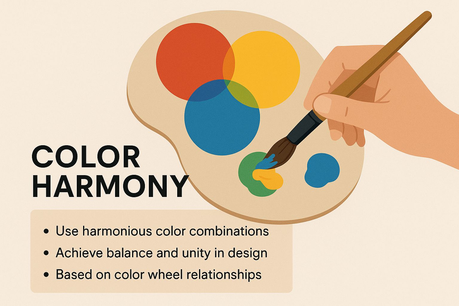
It reinforces the idea that true harmony comes from intentionally combining hues to create something cohesive and impactful.
Complementary High-Contrast Duos
The most straightforward—and dramatic—color harmony is the complementary scheme. It’s simple: just pair two colors directly opposite each other on the color wheel, like red and green or blue and orange. Think of them as a high-energy duo; their extreme contrast makes both colors pop, appearing brighter and more vibrant.
This dynamic tension is perfect for grabbing attention. A bright orange call-to-action button on a deep blue background? Almost impossible to miss. But you have to handle this high contrast with care. Overdo it, and a complementary scheme can quickly become overwhelming. It’s often best to let one color dominate and use its complement as a powerful accent.
Analogous Cohesive Families
If complementary colors are a dynamic duo, then analogous colors are a calm, tight-knit family. This harmony uses three colors that sit side-by-side on the color wheel, like blue, blue-green, and green. Because they all share a common hue, they blend together seamlessly to create a serene and unified look.
This approach is fantastic for designs that need to feel gentle and comfortable. Wellness apps, nature-inspired brands, and elegant user interfaces often lean on analogous schemes to create a soothing experience. A perfect real-world example is Spotify's iconic branding, which uses a range of greens to build a strong, recognizable, and harmonious identity.
The secret to a great analogous palette is making sure you have enough contrast in value (the lightness and darkness) between the colors. Without it, your design can fall flat, with all the elements mushing together.
Triadic Balanced and Vibrant Palettes
Need a palette that’s vibrant but a little more balanced than a complementary scheme? That’s when designers turn to a triadic harmony. This involves picking three colors that are evenly spaced around the color wheel, forming a perfect triangle. The classic primary colors (red, yellow, blue) are a triadic scheme, as are the secondary colors (orange, green, violet).
Triadic schemes give you strong visual contrast while still feeling balanced and rich. They’re energetic and engaging, making them a go-to choice for brands that want to project a fun, dynamic image. Burger King’s old logo, with its bold use of red, yellow, and blue, is a classic example of a triadic scheme in action. To keep it from being too much, a common trick is to use one color as your dominant shade and the other two as accents.
Ultimately, choosing the right harmony comes down to your design goals. Whether you need the high-impact energy of a complementary pair or the quiet unity of an analogous group, these principles give you a solid starting point for building killer color palettes.
Choosing The Right Color Harmony For Your Design Goal
Not sure which harmony fits your project? This table breaks down what each harmony does best, matching them with their psychological impact and ideal use cases to help you make the right call.
| Harmony Type | Visual Effect | Best For | Example Use Case |
|---|---|---|---|
| Complementary | High contrast, vibrant, and energetic. | Drawing attention, creating focal points, and highlighting CTAs. | A bright orange "Sign Up" button on a deep blue website header. |
| Analogous | Serene, cohesive, and comfortable. | Creating a unified and calming user experience without high contrast. | The user interface for a meditation app using shades of blue and green. |
| Triadic | Balanced, vibrant, and dynamic. | Building a lively and engaging brand identity that feels both bold and stable. | A children's toy brand using a playful mix of orange, green, and violet. |
By understanding these fundamental recipes, you can start building palettes that not only look good but also work hard to achieve your design's purpose.
Alright, we've covered the color wheel and the basic rules of harmony. Now we're getting to the good stuff—the part that separates a decent design from one that actually works.
This is where we go beyond the "how" and dig into the "why." Color isn't just decoration; it's a direct line to your audience's emotions. Understanding the hidden meaning behind your palette is what makes a design feel right, build trust, and ultimately persuade people to take action.
But here's a word of caution: simply saying "blue is calming" is a massive oversimplification, and honestly, pretty dangerous advice. The real impact of any color is a complex cocktail of context, culture, and your audience's own experiences.
Context Is Everything
A color’s meaning is never set in stone. It shifts and changes based on where and how you use it. A specific shade can scream trustworthiness for one brand but feel cold and distant for another. It's all about the context.
Think about the color blue. For a company like Meta, blue projects stability, intelligence, and a sense of security—exactly what you want when you're handling people's personal data. But splash that same corporate blue all over a restaurant’s branding? It can actually suppress appetite and make the place feel sterile and uninviting.
Green is another great example. It can mean wildly different things depending on the situation:
- For Whole Foods, green is all about nature, health, and organic goodness.
- For a fintech app, that same green signals money, growth, and financial success.
The hex code doesn't change, but its message is completely transformed by the industry and what the user is expecting to see.
Cultural Perceptions of Color
This gets even trickier when you go global. Color associations are deeply tied to culture, and what means one thing in the West can mean the complete opposite somewhere else.
For example, in many Western countries, white is the go-to for weddings, purity, and clean, minimalist design. But in many Eastern cultures, white is traditionally the color of funerals and mourning.
If you're building a brand for a worldwide audience, you have to be incredibly mindful of these nuances. A color scheme that feels perfect for a North American market might send a confusing or even offensive message in Asia or the Middle East. It's on us as designers to look past our own cultural biases and think about our users' diverse backgrounds.
A fascinating study on color and marketing found that up to 90% of snap judgments people make about products are based on color alone. That one stat shows just how critical it is to get the emotional and cultural context right from the very start.
Using Color to Influence User Behavior
When you nail color psychology, you gain a powerful tool for guiding user behavior and cementing your brand’s identity. Your color choices can make a website feel more intuitive, smooth out friction points, and build an instant sense of trust. Every single hue in your palette should have a job to do.
This strategic approach to color is the foundation of a strong, consistent brand. And to make sure everyone on your team uses those colors correctly, it's vital to document them in a brand style guide. You can get a head start by checking out our deep dive into creating a brand style guide template that actually gets used.
Color's influence is also a cornerstone of successful packaging and branding strategies, where a product's color on the shelf is a huge part of its identity. By mastering these hidden meanings, you turn your palette from a simple aesthetic choice into a strategic asset that connects with people and drives results.
Putting Color Theory into Practice
So, how do we get from abstract principles to actual design work? This is where the rubber meets the road. Knowing the rules of harmony is one thing, but actually applying them to create designs that feel intuitive and balanced is what separates the pros from the amateurs.
Thankfully, there are a few tried-and-true frameworks that turn complex theory into simple, repeatable actions.
One of the most powerful is the 60-30-10 rule. Think of it as a recipe for visual balance. It’s a simple trick that stops your color palette from becoming a chaotic mess by giving each color a specific job to do, creating a natural hierarchy that tells the user’s eye exactly where to go.
When you’re trying to get a feel for how to put color theory into practice, a key step is understanding how colors work in different spaces. While it's aimed at interiors, this guide on choosing interior paint colors has some fantastic lessons on how light and context change our perception—a concept just as crucial for digital designers as it is for decorators.
The 60-30-10 Rule for Visual Balance
This rule is brilliantly simple and incredibly effective, especially for user interface design. It’s all about how you distribute the colors in your palette to make sure your final design looks professional and intentional.
- 60% Dominant Color: This is the main character of your design. It takes up the most visual real estate—think backgrounds, large content areas, and the general atmosphere of the interface. This color sets the entire mood.
- 30% Secondary Color: This color is the supporting act. It’s there to create visual interest without stealing the spotlight from your dominant hue. You’ll often see it used for things like cards, secondary information, or interactive elements that aren't the primary call-to-action.
- 10% Accent Color: Here’s your highlight. This should be the most vibrant, high-contrast color in your palette, and you should save it for the most important elements you want users to notice immediately. We're talking call-to-action buttons, crucial icons, or urgent alerts.
Stick to this ratio, and you'll create a design that feels purposeful and is a breeze to navigate. The dominant color sets the vibe, the secondary color adds depth, and the accent color drives the user to act.
Designing for Everyone with Color Accessibility
A stunning color palette is totally useless if people can't read it. Color accessibility isn't some "nice-to-have" checkbox; it's a non-negotiable part of inclusive, ethical design. The goal is to make sure people with visual impairments, like color blindness, can use your site or app just as easily as anyone else.
The single most critical piece of this puzzle is color contrast—the difference in lightness between your text color and whatever is behind it. Get this wrong, and text becomes difficult or even impossible to read, leading to a massively frustrating experience.
The Web Content Accessibility Guidelines (WCAG) lay out the ground rules here. For normal text, you need a contrast ratio of at least 4.5:1. For large text (18pt or 14pt bold), you can get away with a ratio of at least 3:1.
The good news? You don't have to eyeball it. There are dozens of free online tools that will check your color combos against these standards in seconds, making sure your designs are both beautiful and usable for everyone.
Translating Digital to Print: RGB vs. CMYK
Finally, let's talk about a common headache for designers: the jump from screen to print. Why do the vibrant colors on your monitor suddenly look dull or just wrong on paper? The culprit is the two primary color models we work with: RGB and CMYK.
- RGB (Red, Green, Blue): This is an additive color model built for digital screens. It starts with a black screen (no light) and adds red, green, and blue light together to create the entire spectrum of colors you see on your monitor.
- CMYK (Cyan, Magenta, Yellow, Key/Black): This is a subtractive color model designed for print. It starts with a white surface (paper) and subtracts brightness by adding layers of ink. Black ink (Key) is used to create deep, rich tones and crisp black text.
The RGB color space can produce a much wider, more vibrant range of colors than CMYK can. That’s why that brilliant, electric blue on your screen might look a bit sad and muted once it hits the page.
To get around these color-shifting surprises, always, always set your document’s color mode to CMYK right at the start of any print project. A good project starts with a good plan, and you can learn more about structuring your work with our helpful creative brief template. Mastering these practical applications is what turns theoretical knowledge into professional, high-impact design work.
Common Color Theory Questions Answered
Once you start getting your hands dirty with color theory, the real questions start popping up. It's one thing to know the rules, but it's another to apply them confidently in your daily work. Let's tackle some of the most common hurdles designers face.
A question I hear all the time is, "How many colors should I actually use?" While there isn't a single magic number, a solid rule of thumb is to stick to three to five colors. This gives you enough variety to build hierarchy and visual interest without overwhelming the user.
Go with too few, and your design can feel flat and uninspired. Go with too many, and you risk creating pure visual chaos. The 60-30-10 rule is a fantastic starting point here, giving you a clear structure for a dominant, secondary, and accent color.
What Is the Best Way to Find Inspiration for a Color Palette
This is where so many of us get stuck. Staring at a blank color wheel can feel like a one-way ticket to a creative block. Instead of trying to invent something from scratch, look for inspiration in the world around you.
Some of my favorite methods include:
- Nature Photography: A stunning sunset, a forest landscape, or even a close-up of a flower can reveal perfectly balanced, natural color harmonies.
- Art and Film: Grab a still from a beautifully directed movie or a classic painting. These are masterclasses in using color to create a specific mood.
- Existing Brands: Analyze the palettes of brands you admire. Pay attention to how they use color to communicate their values and guide your eye.
If you're just starting out or need a refresher on the basics, this simple guide to color theory for beginners can be a great resource to spark some new ideas.
Remember, the goal isn't just to copy a palette. It's about understanding why it works. Deconstruct the harmony, the contrast, and the emotion it evokes, then adapt those principles to fit your own project.
How Do I Make My Colors Feel Modern
Trends come and go, but the core principles of visual design are timeless. A "modern" feel often has less to do with the specific hues you pick and more to do with how you apply them. For a contemporary look, focus on palettes with plenty of white space, strong contrast, and intentional simplicity.
Pairing muted, earthy tones with a single, vibrant accent color is a great way to create a look that feels fresh and current. It's also important to remember that color is just one piece of a much larger puzzle. Mastering how to apply it is a fundamental part of the broader principles of visual design that every creative needs to know.
Ultimately, a modern palette is one that serves its purpose clearly and effectively.