
Why Basic Design Principles Matter More Than Trends

Here’s a truth that successful designers live by: trends come and go, but the basic design principles are the unshakable foundation of every great visual. Think of them as the grammar of visual language. Once you get a feel for these core rules, you can communicate with clarity, build designs that last, and even bend the rules with purpose. Trends are the slang of the design world—fun for a moment, but principles are the timeless language everyone understands.
This is why iconic brands feel so effortlessly solid. Their identities aren't built on the latest fad. Instead, they stand on a bedrock of principles like balance, contrast, and hierarchy. This creates a sense of trust and recognition that lasts for decades, long after the trends of their founding era have vanished. These principles act as your creative compass, giving you the confidence to make smart choices, whether you're designing a logo, a website, or a social media post.
The Historical Roots of Modern Design
These principles aren't just random rules; they have deep historical roots that continue to shape how we see and interact with design today. In fact, a study shows that 85% of modern designers admit that historical movements significantly influence their work. You can still see the organic shapes of the late 19th-century Art Nouveau movement or the clean, functional minimalism of the Bauhaus school from 1919 in today's digital and print media. This connection to the past gives designers a rich vocabulary to draw from. You can find a detailed analysis on design statistics that explores the impact of these movements.
Principles as a Framework for Connection
Ultimately, every design is meant to connect with a person. Understanding these fundamentals helps you guide a viewer’s eye, spark specific emotions, and organize information in a way that makes sense. When you learn the "why" behind what looks good, you shift from simply placing elements on a page to intentionally crafting an experience for your audience. The heart of effective design is adopting user-centered design principles, which keeps your audience at the center of your creative process. Mastering these foundational concepts is the first step toward creating work that not only looks professional but also hits its strategic goals with precision.
Balance: Creating Designs That Feel Right
Imagine a perfectly balanced scale. If you place a heavy object on one side, you need something on the other to keep it from tipping over. Visual design works in much the same way. The principle of balance isn't just about placing everything in the center; it's about arranging elements so their visual weight creates a sense of stability and intention.
Visual weight is the perceived heaviness of an object in your design. This is influenced by its size, color, and texture. For instance, a large, dark square feels "heavier" than a small, pale circle. As one of the core basic design principles, balance makes sure your composition feels grounded and intentional, rather than clumsy or lopsided.
When a design lacks balance, it can leave viewers feeling a little off, even if they can't quite put their finger on why. This image below shows how strong contrast can create significant visual weight, a key factor in achieving balance.
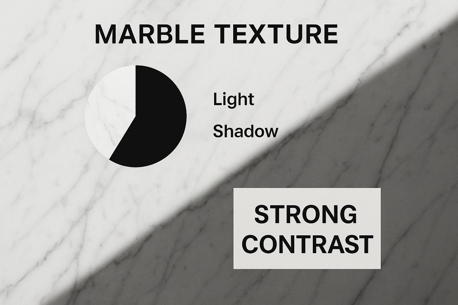
The intense interplay of light and shadow on the marble gives that specific area a heavy, textured feel. To stabilize the entire design, this weight must be offset by other elements in the composition.
The Three Types of Balance
Getting a handle on the different types of balance gives you the power to control the emotional tone and flow of your work. Each approach offers a distinct method for distributing visual weight and guiding the viewer's eye.
- Symmetrical Balance: Think of this as the classic, mirror-image approach. Elements are reflected evenly on either side of a central axis, whether it's horizontal or vertical. This method creates a feeling of formality, order, and tradition. It’s a go-to for established financial institutions or luxury brands that want to communicate trustworthiness and stability.
- Asymmetrical Balance: This is where things get more dynamic. Instead of mirroring elements, you arrange objects with different visual weights to achieve equilibrium. A large, light-colored shape on one side might be balanced by a small, dark, and complex element on the other. This creates a more modern, energetic, and engaging feel, which is why many tech startups and creative agencies use it to appear fresh and innovative.
- Radial Balance: With radial balance, all elements radiate from a single, central point. Picture the spokes on a wheel, the petals of a flower, or ripples spreading in a pond. This technique naturally pulls the eye toward the center, creating a powerful focal point. It's especially effective for designs that need to show motion or focus on a central idea, like event posters or certain app icons.
To help you see how these types of balance work in practice, here's a quick comparison of their characteristics and ideal uses.
| Balance Type | Characteristics | Emotional Impact | Best Used For | Example Applications |
|---|---|---|---|---|
| Symmetrical | Elements are mirrored across a central axis (vertical or horizontal). | Formal, stable, traditional, calm. | Conveying trust, order, and reliability. | Logos for banks, wedding invitations, architectural blueprints. |
| Asymmetrical | Unequal elements are arranged to create equilibrium; no mirroring. | Dynamic, modern, engaging, active. | Creating visual interest and a sense of energy. | Tech company websites, art gallery posters, magazine layouts. |
| Radial | Elements are arranged around a central point, moving outward. | Focused, energetic, unified, sometimes hypnotic. | Drawing attention to a central element or theme. | Sunburst graphics, clock faces, dartboards, tire rims. |
Understanding these different approaches to balance is a major step. The key takeaway is that each type serves a different purpose, allowing you to fine-tune your design's message and emotional impact.
Seeing how professional designers apply these principles can be incredibly helpful. A great way to learn is by looking through creative portfolio website examples, where you can see how balance is used to craft compelling and effective layouts. Mastering balance is about developing an intuition for what feels right and using that instinct to guide your viewer's experience with confidence.
Contrast: Making Your Message Impossible to Miss
If balance gives your design a stable foundation, think of contrast as the spotlight that directs your audience’s gaze. It's one of the most powerful basic design principles for cutting through visual noise and making your message pop. When you hear "contrast," you probably picture black against white. While that’s a perfect example, effective contrast is much more than just color.
Contrast happens when you place two opposite elements next to each other. This strategic difference makes certain parts of your design stand out, telling the viewer, “Look here first!” Without enough contrast, a design can feel flat, uninspired, and confusing to navigate. A study on web accessibility found that websites with low text-to-background contrast see an 86% increase in user-reported readability issues, proving just how essential it is for a good user experience.
How to Use Contrast Effectively
To master this principle, you need to think beyond color. You can create impactful contrast in several ways, and the most compelling designs often layer multiple types together.
- Color Contrast: This is about using colors that are far apart on the color wheel (like blue and orange) or have different values (a very light color against a very dark one). A bright call-to-action button on a muted background is a classic, effective use of this.
- Size Contrast: Placing a large element next to much smaller ones instantly creates a focal point. This is key for building a clear visual hierarchy, like pairing a huge headline with smaller body text.
- Typographic Contrast: Using different fonts, weights, or styles helps separate different kinds of information. For instance, pairing a bold, heavy serif headline with a light, simple sans-serif for body copy can create a layout that is both elegant and easy to read. To dive deeper, you can learn more about the different types of typefaces in our dedicated guide.
- Shape and Texture Contrast: Combining sharp, geometric shapes with soft, organic ones can add major visual interest. Similarly, placing a smooth, sleek surface next to a rough, detailed texture can give your composition a satisfying sense of depth.
Alignment: The Invisible Structure Behind Great Design
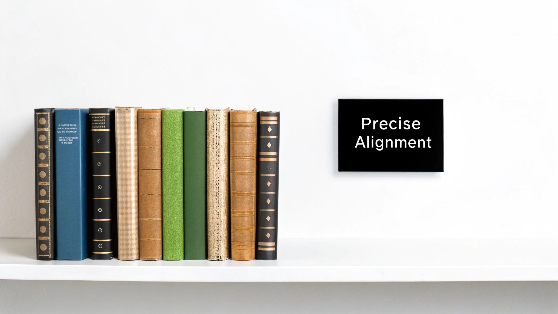
While showy principles like contrast often steal the spotlight, alignment is the quiet, unsung hero of professional design. It’s the invisible grid that holds all your elements together, creating a sense of order and calm for the viewer. Alignment simply means placing elements along a common line, whether on their edge or down their center. This simple action transforms a chaotic jumble of text and images into a clean, sophisticated layout that’s easy to follow.
Think of it like organizing a bookshelf. When all the book spines are lined up neatly, the shelf looks tidy and intentional. When they’re pushed in at random depths, the whole thing feels messy and disorganized. In design, this sense of order isn’t just about looking good; it builds subconscious trust with your audience. A well-aligned design communicates professionalism and care before a single word is even read.
This concept is a cornerstone of the basic design principles that separate amateur work from polished, expert compositions.
Common Types of Alignment
Understanding how to use alignment gives you incredible control over your design’s structure and readability. Most design work relies on a few key types:
- Edge Alignment: This is the most frequent form you'll see. Elements are lined up along their left, right, top, or bottom edges. Left alignment is the standard for text in Western languages because it creates a strong, clean line for the eye to follow as it reads.
- Center Alignment: Use this to create a more formal, symmetrical feel. It works wonderfully for headlines, invitations, or short blocks of text. Be cautious when using it for longer paragraphs, as the ragged left and right edges can make reading more difficult.
Strategically breaking alignment can also be a powerful move for emphasis, but it must be done with purpose to avoid looking like a mistake. Applying consistent alignment across a project also has a big impact on team efficiency. For those looking to improve workflow, you can learn how to master creative team management for peak performance by focusing on consistent standards.
Repetition: Building Recognition That Sticks
Think of your favorite band. Even with a new album, you can usually tell it's them from the first few notes. That's because they have a signature sound—a consistent style that ties all their work together. In design, repetition works the same way. It's the practice of using the same visual elements—like a color, a font, or a specific layout—across all your materials.
While contrast and alignment bring order to a single page, repetition turns your individual designs into a unified brand experience. This isn't about being repetitive in a boring sense; it's about building familiarity. When customers see the same visual cues again and again, your brand becomes recognizable and reliable. This consistency is one of the most important basic design principles for building a strong, memorable brand that people trust.
Creating Rhythm and Reinforcing Your Message
Beyond just making your brand recognizable, repetition creates a visual rhythm. It helps guide people through your content and makes information easier to digest. Imagine reading a magazine where every headline, photo caption, and pull quote has a completely different style. It would be chaotic and confusing.
When you use the same heading style for every section or the same button design for every call to action, you're teaching your audience how to interact with your content. They learn what to expect, which makes their experience smoother and more intuitive.
- Creates Unity: Repetition makes separate elements feel like they belong together, strengthening the overall design.
- Builds Strength: A single design element might go unnoticed, but repeating it gives it weight and importance.
- Establishes Consistency: It sets clear expectations, which is fundamental for good user experience and branding.
Balancing Consistency with Freshness
The biggest challenge with repetition is avoiding monotony. If your designs are too rigid, they can feel stale and uninspired over time. The goal is to strike a balance between consistency and variety. You can keep your core elements the same while introducing subtle changes to keep things interesting.
For example, you could always use your primary brand color but introduce a secondary palette for a specific marketing campaign. Or you could stick to your core brand fonts but experiment with different sizes and weights. To make sure you're getting it right, a structured review process is a huge help. You can use a detailed design review checklist to check if your repetitive elements are effective without becoming dull.
To better understand how this works in practice, let's look at the key elements you can repeat within a design system. This table breaks down how consistent use of these elements strengthens your brand.
| Design Element | Repetition Method | Brand Impact | Implementation Tips | Common Mistakes |
|---|---|---|---|---|
| Color Palette | Use the same 1-3 primary colors for all branding, marketing, and UI elements. | Creates immediate brand association and emotional connection (e.g., Tiffany & Co.'s blue). | Define primary, secondary, and accent colors. Use them consistently for specific functions (e.g., blue for links). | Using too many colors, which dilutes brand identity and creates visual chaos. |
| Typography | Stick to a defined set of 2-3 fonts for headlines, body text, and captions across all platforms. | Establishes a consistent voice and improves readability. A unique font can become a brand identifier. | Choose versatile fonts with multiple weights. Assign specific roles to each font (e.g., serif for body text). | Using inconsistent font styles or too many different fonts, making content hard to read. |
| Logo & Iconography | Place the logo in the same location (e.g., top-left corner) and use a consistent icon style. | Reinforces brand identity and aids navigation. Consistent icons create a universal visual language. | Develop a custom icon set that matches your brand's aesthetic. Ensure the logo is always clear and legible. | Altering the logo's colors or proportions; using clashing icon styles from different sources. |
| Layout & Grid | Apply a consistent grid structure and spacing rules across web pages, ads, and documents. | Creates a sense of order and professionalism. Makes content predictable and easy to scan. | Use a baseline grid and standardized margins. Keep the layout consistent for similar types of content. | Inconsistent spacing and alignment, which makes the design look cluttered and unprofessional. |
| Imagery & Tone | Use a consistent style for all photos and illustrations (e.g., filter, subject matter, composition). | Builds a distinct personality and emotional tone. Helps customers instantly recognize your content. | Create a style guide for photography that defines lighting, color grading, and composition. | Mixing different photo styles (e.g., candid shots with staged stock photos) can confuse the brand message. |
As the table shows, repetition is more than just copy-pasting elements. It’s a deliberate strategy that, when applied thoughtfully to things like color, typography, and layout, builds a powerful and instantly recognizable brand identity.
White Space: The Power of Strategic Emptiness
Sometimes, the most powerful part of a design is what you don't see. White space, often called negative space, refers to the unmarked areas between elements on a page. It's far from being "wasted" space; in fact, it's one of the most critical design principles for creating a feeling of clarity and professionalism. Think of it as the deliberate pauses in a great speech—without them, the message would just be a breathless jumble of words.
White space gives your content room to breathe, which helps people read and process information more easily. Thoughtful use of white space can actually boost user comprehension by up to 20%. It serves as a natural divider, organizing content into logical groups and guiding the viewer's eye through the layout without needing extra lines or boxes. This intentional emptiness is what turns a cluttered design into a clean, sophisticated one that feels easy to follow.
Creating Relationships with Proximity
White space works closely with another important principle: proximity. Proximity is the idea that our eyes naturally group elements that are placed close to each other. When you put a headline, a paragraph, and an image near one another—and separate them from other groups with plenty of white space—you’re sending a clear signal that these items are related.
This simple grouping method is incredibly effective for building a clear visual hierarchy. It tells your audience what to read together and what to consider as separate pieces of information.
- Group Related Items: Place elements that belong together, like a product image and its description, in a close cluster.
- Isolate Unrelated Items: Use generous white space to create a distinct separation between different sections or ideas.
- Emphasize Focal Points: Surrounding a key element, like a call-to-action button, with more white space will make it stand out and draw more attention.
By mastering the balance between strategic emptiness and thoughtful grouping, you can direct focus, improve readability, and create designs that communicate with quiet confidence. This turns white space from a passive background into an active tool for creating focus and conveying a sense of elegance.
Putting It All Together: Your Design Success Framework
Knowing the theory behind design principles is one thing, but actually using them is where the magic happens. Think of it like a musician who has memorized every musical scale but can't put together a melody. The basic design principles are your scales; now it's time to create a song. This framework will help you combine these individual notes to solve real communication challenges, turning scattered ideas into a cohesive message that resonates.
From a presentation that keeps everyone engaged to a social media post that stops the scroll, success is all about how these principles work together. For instance, balance gives your design a solid foundation, while contrast creates a powerful focal point. Repetition builds a recognizable brand identity, and white space gives every element room to breathe.
A Practical Checklist for Your Next Project
When you start a new design, don't feel pressured to use every principle at once. A better approach is to build your composition in logical phases, one layer at a time.
- Foundation (Structure): Begin with alignment and proximity. Group related items together and set up a clean grid. This creates an organized skeleton for your design before you add any visual flair.
- Focus (Hierarchy): Next, bring in contrast and scale. Decide on the single most important part of your message—maybe it's a headline or a call-to-action—and make it stand out. This immediately tells your audience where to look first.
- Flow (Cohesion): Finally, add repetition and check for overall balance. Does the design feel connected to your other brand materials? Is the visual weight distributed in a way that feels stable and intentional? Layering principles thoughtfully also lets you introduce engaging elements. You can learn more about how to inject character into your designs in our guide on variety.
Evaluating Your Own Work
This systematic process isn't just for building new designs; it’s also perfect for reviewing them. Just like scientists need a framework to conduct sound experiments, designers need one for their creative process. The idea of using a structured approach for reliable results isn't new. Modern experimental design was established about a century ago, introducing concepts like randomization and replication to bring rigor to research. You can learn more about the history of experimental design to see how structured thinking produces dependable outcomes.
For those applying these principles to an online presence, understanding key blog design best practices can offer more specific guidance. Always remember that every design choice should have a clear purpose. Ask yourself: does this color choice improve contrast? Does this spacing clarify the relationship between elements? This habit of self-critique will transform your work from simply looking good to being genuinely effective.
Ready to find the right creative partner to bring these principles to life for your brand? Explore top creative talent on Creativize and start your next project with confidence.