
Spice Up Your Site: Exploring Background Patterns
A website is more than just information; it's a visual journey. Impactful design grabs attention and creates memorable connections, and background patterns are a designer's secret weapon. From the early web's tiled GIFs to today's subtle gradients and dynamic animations, background patterns shape online aesthetics. They add depth, texture, and personality, transforming a plain backdrop into a canvas reflecting your brand's identity.
What makes a background pattern effective? It's the balance between visual interest and usability. A good pattern enhances the design without overpowering the content, guiding the user's eye for a cohesive, engaging experience. Think of it as your website's rhythm, setting the tone while letting your message shine.
This article explores ten distinct background pattern categories, showcasing their unique characteristics and how they elevate your website's visual appeal. Whether you're a small business owner refreshing your online presence, a startup aiming for a modern aesthetic, or a freelancer showcasing a portfolio, understanding background patterns is essential. Get ready to discover visual possibilities and transform your website's backdrop from bland to grand.
Pattern Categories to Consider
-
Geometric Patterns: These use repeating shapes like squares, triangles, and hexagons for a sense of order and modernity. They work well for tech companies or businesses wanting a clean, structured look.
-
Organic Patterns: Inspired by nature, these patterns use flowing lines, leaves, and floral motifs to create a softer, more natural feel. They're suitable for lifestyle brands, wellness sites, or businesses focused on natural products.
-
Textured Patterns: These mimic real-world textures like wood, fabric, or stone, adding depth and tactile appeal. They can create a rustic, vintage, or luxurious feel depending on the texture used.
-
Abstract Patterns: These use non-representational shapes and colors for a unique, artistic feel. They're great for creative portfolios or businesses wanting to stand out.
-
Striped Patterns: Simple yet versatile, stripes can add a classic or modern touch depending on their width and color. They can create a sense of movement and direction.
Implementing Background Patterns Effectively
Consider these tips for using background patterns:
-
Subtlety is Key: Avoid overly busy patterns that distract from your content. Opt for subtle patterns that complement your design.
-
Contrast: Ensure sufficient contrast between the pattern and your text for readability.
-
Image Choice: If using image-based patterns, choose high-quality images that are optimized for web performance.
-
Testing: Test your patterns on different devices and browsers to ensure they look good and don't impact loading times. Tools like Google PageSpeed Insights can help analyze website performance.
-
Branding: Align your pattern choices with your overall brand aesthetic.
By understanding the nuances of background patterns and applying these tips, you can create a visually stunning and engaging website that leaves a lasting impression on your visitors.
1. Geometric Patterns

Geometric patterns, using repeated shapes like triangles, squares, and circles, offer a visually appealing way to design website backgrounds. These patterns can be simple, subtle textures or complex, eye-catching designs, adding depth and dimension without overwhelming the content. Their mathematical precision and symmetry create a clean, modern aesthetic suitable for diverse website styles.
One key advantage of geometric patterns is their scalability. As vector-based designs, they resize without quality loss, ensuring crisp visuals across different screens and resolutions. This is essential in today's multi-device environment. Their simplicity also means smaller file sizes, especially when using CSS or SVG, which leads to faster page loads—a plus for user experience and SEO. For more on website optimization, check out Our Sitemap of Posts.
Geometric patterns are also highly customizable. Changing color palettes dramatically alters a pattern's mood and feel, aligning it with your brand identity. This flexibility lets businesses create unique visual experiences that resonate with their target audience.
Several companies demonstrate effective use of geometric patterns. Stripe uses subtle patterns in their hero sections to add visual interest without distracting from their core message. Mailchimp incorporates geometric shapes with their brand colors to reinforce brand recognition. Zendesk uses patterns to create clear visual separation between content sections, improving readability and navigation.
Pros and Cons of Geometric Patterns
Let's weigh the advantages and disadvantages:
Pros:
- Timeless Aesthetic: Geometric patterns offer classic appeal.
- Engaging Visuals: They create visual interest without being overpowering.
- Brand Identity: They're highly customizable for a unique brand presence.
- Responsive Design: They work seamlessly across various screen sizes.
Cons:
- Impersonal Feel: They can feel cold if not balanced with other elements.
- Visual Noise: Complex or high-contrast patterns can create clutter.
- Overuse: They can feel unoriginal if not implemented creatively.
Tips for Implementation
Here's how to use geometric patterns effectively:
- Subtlety is Key: Use low opacity or subtle colors for text-heavy areas.
- Modern Touch: Combine them with gradients for a contemporary look.
- Interactive Elements: Animate patterns for interactive elements to boost engagement.
- Contrast: Ensure sufficient contrast between the pattern and content.
The popularity of geometric patterns stems from influential design movements like Google's Material Design, the Swiss/International design movement, and the Bauhaus school. These movements emphasized clean lines, geometric forms, and functional aesthetics, principles still relevant in web design today. Understanding these principles and best practices empowers businesses to create visually engaging and effective online experiences with geometric patterns.
2. Subtle Textures
Subtle textures are the unsung heroes of web design. They mimic real-world materials like paper, fabric, or even noise, adding depth and a tactile quality to otherwise flat digital interfaces. These patterns are designed to be barely noticeable, working quietly in the background to enhance the overall feel of a website. They create a sense of warmth, dimension, and subtle sophistication without distracting from the main content.
One of the key features of subtle textures is their low contrast. Variations are kept minimal, ensuring they enhance rather than overwhelm the design. Often inspired by physical materials, these seamless repeating patterns are typically implemented as lightweight PNG or JPEG files. Think of the gentle grain of wood, the weave of linen, or the subtle speckled texture of handmade paper. These visual cues resonate with our tactile senses, grounding the digital experience.
Benefits and Drawbacks of Subtle Textures
The benefits of using subtle textures are numerous.
- Add warmth and depth to flat designs, countering a sterile or impersonal feel.
- Contribute to a perceived sense of quality and craftsmanship, elevating the user experience.
- Establish mood and atmosphere. A soft, grainy texture can evoke nostalgia or comfort, while a more structured pattern can communicate professionalism and precision.
- Reduce the clinical feel of digital interfaces, making them more inviting.
However, potential drawbacks exist.
- Large texture files can increase page load time, impacting user experience.
- They may not scale well on high-resolution displays, appearing pixelated or blurry.
- Resizing can create undesirable moiré patterns.
Implementing Subtle Textures Effectively
To avoid these issues, keep file sizes small by using optimized images or CSS techniques. Always test your design across different screen resolutions to identify and correct any scaling or moiré effects. Use textures that align with your brand personality and overall website aesthetic. Consider exploring CSS3 techniques like noise functions to generate textures dynamically, offering greater control and performance benefits. You might be interested in: Our guide on sitemaps for more technical tips.
Examples and Inspiration
Anthropologie masterfully uses fabric-like textures throughout their site, reinforcing their brand identity and creating a cohesive, tactile experience. Dropbox Paper implements a barely-visible paper texture, adding familiarity and warmth to the digital document workspace. Squarespace templates also frequently incorporate subtle textural elements, adding sophistication and polish to their designs. Resources like Subtle Patterns (by Toptal), a library offering a vast collection of ready-to-use patterns, further popularized the use of subtle textures. Apple's early iOS skeuomorphic design, which mimicked real-world textures, also contributed. The trend has been embraced by craft and artisanal brand websites, seeking to translate the tactile qualities of their products into the digital realm.
Subtle textures deserve a place in this list as a powerful, often overlooked design element. By understanding their features, benefits, and potential pitfalls, you can use subtle textures to enhance the user experience and create more engaging, visually appealing websites.
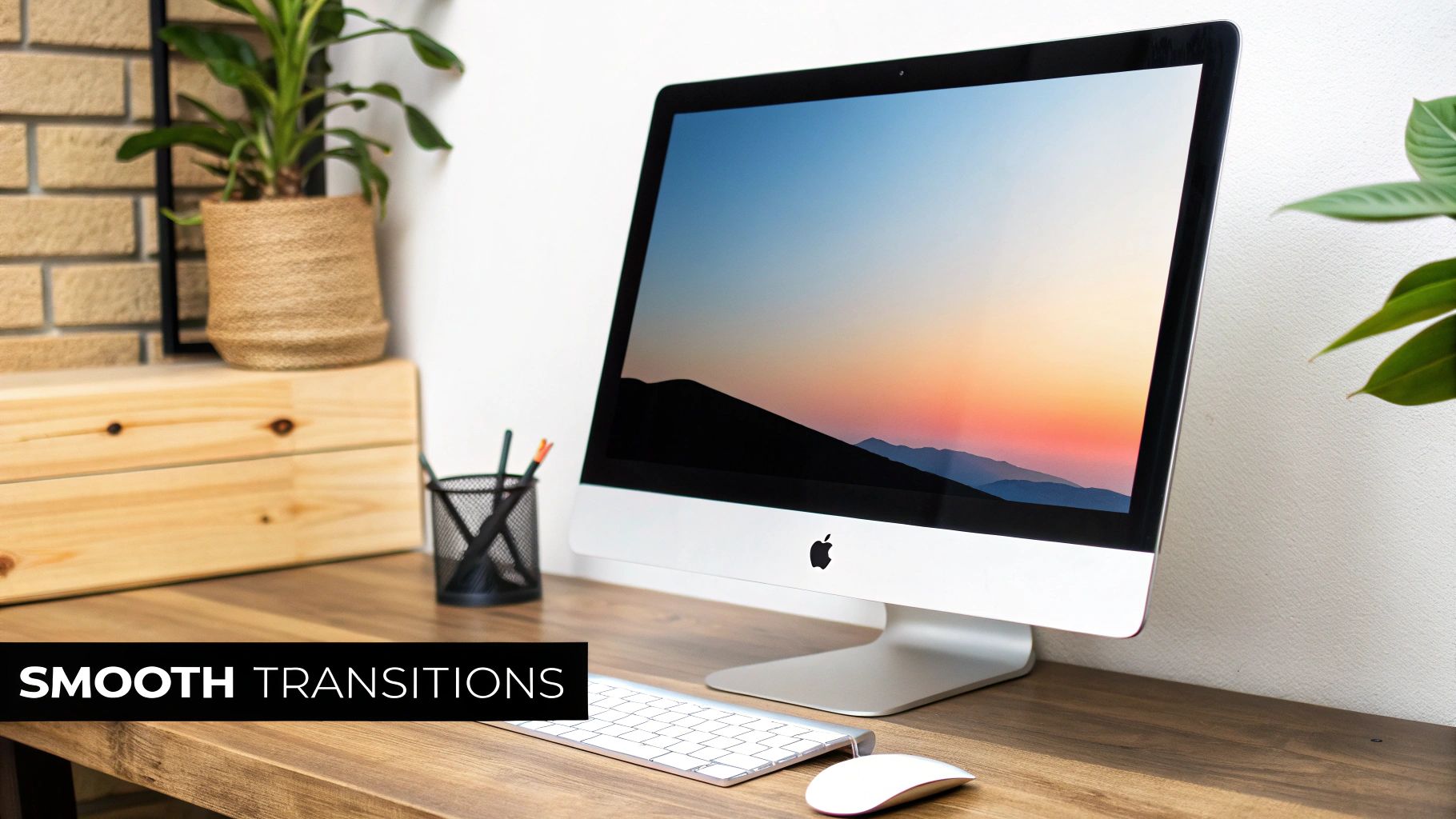
3. Gradient Backgrounds
Gradient backgrounds have become a mainstay of modern web design. They offer a versatile way to add depth and visual interest, even directing user attention, without using large image files. Gradients use smooth transitions between two or more colors, creating a visual effect that can be subtle and professional or bold and vibrant.
Today's gradients offer a wider range of possibilities than the simple linear gradients of the past. Modern CSS allows for radial, conic, and even mesh gradients, unlocking a world of creative potential. This evolution is due to advancements in browser technology and a renewed appreciation for the artistry of color transitions.
Features and Benefits
-
Smooth Color Transitions: Gradients create depth and movement that flat colors can't match.
-
CSS Implementation: Pure CSS implementation means faster loading times than image-based backgrounds.
-
Customization: Control the direction, shape, color stops, and type of gradient to fit your brand.
-
Responsive Design Friendly: Gradients adapt seamlessly to various screen sizes, ideal for responsive websites.
-
Direct User Attention: Strategic use of color gradients can guide the user's eye to specific page areas, using principles of color psychology.
Pros and Cons
Here's a quick look at the advantages and disadvantages of using gradient backgrounds:
| Pros | Cons |
|---|---|
| Visually engaging, lightweight performance | Readability can suffer with poor text/background contrast |
| Fast loading times | Outdated color combinations can date the design |
| Easy customization | Older browsers may have limited support |
Real-World Examples
Several prominent companies effectively utilize gradient backgrounds:
-
Instagram: Their vibrant brand gradient features prominently in their logo and app interface. (instagram.com)
-
Stripe: Uses subtle gradients in their documentation to create visual separation and add elegance. (stripe.com)
-
Asana: Uses color gradients to distinguish between different workspaces, improving user experience. (asana.com)
-
Linear: Employs gradients for depth and a modern aesthetic throughout their website. (linear.app)
Tips for Implementation
-
Subtlety is Key: For professional websites, choose subtle gradients. Bolder gradients suit creative industries or youth-oriented brands.
-
Contrast is Crucial: Ensure adequate contrast between the gradient and any overlaid text or elements for readability.
-
CSS Variables: Use CSS variables to define gradient colors, making website-wide brand color updates easy.
-
Texture Enhancement: Combining gradients with subtle textures can enhance depth and create a tactile feel.
Rise in Popularity
Several factors contributed to the widespread adoption of gradients:
-
Instagram's 2016 app redesign: Their bold use of gradients solidified it as a trendy design element.
-
Apple's iOS 7+ design language: The introduction of flatter design and subtle gradients in iOS influenced web design.
-
Material Design 2.0 gradients: Google's Material Design guidelines further embraced gradients in various UI elements.
Gradient backgrounds are a powerful and efficient way to enhance a website's visual appeal. Their flexibility, performance benefits, and alignment with modern design trends make them an essential tool for web designers.
4. Minimalist Grid Patterns
Minimalist grid patterns have become a staple of modern web design. They offer a subtle yet effective way to structure a website visually and improve its overall organization. These backgrounds use clean, straight lines with consistent spacing and alignment. This creates a sense of order without overwhelming the website's content.
These grids often use a monochromatic or low-contrast color scheme. This allows them to act as a quiet backdrop, subtly guiding the user's eye through the content hierarchy. They also reinforce the design's alignment principles. Plus, their simplicity translates to excellent performance, contributing to faster page load times. Page speed is a crucial factor for both user engagement and SEO.
The true strength of minimalist grids lies in their unobtrusiveness. They create structure without adding visual noise, allowing the content to take center stage. Clean lines with minimal thickness and consistent spacing contribute to this subtle but effective impact. Developers can implement this approach using pure CSS or SVG, providing flexibility in the design process.
Consider the subtle grid system often used on Apple's marketing pages, the structured interface of Notion, or even Figma's editor background. Design portfolio sites frequently use grid backgrounds to showcase their work cleanly and professionally. These examples highlight the versatility and effectiveness of minimalist grids.
Pros of Minimalist Grids
- Creates structure and organization without visual clutter
- Reinforces alignment principles within the design
- Provides subtle visual cues for content hierarchy
- Extremely lightweight, leading to improved performance
Cons of Minimalist Grids
- Can appear too clinical or sterile if not styled correctly
- May create moiré patterns on some screens with improper implementation
- Sometimes perceived as too safe or conventional a design choice
Tips for Implementing Minimalist Grids
- Subtlety is Key: Keep the grid's opacity low (5-15%) to prevent it from overpowering the content.
- Cohesive Layout: Align content elements with the grid lines to create a harmonious and unified look.
- Dynamic Touch: Consider adding subtle animations or parallax effects on scroll for a touch of interactivity.
- Easy Adjustments: Use CSS custom properties (variables) for easy modification of the grid's appearance across different screen sizes.
The rising popularity of minimalist grid patterns can be linked to Swiss design principles. These principles emphasize clarity, order, and functionality. The widespread use of these grids in design tool interfaces, like Figma, further cemented their place in modern web design. Their adoption by architectural and product design websites demonstrates their suitability for showcasing visual content.
Minimalist grid patterns deserve recognition for their practical and effective enhancement of website backgrounds. They achieve this without sacrificing performance or visual clarity. They are a valuable asset for businesses, freelancers, and organizations aiming to create a professional, organized, and modern online presence. You might also be interested in: Our Sitemap for more resources on web design.
5. Abstract Organic Patterns
Abstract organic patterns are a popular choice for website backgrounds, offering a visually appealing blend of natural aesthetics and engaging design. Unlike rigid geometric patterns, abstract organic patterns utilize flowing, non-geometric shapes. These shapes often draw inspiration from natural elements like smoke, water, or even cellular structures. They bring a sense of movement and fluidity to a design, adding a touch of warmth and personality.
These patterns typically feature asymmetrical compositions, giving them a natural, unrestrained feel. Rather than depicting recognizable objects, they focus on evoking feelings and establishing a distinct atmosphere. Often implemented as SVG or optimized PNG files, these patterns subtly enhance a website's visual appeal.
Why Choose Abstract Organic Patterns?
Abstract organic patterns provide a refreshing alternative to more traditional, structured background designs. They help brands stand out, especially in industries saturated with geometric or image-based backgrounds. The fluid nature of these patterns can evoke specific emotional responses based on their shape and movement, subtly influencing user perception and creating a more welcoming online experience.
Pros:
- Creates a sense of warmth and personality in digital interfaces.
- Evokes specific emotional responses based on shape and movement.
- Offers visual interest without strict formality.
- Differentiates a brand from competitors using more common geometric patterns.
Cons:
- Can be more complex to create and implement than simpler patterns.
- May increase page load time if not properly optimized.
- More difficult to ensure responsive behavior across different devices.
Real-World Examples:
- Slack: Slack's illustrated backgrounds frequently incorporate organic shapes and patterns, contributing to their playful and approachable brand identity.
- Headspace: The popular meditation app uses soft, organic patterns to cultivate a calming and peaceful atmosphere.
- Dropbox: Dropbox's rebranding incorporated abstract organic patterns to modernize their image and convey fluidity.
- Many SaaS Companies: Numerous Software as a Service companies have adopted fluid background designs for a modern and dynamic feel.
A Rise in Popularity:
The trend of “blob” designs in UI/UX gained traction around 2018, fueled by digital agencies like Ueno and Fantasy. Health and wellness brands, aiming for natural aesthetics, were early adopters. This trend quickly spread to other industries, driven by the desire for a more human-centered design approach.
Tips for Implementation:
- Use SVG Format: SVGs are scalable, ensuring crisp visuals at any size and often better performance than large PNGs.
- Subtle Animations: Subtle animations can enhance the organic feel and create dynamic movement.
- Limited Color Palette: A limited color palette avoids overwhelming the user and maintains a professional look.
- Sufficient Contrast: Ensure sufficient contrast between the background pattern and overlaid text for readability.
By considering these aspects, businesses and freelancers can use abstract organic patterns to create engaging and memorable online experiences. They are a powerful tool for conveying brand personality and building a visually appealing digital presence.
6. Dot Patterns
Dot patterns, using arranged circles or points in organized or more free-flowing layouts, offer a subtle yet effective method for adding texture and visual flair to website backgrounds. From basic, evenly spaced grids to intricate halftone effects, dot patterns provide a versatile design element that maintains a clean, modern look adaptable to various design styles. This adaptability makes them a valuable asset for businesses, startups, freelancers, and organizations looking to elevate their online presence.
Dot patterns create a gentle visual rhythm. This texture can break up large areas of solid color, add depth, and subtly guide the user's eye without overshadowing the primary content. Their adaptability allows them to be scaled to different densities, arranged in structured grids or randomized clusters, and implemented in single or multiple color schemes. Adding to their flexibility, designers can leverage differences in dot size to create depth and highlight certain areas.
Features and Benefits
- Scalable and Adaptable: Dot density can be adjusted to fit different needs, from subtle background textures to more prominent visual elements.
- Structured or Random: Use structured layouts with CSS grid or flexbox for an ordered feel, or create organic, scattered arrangements for a more dynamic look.
- Monochromatic or Multicolor: Dot patterns work well with single colors or multiple hues, allowing seamless integration with brand color palettes.
- Depth through Size Variation: Varying the size of individual dots within the pattern creates the illusion of depth and dimensionality.
Pros
- Versatile Design Element: Dot patterns complement numerous design styles, from minimalist to bold.
- Subtle Texture: Adds visual interest without distracting from the content.
- Easy Implementation: Achievable with CSS or SVG, making them accessible for developers of all skill levels.
- Animation Potential: Dots can be animated for interactive effects, adding an engaging layer to the user experience.
Cons
- Visual Vibration/Moiré Patterns: Incorrect implementation, particularly with high densities, can create unpleasant visual vibrations or moiré patterns. Thorough testing is essential.
- Dated Halftone Styles: Certain halftone styles can appear outdated. Choose modern interpretations for a contemporary aesthetic.
- Accessibility Concerns: Low contrast between the dots and the background can hinder accessibility for users with visual impairments. Maintain sufficient contrast ratios.
Real-World Examples
Several well-known companies effectively use dot patterns:
- IBM: Integrates dot grid patterns into their design system for a consistent, textured background.
- Salesforce: Employs subtle dot patterns in section backgrounds to add depth and visual separation.
- Atlassian: Uses dot patterns across its product suite for brand cohesion and subtle visual texture.
- Spotify: Uses dot patterns in their year-in-review visualizations for engaging data backgrounds.
Tips for Implementation
- Vary Dot Size for Depth: Experiment with various dot sizes to create visual hierarchy and depth.
- CSS Grid/Flexbox for Structure: Use CSS grid or flexbox to precisely control dot placement and spacing in structured layouts.
- Parallax Effects: Incorporate parallax scrolling to create layered depth with dot patterns, adding dynamism to the user experience.
- Radial Gradients: Use radial gradients for individual dots to create softer edges and a more subtle look.
Historical Context and Popularization
Dot patterns have a rich history, originating from halftone printing techniques in graphic design. This method used varying sizes of dots to simulate grayscale and create images. This technique's influence remains visible in modern dot pattern uses. More recently, design systems like IBM’s and guidelines like Material Design's focus on elevation and depth have further popularized dot patterns in web design.
Dot patterns are a valuable addition to this list because they offer a simple, elegant, and versatile solution for improving website backgrounds. Their ability to add texture, depth, and visual interest without overwhelming content makes them a strong tool for businesses and organizations aiming to create a visually appealing and engaging online experience.
7. Animated Background Patterns
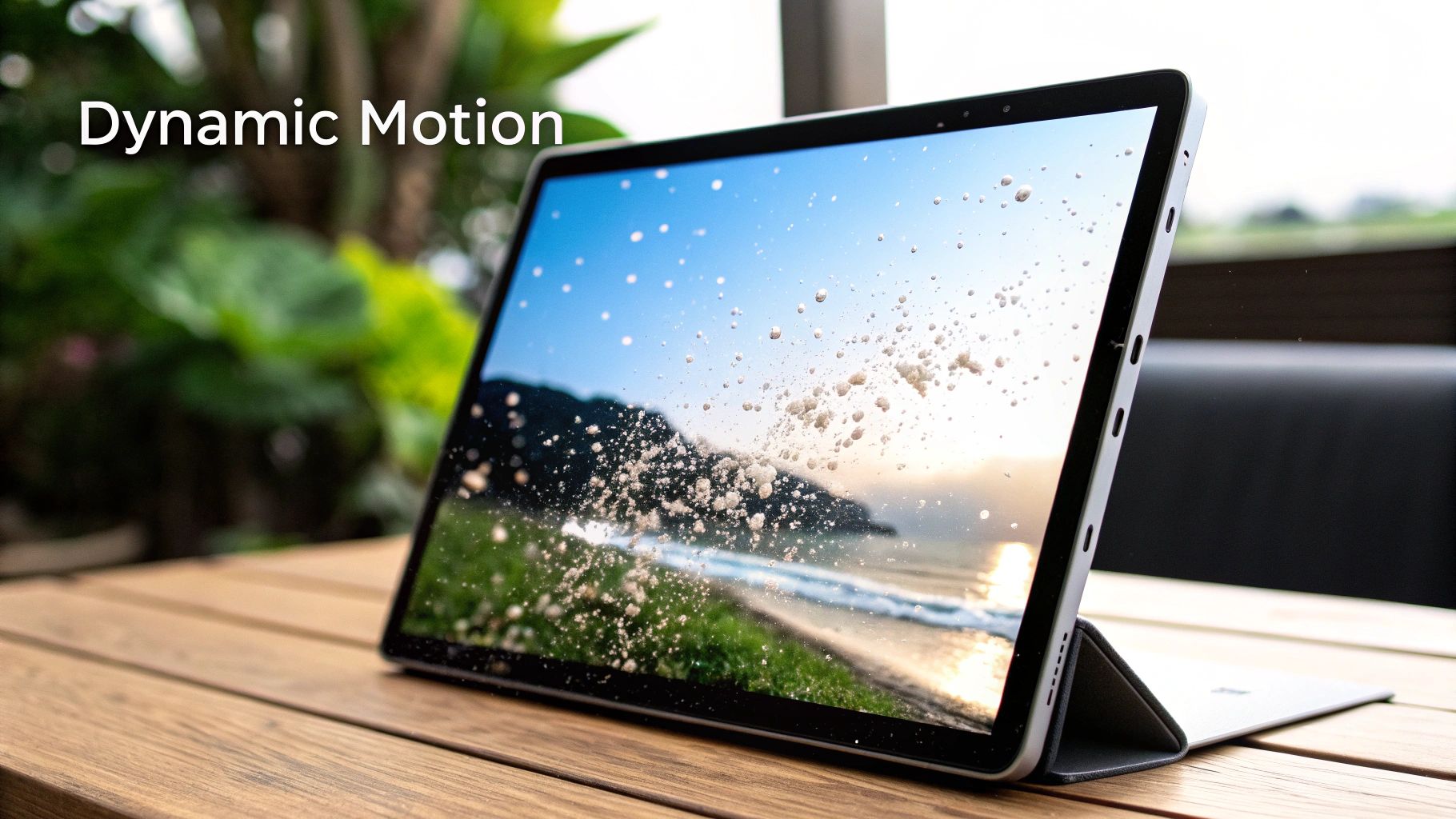
Animated background patterns inject a sense of vibrancy into website designs. They offer a dynamic visual appeal that static backgrounds simply can't match. Instead of just displaying a still image, these patterns incorporate subtle movements, smooth transitions, or even interactive elements within the design itself. This results in a more captivating online experience that grabs user attention and enhances their overall journey. This dynamic approach makes animated backgrounds a powerful tool in modern web design, helping websites stand out and leave a lasting impression.
These patterns are made possible by modern web technologies like CSS animations, JavaScript libraries (such as GreenSock (GSAP) or Anime.js), and even WebGL for more intricate effects. This opens up a wide range of creative possibilities, from gently flowing gradients and subtly shifting geometric shapes to interactive particle systems that respond to a user's mouse movements.
Features and Benefits
-
Subtle Motion Enhances, Doesn't Distract: Well-executed animated backgrounds use subtle movements that complement the content, not overpower it. They create a modern and dynamic feel without pulling the user's focus away from the main message.
-
Interactive Responses: Animations can be designed to react to user interactions such as scrolling, mouseovers, or clicks. This adds a layer of visual feedback and encourages engagement. Interactivity can be especially effective in drawing attention to calls to action or guiding users through a website.
-
Variety of Implementations: The range of implementation possibilities is vast. Simple CSS transitions can be used for subtle effects, while complex particle systems powered by JavaScript or WebGL cater to more advanced design needs. This flexibility allows developers to choose the best approach for their project and technical skills.
-
Differentiation and Branding: In a crowded digital space, standing out is crucial. Animated backgrounds can be a key differentiator, helping to create a unique brand identity and a more memorable user experience.
Pros and Cons
Let's take a look at the advantages and disadvantages of using animated backgrounds:
| Pros | Cons |
|---|---|
| Creates memorable, engaging user experiences. | Can impact performance on low-end devices. |
| Can direct user attention to important elements. | May be distracting if overused or too intense. |
| Provides visual feedback for interactions. | Requires careful implementation to maintain accessibility. |
| Differentiates from static websites. | Higher development complexity than static patterns. |
Real-World Examples
Several well-known companies effectively use animated background patterns:
-
Stripe: Stripe's homepage is a classic example of subtle yet impactful animated background patterns. Their use of interactive particles that react to mouse movement demonstrates how animation can enhance user engagement.
-
Apple: Apple often uses subtle animated backgrounds on their product pages, emphasizing the sleek design and features of their devices.
-
Coinbase: Coinbase uses animated gradients to create a modern and dynamic feel on their platform.
-
Web3 Sites: Many Web3 sites employ subtle animated dot or line patterns to create a sense of technological advancement and innovation.
Tips for Implementation
Here are some practical tips for implementing animated backgrounds:
-
Throttle animations based on device performance: Use JavaScript to detect device capabilities and adjust animation intensity or disable them entirely for low-powered devices.
-
Provide options to reduce motion for accessibility: Offer users control over animation intensity to accommodate those with vestibular disorders or other accessibility needs.
-
Keep animations subtle in content-heavy sections: Avoid overwhelming users with excessive movement in areas where they should be focused on reading or interacting with content.
-
Use
requestAnimationFramefor smooth performance: Leverage therequestAnimationFrameAPI to optimize animation performance and conserve battery life. -
Consider using canvas or WebGL for complex animations: Canvas and WebGL are better suited for intricate particle systems or other performance-intensive animations.
Popularized By
Stripe's design team, particularly their homepage designs, significantly influenced the adoption of subtle, interactive animated backgrounds. Three.js demos and examples have showcased the power of WebGL for creating more complex animations. Apple's product marketing pages consistently demonstrate the effective use of subtle animation. These examples have inspired and shaped the widespread use of animated background patterns in modern web design.
8. Isometric Patterns
Isometric patterns offer a distinctive way to add depth and visual flair to your website without needing complex 3D models. They use a specific three-dimensional projection where all axes are equally spaced, creating the illusion of 3D objects on a flat, 2D surface. This method avoids perspective distortion, resulting in a clean, organized aesthetic that's especially popular with tech and data-focused websites.
Features and Benefits
The defining characteristic of an isometric pattern is its use of 30-degree angle projections. These angles, combined with a uniform scale across the pattern, create a convincing illusion of depth. The patterns typically employ repeated cubic or geometric shapes and can be created using web technologies like SVG, CSS, or raster graphics.
This approach offers several key advantages:
-
Perceived Depth without Complexity: Isometric patterns give a sense of 3D without the performance costs and design hurdles of actual 3D graphics.
-
Modern and Distinctive Visuals: They create a contemporary look, helping a website stand out.
-
Suitable for Tech and Data Brands: The structured, geometric look of isometric patterns fits well with the visual language of technology and data visualization.
-
Extensible to Illustrations: You can design isometric illustrations that blend seamlessly with the background pattern, boosting overall visual consistency.
Pros and Cons
While visually appealing, isometric patterns have drawbacks:
Pros:
- Create perceived depth without the complexity of true 3D.
- Offer a distinctive and modern look.
- Work well for technical or data-focused websites.
- Can be extended into matching illustrations.
Cons:
- Can be visually complex and potentially distracting.
- Are harder to create than simpler patterns.
- May seem technical or impersonal if not styled carefully.
- Can become overused, particularly in the tech and financial technology sectors.
Real-World Examples
Several companies effectively use isometric patterns in their web design:
-
Asana: Known for its project management software, Asana uses isometric patterns and illustrations throughout its website for a cohesive and visually appealing experience.
-
Cryptocurrency & Blockchain Websites: Many websites in this area use isometric backgrounds to project a sense of technological advancement and innovation.
-
Data Visualization Platforms: Isometric grids are often used in data visualization to represent complex data clearly and intuitively.
-
Developer Documentation Sites: Isometric elements are frequently used to illustrate concepts and processes in developer documentation.
Tips for Implementation
-
Consistent Angles: Stick to 30-degree angles for a unified isometric appearance.
-
Limited Color Palette: A restrained color palette avoids visual clutter and keeps things clear.
-
Subtle Animations: Small animations can enhance the 3D effect and add interaction.
-
Sufficient Contrast: Ensure enough contrast between the background and foreground elements for readability.
-
Strategic Placement: For content-rich websites, use isometric patterns sparingly, like for section dividers or background accents, rather than full-page backgrounds, so as not to overpower the content.
Historical Context
Isometric patterns gained popularity in the 2010s, driven largely by tech startup branding. Their adoption by the blockchain and cryptocurrency community strengthened their place in modern design. Gaming UI trends also contributed to their widespread use.
Isometric patterns are valuable design elements because they add visual depth and a modern aesthetic. Used strategically, they can significantly enhance a website’s visual identity, especially in the tech and data-driven sectors. They offer a unique visual style and are a flexible element that can be incorporated in various creative ways.
9. Noise and Grain Textures
Noise and grain textures are becoming increasingly popular in modern web design. They provide a subtle yet effective way to add depth and a tactile feel to digital interfaces that might otherwise appear flat. These textures consist of random pixel variations, mimicking the appearance of things like film grain, the texture of paper, or static. This touch of imperfection adds warmth and visual interest, making websites feel more engaging and less sterile.
Why Noise and Grain Are Trending
In a digital world often dominated by clean, crisp aesthetics, noise and grain textures offer a welcome contrast. They help bridge the gap between the digital and the tangible. This subtle imperfection adds a human touch that resonates with users. For businesses, incorporating these textures can contribute to a more authentic, premium, and memorable online presence.
Features and Benefits
- Subtle Imperfection: Noise textures involve slight, random variations in pixel intensity. This adds visual depth without overwhelming the overall design.
- Versatility: Noise can be monochromatic, blending seamlessly with the background, or subtly colored to complement a brand’s color scheme.
- Implementation Options: Noise and grain can be applied using several methods, including SVG filters, CSS, or optimized PNG overlays. SVG filters generally offer the best performance and scalability.
- Lightweight: Modern techniques ensure minimal impact on website performance.
Pros and Cons of Using Noise and Grain
Let's take a look at the advantages and disadvantages of using noise and grain:
| Pros | Cons |
|---|---|
| Enhanced Depth and Tactility | Implementation Challenges (potential compression artifacts) |
| Subtle Visual Interest | Potential for Misinterpretation (seen as a design flaw) |
| Reduced Sterility of Digital Interfaces | Readability Issues (if too intense) |
| Performance-Friendly |
Real-World Examples
Several prominent platforms and websites use noise and grain textures effectively:
- Linear App: This project management software uses subtle grain to create a softer, more polished look.
- Figma: This popular design tool has incorporated noise textures, further solidifying the trend's growing popularity within the design industry.
- Creative Agency Websites: Many creative agencies use grain to give their online portfolios a handcrafted, artistic feel.
- Premium Product Websites: Websites showcasing high-end products often utilize noise to convey a sense of quality and craftsmanship.
The Growing Popularity of Noise and Grain
The increased use of noise and grain in web design is due to a confluence of factors:
- Resurgence of Film Photography Aesthetics: Noise textures evoke the nostalgic charm of analog film photography.
- Neo-Brutalist Web Design: This design movement embraces raw, unpolished aesthetics, with noise playing a significant role.
- Reaction Against Overly Clean Design: As users tire of perfectly smooth interfaces, designers are exploring ways to reintroduce texture and visual depth.
Practical Tips for Implementation
- Subtlety is Key: Begin with a low opacity (2-5%) and adjust as needed.
- Optimize for Performance: SVG filters provide better performance and scalability than image overlays.
- Responsive Design: Adjust grain size according to screen size for a consistent look across devices.
- Animated Noise: Experiment with animated noise for unique effects, such as subtle background movement.
- Brand Alignment: Subtly color the noise to align with your brand's palette for a cohesive visual identity.
By understanding how to use noise and grain textures effectively, businesses and designers can enhance their websites, creating visually appealing and sophisticated online experiences.
10. Wave and Curved Patterns
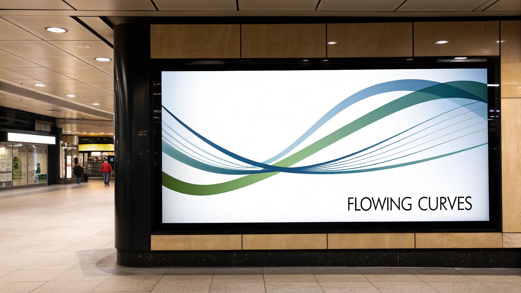
Wave and curved patterns have become increasingly popular in modern web design. They offer a fresh, visually engaging alternative to the traditional straight lines and boxy layouts we're used to seeing. These patterns, distinguished by their smooth, undulating lines and shapes, introduce a sense of movement and organic form to website backgrounds.
Their widespread adoption comes from their ability to guide users through content, create visual interest, and soften the sometimes rigid structure of digital interfaces. This versatility makes them a powerful tool for website owners seeking to improve aesthetics and enhance user experience.
Using Waves and Curves Effectively
From subtle ripples to more pronounced wave formations, these patterns bring a dynamic feel to web design. They can be used in various ways, such as subtle background textures or prominent dividers between sections. This adaptability allows for a wide range of creative implementations, making them appropriate for diverse website styles and industries.
Key Features and Benefits:
- Flowing, curved lines: Create visual rhythm, which can be adjusted for varied or consistent effects.
- Layered effects: Overlapping waves add depth and visual complexity.
- Scalability: Often created using SVG (Scalable Vector Graphics), these patterns maintain quality at any size, ensuring a professional appearance across devices.
- Color transitions: Adding color transitions along the curves can further enhance the visual appeal and create a more dynamic feel.
- Guiding user attention: The natural flow of waves can subtly direct users' eyes toward specific content.
- Softening digital interfaces: Curved lines break the monotony of straight lines and sharp corners, creating a more inviting and natural feel.
- Evoking natural elements: Wave patterns can remind users of natural elements like water or hills, contributing to a calming and engaging experience.
- Versatile application: They work well as section dividers, transitional elements, or even subtle background textures.
Real-World Applications of Wave Patterns
- Asana: This project management platform utilizes wave patterns to effectively separate page sections, creating a clear visual hierarchy for improved readability.
- Slack: The communication platform incorporates curved section dividers to break up content and create a more visually appealing layout.
- Landing Pages: Many landing page templates use wave patterns to generate visual interest and guide visitors towards call-to-action buttons.
The Rise and Fall (and Rise?) of Wave Patterns
Wave patterns saw a surge in popularity around 2018, largely influenced by SaaS marketing sites and landing page design trends. Tools like GetWaves.io made them more accessible by providing easy-to-use wave pattern generators. This, combined with the growing trend of organic and fluid shapes in web design, solidified their position as a popular design element.
Weighing the Pros and Cons
Pros: Creates visual flow, softens digital interfaces, evokes natural elements, versatile application.
Cons: Can create awkward shapes at different viewport sizes if not implemented correctly, potential for overuse, more complex to make responsive.
Tips for Implementing Wave Patterns
- Use SVG format: Ensures sharp rendering and optimal performance.
- Subtlety in content-heavy sections: Keep wave heights subtle where there is a lot of text to avoid distractions.
- Responsiveness: Test thoroughly on different devices to ensure proper display at various screen widths.
- CSS clip-path: This CSS property offers a simple way to create basic wave shapes.
- Subtle animation: Consider adding subtle animations for enhanced visual interest, but always provide reduced motion options for accessibility.
By understanding the features, benefits, and implementation best practices, you can effectively use wave and curved patterns. They enhance your website's visual appeal, user experience, and overall effectiveness. Wave patterns provide a way to add dynamism and personality to your site, distinguishing it from the competition and creating a more engaging visitor experience.
10 Website Background Patterns: Comparative Analysis
| Pattern | 🔄 Complexity | ⚡ Resources | 📊 Outcomes | 💡 Use Cases | ⭐ Advantages |
|---|---|---|---|---|---|
| Geometric Patterns | Moderate – CSS/SVG with mathematical precision | Low – Scalable vector files | Clean, structured, visually balanced | Corporate, tech, and modern brand sites | Timeless design, high customizability |
| Subtle Textures | Low to Moderate – Simple image/CSS methods | Moderate – Requires image optimization | Warm, tactile feel with minimal distraction | Artistic, boutique, and premium product sites | Enhances craftsmanship and visual depth |
| Gradient Backgrounds | Low – Pure CSS implementation | Very efficient – No heavy images | Smooth transitions with dynamic color depth | Modern brands, mobile apps, and creative layouts | Fast loading, easily adjustable, attention directing |
| Minimalist Grid Patterns | Low – Basic CSS or SVG grids | Very light – Minimal file size | Clear structure and subtle organization | Design tools, portfolios, and content-focused sites | Reinforces order with high performance |
| Abstract Organic Patterns | High – Irregular shapes require precision | Higher – May need optimization | Fluid, emotive visuals with natural, organic flow | Creative agencies, wellness, and innovative brands | Unique look with warm, non-formal aesthetics |
| Dot Patterns | Low – Easily done via CSS/SVG | Low – Minimal overhead | Adds texture and modern visual interest | Tech, corporate, and data visualization sites | Versatile, subtle texture with animation potential |
| Animated Background Patterns | High – Requires JS/CSS/WebGL for motion | High – Can impact low-end devices | Dynamic, interactive, and engaging feedback | Landing pages, high-engagement and interactive sites | Memorable user experience with interactive flair |
| Isometric Patterns | High – Demands consistent angles and precision | Moderate – Depends on asset resolution | Creates a 3D illusion on a 2D surface with modern appeal | Tech, fintech, and data-driven platforms | Distinctive depth, modern and technical aesthetics |
| Noise and Grain Textures | Moderate – Uses CSS filters or SVG overlays | Low if optimized, but risk in excess | Subtle warmth and tactile depth to flat interfaces | Premium, artistic, and neo-brutalist designs | Adds rich texture and breaks digital flatness |
| Wave and Curved Patterns | Moderate to High – Responsive SVG implementations | Efficient when using vector formats | Fluid, dynamic motion that guides user attention | Creative agencies, landing pages, and modern sites | Organic movement and modern elegant flow |
Level Up Your Web Design With the Perfect Pattern
From the crisp lines of geometric shapes to the natural ebb and flow of wave patterns, background designs offer a powerful way to enhance your website's aesthetic and user experience. We've explored a variety of patterns, from subtle textures and minimalist grids to dynamic animations and isometric designs. Each brings its own unique advantages to the table.
The key to successfully using patterns lies in understanding the interplay between pattern type, color palette, and the overall website design. A subtle noise texture can add depth and a touch of elegance, while a bold geometric pattern can infuse energy and personality. Think about the emotional impact you're aiming for and select a pattern that aligns with your brand identity and resonates with your target audience.
Balancing Aesthetics With Functionality
Effectively using patterns requires careful consideration of both accessibility and performance. High contrast between the background pattern and foreground content is essential for readability, especially for users with visual impairments.
Optimizing image file sizes and using CSS techniques whenever possible will minimize loading times and ensure a smooth browsing experience for everyone. Don't be afraid to experiment! A/B testing different patterns can offer valuable insights into what works best with your audience.
Staying Ahead of the Curve
The world of web design is always evolving. Keep an eye on emerging trends like generative art patterns, 3D-integrated backgrounds, and interactive pattern experiences. By staying informed and adapting to these developments, you can ensure your website remains visually captivating and ahead of the curve.
Key Takeaways:
- Purposeful Selection: Choose patterns that align with your brand and target audience.
- Balance and Contrast: Ensure readability by maintaining sufficient contrast between background and content.
- Performance Optimization: Optimize images and use efficient coding practices to minimize loading times.
- Accessibility Considerations: Prioritize visual accessibility for all users.
- Continuous Learning: Stay updated on design trends and adapt your strategies accordingly.
Want to transform your website with engaging background patterns? Connect with talented creatives to make your vision a reality. Creativize offers a platform to discover local designers, animators, and branding specialists who can help you craft the perfect visual identity. Find the expertise you need and elevate your online presence.